Form Type Properties Screen
Description
An explanation of the form type properties shown in the middle of the screen.
Discussion
The Form Type Properties Screen displays some of the form type properties other than the commands. It also gives access to properties expressed in the JSON data format for advanced use.
Basic Info
Display Name and Form ID
The Basic Info section of the Form Properties Screen lets you set the Display Name and the Form ID.
The Display Name is shown in lists and on Tabs to indicate the title of forms of that form type. It usually should not be too long (less than 20 characters or so), since it may appear in the top of a phone, etc. Longer descriptions can go on the form itself using Heading commands.It does not need to be unique as form types are distinguished in the system by unique Form IDs, not Display Name. Form types may be distinguished to the user through use of different icons and colors in the Form Tab, and users with different roles may only see a subset of the form types for an account. Examples are: "Form 1040-EZ", "Post-assembly Check".
The Form ID is a short, unique name to distinguish this form type from all other form types in this account. A name is automatically provided when a form type is first created but it may be changed. Filled-out forms automatically include this Form ID in their data to associate the data with the form type definition. (Changing the Display Name does not affect the association of existing forms and their data with a form type. Only the Form ID has that effect.)
Input Quickstart Text
New form types may have the commands that define the fields of that type of form initially entered using a simple method made up of lines of text. You do this by clicking the "Input Quickstart Text" button.
Quickstart Text looks like this:
# Work Apron Request Form
Name
Badge Number:number
### Correspond to sweatshirt sizes
Size::Small, Medium, Large
See the Help section on Quickstart Text for a detailed description of what to enter. There is also extensive help on the screen when entering Quickstart Text.
The button may only be used on the Form Properties Screen when a form type is first defined and has no commands. It will be disabled when it is no longer applicable. Once you have started a form type definition you can add additional items to a form type using the Command List. One of the options there lets you insert additional commands using the Quickstart Text method.
Advanced Features
The next set of Form Properties may require more technical skill than the ones above. Form Types may be defined without needing to use any of them or at most just the first (Color and Icon). Click the "Advanced Features" button to toggle the display of these properties.
Set Color and Icon
The "Set Color and Icon" button brings up a screen to set the Color and Icon properties. These refer to the tab color and icon on the Form Tab for the form type being defined.
A sample Form Tab is displayed below the Save/Cancel buttons which gives you an indication of how the colors and icon you enter will display. The sample includes bars with the colors used to indicate modified, new, deleted, and error conditions so you can check whether or not they will still be visible with the colors you have chosen.
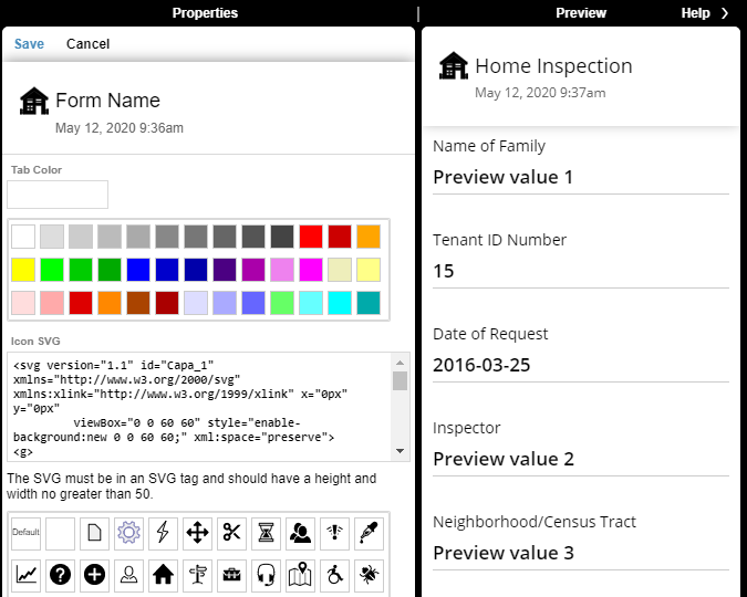
There is a textbox for entering the color for the Form Tab color. The color value must be in CSS format. For example:
red
#FF0000
#F00
rgb(255,0,0)
There is a list of predefined colors in a list below each textbox. Clicking on a color box will enter that value.
The Icon SVG textbox lets you type or paste in the specification for an icon. There are predefined samples on the list below the textbox.
The SVG must be represented as text starting with an <SVG> tag. It should have a height and width of no greater than 50. The samples may be edited, such as by editing the "fill" and "stroke" attributes to change colors. SVG may be created using various editing tools or found on libraries on the Internet.
Pre-TPL Form Definition
TransForm has a built-in programming language called TPL that is used for a variety of purposes when specifying a form type, such as for determining whether or not to display certain fields depending upon the current value of another field (the IF and ELSEIF commands) and for displaying text that is dynamically updated as a form is used (through a means called "templating"). Early versions of TransForm from before TPL became available used different syntax to provide this functionality.
The "Pre-TPL Form Definition" section of the Form Properties is displayed when examining a form type that was created prior to TPL and that has indications that it might be relying on pre-TPL syntax. (A small orange dot will also appear after such forms types in the Form Types list.) This section of the Form Properties explains the steps to take to upgrade to the new syntax. The section will also include a list of potential uses of pre-TPL syntax that is has detected to aid in conversion. Information about TPL and pre-TPL syntax is available elsewhere in this help.
Pre-TPL form types are currently still supported by the system with no changes required. This might change in the future when making changes to those form type definitions may not be easily available and when account-level action may be needed to enable support. The "Pre-TPL Form Definition" section of the Form Properties will be updated as needed to explain any such changes.
Enable custom code for this form type
Edit Custom Code
The "Edit custom code for this form type" property displays two choices: Yes and No. If Yes is selected, the "Edit Custom Code" button will be displayed immediately below. If No is selected, the button will be hidden.
Clicking the Edit Custom Code button switches to the TPL Editing and Testing screen, replacing the main screen that has the Form Types list, Properties, and Preview/Help. The TPL Editing and Testing screen is used to edit and test TPL code associated with the form type, including TPL code that is executed when field values are changed or Action Buttons are pushed, and User-Defined Functions that may be used in TPL expressions and other TPL code.
Edit Commands As Raw JSON
This button brings up a screen with a large textbox displaying the current commands defining the fields and headings that make up the form type in their raw, internal JSON format.
The raw JSON may be used to copy/paste from one form type to another. It may also be used by a person with appropriate technical skill to make changes to the commands directly in JSON without using the Commands List.
When the Save button is clicked, some simple validity tests are performed before the commands are changed.
Edit Entire Definition As Raw JSON
This button brings up a screen with a large textbox displaying the data that makes up the entire form type in its raw, internal JSON format. This includes the form ID, color info, etc.
The raw JSON may be used to copy/paste from one form type to another. It may also be used by a person with appropriate technical skill to make changes without using the other editing functionality.
When the Save button is clicked, some simple validity tests are performed before the definition is changed.
Heading Template
When a form is listed in the Form Filler app, the Form Tab includes standard text listing the form Display Name as well as the date/time that the blank form instance was first added to the list (the "created" time). A red star is also added if the commands that make up the form definition determine that there is a problem with the entered data or a required field has not been filled in with data.
The Heading Template allows the form type designer to specify additional text to be displayed on the Form Tab. That text can include data within the form as well as HTML markup and the results of simple tests and calculations. The Heading Template is an advanced feature that is only to be specified by a person with appropriate technical knowledge.
The template makes use of the TransForm TPL Templating functionality. See the TPL Templating for more information.
Listing Template
When a form is listed in the Management Console app, the row of information includes standard text listing the Status, dates Created and Changed, and other information. Optional Details may also be displayed through use of the Listing Template.
The details text can include data within the form as well as HTML markup and the results of simple tests and calculations. The Listing Template is an advanced feature that is only to be specified by a person with appropriate technical knowledge.
The template makes use of the TransForm TPL Templating functionality. See the TPL Templating for more information.
Further documentation of the templates is available through other sources.
Initialization Commands
When a form is first created and added to the Form Filler app, values in fields by default are all blank. They may be given initial values by providing commands in the Initialization Commands textbox. Only top-level fields (that is, fields not within a Data Group) may be initialized using this textbox. Fields within a Data Group may be initialized using commands associated with that Data Group.
An initialization command consists of a line of text, one line for each field being initialized. There are several forms:
fieldname:text,value
fieldname:date
fieldname:time
fieldname:datewithzone
fieldname:timewithzone
Fieldname is the name of the field (e.g., "field1", not the Title "User Name"). Value is the text to use as the initial value. The second and third forms set the value to the text value of the current date (e.g., "2017-01-10") or the current date and time (e.g., "2017-01-10 09:55:05").
To initialize date or time values for fields that have "Include Timezone" set to "Yes", use "datewithzone" and "timewithzone". This will result in ISO 8601 Format values such as "2017-01-10T09:55:05-4:00".
The following example shows how to set the default for a field, "jobStatus", which can have a value of 'open', 'in progress', 'hold', or 'closed':
jobStatus:text,open
Preview Data
The Preview Screen displays a preview of a form of the form type with sample data. The data for fields can either be blank, from the Preview Value property associated with the Data Field command (created by default), or from the data in JSON data in the Preview Data textbox. The Preview Data in the Form Properties, if present, overrides all other preview values. In all cases, the preview information is only used to help a person defining a form visualize and test how the form will look and behave while using the Form Designer.
The Preview Data in JSON form is for use by a person with appropriate technical skill. It should be a JSON object where values are either text strings or arrays of objects similar to the top-level.
For example, this JSON specifies a single, top-level field named "field1" with a value of "Sample text", and an array (Data Group) named "array1" with a single item with the fields "field1" and "field2":
{
  "field1": "Sample text",
  "array1": [
    {"field1": "Text 1",
     "field2": "Text 2"}
  ]
}
Note that form types may optionally have Data Groups within Data Groups. For example:
{
  "field1": "Sample text",
  "array1": [
    {"f1": "Text 1",
     array2: [
       {"f1": "Text 2"}
     ]
    }
  ]
}