UX Component
- Introduction
- Quick Start
- Place a repeating section on the UX
- What to do about your old UXs
- Use Cases for the UX Component
- UX Features
- Deciding whether to use a UX or a Grid
- Creating a UX from a Grid
- Why would you want to convert a Grid to a UX?
- Using the UX Builder
- Creating a Control
- Designer Tools
- Tree View
- Wysiwyg View
- Menu Actions
- Creating Multiple Controls at Once
- Using the Property Dropper
- UX and other Properties
- UX Properties
- Class map
- Resolve abstract CSS class names
- Style name
- Style overrides
- Font size
- Font scaling option
- Label width
- Customization
- 'Reset Form' UX message
- 'Reset Form' UX title
- 'Reset Form' UX icon
- 'Reset Form' Yes button text
- 'Reset Form' No button text
- Validation and Error Reporting
- Only validate edited fields
- Error style
- Classname - field with error
- Classname - error message
- Classname - field with error when hovering over error message
- Classname - error message (on hover over error message)
- Error icon
- Show UX validation errors in popup-window
- Error messages popup-window title
- Show message on UX if has field validation errors
- Field validation error message
- CSS
- A5Container class padding
- Local CSS definitions
- Additional styles
- CSS Linked files
- Arguments
- Javascript
- Other
- Language definitions
- Active language
- Date format
- Switch year
- Date picker - day names
- Date picker - first day of week
- Date picker - month names
- Date picker - 'Today' button text
- Date picker - 'Close' button text
- Client-side Xbasic
- Head section tags
- Help Table definition
- Field help window style
- Data Binding
- Advanced
- Working and Live Preview
- UX Controls
- Common control properties
- Field Properties
- Variable name
- Type
- Treat field as a Logical field
- Default value
- Blank default if variable not found
- Validation Xbasic
- Validation rules
- Immediate validation
- Validation Javascript
- Class
- Style
- Break
- Break height
- Horizontal spacer
- Hide
- Has help
- Help ID
- Show help icon
- Help icon
- Help icon behavior
- Captcha form validation
- Number of characters
- Image height
- Image width
- Refresh icon
- Refresh icon help
- Captcha error text
- Initial focus
- Field Label
- Label
- Bubble help
- Class
- Style
- Position
- Width
- Alignment
- Show/Hide (Server Side)
- Show/hide expression
- Client Side Properties
- Client side formatting
- Format type
- Format definition
- Calculated field expression
- Show/hide expression
- Enable expression
- Readonly expression
- Conditional style
- Security
- Security Groups
- Data Binding
- Updateable
- Table Alias
- Field Name
- Field Definition
- Textbox
- Maximum length
- Bubble help
- Display format
- Control Javascript
- Password
- Watermark
- Watermark class name
- Watermark style
- Date/Time Picker Properties (Also used for embedded Calendar control)
- Date/Time Picker
- Open how
- Date format
- Switch year
- User must select from Date/Time picker
- Low date
- High date
- Disabled days
- Show days of week
- OK button label
- Cancel button label
- Lock column widths
- Draw boxes around dates
- Date item hover class name
- Date item selected class name
- Date item out of range class name
- Date item style
- Has events
- onItemDraw
- onClick
- onRightClick
- onSelect
- onNavigate
- onMonthNavigate
- onYearNavigate
- Textarea
- HTML editor
- HTML Editor
- HTML editor width
- HTML editor height
- HTML editor is popup
- Popup editor width
- Popup editor height
- Save data when closing popup editor
- HTML editor style
- Has 'Click to edit' button
- Edit hyperlink text
- Allow image upload
- Upload folder
- Image upload UX customization
- Allow file upload
- Upload folder
- File upload UX customization
- Plain text area (not HTML Editor)
- Bubble help
- Rows
- Columns
- In-line style
- Watermark
- Watermark text
- Watermark class name
- Watermark style
- Lookups for text boxes and areas
- Lookup
- Lookup type
- Lookup definition
- Dropdownbox
- Choices
- Maximum choices
- Height
- Multi-select allowed
- In-line style
- Not in list rule
- RadioButton
- Choices
- In-line style
- Orientation
- Column flow
- Column count
- Row count
- Maximum choices
- Not in list rule
- CheckBox
- Choices
- In-line style
- Orientation
- Column flow
- Column count
- Row count
- Maximum choices
- Not in list rule
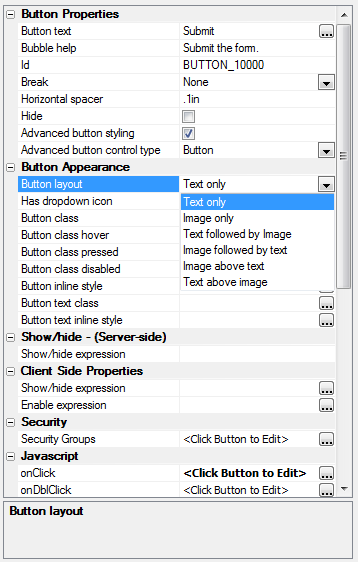
- Buttons
- Slider
- Width
- Minimum value
- Maximum value
- Step
- Two value
- Show slider message
- Slider message
- Hide slider message when focus lost
- Slider message position
- OnChange event
- OnSlide event
- Choice lists for drop downs, radio buttons, and checkboxes
- Label
- Hidden
- Validating Individual Controls
- Validation Xbasic
- Validation rules
- Immediate validation
- Validation Javascript
- Defining Help for Controls
- Control Events
- Containers
- Tab Control
- Accordion Control
- Frame
- Container
- Free-form Layout
- Container Collapse and Expand
- Other Controls
- (Pre)Defined Controls
- UX Events
- onUXInitialize
- onUXExecute
- UXValidate
- afterUXValidate
- OnUXRender
- Client-side Events
- canAjaxCallback
- afterAjaxCallbackComplete
- canSubmitUX
- onInitializeComplete
- afterValidate
- onTabPaneChanged
- canRptSectionRowAdd
- afterRptSectionRowAdd
- canRptSectionRowDelete
- afterRptSectionRowDelete
- onStateChange
- onControlFocus
- onRptSectionFocus
- onRptSectionRowChange
- onSynchronizeUX
- canRecordNavigate
- afterRecordNavigate
- afterPopulateFromTable
- UX JavaScript Placeholders
- {UX.object}
- {UX.ComponentName}
- {UX.Style}
- {UX.ControlId}
- {UX.ControlIdEscaped}
- Repeating Sections
- Placing a repeating section on a UX
- Repeating Section Properties
- Repeat count
- Show label rule
- Has divider
- Divider HTML
- Repeating row container in-line style
- Repeating row container class name
- Highlight row on hover
- Highlight row on select
- Scrollable container
- Scrollable container height
- Scrollable container width
- Scrollable container in-line style
- Scrollable container class name
- Has active row selector
- Active row icon
- 'Delete Row' icon
- 'Add Row' bubble help
- 'Delete Row' bubble help
- Validation - row option
- Validation - field option
- Delete row prompt
- Delete row UX title
- Delete row UX icon
- Repeating Section Control Properties
- Repeating section heading
- Compute summary values
- Handling submissions for repeating sections
- Hiding a control in a repeating section
- {UX.Object}.V.R1.
- Summary Fields
- Multi-page UXs
- Tabbed Multi-page UXs
- Genie-style Multi-page UXs
- Binding a UX to a Database
- Embed other objects
- UX Methods
- UX Examples
Description
This is an older UX Component page that gives a general overview of the builders categories, properties, and features. For a more current description of the UX builder visit the other UX Component page.
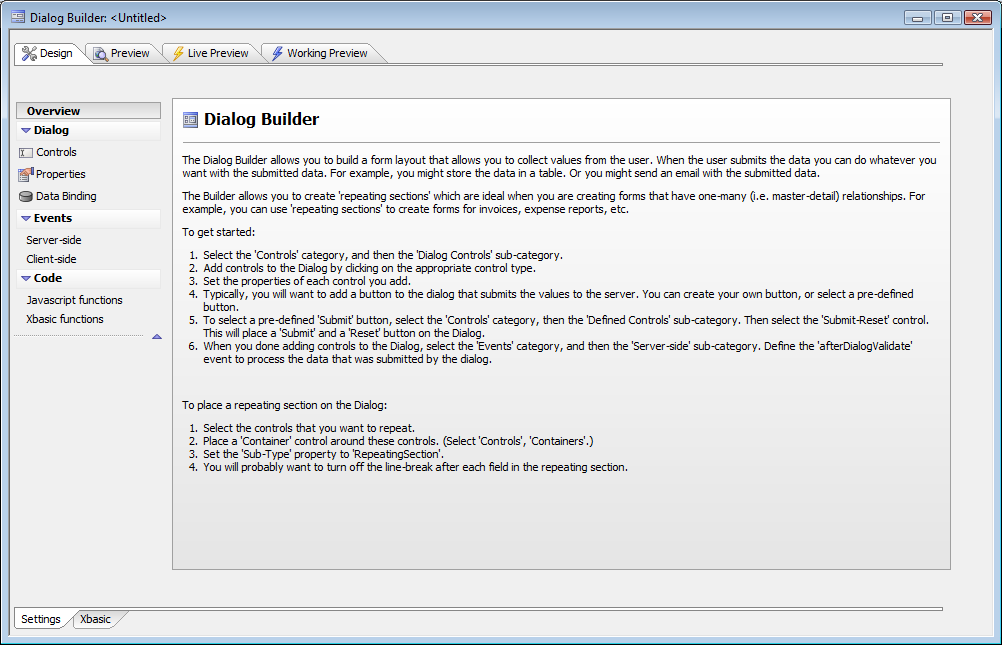
Introduction
The UX Builder allows you to build a form layout that allows you to collect values from the user. When the user submits the data you can do whatever you want with the submitted data. For example, you might store the data in a table. Or you might send an email with the submitted data. The UX Builder allows you to create 'repeating sections' which are ideal when you are creating forms that have one-to-many (i.e. master-detail) relationships. For example, you can use 'repeating sections' to create forms for invoices, expense reports, etc. The new UX Builder has much more functionality and much better performance than the old (V10 and older) UX builder.
Quick Start
Create a new UX component from the Web Projects Control Panel
Pick an appropriate template or start with a blank UX component
Select the 'Controls' category, and then the 'UX Controls' sub-category.
Add controls to the UX by clicking on the appropriate control type.
Set the properties of each control you add.
Typically, you will want to add a button to the UX that submits the values to the server. You can create your own button, or select a pre-defined button.
To select a pre-defined 'Submit' button, select the 'Controls' category, then the 'Defined Controls' sub-category. Then select the 'Submit-Reset' control. This will place a 'Submit' and a 'Reset' button on the UX.
When you done adding controls to the UX, select the 'Events' category, and then the 'Server-side' sub-category. Define the 'afterUXValidate' event to process the data that was submitted by the UX.
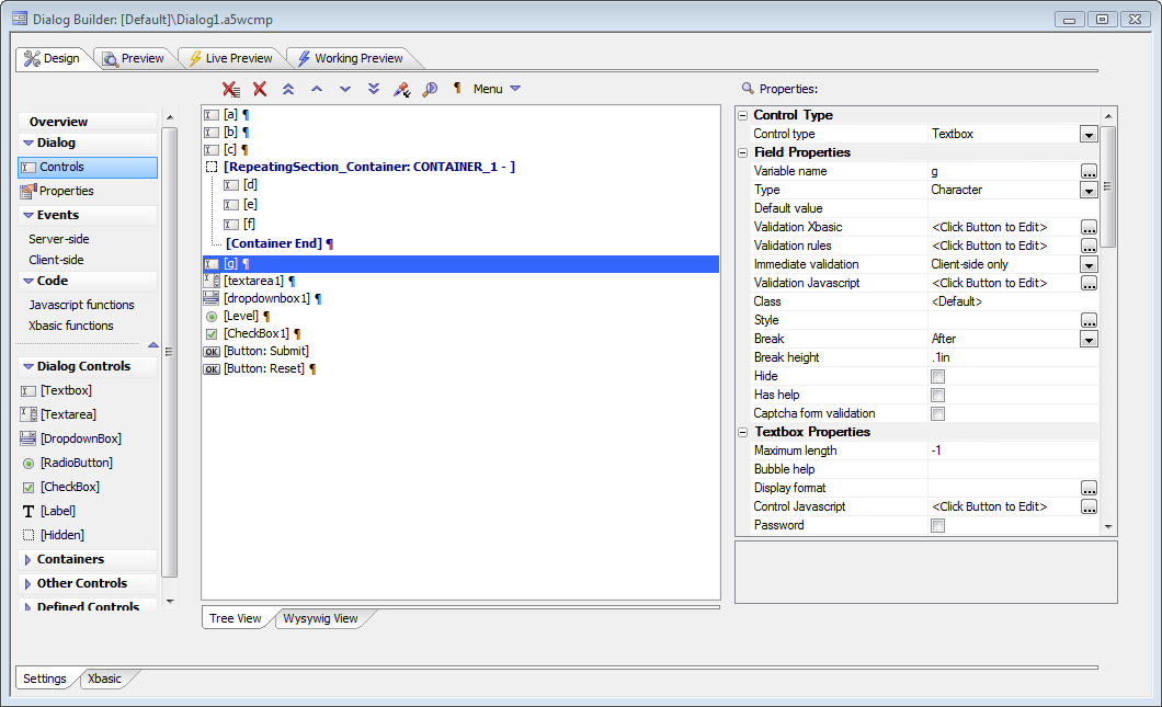
Place a repeating section on the UX
Select the controls that you want to repeat.
Place a 'Container' control around these controls. (Select 'Controls', 'Containers'.)
Set the 'Sub-Type' property to 'RepeatingSection'.
You will probably want to turn off the line-break after each field in the repeating section.
What to do about your old UXs
You may continue using any UXs built with the old (V10 and earlier) UX builder. If you right click on a legacy UX component in the Web Control Panel, there is a menu item that will allow you to convert the component to a new UX component. The new UX component in V11 offers significantly more functionality than the legacy UX component, and it is recommended that you migrate your legacy UXs to new UXs over time. The conversion will not do a perfect job of converting your legacy UX, but it will give you a good start. You can also use the new UX builder to create fields from the existing tables, instead of converting an old UX. You should use the new UX builder for any new UXs.
Use Cases for the UX Component
Simple Web Forms, for example mailing-list subscriptions
Multi-page Web Forms, for example surveys
Single-record database entry and editing, for example a membership database
Parent-child database editing that requires a single transaction, for example shipment invoices with invoice items
Any data entry that should not or can not be immediately committed to a database, for example sales order entry on an occasionally connected mobile device.
UX Features
Ajax web forms
6 input control types (text, checkbox, etc.) and 4 container types (tabs, frames, etc.)
6 other control types (buttons, images, etc.) and several predefined action controls (submit, etc.)
Define repeating sections with variable numbers of rows
Validate individual controls, whole forms, or all controls on the current tab
Validate on the web browser client, the application server, and/or the database
Perform immediate field validation if desired
Define bubble help and/or pop-up help for each control
Password and watermark text field styles
Built-in Captcha form validation
Text area can be a full-blown HTML editor
Use calculated field expressions, show/hide expressions, enable expressions, and conditional styles
Automatically calculate summary values for repeating fields
Populate drop-down lists, edit-combo boxes, and auto-suggest lists statically or dynamically
Optionally use JavaScript controls, for example jQuery UI widgets
Optionally handle mouse and key events on a per-control basis
Optionally apply security group permissions on a per-control basis
Genie mode with optional progress reporting for multi-page UXs
Deciding whether to use a UX or a Grid
A single-record Grid form based on a database table and a UX based on the same database table may wind up looking and acting almost the same. Beyond this area of overlap, however, the two components have different strengths and weaknesses.
A tabular Grid with a search part and an editable detail view provides a superior way to search, sort, and edit a database table. A tabular grid with a child table in a linked grid or row expander is an excellent way to deal with a two database tables with a one-to-many relationship and takes little or no code; its only serious drawback is that you can't easily commit the saving of the child records and the parent record in a single transaction.
A UX with a repeating section is another good way to deal with a two database tables with a one-to-many relationship. With this scheme you can commit all the fields and records in a single transaction, but you may have to write a little code to handle the data binding and the transaction. Or not: see Genies for New UX Component and Server-side Action Scripting.
If the action you want to take after data entry is not a database operation, then a UX is probably a better choice for your application. For example, you may want to create a UX to capture signups for an event and email the results to the organizer. While that could be done with a Grid, there would have to be a database involved, which is not necessary if you use a UX.
If you have a large number of controls and want to break them up into pages and validate each page, the UX is a much better choice than a Grid. A typical use of this kind of UX would be for an online survey form.
Creating a UX from a Grid
You can automatically convert a Grid component into a UX. To do so, right click on the Grid component in the Web Control Panel, and select Create UX component from this Grid component.
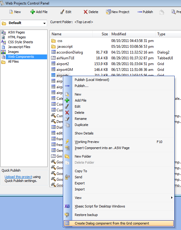
This command can only be used on updateable (read-write) Grid components that have a Detail View, or Grids that use the 'Form' style layout. In the case of a Grid with a Detail View, the controls in the Detail View are added to the UX component (the controls in the Grid part are ignored). In the case of a Grid that uses the 'Form' style layout, the controls in the Grid part are added to the UX component.
Why would you want to convert a Grid to a UX?
Many users have been using the Grid as a proxy for a data entry form. This is done by setting the Grid style to 'Form' and setting the 'Add records only' property of the Grid. While this works well in most cases, in the case where you have a large number of fields in the Grid, the Grid builder can be slow. A UX component is better suited to this type of application.
Using the UX Builder
To invoke the UX Builder, go to the Alpha Anywhere Web Projects Control Panel, select the Web Components view, and press New. Pick Web Component and press Next. Pick UX. (Not UX (Classic) in the Legacy section.) Press OK. You will see the Select UX Component Template UX. If there is a template shown that sounds like a good approximation of what you want to create, choose it. If not, start with a blank UX Component. In either case, you will see a new UX Builder. (Hover over the image to see it full size.)
Creating a Control
Select the UX|Controls pane. The UX Controls accordion should open automatically; if now, click on it. Click on your desired control. You will see a New Control UX.
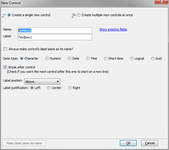
If you want to creat a single control, fill in the name and label you want to give it, select the data type it should have, and select the appropriate options for label position, label justification, and whether there should be a line break after the control. Press OK. Don't obsess about the options at this point, because you can change them all at any time.
Designer Tools
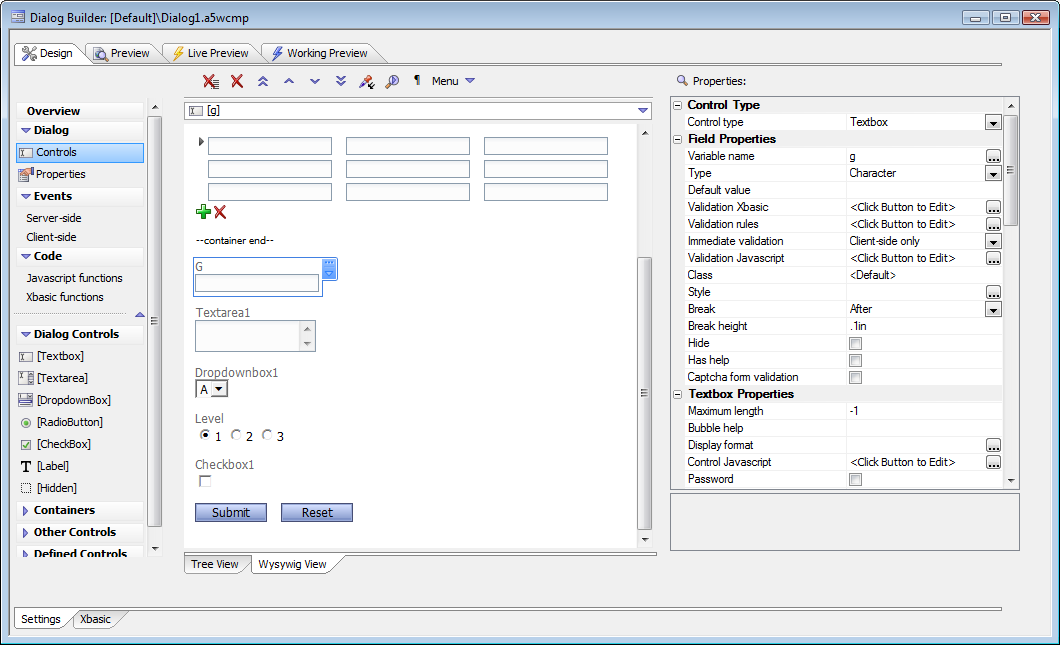
The UX|Controls pane has two tabs (chosen at the bottom): Tree View and Wysiwyg view. Tree View will open by default. You can design in either tab, and switch tabs freely. The Tree View is more compact and easier to navigate from the keyboard. The Wysiwyg view shows a much closer approximation of the final UX appearance.
Tree View
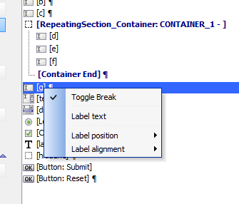
You can right click on a control in the tree-view to get a pick list of actions that can be performed on the control.
Wysiwyg View
Menu Actions
In either view, you can use the UX menu to act on the controls in the UX.
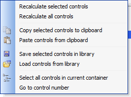
The reason for recalculating controls is to update the generated HTML for the control. The HTML is generated whenever the control is edited and saved, and whenever you open a UX created in an older build of Alpha Anywhere, but there are times when you might want to force the HTML to be regenerated. You can copy and paste controls to and from the clipboard; this allows you to, for example, create multiple sets of a group of controls in a matter of seconds. A typical use case would be the shipping and billing addresses for an order. This can also be used to reuse controls from one UX in another. If you want to reuse controls in the longer term, you can save them to and load them from a library. The library lives in the file system of your development computer, and is organized by control sets.
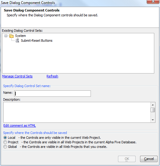
Libraries can be local to your Web Project, visible to all Web Projects in the current Alpha Anywhere database (master project), or visible to all Web Projects on this computer. There is a system library as well but you can't save to it, only load from it.
Creating Multiple Controls at Once
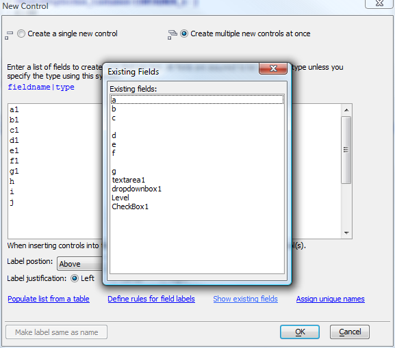
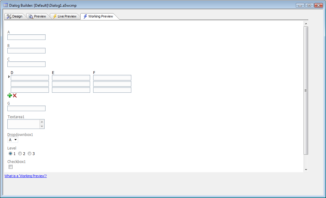
In the New Control UX, you can switch to multiple control mode by choosing the top right-hand radio button, labeled "Create multiple controls at once." In this mode you need to enter a list of control names, with optional control types. You can define rules for the labels for each control. Clicking on the "Assign unique names" link will examine all the names you have entered and resolve any duplication with existing names. Click on the "Show existing fields" link will display all the existing field names for the UX. In the image below we have entered fields a through j. Clicking on "Assign unique names" added "1" to the ends of the duplicate names to make them unique. After doing that we clicked on "Show existing fields."
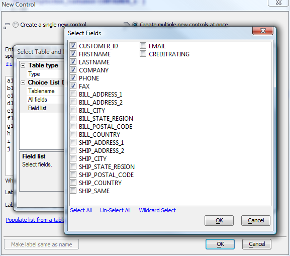
If you have a database table that has some or all of the fields you want in your UX, you can base your field names on the table using the Populate list from a table link.
By placing multiple comma delimited controls on the same line in the UX, you cause the Controls on the UX component to be created with no break after each control, other than the last control on the line. You can also specify the width of the control, by including a width directive in parentheses. The width directive uses CSS syntax. E.g. 2in, 300px, 20em, etc.
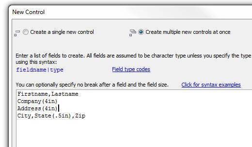
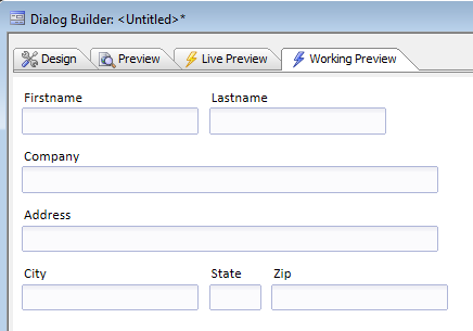
The Firstname and Lastname controls will be on the same line. City, State and Zip will also be on the same line. Company and Address will be 4 inches wide. Here is the UX created from the above definition:
Using the Property Dropper
Sometimes you will want to set a property value in multiple controls at once, rather than selecting an individual control, setting its property value, then selecting the next control, and so on.... To set multiple properties:
Give focus to a propery in the Property Grid. This is your 'source' value.
Click the 'Set multiple properties' button.
A pop-up UX appears. Select the controls that you want to update.
Click the 'Set Properties' button.
All of the selected controls that have the 'source' property will be updated.
The next time you bring up the 'Set multiple properties' UX, the controls that you previously selected will still be selected.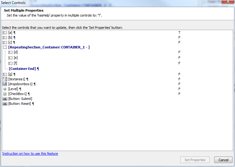 Advanced users can edit code in the Xbasic pane of the UX to copy and paste properties. Unlike the Grid control, the UX control will update the settings pane based on the contents of the Xbasic pane, when you switch panes.
UX and other Properties
UX Properties
Class map
Specify how the abstract CSS class names used in this component map to physical CSS class names in your style sheets.
Resolve abstract CSS class names
Replace abstract CSS class names with physical CSS class names. This should only be un-checked if you are in development mode and you want to determine what the abstract CSS class name is for a particular element in the UX.
Style name
Click the button to select a new style, or edit the existing style. means that the component will use the default style defined in the Web Project.
Style overrides
By default, the Tabs, Accordions, pop-up Windows, Lists (edit-combo, auto-suggest, etc.) are style using the selected component style. You can override the style for these elements. This might be necessary for certain styles where the default appearance for these elements do not work well.
Font size
Specify if the fonts in Components should be scaled to make the component larger or smaller. Select 'Medium' for no scaling (i.e. the fonts shown will match those defined in the style sheet).
Font scaling option
Specify which CSS classes should be scaled. If you choose All, the fonts in these classes will be scaled, in addition to the fonts in the CSS classes specific to the Style that you selected: BODY, TABLE, TH, TR, TD, UL, OL, LI, P, A, BLOCKQUOTE.
Label width
If a control's label is set to display to the left or right of the control, specify the default width of the label. Uses CSS syntax. e.g. '3in;'. All controls that have their label width set to '{Global.LabelWidth}' will inherit this value.
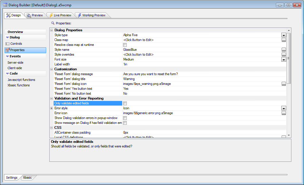
Customization
'Reset Form' UX message
This is the message is shown when the user clicks a button to reset the form contents. You can use ... language tags in the message to translate the message into different languages.
'Reset Form' UX title
You can use ... language tags in the title to translate it into different languages.
'Reset Form' UX icon
Customize the icon used
'Reset Form' Yes button text
You can use ... language tags in the message to translate the message into different languages.
'Reset Form' No button text
You can use ... language tags in the message to translate the message into different languages.
Validation and Error Reporting
Only validate edited fields
Should all fields be validated, or only fields that were edited?
Error style
Specify how field validation errors should be displayed. 'block' - under the field, 'inline' - next to the field, 'tip' - popup error when hovering over the field, 'icon' - display an error icon and show error when hovering over icon, 'global' - display all errors in a single location.
Fields in Repeating Sections automatically use the 'tip' error style.Classname - field with error
Classname of the control that has the error. Leave blank for default class.
Classname - error message
Classname of the element in which the error is displayed. Leave blank for default class.
Classname - field with error when hovering over error message
When you hover over the error message (in the global space), or over the control that has the error, this class defines how the control that has the error is styled. This option is only displayed if the error style is Global.
Classname - error message (on hover over error message)
When you hover over the error message (in the global space), or over the control that has the error, this class defines how the control that has the error is styled. This option is only displayed if the error style is Global.
Error icon
Icon to indicate field has an error. To use a built-in image use the syntax: images/BuiltInImageName.png.a5image
Show UX validation errors in popup-window
If a UX validation error occurs, specify if the error should be show in a popup-window. Note: UX validation errors are distinct from field validation errors. UX validation errors are defined in the 'UXValidate' server-side event.
Error messages popup-window title
Specify the title for the popup-window. Only displayed if "Show UX validation errors in popup-window" is checked.
Show message on UX if has field validation errors
If any fields have validation errors, show a message on the UX to indicate that there were errors. Only shown if the error style is not Global.
Field validation error message
Specify the message to show on the UX if any field has a validation error. This message will indicate that the UX has errors, but the actual error message will be shown next to the field. Only shown if the error style is not Global and "Show message on UX if has field validation errors" is checked.
CSS
A5Container class padding
Every control is wrapped in a div with the class of 'a5container'. The padding specified here is the minimum space between adjacent controls. Use CSS syntax to specify padding. e.g. 10px, .1in, etc.
Local CSS definitions
Define any local CSS classes.
Additional styles
Specify if any other styles (in addition to the primary style for the component) must be included. Enter a comma delimited list of style names. e.g., GlassOlive,Airport
CSS Linked files
Specify any CSS files that should be linked (in addition to the primary style for the Component). Enter a comma delimited list of filenames.
Arguments
Define arguments. Arguments can be bound to page, session and cookie variables. Argument values are passed into all server-side Xbasic event handlers in the component.
Javascript
Specify any Javascript files that should be linked. Enter a comma delimited list of filenames.
Other
Language definitions
Define strings for different languages.
Active language
Specify the active language to use for translatating strings tagged with .. tags. Setting the property here is useful for for testing purposes. In a real application you can set the 'session.protectedactiveLanguage' variable to specify the active language. To select the default language, enter or leave this property blank.
Date format
Specify the format that the user must use for entering date values.
Switch year
Leave blank to use the default value of 20. If the user types in a 2 digit year that is above the switch year, the year is assumed to be in 1900.
Date picker - day names
Specify the names of the days of the week to be shown when the pop-up date picker is used. First entry is list is Sunday. Enter a comma separated list. TIP: You can also set the day names in this special session variable: session.protecteddatePickerDayNames
Date picker - first day of week
Specify the first day of the week. 1=Sunday, 2=Monday, etc. IMPORTANT: Regardless of what value you set here, if you customize the day names, the list of day names always starts with the name for Sunday.
Date picker - month names
Specify the month names to be shown when the pop-up date picker is used. Enter a comma separated list. TIP: You can also set the month names in this special session variable: session.protecteddatePickerMonthNames
Date picker - 'Today' button text
Specify the text for the 'Today' button. You can tag the text with ... for automatic language translation.
Date picker - 'Close' button text
Specify the text for the 'Close' button. You can tag the text with ... for automatic language translation.
Client-side Xbasic
Define client-side Xbasic functions. When the UX is running in Working Preview mode (or on the Desktop), you can respond to HTML events with Xbasic functions (in addition to Javascript functions).
Head section tags
Specify any tags you want to appear in the HEAD section of the page that hosts this component.
Help Table definition
Define the source for the Help text displayed in this UX.
Field help window style
Specify the type of window in which Field Help is shown.
Data Binding
Compute data binding code at design time: Only check this option if you have a very large UX that loads very slowly at run-time.
Advanced
Other properties: Allows you to set properties in Xbasic code, which is most useful for properties not exposed in this property grid or in arguments.
Working and Live Preview
Like the Grid, the UX component can be tested in both Working Preview and Live Preview modes. Working Preview runs on the desktop in a single thread, which means that debug(1) Xbasic statements cause a break. Live Preview uses the Application Server and a hosted browser window.
You can also preview a UX component in an installed Web browser as long as the Application Server is running. Use the browser dropdown on the Web component toolbar to run this component in the browser of your choice.
UX Controls
Common control properties
Field Properties
Variable name
Must be unique
Type
Data type:Character, Numeric, Date, Time, Short-time, Logical, or Guid
Treat field as a Logical field
If the field is a Numeric (Integer) field, and it contains only values of 0 or 1, then you can treat it as a Logical field and set the control type to a Checkbox.
Default value
Specify the default value for the control. The default value can be a value, an expression (start expression with = sign), a session variable (e.g. session.name), a page variable (e.g. pageVariable.name), or an argument (e.g :arg1).
Blank default if variable not found
If the pageVariable or session variable referenced in the Default Value expression is missing, set the default value to a blank value. Only shown if the default value is a reference to a session or page variable.
Validation Xbasic
Specify Xbasic code to test if the data in this field is valid. By default, only dirty fields are validated. You can specify that all fields should be validated in Update Settings, Editing Properties.
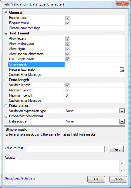
Validation rules
Specify rules to test if the data in this field is valid. By default, only dirty fields are validated. You can specify that all fields should be validated in Update Settings, Editing Properties.
Immediate validation
Specify if the value in the field should be validated as soon as you tab out of the field, or in the case of radio button, dropdown or checkbox controls, as soon as you change a value. The 'server-side' option will generate an Ajax callback, so you should try to limit the number of fields that require real-time server-side validation. Options are Client-side only,Client-side and server-side, or None.
Validation Javascript
Specify Javascript to validate the data in the field. Client-side validation is very fast because it does not involve making an Ajax callback to the server. Only shown if "Immediate validation" is not "None".
Class
Specify the class name for the control. will use the default class name for the style name selected.
Style
Specify the in-line style for the tag.
Break
Force a column break before, after, or both before and after this control.
Break height
Specify the vertical distance between this control and the next control. Use CSS syntax. e.g. 10px, .5in, 20pt.
Horizontal spacer
Specify the horizontal space between this control and the next control. Use CSS syntax. e.g. 10px, .5in, 20pt.
Hide
Specify if this control should be hidden. Controls are typically hidden so that they can be manually placed into the UX HTML in a 'Free-form Container'.
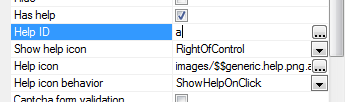
Has help
Specify if there is help for this field. The help will appear in a window when the user presses F1. The Help text is read from a database. Go to the Properties pane to configure the Help database source. The Help Window style can either be a pop-up window or a dropdown window. To configure the Help Window style, go to the Properties pane and set the 'Field help window style' property.
Help ID
Specify the Help ID. The help text for this field is looked up in the Help table using this ID as the key. Only shown if the control has help.
Show help icon
Specify if an icon should be displayed next to the control to indicate that help is available for this control. Only shown if the control has help.
Help icon
Specify the icon to show next to the field control. Clicking, or hovering over this icon will show the help text for the field. Only shown if the control has help and shows a help icon and the icon position is not 'None'.
Help icon behavior
Specify the action when the user clicks the help icon, or moves the mouse over the help icon. Only shown if the control has help and shows a help icon and the icon position is not 'None'.
Captcha form validation
Specify if a Captcha image should be displayed for this control. The user will need to enter the text shown in the Captcha image in order to submit the UX. Only shown for Textbox controls.
Number of characters
Specify the number of characters to display in the Captcha image. Only shown if Captcha form validation is checked.
Image height
Specify the height (in inches) of the Captcha image. Only shown if Captcha form validation is checked.
Image width
Specify the width (in inches) of the Captcha image. Only shown if Captcha form validation is checked.
Refresh icon
Specify the icon for the 'Refresh' button. This is the button that the user can click to get a new Captcha image if the text in the current image is too hard to make out. Only shown if Captcha form validation is checked.
Refresh icon help
Specify the bubble help for the refresh icon. Only shown if Captcha form validation is checked.
Captcha error text
Specify the error text to show if the user does not enter the correct text into the Captcha control when submitting the UX. Only shown if Captcha form validation is checked.
Initial focus
If checked, the control will have focus when the UX is shown. If you check this on multiple controls, the first control in the UX that has this checked will get the focus.
Field Label
Show/Hide (Server Side)
Show/hide expression
Specify the show/hide expression. The show/hide expression can refer to session variables, or arguments (defined on the Properties pane). The control is shown if the expression is true. If the expression is false, or invalid (perhaps because a referenced session variable has not been yet been defined), the control is not shown. Example expressions: session.var1="alpha", :argument1 = 2
Client Side Properties
Client side formatting
Specify if the textbox has client side formatting, such as a mask or a custom display format
Format type
Mask, Number or Custom (depending on variable type)
Format definition
Specify the client side format
Calculated field expression
Define a calculated field expression. The calculation is done in the Browser (i.e. on the 'client side') using Javascript.
Show/hide expression
If the expression evaluates to true, the control will be shown, othewise it will be hidden. The calculation is done in the Browser (i.e. on the 'client side') using Javascript.
Enable expression
If the expression evaluates to true, the control will be enabled. The calculation is done in the Browser (i.e. on the 'client side') using Javascript.
Readonly expression
If the expression evaluates to true, the control will be readonly. Subscription feature
Conditional style
Specify if the style for the cell that contains this control is computed, based on the values of the fields in the row. Note: You can also define conditional styles at the row level (see Properties page). For example, you might want to display a cell with a red background if a value in the row is outside a certain range. Note: The calculation is performed in the Browser using Javascript. Contrast with 'server-side' conditional styles in the 'Display Settings' section.
Security
Security Groups
Security Groups Select which security groups can see this object. If no groups are selected, all users can see the object.
Data Binding
These properties are used by the table-creation and data-binding Genies, and some of the server-side action scripts.
Updateable
Control is only bound to a field if this is checked
Table Alias
Abstract table name to use for storage; alias is mapped to a real SQL or DBF table
Field Name
Field name in the table
Field Definition
Data type and length of the field used for storage
Textbox
Maximum length
Specify the maximum number of characters that can be entered into the control. Set to -1 if there is no maximum.
Bubble help
Specify the bubble help for this field
Display format
Specify how this field should be formatted
Control Javascript
Specify any Javascript code that should be emitted for this control. You can use the special {UX.ControlId} and {UX.ControlIdEscaped} placeholders to reference the control's Id. This is an advanced feature typically used by developers who are using a 3rd party Javascript library, such as JQuery, to style a control using Javascript. See also: Grid and UX Component jQuery Date Picker
Password
Is this a password field? Only shown for character fields.
Watermark
Specify the watermark text. Set to to use the field label as the watermark text.
Watermark class name
(Optional) Specify the CSS class name for the watermark text. Leave blank to use default class. This class is applied on top of any existing classes. Only shown if Watermark is checked.
Watermark style
(Optional) Specify the CSS style for the watermark text. Only shown if Watermark is checked.
The Display Unformat property has been removed as it was not needed, since the data can be unformatted in the UXValidate event. For example,
e.dataSubmitted.amount = stritran(e.dataSubmitted.amount,"(Dollars)","")
Date/Time Picker Properties (Also used for embedded Calendar control)
Date/Time Picker
Show a 'DatePicker' icon which can be clicked to open a calendar. Users can click in the calendar to enter date values.
Open how
Specify how the date picker will be opened. Can either be when user clicks the icon, or when user clicks in the field. (Not shown for embedded Calendar control.)
Date format
Specify the date format in which dates will be returned when the user makes a selection from the Date Picker. If you specify , the format is controlled by the 'Date format' property in the 'Miscellaneous' section on the Grid Properties tab page. The setting allows you to easily configure the Grid to use US formats for users in the U.S.A and 'day/month/year' formats for users outside the US.
Switch year
Specify how the date picker will interpret 2-digit years. IMPORTANT: If you want to define how the server will interpret 2-digit years, you must set the Switch year in the Grid Properties, Miscellaneous section.
User must select from Date/Time picker
Specify if the user can type in a date/time value, or must select the value from the Date/Time picker. If this option is checked, then the Date/Time picker is automatically set to open when the control gets focus.
Low date
Specify the lowest date value that the Date/Time picker will show. You can compute this value dyamically using a Javascript function that gets called when the Date/Time picker is opened.
High date
Specify the highest date value that the Date/Time picker will show. You can compute this value dyamically using a Javascript function that gets called when the Date/Time picker is opened.
Disabled days
Specify disabled days in the calendar. Enter a comma delimited list. e.g. 0,6 to disable dates on Sunday and Sayurday. 0=Sunday, 1=Monday and so on. You can also enter: function:yourFunctionName if you want to define a Javascript function to dynamically return a comma delimited list of disabled days.
Show days of week
Specify if the days of the weeks should be shown as column titles on the Date/Time picker.
OK button label
When the Date/Time picker displays a time portion, the window has OK and Cancel buttons. Specify the label of the OK button. You can use language tags - and .
Cancel button label
When the Date/Time picker displays a time portion, the window has OK and Cancel buttons. Specify the label of the Cancel button. You can use language tags - and
Lock column widths
Specify if all columns widths should be the same, or can be different. Only meaningful when day names are of different lengths.
Draw boxes around dates
Allows you to put the individual dates in a box - see image below
Date item hover class name
Class name for when the mouse is hovering over a date
Date item selected class name
class name for the selected date
Date item out of range class name
Class name for dates that are not in the current month - can use this to hide days at the start and end of the range of displayed dates that are in the previous and next month.
Date item style
Can use this to change the size of the date cells - see image below
Has events
Specify if you want to define event handlers for the various events raised by the Date Picker. The event settings that follow are only displayed if this is checked.
onItemDraw
Specify the name of a Javascript function that gets called when each date is drawn on the Date Picker. The Javascript function prototype has these arguments: ele,date,type. ele - id of the element being drawn. Your function will typically set the .innerHTML property of this element. date - the Javascript date value of the element being drawn. type - can be 'date', 'month' or 'year' depending on what part of the Date Picker is being rendered.
onClick
Specify the name of a Javascript function to call when the user clicks on the Date Picker. The Javascript function prototype has these arguments: date. date - the Javascript date value that the user clicked on.
onRightClick
Specify the name of a Javascript function to call when the user right-clicks on the Date Picker. The Javascript function prototype has these arguments: date. date - the Javascript date value that the user right-clicked on.
onSelect
Specify the name of a Javascript function to call when the user selects an item on the Date Picker. The Javascript function prototype has these arguments: date. date - a Javascript date value.
onNavigate
Specify the name of a Javascript function to call when the user navigates in the Date Picker. The Javascript function prototype has these arguments: date. date - a Javascript date value.
onMonthNavigate
Specify the name of a Javascript function to call when the user navigates in the Date Picker. The Javascript function prototype has these arguments: date. date - a Javascript date value.
onYearNavigate
Specify the name of a Javascript function to call when the user navigates in the Date Picker. The Javascript function prototype has these arguments: date. date - a Javascript date value.
Textarea
HTML editor
Specify if the control has an HTML editor. (HTML editor allows you to set fonts and colors for your text and to use other HTML features such as tables, ordered and un-ordered lists, etc.)
HTML Editor
HTML editor width
Specify the editor width. Use CSS style syntax. For example: '6in', '100px' etc.
HTML editor height
Specify the editor height. Use CSS style syntax. For example: '6in', '100px' etc.
HTML editor is popup
Specify if the HTML editor is always 'live', or if the user must click in it, or on the 'Click to edit' hyperlink before it enables editing.
Popup editor width
Specify the width for the popup editor. If width is blank uses same size as the initial display. Use CSS style syntax. For example: '6in', '100px' etc.
Popup editor height
Specify the height for the popup editor. If height is blank uses same size as the initial displayt. Use CSS style syntax. For example: '6in', '100px' etc.
Save data when closing popup editor
Specify if the data in the UX should be saved when the popup editor is closed. Normally the data is not saved when the popup editor is closed.
HTML editor style
CSS style override
Has 'Click to edit' button
If the HTML editor is a popup editor, by default, clicking on the control causes the editor to pop up. However, if you have enabled 'File upload' then you will want to be able to download linked files by clicking on them. If you check this property, an 'Edit' hyperlink will be shown. Clicking on the HTML editor will not cause it to pop-up, but instead will allow you to download linked files. You will need to click on the Edit hyperlink to edit the HTML.
Edit hyperlink text
Specify the text for the edit hyperlink. When you click this hyperlink the HTML editor pops up so that you can edit the text in the field.
Allow image upload
Specify if the user can upload images to the server when editing this field. The uploaded images are inserted into the body of the memo.
Upload folder
Specify the folder where the uploaded images are stored. Enter a relative folder name. The folder is in the webroot. For example if you enter 'images' here, and the webroot is c:\a5webroot\project1, the physical folder where the images will be stored is c:\a5webroot\project1\images.VERY IMPORTANT: If you have the Security Framework turned on, be sure to set the appropriate permissions for this upload folder and the files that it contains.
Image upload UX customization
Specify how the Image Upload UX should be customized.
Allow file upload
Specify if the user can upload files to the server when editing this field. The uploaded files are inserted into the body of the memo as hyperlinks.
Upload folder
Specify the folder where the uploaded files are stored. Enter a relative folder name. The folder is in the webroot. For example if you enter 'uploadedFiles' here, and the webroot is c:\a5webroot\project1, the physical folder where the files will be stored is c:\a5webroot\project1\uploadedFiles. VERY IMPORTANT: If you have the Security Framework turned on, be sure to set the appropriate permissions for this upload folder and the files that it contains.
File upload UX customization
Specify how the File Upload UX should be customized.
Plain text area (not HTML Editor)
Bubble help
The bubble help for the text area.
Rows
The number of rows for the text area.
Columns
The number of columns for the text area.
In-line style
Specify style attributes that override the settings inherited from the style sheet.
Watermark
Specify if the field has a watermark. The watermark text appears in the text area when there is no value in the text area.
Watermark text
Specify the watermark text. Set to to use the field label as the watermark text.
Watermark class name
(Optional) Specify the CSS class name for the watermark text. Leave blank to use default class. This class is applied on top of any existing classes.
Watermark style
(Optional) Specify the CSS style for the watermark text.
Lookups for text boxes and areas
Lookup
Lookup data in another Grid, Table, variable, or static data source.
Lookup type
'Grid Component' - shows a 'Lookup' link next to the field. Users can click this link to open another window which displays a Grid component from which they can select the value for this field. 'Auto-Suggest List' - as users start typing, a list of suggestions is shown. 'Edit-Combo List' - users can either type in a value, or click a button to show a drop-down list with choices.
Lookup definition
Click the smart field button to define the lookup.
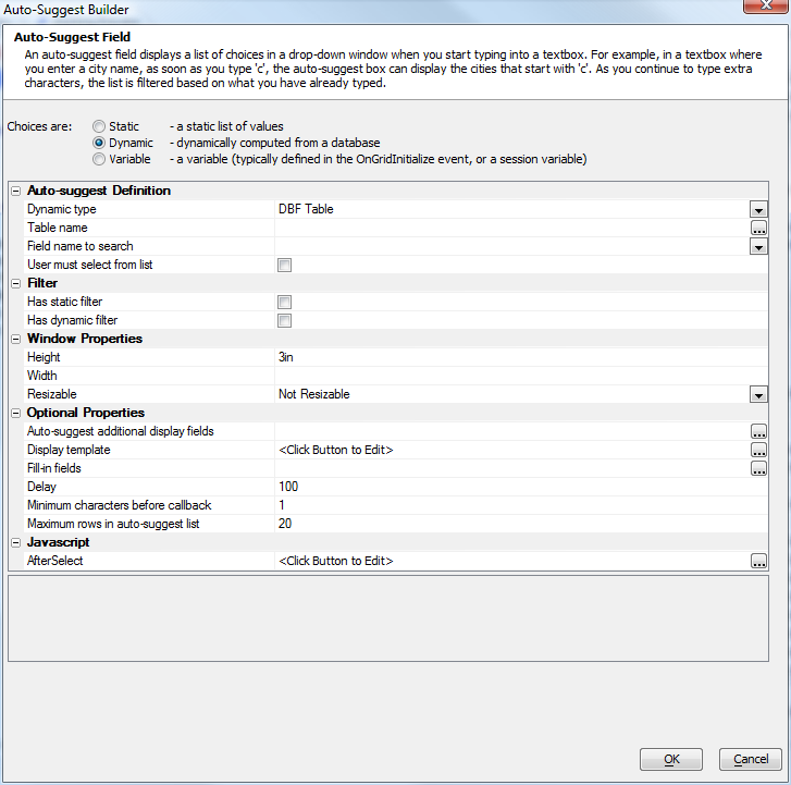
Auto-suggest lookup builder.
Dropdownbox
Choices
Specify the choices that appear in the DropDownBox. It is possible for the stored value to be different from the displayed value.
Maximum choices
Specify the maximum number of choices to show. Set to 0 to show all choices.
Height
Specify the height of the box. If height is 1, then box appears as combo box. If height is greater than 1, then box appears as a list box.
Multi-select allowed
Specify if user can select more than one choice
In-line style
Specify style attributes that override the settings inherited from the style sheet.
Not in list rule
If the value in the field is not in the list of choices for the dropdownbox, should the current value of the field be added to the list of choices in the dropdownbox?
RadioButton
Choices
Specify the choices for the group of radio buttons. Each choice will be the label of a radio button in the group. It is possible for the stored value to be different from the displayed value (label).
In-line style
Specify style attributes that override the settings inherited from the style sheet.
Orientation
Are the radio buttons laid our vertically, horizontally, or in columns? If in columns, you can specify the 'snaking' style - Left-to-Right-Top-to-Bottom (LRTB), or Top-to-Bottom-Left-to-Right (TBLR).
Column flow
Specify how the choices are organized. LRTB - left-to-right, then top-to-bottom. TBLR - top-to-bottom, then left-to-right. Only shown if the orientation is "Columns".
Column count
Specify how many columns should be used to display the radiobutton choices. Only shown if the orientation is "Columns" and the column flow is "LRTB".
Row count
Specify how many rows should be used to display the radiobutton choices. Only shown if the orientation is "Columns" and the column flow is "TBLR".
Maximum choices
Specify the maximum number of choices to show. Set to 0 to show all choices.
Not in list rule
If the value in the field is not in the list of choices for the radiobutton, should the current value of the field be added to the list of choices in the radiobutton?
CheckBox
Choices
Define the choices for the check boxes. If the variable is Logical, then there can only be one check box.
In-line style
Specify style attributes that override the settings inherited from the style sheet.
Orientation
Are the check boxes laid our vertically, horizontally, or in columns? If in columns, you can specify the 'snaking' style - Left-to-Right-Top-to-Bottom (LRTB), or Top-to-Bottom-Left-to-Right (TBLR).
Column flow
Specify how the choices are organized. LRTB - left-to-right, then top-to-bottom. TBLR - top-to-bottom, then left-to-right. Only shown if the orientation is "Columns".
Column count
Specify how many columns should be used to display the CheckBox choices. Only shown if the orientation is "Columns" and the column flow is "LRTB".
Row count
Specify how many rows should be used to display the CheckBox choices. Only shown if the orientation is "Columns" and the column flow is "TBLR".
Maximum choices
Specify the maximum number of choices to show. Set to 0 to show all choices.
Not in list rule
If the value in the field is not in the list of choices for the CheckBox, should the current value of the field be added to the list of choices in the CheckBox.
Buttons
Buttons may be added from Other Controls or as (Pre-)Defined Controls. By default, they will be simple text-only buttons that may have a class and/or inline style applied. You may also check Advanced Button Styling to create buttons that may have graphics and/or text.
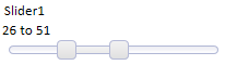
Slider
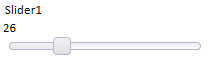
Width
Specify the width of the slider control. Use CSS syntax. E.g. 6in, 300px.
Minimum value
Specify the minimum value of the slider.
Maximum value
Specify the maximum value of the slider.
Step
Specify the amount by which the slider value increases when you drag on the handle.
Two value
Specify whether the slider sets a single value or two values (a start and end value). If you check this box, the control value will be set to a string like this: 23..45. The value to the left of the double periods is the start of the range and the value to the right of the double periods is the end of the range.
Show slider message
Specify if a message should be shown when the user is dragging on the slider.
Slider message
Specify the message that should be shown when the user is dragging on the slider. The message can use HTML markup. You can use placeholders in the template to indicate the value of the slider. You can also specify a Javascript function to compute the message text.
Hide slider message when focus lost
Should the slider message fade from view when the mouse is no longer over the slider.
Slider message position
Specify where the slider message should be positioned relative to the slider.
OnChange event
Specify the name of a Javascript function to call when the slider is dropped at a new position.
You specify the name of a Javascript function here, not the actual Javascript code.OnSlide event
Specify the name of a Javascript function to call when the slider is moved position.
You specify the name of a Javascript function here, not the actual Javascript code.
Choice lists for drop downs, radio buttons, and checkboxes
Choice lists can be defined by a static list of values, a list dynamically computed from a database, or from a variable.
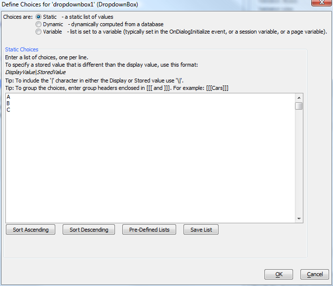
Static choice list.
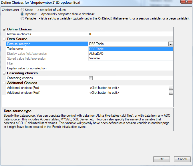
Dynamic choice list. Note the option for cascading choices. Cascading choices are ideal for searching hierarchically organized data, such as Country, State/Province, and City.
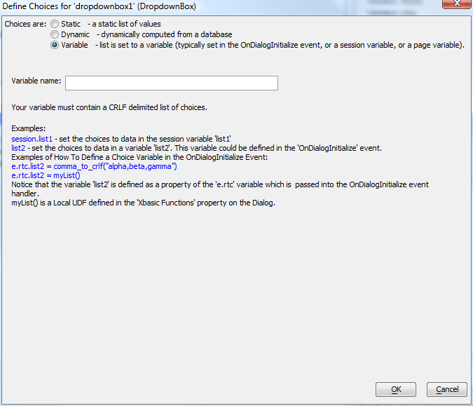
Choice list bound to a variable.
Label
A label control, which displays text in a read-only form, has only the properties common to all controls. That includes having a field label. Use a label control when you want to display a dynamically-determined value that the user should not edit directly, such as a calculated field. You can also use a label control for indirect input, for example with an OnClick action that sets the field from a pop-up JavaScript control or an Ajax callback.
Hidden
A hidden control type, which holds but does not display data, has only the properties common to all controls. Use a hidden control to hold a value that the user should not see, but needs to be submitted with the rest of the UX. To make it appear the way you expect, set its field label position to None. A hidden control type may not be necessary to your application, as you can hide any control type, and define client-side and server-side show/hide expressions for any control type.
Validating Individual Controls
To review, each control has the following four properties:
Validation Xbasic
Specify Xbasic code to test if the data in this field is valid. By default, only dirty fields are validated. You can specify that all fields should be validated in Update Settings, Editing Properties.
Validation rules
Specify rules to test if the data in this field is valid. By default, only dirty fields are validated. You can specify that all fields should be validated in Update Settings, Editing Properties.
Immediate validation
Specify if the value in the field should be validated as soon as you tab out of the field, or in the case of radio button, dropdown or checkbox controls, as soon as you change a value. The 'server-side' option will generate an Ajax callback, so you should try to limit the number of fields that require real-time server-side validation. Options are Client-side only,Client-side and server-side, or None.
Validation Javascript
Specify Javascript to validate the data in the field. Client-side validation is very fast because it does not involve making an Ajax callback to the server. Only shown if "Immediate validation" is not "None".
Validation Xbasic is the most flexible server-side validation method.
function validate_a as p (e as p)
'Sample validation function.
'Data for the current row is available in 'e.data'.
'For example, e.data.firstname, e.data.lastname
  if e.data.a = "" then
    validate_a.hasError = .t.
    validate_a.errorText = "a cannot be blank."
  end if
end function
Validation rules offer an easier server-side validation method that usually suffices.
Validation JavaScript with client-side immediate validation provides the user with validation feedback as soon as she has completed input of the field.
/* Use 'data' to refer to the value in the control. 'data' is a string variable.
To convert data to numeric or logical value you can use these Javascript functions:
$u.s.toNum(STRING as string) - convert to number
$u.s.toBool(STRING as string) - convert to logical

If the validation fails, your code should return the error message.
Otherwise, it should return false.

Example: */
var dataN = $u.s.toNum(data);
if(dataN > 10) (
  return 'Quantity must be less than 10';
) else (
  return false;
)
Defining Help for Controls
You can define help for controls by enabling help and giving the control a help ID. You can browse the help table for the ID or create and edit a new ID. You can control whether and where a help icon displays near the control, and whether it triggers on a mouse click or a mouse-over event. If you don't display an icon, pressing F1 with the focus inside the control will bring up help.
Here the default help icon is displayed to the right of the text box control.
Clicking on the icon brings up the help window.

The help source is a database table. If you don't already have an appropriate table, Alpha Anywhere can make one for you.
Control Events
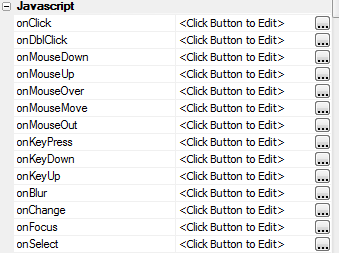
Every UX control supports the full range of JavaScript mouse and keyboard events.
Containers
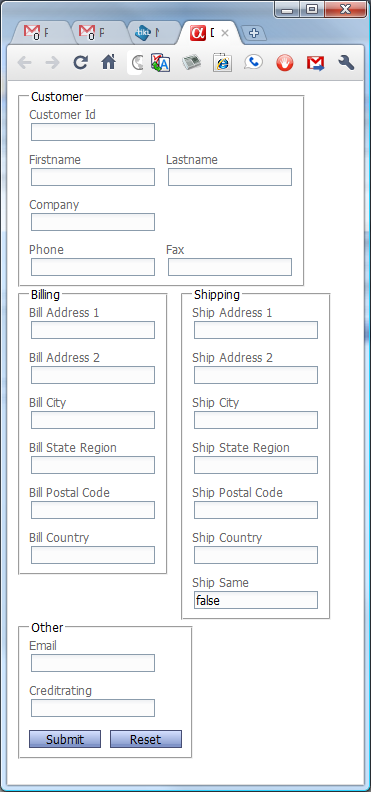
The tab, accordion, frame, container, and free-form layout containers are each useful for a slightly different purpose. Hover over each image to see it full-size: the differences will be visually obvious. For demonstration purposes, we based the UX for these examples on the Alphasports customer table.
Tab Control
Tabs and accordions are different settings of the same control. Let's start with tabs.
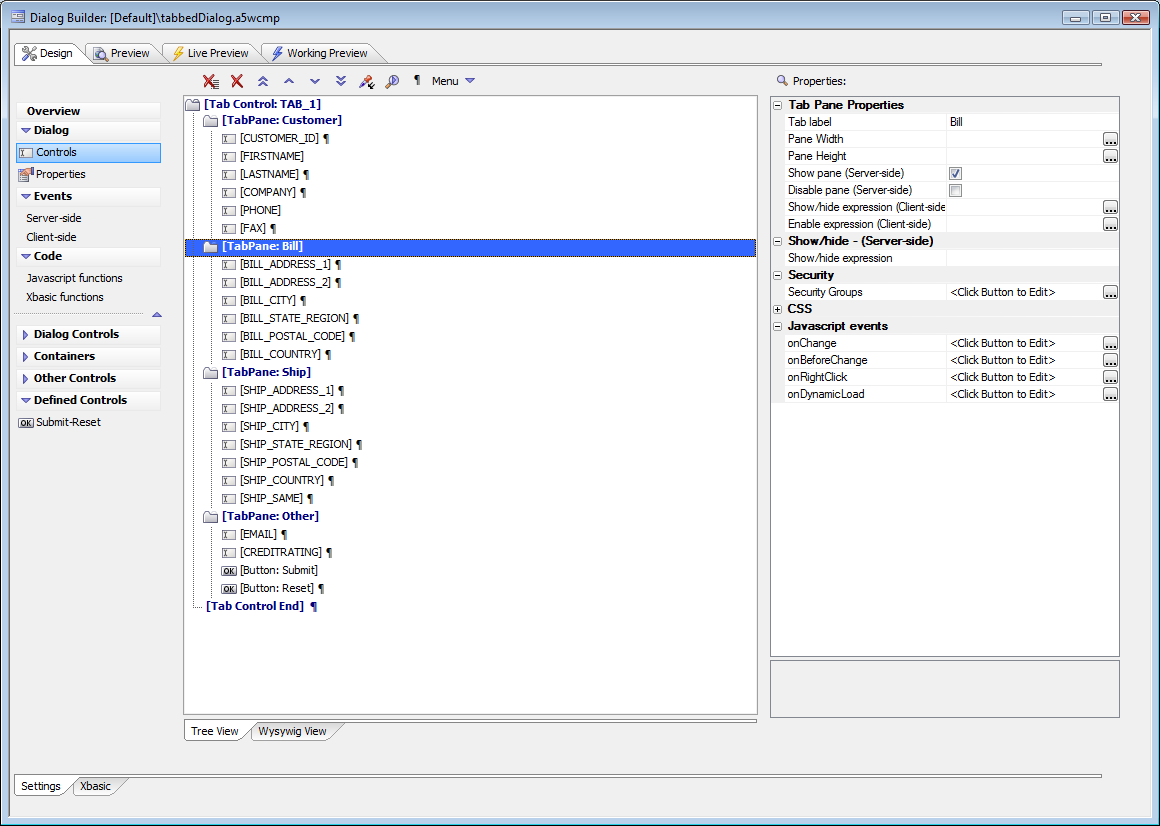
Designing a tabbed UX
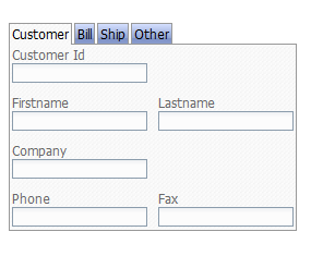
Tabbed UX preview. Tabbed UXs can be turned into multi-page UXs, as we discuss below.
Accordion Control
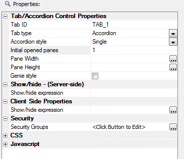
After switching a tabbed UX to an accordion
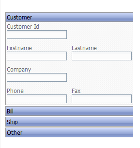
Accordion UX preview
Frame
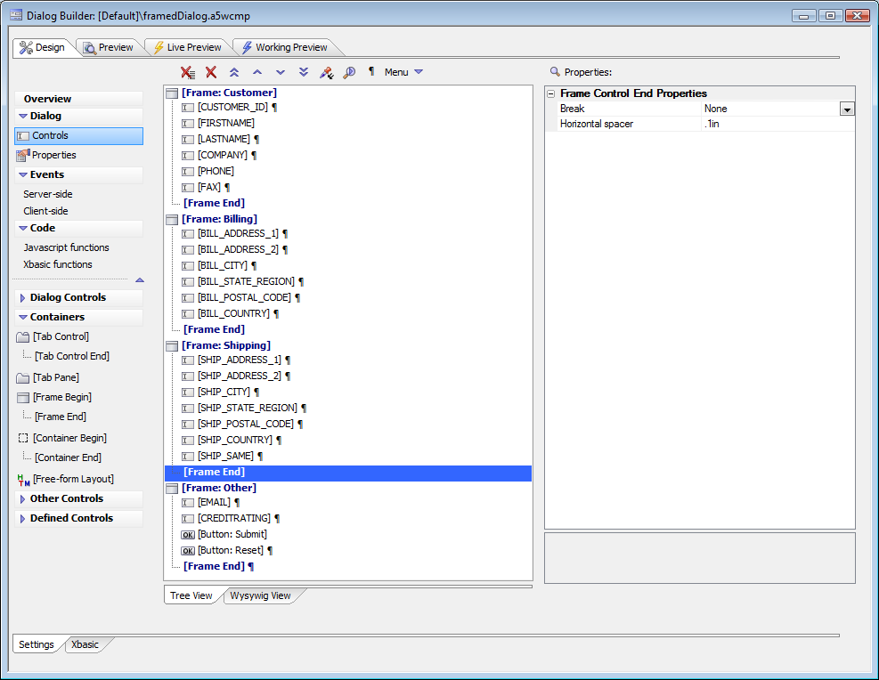
Framed UX design. Note that breaks have been removed from the frame ends. This allows for a liquid layout that will flow the form frame by frame, keeping related content together.
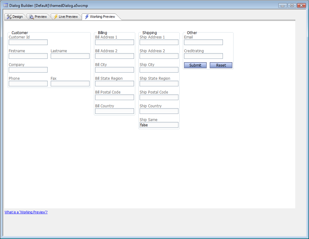
Framed UX preview. Note the wide horizontal flow from the removed breaks
The same framed UX in a narrow browser, similar to a smart phone form factor. Note how the frames automatically moved down to fit the space available. Here we have shown the browser frame as well as the container frames.
Container
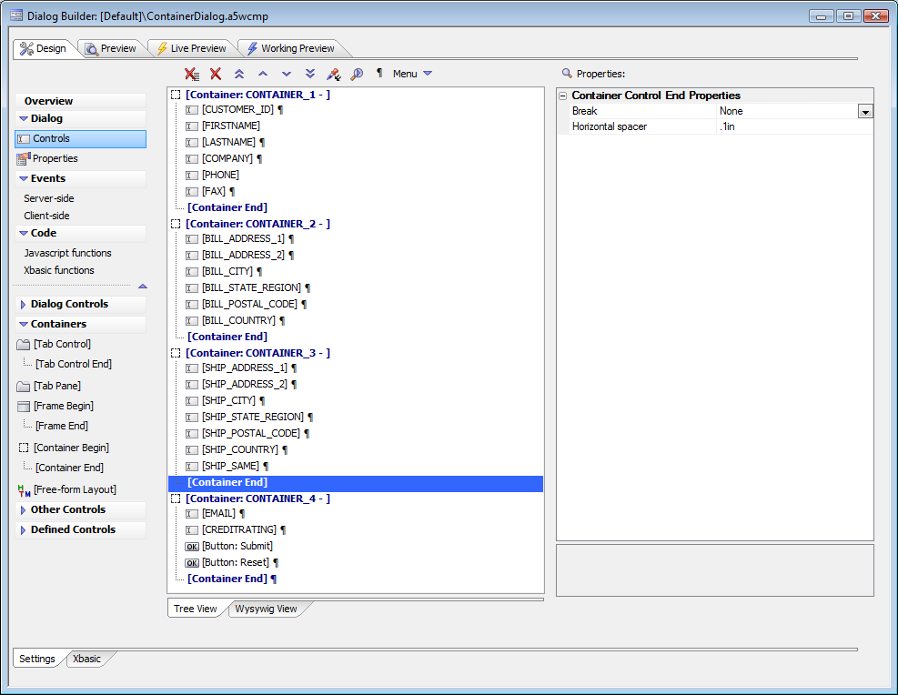
Container UX design. Note that breaks have been removed from the container ends. This allows for a liquid layout that will flow the form, container by container, keeping related content together.
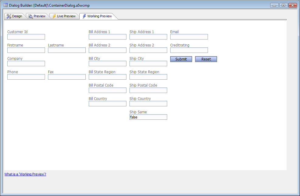
Container UX preview. Note the wide horizontal flow from the removed breaks. Containers are basically frames, only without the frame and title. This flow is what you'd most likely get on a tablet in landscape mode as well as a standard desktop browser.
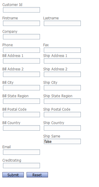
The same container UX in a narrow browser, similar to a smart phone form factor. Note how the containers automatically moved down to fit the space available. Here we have shown only the browser page contents, in the spirit of a smart phone. The container sub-type Repeating Section is used for another purpose, discussed below.
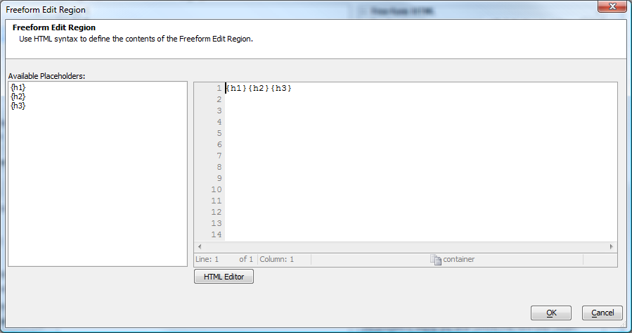
Free-form Layout
To create a free-form layout, first hide the fields that you want to place in the layout. Then add the free-form layout container control.
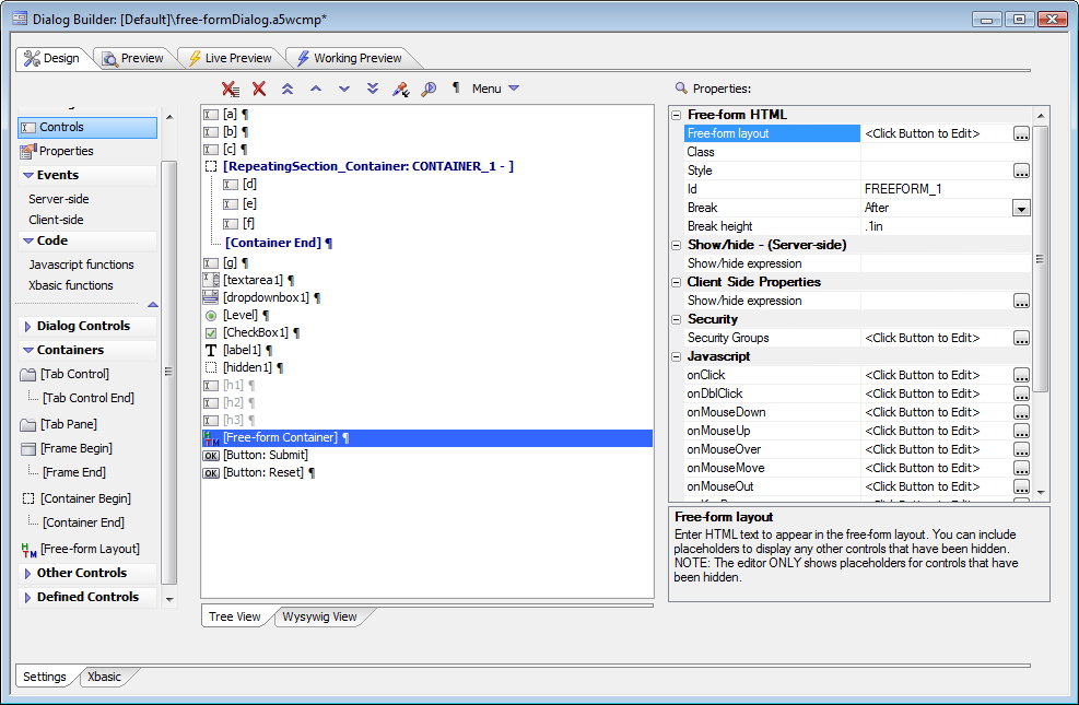
In the free-form layout container, edit the Free-form layout property and add the field placeholders along with any HTML markup you wish. If you want the fields labeled, add the text where you want it.
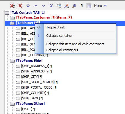
Container Collapse and Expand
Subscription feature. Subscribers can collapse and expand containers when editing a UX in Tree View. This is very useful when you are editing complex UXs.
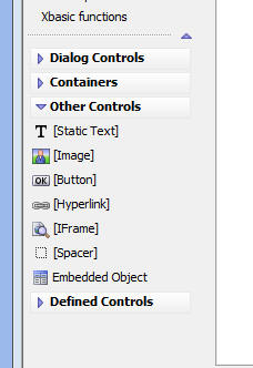
Other Controls
A Static Text control is like HTML text. If the text needs to be dynamic, consider using a Label control instead. A Static Text control can have a CSS style and JavaScript events, although users will not expect ordinary text to handle JavaScript events. If you want the text to have an onClick action, consider using a Button or Hyperlink control instead.
An Image control can be static, or dynamically computed based on other data in the UX. An Image control can have a CSS style and JavaScript events. Images are often used with an onClick event to trigger an action.
A Button control is like an HTML button. It has HTML text inside the button drawing, and has different drawings for the pressed and unpressed states. If the text needs to be dynamic, you can manipulate the innerHTML of the button with JavaScript. A Button control can have a CSS style and JavaScript events. Buttons are usually used with an onClick event to trigger an action.
A Hyperlink control is like an HTML hyperlink, i.e. an tag. It has HTML text which is underlined by default, and has a destination address to supply the href for the tag. A Hyperlink control can have a CSS style and JavaScript events, but you can additional specify a CSS style for a tag that wraps the hyperlink text. Hyperlink controls do not need to have an onClick event to trigger an action, but you can use one to override the default hyperlink destination.
An IFrame control is like an HTML IFrame, which wraps another web page specified by the URL. The most common customization for the IFrame control is to set the CSS width and height.
A Spacer control is just white space; you can set the width and height that you need, and it can optionally be followed by a break.
An Embedded object can be a Component, Report, .A5W Pages, PDF Document, or anything else that can be embedded in a Page Layout or Tabbed UI Component. That includes the UX and Grid components.
When you embed a Grid, UX or Custom component into a UX, the builder allows you to specify the component alias. It is recommended that you override the default suggestion and enter an explicit alias. This alias must be unique to the current UX component. The reason for this is that it makes it easier to get the alias of the embedded object so that you can execute methods on the embedded object. For example, you might want a button the parent UX to execute a .submitGridPart() method on an embedded Grid.
- Placeholders for Embedded Object Names When you embed a Grid, UX or Custom Component in a UX you will likely want to execute methods of the embedded object. You can use special placeholders in your Javascript. For example, assume that you embedded a Grid component into a UX, and you gave the Grid an explicit alias of EMBEDGRID1. Now, assume you want to execute the .submitGridPart() method of the embedded Grid from a button in the UX. You could use this code in the event handler for the button's onClick event:
(UX.EmbeddedGrid_EMBEDGRID1).submitGridPart()
(Pre)Defined Controls
Defined Controls are in fact predefined controls. They are controls that have already been customized to perform common actions. You can customize Defined Controls after they have been inserted if you wish.
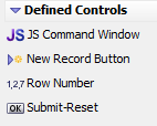
JS Command Window: Inserts a text area where you enter JavaScript commands to run. Useful for development, debugging and testing.
New Record Button: Sets all controls to their default values and starts entering a new record.
Row Number: Insert a field in a repeating section that displays the row numbers.
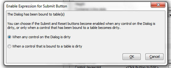
The Submit-Reset definition inserts two buttons, one named Submit and one named Reset. They are predefined to be side by side. The Submit button action is defined as {UX.object}.submit(); and the Reset button action is defined as {UX.object}.resetForm();. When you define a Submit button and at least some of the controls on the UX have been bound, a prompt appears asking if you want the enable expression for the buttons to be tied to the UX.isDirty or UX.isDataDirty system field.
UX Events
onUXInitialize
Fires the first time the UX is run.
onUXExecute
Fires every time the UX is run. This includes the first time it is run and whenever an Ajax callback is made.
UXValidate
Validates data in the UX that was submitted
afterUXValidate
Fires after the UX is successfully validated. Does not fire if the UXValidate() event returns any errors.
OnUXRender
This event fires after all of the HTML for the UX has been computed. It allows you to modify the HTML or Javascript that was computed. You can perform string manipulation operations on e.html or e.javascript to change the HTML or Javascript that gets rendered. Subscription feature
You can define field level error messages in the UXValidate event that display the errors next to the fields in error. For example:
UXValidate.hasError = .t.
UXValidate.errorText = "Your UX has errors"

dim UXValidate.fieldErrors[0] as p
i = UXValidate.fieldErrors.append()
UXValidate.fieldErrors[i].varname = "FIRSTNAME"
UXValidate.fieldErrors[i].errorText = "Error message for the FIRSTNAME field"

i = UXValidate.fieldErrors.append()
UXValidate.fieldErrors[i].varname = "QUANTITY:3"
UXValidate.fieldErrors[i].errorText = "Error message for the QUANTITY field in the 3rd row of a Repeating Section"
If you have defined field level error messages, you might want to suppress the global message. You can do this by setting UXValidate.errorText to "No Message". If you modify a field programmatically in the UXValidate or afterUXValidate event, you also have to add the field to the dirty columns list or the Genie code will not know to commit it. If you don't use the Genie, then it's all up to you. The list of dirty submitted fields is in e.dirtyColumns. This is a CRLF delimited string of dirty fields (i.e. fields edited by the user). For example:
COMPANY
QTY_A5INSTANCE3
For example, assume that you want to set the Company field to 'Alpha' and the 'Qty' field in row 1 of a repeating section regardless of whether the user edited the value or not. You'll need this code:
e.dataSubmitted.COMPANY = "alpha"
e.dataSubmitted.QTY_A5INSTANCE2 = "2"
e.dirtyColumns = e.dirtyColumns + crlf()+ "COMPANY" + crlf() + "QTY_A5INSTANCE2"
Client-side Events
canAjaxCallback
Fires before an Ajax callback. If the function returns false, the callback will be aborted.
afterAjaxCallbackComplete
Fires after an Ajax callback has completed.
canSubmitUX
Fires before the UX is submitted. If event returns false, the UX is not submitted.
onInitializeComplete
Fires after the component has been completely initialized and all HTML has been rendered. Does not fire on subsequent Ajax callbacks.
afterValidate
Fires after all controls in the component, or a single control has been validated.
onTabPaneChanged
Fires when the active pane of a Tab or Accordion object changes. This event is typically used in Genie style Tab objects to set the state of the progress meter showing you were you are in the list of Genie panes.
canRptSectionRowAdd
Fires when the user tries to add a new row to a Repeating Section. Return false to abort the action.
afterRptSectionRowAdd
Fires after the user adds a new row to a Repeating Section.
canRptSectionRowDelete
Fires when the user tries to delete a row from a Repeating Section. Return false to abort the action.
afterRptSectionRowDelete
Fires after the user deletes a row from a Repeating Section.
onStateChange
Fires when the UX changes state from dirty to clean, or vice versa.
onControlFocus
Fires when a control gets focus.
onRptSectionFocus
Fires when a Repeating Section gets focus.
onRptSectionRowChange
Fires when the focus row in a Repeating Section changes.
onSynchronizeUX
Fires after a UX has been synchronized. The reason this is neeeded is that when a button opens a UX in a Window, if the caching option is on and window has been previously instantiated, the existing UX in the window is simply synchronized, rather than loaded from scratch. Since the UX is not being loaded from scratch, the OnUXInitialize event event will not fire. This event will fire.
canRecordNavigate
Fires before a Data Bound UX navigates to a new record. You can test the e.isDataDirty parameter to see if navigation should be cancelled because the user has uncommitted changes. (Note: Requires the UX Record Navigation Feature Pack)
afterRecordNavigate
Fires after a Data Bound UX navigates to a new record. This event fires before the callback that retrieves the data from the server has completed. Use the afterPopulateFromTable event to respond at that point.
afterPopulateFromTable
Fires after a Data Bound UX has fetched a record from the server.
UX JavaScript Placeholders
When you edit client-side event handlers for the UX Component, you can insert any of the following placeholders, which will be replaced with the correct names when the UX loads:
{UX.object}
Gets replaced with the name of the Javascript UX Component Object. For example, if the UX alias is 'DLG1', then is replaced with 'DLG1_DlgObj'. Use this placeholder when you want to call a method of the UX Object. e.g. {UX.Object}.submit(), to submit the UX to the server.
{UX.ComponentName}
Gets replaced with the alias of the UX Component. For example, if the UX alias is 'DLG1', then is replaced with 'DLG1'.
{UX.Style}
Gets replaced with the style name of the UX. For example, if the style is 'GlassOlive', then gets replaced with 'GlassOlive'.
{UX.ControlId}
The control Id of the control. Note: See comment on {UX.ControlIDEscaped}.
{UX.ControlIdEscaped}
The control Id of the control. Special characters in the id are Javascript escaped. You must use this placeholder (and not {UX.ControlId}) if you want to use this placeholder in a selector (such as JQuery - jQuery('#{UX.controlIDEscaped}') )
Repeating Sections
A repeating section is a good way to handle parent-child or one-to-many table relationships in a UX. The repeating section represents the child table records, embedded in the fields of the parent table.
Placing a repeating section on a UX
Select the controls that you want to repeat.
Place a 'Container' control around these controls. (Select 'Controls', 'Containers'.)
Set the 'Sub-Type' property to 'RepeatingSection'.
You will probably want to turn off the line-break after each field in the repeating section.
Repeating Section Properties
Repeat count
Specify how many times the controls in this section should be repeated.
Show label rule
Specify if labels should be shown for fields in the first repeated row only, or if labels should be shown for fields in all repeated rows. Typically, you will set the field label position for fields in a Repeating Section to be 'Above' the field, and you will then set the Labels to only appear on the first repeating row.
Has divider
Specify if there should be a divider between each repeating instance (row) in the repeating section.
Divider HTML
Specify the HTML for a divider. Only shown if the repeating section has a divider.
Repeating row container in-line style
The repeating row is contained in a DIV. You can set the in-line style for this div. For example, you might want to put a border around the repeating row. e.g border: solid 1px blue;
Repeating row container class name
The repeating row is contained in a DIV. You can set the class for this div.
Highlight row on hover
Should the row be highlighted when the mouse is moved over it?
Highlight row on select
Should the selected row be highlighted?
Scrollable container
Should the Repeating Section rows be inside a fixed size (scrollable) container?
Scrollable container height
Specify the height of the scrollable container. Use CSS syntax. e.g. 2in, 200px, etc.
Scrollable container width
Specify the width of the scrollable container. Use CSS syntax. e.g. 6in, 200px, etc.
Scrollable container in-line style
Specify the in-line style for the scrollable container.
Scrollable container class name
Specify the class name for the scrollable container.
Has active row selector
Specify if an icon to the left of each repeating instance should indicate which row is active.
Active row icon
Specify the active row icon. Only shown if the repeating section has an active row selector.
'Delete Row' icon
Specify the icon for the 'Delete Row' button. Only shown if the repeating section has an 'Delete Row' button.
'Add Row' bubble help
Specify the bubble help for the 'Add Row' button. Only shown if the repeating section has an 'Add Row' button.
'Delete Row' bubble help
Specify the bubble help for the 'Delete Row' button. Only shown if the repeating section has an 'Delete Row' button.
Validation - row option
Specify if all fields in a Repeating Section row should be validated, or only the dirty fields in the row.
Validation - field option
Specify if all fields in a Repeating Section row should be validated, or only the dirty fields in the row.
Delete row prompt
Specify the text for the confirmation message that appear when the user deletes a dirty row in the Repeating Section. You can use .. language tags in the text.
Delete row UX title
Specify the text for the confirmation message box title that appear when the user deletes a dirty row in the Repeating Section. You can use .. language tags in the text.
Delete row UX icon
Specify the icon for the message box. Set to '' to use the icon specified in the UX style.
If you'd prefer to use buttons, images or hyperlinks for 'Add Row' and/or 'Delete Row', you may insert them after the repeating section using the UX builder, turn off the Has 'Add Row' button and Has 'Delete Row' button options for the Repeating Section, and use code such as the following for their onClick events. You can get the correct arguments for addRepeatingSectionRow() and deleteRepeatingSectionRow() from the Container ID of the Repeating Section. Add new row:
onClick="{UX.object}.addRepeatingSectionRow('CONTAINER_1')"Delete row:
onClick="{UX.object}.deleteRepeatingSectionRow('CONTAINER_1')"Repeating Section Control Properties
These properties appear on controls within a repeating section.
Repeating section heading
Specify the column heading for this control when it is displayed in a Repeating Section that shows labels on the first row only. Set to to use the control label as the column heading.
Compute summary values
Compute summary values for this field. (Only applies to fields that are in Repeating Sections).
Handling submissions for repeating sections
In the UXValidate and afterUXValidate events, you will need to understand the format in which your data is passed to your Xbasic function. Reading the discussion below for repeating sections may be helpful.
function afterUXValidate as v (e as p)
'e.dataSubmitted - contains all values that were submitted by the UX

'--------------------Repeating Sections ----------------------------------------
'If your UX contains repeating sections, data in the repeating
' sections will be in an array.
'For example, say that your UX has a repeating section that
' includes a field called QTY:
'e.dataSubmitted.qty[1] - contains data from first repeating section row
'e.dataSubmitted.qty[2] - contains data from 2nd repeating section row, etc
'e.dataSubmitted.qty.size() - number of entries in the array.

'In addition, the e object will contain information about the
'  repeating sections
'e.repeatingSectionNames - a comma delimited list of the name
'  (container ID) or each repeating section
'e.repeatingSectionInfo - a property array with one entry for each
'  repeating section.
'The e.repeatingSectionInfo[] array will have these properties for
'  each entry:
' - .activeRow - the row in the repeating section that had focus
'    when the UX was submitted
' - .deletedRows - a CRLF delimited list of rows that were deleted.
'    e.g. 1 and 3
' - .rowCount - a count of the number of non-deleted rows
' - .totalRowCount - a count of all rows in the repeating section
'    including rows that were deleted
' - .fieldsInRepeating section - a CRLF delimited list of fields
'    in the repeating section
' - .dirtyRowsInSection - a CRLF delimited list of rows in the
'    repeating section that were edited.
' (A row that was edited, then deleted, will still appear in this list).
' - .dirtyFieldsInSection - a CRLF delimited list of fields in the
'    repeating section that were edited.
'    repeating section that were edited.

' for example: PARTNO_A5INSTANCE3 is the 'PARTNO' field in row 3.


'----------------------------------------------------------------------
'Also inside e:
'e.tmpl = Component definition
'e.rtc = Runtime calculations - you can use this to store data to be
'  passed to other server side events
'e.arguments = SQL::Arguments object with values for each of the

'  arguments defined in this component
'Request - The Request object. Includes Request.Variables, which should be used instead of the older e.rv construct

'Session - The Session object. Should be used instead of the older e.session construct
'You can can set these properties:
'e.url - if you want to redirect to another page, set this property
'e.javascript - if you want to send some javascript back to the browser,
end function
If you are in any doubt about how your data is passed, put a debug(1) statement in your afterUXValidate code, run the component in working preview, press your Submit button, and look at the e properties in the debugger.
Hiding a control in a repeating section
The controls in the repeating section are 'flowed'. That means if you hide a single instance of a control by setting its display property to 'none', the controls to the right of the hidden control will shift to the left. This is probably not what you would want. So, instead of actually hiding the control, you should rather set its visibility property to 'hidden'. This will make the control invisible, but not cause controls to the right of it to shift. e.g.
e.javascript = "$('{UX.Object}.V.R1.FIELDNAME_A5INSTANCE1').style.visibility = 'hidden';"In this example, the JavaScript string is being set in a server-side event, such as onUXInitialize, for execution on return to the client. The control being hidden is named FIELDNAME, and _A5INSTANCE1 is how you reference a control in the first repeating section row.
{UX.Object}.V.R1.
{UX.Object}.V.R1. is the conventional prefix for all UX controls, for compatibility with Grid controls. In the current implementation of the UX, there is only one row at the top level, even though there are multiple rows or instances within repeating sections. If you are hiding all the instances of a control, i.e. a whole column, you can use a more convenient method, {UX.Object}.hideRepeatingSectionColumn(). This takes care of looping over all the instances, and lets you choose the method used to hide the column. When you are hiding a whole column, you usually do want the columns to the right to shift over. The prototype for the method is:
{dialog.object}.hideRepeatingSectionColumn(columnName {,mode});Options for mode are 'hide', 'show', 'visibility_hide', and 'visibility_show'. The default is 'hide'. For example,
//Hide the 'SalesTax' column in a Repeating Section
{dialog.object}.hideRepeatingSectionColumn('SALESTAX');

//Show the 'SalesTax' column in a Repeating Section
{dialog.object}.hideRepeatingSectionColumn('SALESTAX','SALESTAX');
Summary Fields
When you use repeating fields you can set up the UX to create summary fields automatically. This is a two-step process. First, check the Compute summary values box for any field in the repeating section for which you want summaries.
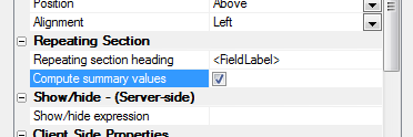
Then, create a calculated field and set it to the value of one of the summary fields, or to an expression that depends on one or more summary fields.
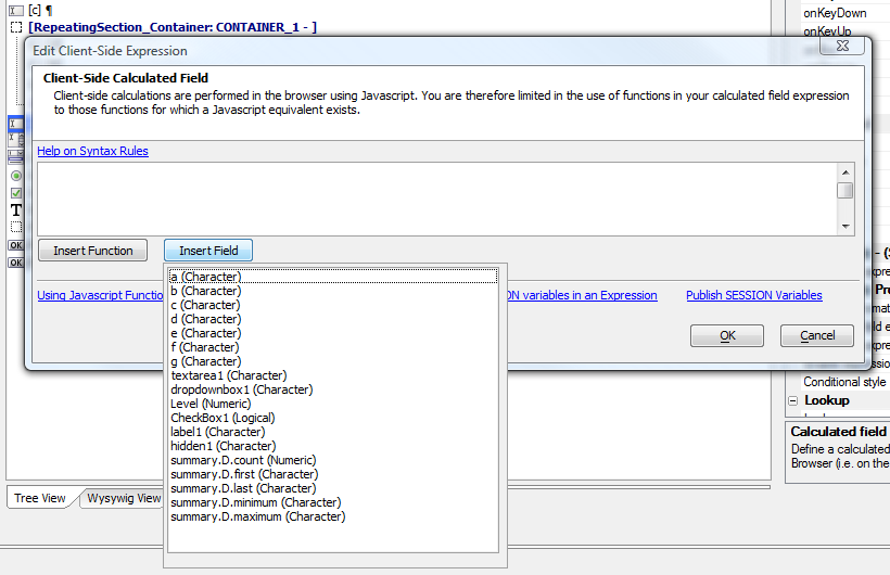
Multi-page UXs
Surveys and other long web data entry forms are often most conveniently presented as multi-page UXs. You can accomplish this with tabbed UXs or Genie-style UXs.
Tabbed Multi-page UXs
We have already discussed how to create tabbed UXs. The following image should look familiar from the earlier discussion.
When a tabbed UX is used as a multi-page form, the user is responsible for clicking on the tabs in the correct order.
Genie-style Multi-page UXs
Once you have a tabbed UX, you can turn it into a Genie-style UX by checking the Genie style box in the Tab control properties.
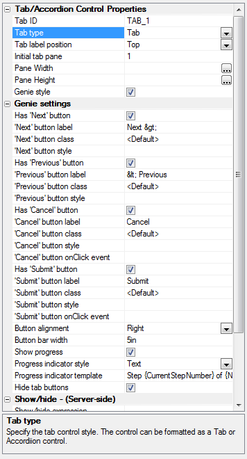
If you accept the default options, the Genie-style UX will hide the tabs and provide an alternate interface for advancing through the page and showing progress.
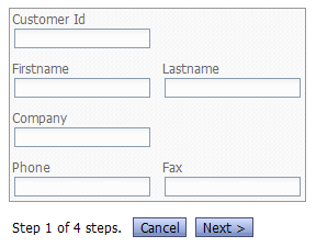
Binding a UX to a Database
At a fundamental level, binding a UX to a database is simple, as long as you are able to write a few lines of Xbasic code. On the other hand, you don't need to write code, as Alpha Anywhere can write the code for you. See Genies for New UX Component.
Populating the list from a table
All you need to do to initialize the UX from a database record for editing is to add code that reads the database record and sets the UX field values, in the UX's onUXInitialize event handler. A simple way to determine what record to read is to add an argument to the UX that is set from a variable or at runtime. This argument would hold the primary key value of the record to be read. If you were creating a pure data-entry form, you would omit adding any code to the onUXInitialize handler, and rely instead on the default values of the UX fields. All you need to do to save the UX's contents into a database record is to add code that reads the field values and writes (creates or updates) the database record, in the UX's afterUXValidate event handler. If this is a data-editing form, use the primary key value that was set initially to update the correct database record. If this is a data-entry form, then ideally the database record you add will have an auto-incrementing primary key, and you can perform a simple create operation.
Embed other objects
You can embed other objects into the UX just as you can in a Page Layout. For example, you can embed a Grid, UX, Report, PDF file, .A5W Page, etc. inside a UX. See Other Controls.
UX Methods
All JavaScript UX methods belong to the {UX.object} placeholder, for example {UX.object}.setFocus(). You can view all the current methods by running a UX in Firefox with Firebug and examining the DOM:
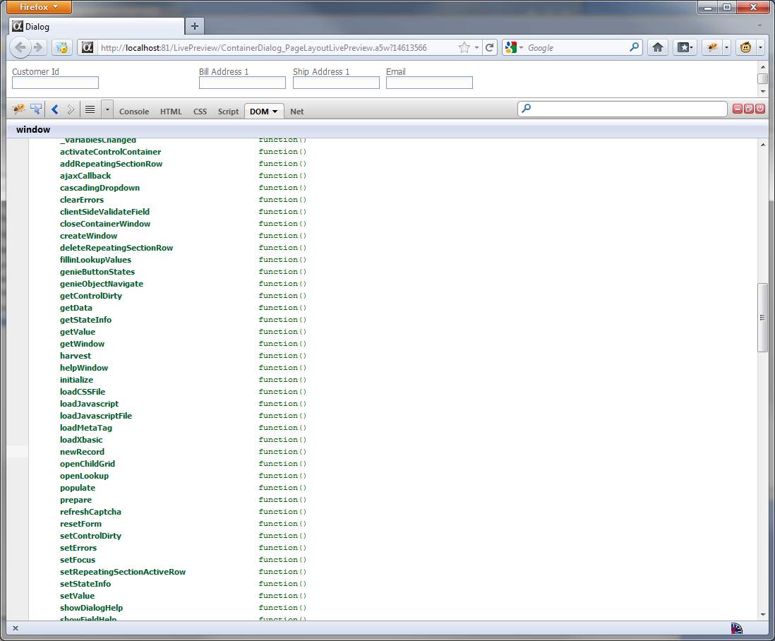
The functions we consider useful for your development are documented in the Insert Method UX available from the JavaScript, Action JavaScript, and client-side event editors.
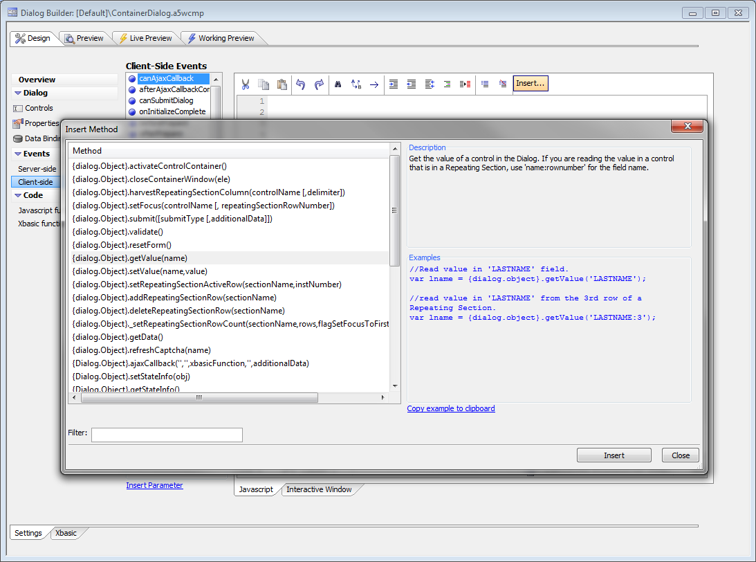
UX Examples
Simple UX Example demonstrates how to set up a UX, validate the fields, and display the entered data. Saving UX Contents to a DBF demonstrates the Xbasic code to save entered data to a DBF. Saving UX Contents to a SQL Database demonstrates the Xbasic code to save entered data to a SQL table. Sending UX Contents via Email shows the Xbasic code for one way to email entered data. Parent-Child UX Example shows how to design a simplified UX for InvoiceHeader and InvoiceItems, and the Xbasic code to save the data to the two tables wrapped in a transaction. Genie-Style UX Example demonstrates how to build a UX based on a real Customer table, divide the UX into logical tabs, and run the UX in "Genie mode" with one tab per page.
Simple UX Example
Saving UX Contents to a DBF
Saving UX Contents to a SQL Database
Sending UX Contents via Email
Parent-Child UX Example
Genie-Style UX Example
See Also
- Genies for New UX Component
- Server-side Action Scripting
- Videos for New UX Component
- Videos for UX Component - Managing Data in the Security Framework
- JQuery Support
- How to Dynamically Set the Client-side Mask
- Grid, UX and Custom Components Storing state information
- Grid and UX Component Date Picker
- Grid and UX Component Time Picker
- Grid and UX Component Edit-Combo Control Filter Method for Required Selection property