Date picker
Description
In both the UX Builder and the Grid Builder it is possible to add a Date Picker to your application.
The Date Picker includes, among other things, the following features.
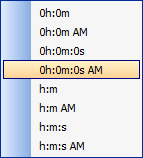
It can be configured as a date, date/time, or time picker by setting the Date format string.
Client-side Event mode allows the first and last date shown in the Date Picker to be dynamically computed using Javascript functions
It can be configured to disable certain days of the week. For example, can disable dates on Saturdays and Sundays
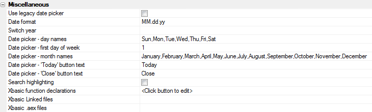
To select the new Date Picker in the Grid Builder, make sure that the ' Use Legacy Date Picker property ' in the Properties > Miscellaneous section is unchecked. The UX Builder will always use the new Date/Time Picker . To turn a date picker into a date/time picker, simply define a Date Format that includes a time portion.
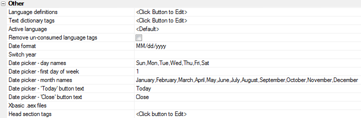
Additional settings, including localization properties, are found in the Properties > Other for the UX builder . In the Grid builder these same properties can be found under the Properties page under Miscellaneous .
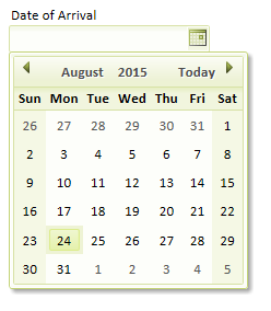
To create a Date Picker in the UX Builder, click on the Controls button  under the design menu. Next go to the Data Controls drop-down under the same menu and select the [Textbox] control. The New Control Dialog will appear. Give your control a name and a label, like 'Length of Stay' or 'Date of Arrival' and select a data type for your control. You can choose Character, Date, Time, or Short-time as a data type, though if you choose Character this will limit you to the Time Picker properties. Click OK, the new control will be added to your list of controls. As noted in the intro, in order to turn a Date Picker into a Date/Time Picker it is necessary to change the Date Format setting. While still on the Control page, click on the control that you created. You will notice that the Date Format property is set to

This property refers to whatever you set as the Date Format under the Properties Menu in the UX builder. Put another way, is nota generic Alpha Anywhere setting but rather whatever you would like the default setting for your project to be. If you would like your application to contain both a date and time picker you need to make both of these format strings appear in the.
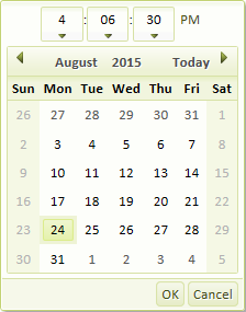
Set to include a Date and Time Picker
With a [Textbox] control with a Time type added to the UX Builder, go to Properties .
Go to Other and select the Date Format property row. Click the button
 to the right of the row.
The Date Format Dialog will load. Select the Date Format you wish to use from the drop-down and click the Build button next to the Time Format : box.
The Time Format Codes Dialog will appear. Here you can either format your own string using the Format String box and the Format Code list that appears above it. Alternatively, if you want a format string that has already been created simply click the text button labeled Insert pre-defined format strings . This will determine how the Time picker appears in your control. This example creates a Time Picker showing the hours, minutes, and seconds with either an AM or PM displayed and a 0 when empty. Pre-defined format strings
Click OK to close the Time Format Codes dialog. You will see your new Time Format displayed in the Date Format dialog.
Click OK to close the Date Format dialog. Your change should be visible in the Date Format definition on the Properties page.

In the Grid Builder go to the Working Preview tab. You should see something like this when you click the Date/Time Picker drop-down button.
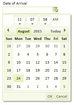 Date and Time Picker
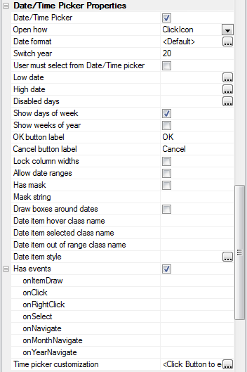
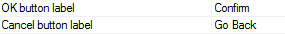
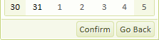
If you have a Date Picker control with both a date and time portion, you will see an OK and Cancel button at the bottom of the Date Picker. Users can click on these to confirm changes when there is more than one format string. If there is only one format string these buttons will disappear completely. You can set the label on the OK and Cancel buttons by going to Controls in the UX Builder design menu, scrolling down to the Date/Time Picker Properties list, and changing the text under the 'OK button label' and/or 'Cancel button label' properties.
Creating Multiple Controls with Different Portions.
If you want one of your controls to have a date and time format while limiting the format of some other controls there is an easy way to do this. First go to the Controls page under the UX Builder Design menu.
Click on the control you wish to modify and on the right scroll down to the Date/Time Picker Properties list.
On the Date Format property row click the button
at the end of the row.
The Date, Date/Time, Time Format Dialog will open. If you have not set the to include a Time and Date Picker format string see the instructions above on how to do this. If your setting does include both of these, then this dialog is where you can override the setting. Click on the drop-down to select the override setting you wish to use. will make the control only displays the date format string from your . will alter a control to only include the time format string from your . lets you create a control with its own separate date and time format strings. Selecting is the same as seleting.
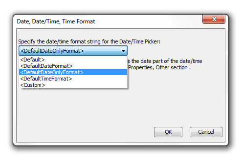 Override the Setting for Date/Time Format
If the 'Date of Arrival' control shown at the beginning of the guide is overridden with the then it will look something like this...
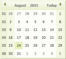
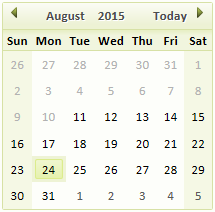
There are a number of additional properties that you can set in the date picker. Show weeks of the year numbers the weeks in a year and displays them vertically next to the calendar. In this example, checking ' Show weeks of the year ' displays August containing weeks 31 through 36 of the year 2015...

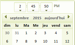
The ' Show days of the week ' Setting toggles on and off the days of the week. Out of the box these settings are in English. However, if you are in a non-English speaking country you can control the month and day names. To access the language strings go to the UX Builder Properties on the design menu and scroll down to the Other properties. Change the text for the " Date picker - 'Today' button text ", the " Date picker - day names " text, and the " Date picker - month names " text to your liking. To see the changes simply click on Working Preview and open your Date Picker control.
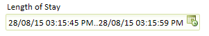
The Has mask property on the Controls page under Date/Time Picker properties allows you to restrict what a user can enter into a Date Picker. In cases where the user is doing their own typing into a field, a mask can prevent them from entering characters and only allow them to enter numbers, or visa versa. Alpha Anywhere also has an Allow date ranges property. A date range is where you use a single date field to enter two date values. The Multiple separator property lets you decide which character(s) you want to use to distinguish the two ranges. Before you change it the separator is usually '..', Here is a date range with .. as a separator
The Low date property sets the lowest date that a user can select on the Date Picker. Similarly the High date property sets the highest date that a user can select. Both of these properties are listed on the Controls page under Date/Time Picker properties. When you click the button next to either of the two, the ' Property Value ' dialog will open. Here you can choose either an Explicit value or a Javascript function for the low and or high date. If you want an explicit value, which a user can not go beyond, simply enter it in the Property value: text box. Alternatively you could also copy and paste into this box from your working preview.
If you click the Javascript function radio button in the Property value dialog, then you can use a function for the Low date or High date property instead of an absolute value. Using this feature you can prevent users from entering an end date that occurs before the start date that enter.
Adding a Javascript Function to a Low date Property
Go to the UX Controls page.
Click on [Textbox] under Data Controls and when the New Control Dialog opens create a control with the Name: start_date and the Label: Start Date. Under Data Type: select 'Date'.
Click OK .
Create a second [Textbox] control. Give it the Name: end_date, Label: End Date, and select Data type: 'Date'.
Click on the [end_date] control in your control list. Scroll down the Properties list on the Controls page until you get to Date/ Time Picker Properties .
Click on the button
next to the Low date property to open the Property Value dialog.In the Property Value dialog click the Javascript function radio button. In the Javascript function name: textbox type getLowDate.
Go to the Design menu on the left and click on the Code section drop-down to open it. Select Javascript functions
Enter the following Javascript code into the Javascript code editor.
function getLowDate(){
var startDate = {dialog.object}.getValue('START_DATE');
if(startDate != '') return startDate;
else return '';
}
Go to your Working Preview window. You should now not be able to enter a end date earlier than the start date you entered.
The Disabled days property in Date/Time Picker Properties under UX Controls prevents users from entering data for certain days of the week. The disable a day first click the button next to the Disabled days property to load the Property Value Dialog. Enter the code for the day you want to disable into the Property value: textbox. Days are coded based on numbers... 0 (Sunday), 1 (Monday), 2 (Tuesday), 3(Wednesday), 4(Thursday), 5(Friday), and 6(Saturday). So, entering 0,6 as a property value will stop people from entering data on a weekend.
Disabled Days
One last property that you might have noticed listed under the Date/Time Picker Properties are Has events . Has events allow you to define your own Javascript for events like on Click, onNavigate, and onSelect. 'Has events' also contains onItemDraw which is a very powerful javascript event handler that lets you to customize the html layout of your date picker.
These videos give a tour of the Date Picker features and show how the Date picker appears with various settings:
Date Picker
In previous updates support was added for customizing the day and month names in the calendar. Now, you can customize the day that the week starts on. In the Grid Properties there is a new property for 'First day of week'. By default this is set to 1 ( for Sunday). If you want the week to start on Monday, set this property to 2. The screen below shows how the calendar looks when the first day of the week is set to 3 (Tuesday).
Keeping a Calendar Control Current
When you place a Date Picker (popup calendar) control on a grid or dialog component, there are several properties that you can set.
Date format
Low year
High year
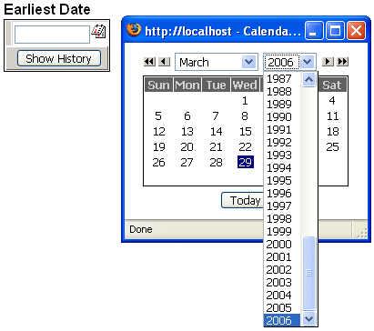
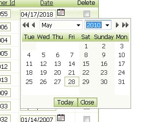
There are applications where you would want to limit the range of years shown on the control. You might also want to dynamically change the date format, depending on the preferences of the web user. This example shows the override section of the dlg_hdatedialog component after the designer placed it on an A5W page. The date picker was the first control on the page (hence with Variable_Info[1]).
with tmpl_dlg_hdate
with Variable_Info[1]
.DatePicker.DateFormat = "mm/dd/yyyy"
.DatePicker.HighYear = cyear(date())
end with
componentName = "dlg_hdate"
end with
Note how the .DatePicker.HighYearproperty will always be set to the current year (in this case, 2006). There will be no need for future maintenance.