How to Create and Assign a Sub-theme
Description
Sub-themes are reusable style definitions for controls.
Discussion
Sub-themes allow you to create one or more reusable 'looks' for controls - such as buttons or Lists. In a sub-theme definition, basic styling as well as behaviors (hover, visited, active, focus, etc) can be defined for a control.
For a great guide to pseudo-elements and pseudo-classes, check out https://www.smashingmagazine.com/2016/05/an-ultimate-guide-to-css-pseudo-classes-and-pseudo-elements/.
The sub-theme is applied to a control using its Sub-theme property. Multiple sub-themes can be created for the same control type, however only one sub-theme can be assigned to a control at design time.
To create a sub-theme, use the Sub-theme Builder. Sub-themes can be created in several locations:
- In the Sub-theme Builder accessed via a control's Sub-theme property
- In the component settings when defining Style Tweaks
- In the Web Theme Builder
While sub-themes can be defined directly using a source editor (JavaScript and CSS), it's easiest to start by copying an existing sub-theme and then making your own modifications. In the Sub-theme Builder, you can optionally select a sub-theme to copy when creating a new sub-theme. All items that support sub-themes have at least one sub-theme, "base", defined in the styles that ship with Alpha Anywhere. Some controls, such as List controls (listbox) and button controls (button) have multiple sub-themes defined in the styles that ship with Alpha Anywhere.
Creating a Sub-theme
To create a sub-theme, it's easiest to start by copying an existing sub-theme definition and then adding your own class definitions.
The following steps show you how to create a sub-theme using the Web Style Builder. Sub-themes can also be created from within the UX Builder using the Style sub-theme and CSS 'tweaks'.
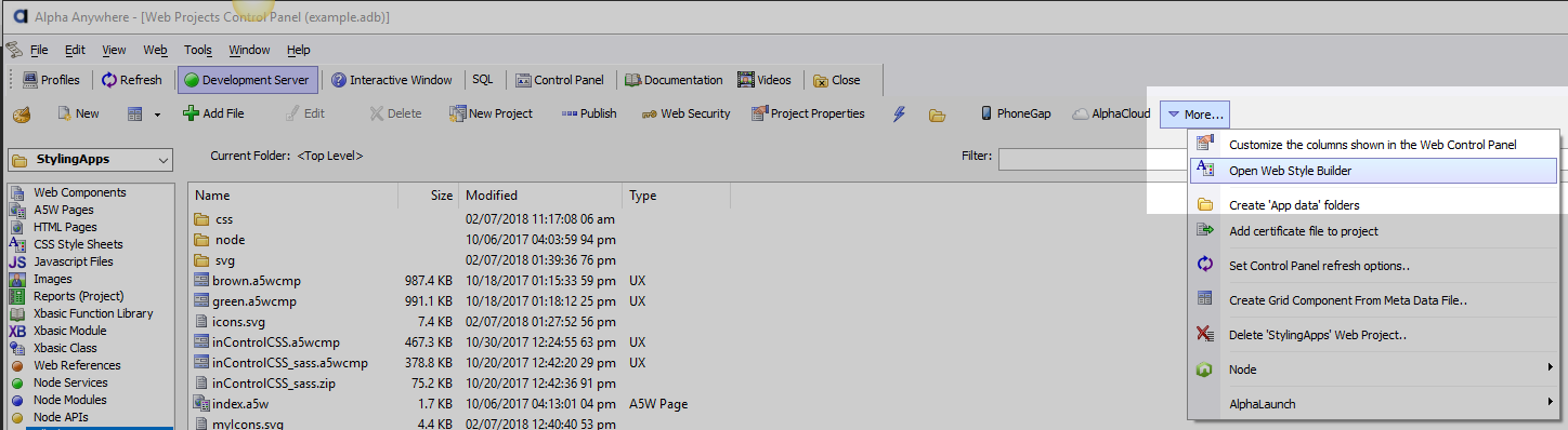
Open the Web Style Builder from the Web Projects Control Panel.
Select one of the style sheets that support sub-themes. Styles that support sub-themes include "Alpha", "iOS7", "AndroidDark", and "AndroidLight".
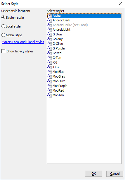
You can create your own style that supports sub-themes as well by copying an existing style sheet and editing it using the Web Style Builder.
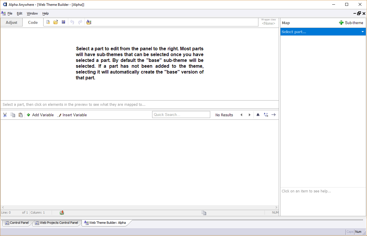
On the Code tab in the Web Style Builder, locate the Select part... menu.
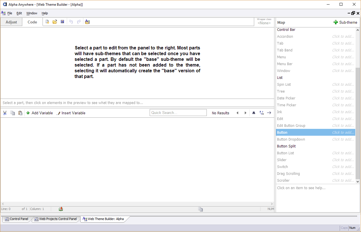
Select the part for which you would like to create a new sub-theme. Every part in the list can have a sub-theme. The list below explains what each listed part corresponds to in the UX Component (this is not a comprehensive list):
- Part
- Supported Controls
- Panel Card
The Panel Card control
- Panel Navigator
The Panel Navigator control
- Panel Layout
The Panel Layout control
- Control Bar
The ControlBar control
- Accordion
Tab Control rendered as an accordion
- Tab
The Tab control - styles the tab pane
- Tab Band
The Tab control - styles the tabs
- Menu
The Menu control
- Menu Bar
The Menu control
- Window
The Window container control
- List
The List control
- Spin List
The Spin List control
- Tree
The Tree control
- Date Picker
The Date Picker for a Text Box control.
- Time Picker
The Time Picker for a Text Box control.
- Edit
Text Box, Textarea, and Dropdown Box controls.
- Edit Button Group
The in-control buttons shown in a Text Box control.
- Button
A Button control.
- Button Dropdown
A Button control with Has dropdown icon enabled.
- Button Split
A Button control with Has dropdown icon and Display as split button enabled.
- Button List
The Button List control.
- Slider
The Slider control.
- Switch
The Switch control.
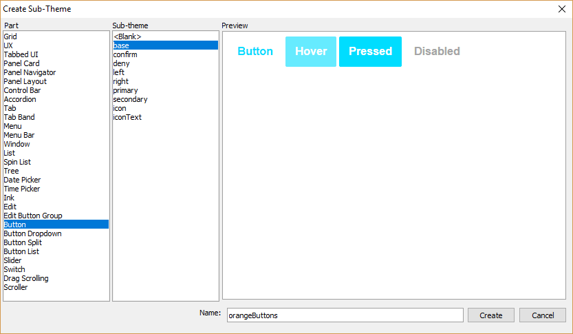
After you select a Part, you can optionally select a Sub-theme to copy. Every Part has at least one sub-theme - "base". In the image below, the base sub-theme will be copied to a new sub-theme called "orangeButtons".
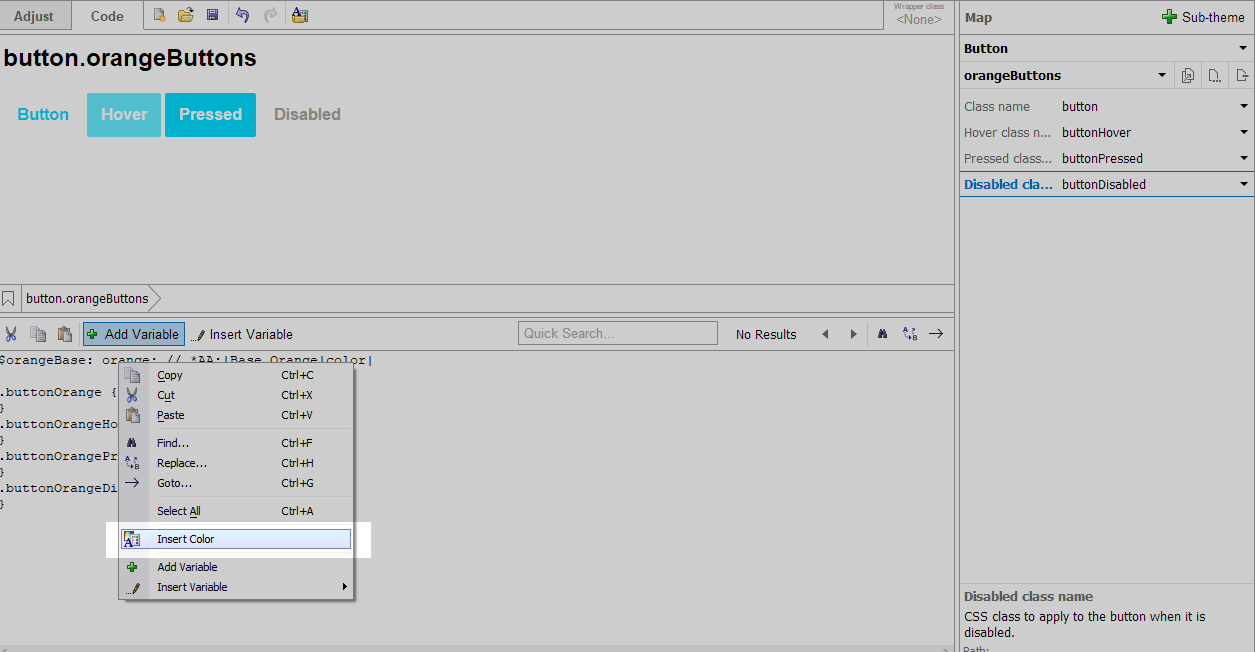
Click Create to create the sub-theme. This will take you back to the Code tab in the Web Theme Builder with the new sub-theme selected. Both CSS and Sass can be used to define the style for the sub-theme. Several tools exist to make it easier to add colors and variables to your style. To insert a color, select Insert Color from the Add Variable menu.
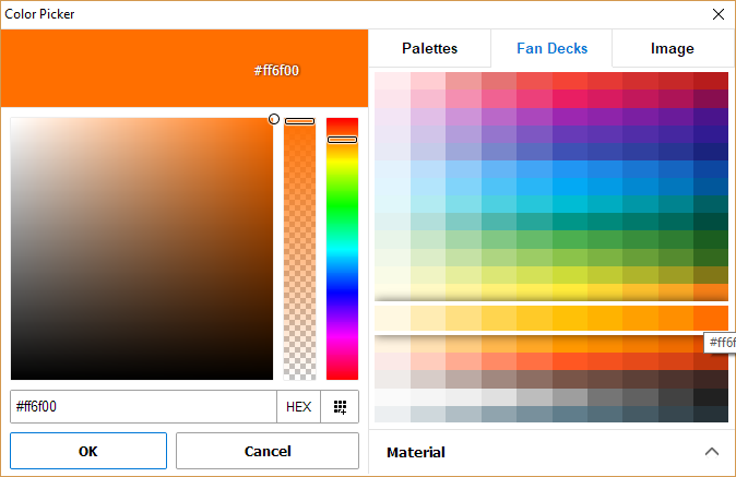
The Color Picker includes multiple tools for selecting colors, including Fan Decks and the ability to select colors from an existing image. The Palettes tab is where you can create and save color collections.
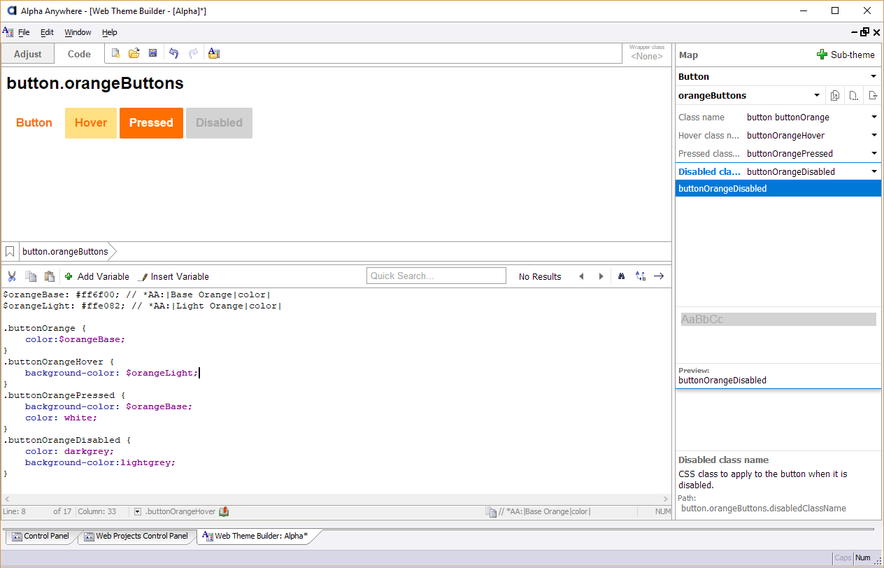
Once you have finished defining your new sub-theme, it's ready to be used. Click the Save icon in the toolbar to save your changes.
Assigning a Sub-theme
Sub-themes are assigned to controls using the Sub-theme property. Let's assign the sub-theme created in the previous section to a button in a UX Component.
Open the UX Builder and go to the Controls pane.
Select a control to the UX that you built the sub-theme for. Then, click the
 smart field for the Sub-theme property for the control.
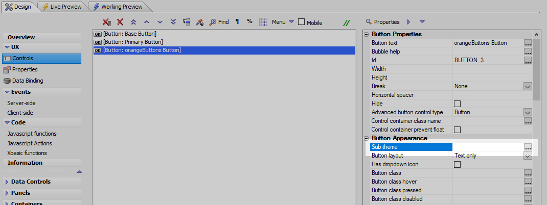
Select the new sub-theme from the Select Sub-theme dialog and click OK to assign the sub-theme. Open the component in Live or Working Preview to preview your change.
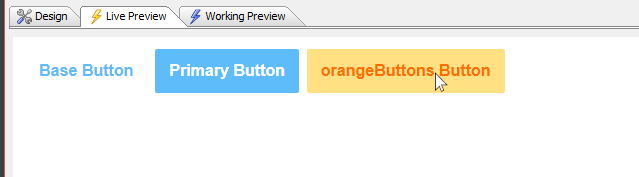 A button in a UX with the "orangeButtons" sub-theme applied.
See Also