How to Preview Themes in Other Contexts in the Web Theme Builder
Description
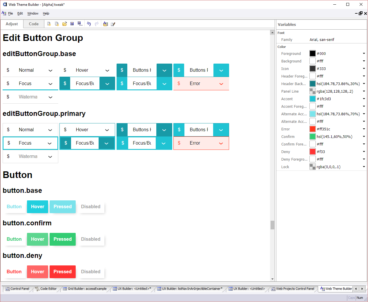
The Web Theme Builder let's you preview the theme in other contexts. A context is a wrapper class that is applied to a control, such as the "compact" or "panelCard" classes.
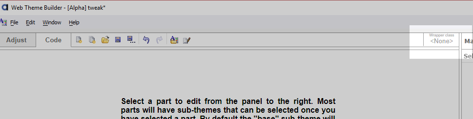
Open the style in the Web Theme Builder. If the style has not been tweaked, you may be prompted to copy it. You can avoid this by tweaking the style first. See How to Define Style Tweaks for more information.
On the Code tab, click on Wrapper class located on the right-hand side of the toolbar.
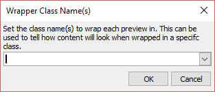
When prompted, enter the class name(s) to wrap the preview for each part. Try one or more of the following class names:
- Class Name
- Description
- compact
Shows the theme as rendered using a more compact design.
- panelHeader
Shows parts as they would appear rendered inside a panel header.
- panelFooter
Shows parts as they would appear rendered inside a panel footer.
- pulse
Renders the theme with the pulse effect applied. The preview is interactive. Click on various parts to see how the pulse effect is applied to them.
Click on the Adjust tab to preview the style.
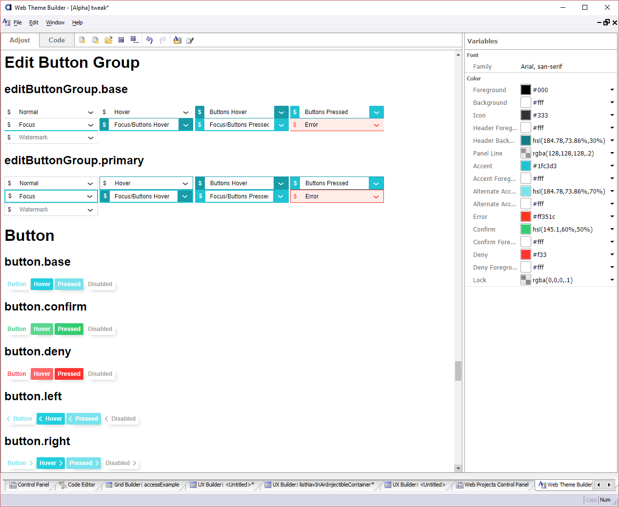 Previewing parts wrapped in the "compact" class.
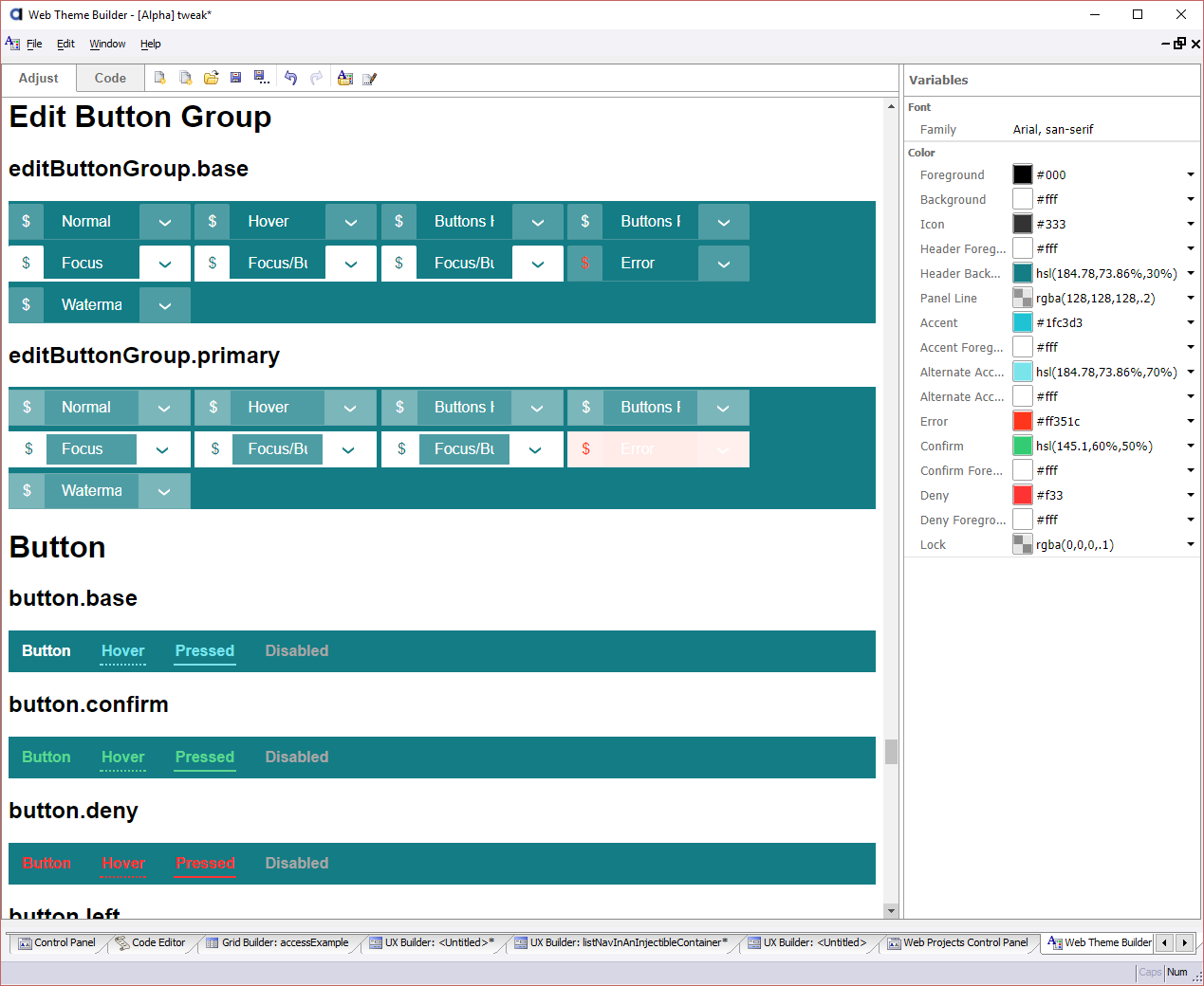 Previewing parts wrapped in the "panelHeader" class.