How to make Alpha Theme SVG Icons Resizeable in Applications
Description
The Alpha and Alpha-* inherited web themes include several CSS classes used for styling SVG icons included in your application.
Discussion
When you select an SVG Icon, you must also assign styling to the icon, such as fill or stroke colors, so the icon is displayed the way you want it to appear in your application. The Alpha theme and Alpha-* Inherited themes (which are based on Alpha) include several classes with pre-defined styling for use with SVG Icons. These classes include:
- Class
- Description
- icon
Default styling for SVG icons in the Alpha theme.
- iconSizeable
Uses same styling as icon, however SVG icon can be resized.
- iconDisabled
SVG icon color is rendered 25% lighter, giving it the appearance of being disabled.
In most cases, using the icon style is sufficient to render an SVG Icon in applications using Alpha. However, if you wish to add an SVG Icon that is rendered larger or smaller than the icons in the Alpha theme, you must use the iconSizeable class, not icon. icon has a fixed width and height while iconSizealbe is dynamically sized.
The section below walks you through how to insert a resizeable SVG Icon using the image picker in Alpha Anywhere.
How to Insert an SVG Icon that is Resizeable
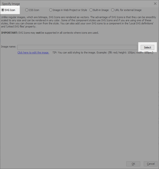
In the Specify Image dialog (used when specifying image properties for controls), select SVG Icon and click the Select button.
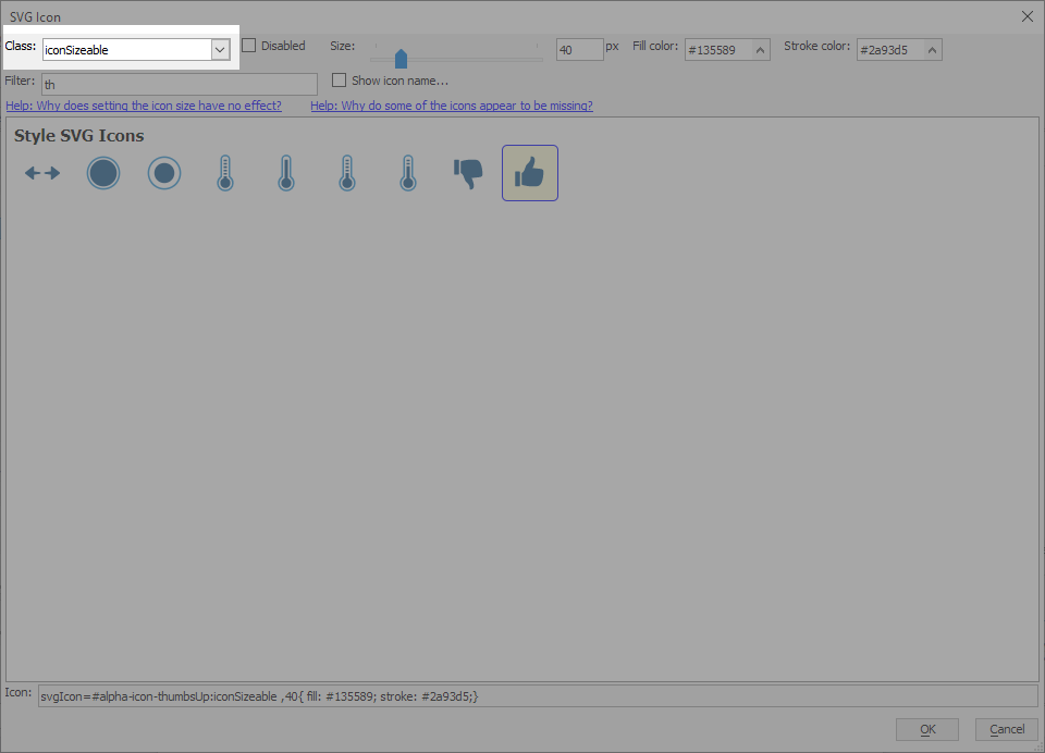
In the Class text box, enter iconSizeable. Use the Size control to choose a size for your icon. Alternatively, you can specify a CSS class you created that sets the size (width and height.) Multilple CSS classes can be specified with a space between each class name.
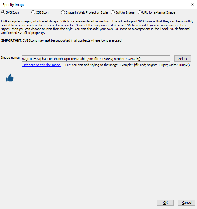
Select the SVG icon you want to insert and click OK to add it to your project.
Adding iconSizeable to Your CSS
If your style does not have a the .iconSizeable class, you can add it your component or theme by copying the CSS below into the Style Tweaks or Local Component CSS.
.iconSizeable {
    vertical-align: middle;
    width: auto;
    height: auto;
    fill: #333;
    stroke: #333;
}
Videos
SVG Icons
SVG Icons have many benefits over bitmap images and font icons. In this video we introduce you to SVG icons and show how they can be used in your components. Topics that we will cover include adding and styling SVG Icons, importing SVG Icons into a component, creating and linking external SVG Icons files into components, and using SVG Icons in a menu List.
See Also