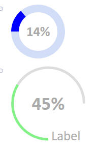
Circular Progress Indicator
Description
Displays progress for an event using a circular progress bar.
Discussion
The Circular Progress Indicator action creates and displays a numeric value as a circular progress indicator, or gauge. This value can be read from a control. The progress indicator can be placed in a [Placeholder] control or DIV defined in the component.
Circular Progress Builder
The Circular Progress Builder allows you to customize the progress indicator, including:
- Defining color ranges to indicate progress.
- Customize the size and width of the control.
- Configure the start and end angle for the progress bar.
- Add labels, units, and more.
Color - complete
The color for the completed portion of the progress indicator. The color can be a single color (e.g. #834187) or a range of colors. A color range is specified as a CR-LF delimited list of pipe separated value-color pairs. Values that fall within a range will use the specified color. For example:
20|red
30|yellow
green
In the above example, values less than or equal to 20 will be red, between 20 and 30 yellow, and above 30 green.
Use the Insert color... URL to insert a color using the Color Picker.
Color incomplete
The color shown for the portion of the progress indicator representing the remaining progress.
Thickness (pixels)
The width of the circular progress bar.
Size (pixels)
The diameter of the progress indicator. This is the height and width of the control.
Start angle
The angle of the starting position of the progress indicator. The 12 o'clock position is 0. A positive value specifies an angle in the clockwise direction from 0. A negative value specifies an angle in the counterclockwise direction from 0.
End angle
The angle of the ending position of the progress indicator. The 12 o'clock position is 0. A positive value specifies an angle in the clockwise direction from 0. A negative value specifies an angle in the counterclockwise direction from 0.
Value show
If checked, the value of the progress indicator is shown in the center of the control.
Value suffix
Shown when Value show is checked.
Text shown after the value.
Value style
Shown when Value show is checked.
The CSS to apply to the value.
Control label show
If checked, a label is shown for the control.
Control label text
Shown when Control label show is checked.
The control's label text.
Control label style
Shown when Control label show is checked.
The CSS to apply to the label. This property can be used to position the label.
Placeholder or div
The name of a Placeholder control or DIV id where the progress indicator will be displayed. To specify a DIV, use this syntax:
DIV:div_id
For example, to display the progress indicator in a DIV tag with the id "progress":
DIV:progress
Read control value from
The control that contains the value to display in the progress indicator.
Videos
Displaying progress using a circular progress display
A common requirement in many applications is to display progress for some task. The circular progress indicator, or gauge, is a very easy and attractive way to display progress.
In this video, we show how to add progress indicator controls to a UX component.
See Also
