{grid.object}dropDownMessage Method
Syntax
{grid.object}.dropDownMessage(type, title, body, [width, [okButtonLabel, [cancelButtonLabel, [onOK, [onCancel, [location, [animationStyle]]]]]]]);
Arguments
- typestring
The message type. Can be 'message', 'confirm', or 'wait'.
- titlestring
The message title. Displays in bold.
- bodystring
The message body.
- widthstring
Message box width. Defaults to 400px.
- okButtonLabelstring
The label for the OK Button (applies to 'message' and 'confirm' types.)
- cancelButtonLabelstring
The label for Cancel Button (applies to 'confirm' type.)
- onOKfunction
Javascript function to call when the OK button is clicked.
- onCancelfunction
Javascript function to call when the Cancel button is clicked.
- locationstring
Determines where the drop down message is shown. Option are 'top', 'bottom', and 'center'. If 'top' or 'bottom' an optional offset (in any absolute CSS units) can be specified. For example, 'top + 50px' - will display the dropdown message 50px from the top of the screen.
- animationStylenumber
Applies to 'wait' type. can be 1 or 2. Defines the type of spinner that the message will display. Defaults to 1.
Description
Shows a dropdown message.
Discussion
This method can be used to show a dropdown message. Three styles of dropdown messages are available:
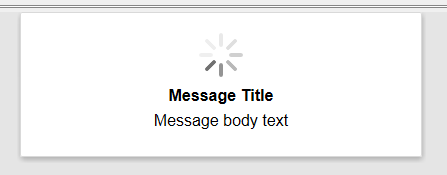
- wait - displays a spinner. Does not have any buttons and therefore cannot be closed by the user. Must be closed programmatically. See the {grid.object}.dropDownMessageHide() method.
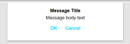
- confirm - displays a message with OK and Cancel buttons. You can define the event handler for both buttons.
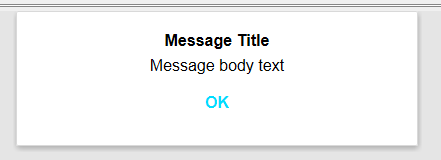
- message - displays a message with an OK button.
var dropDownType = 'confirm';
var title = 'Message Title';
var msgBody = 'Message body text';
var width = '400px';
var oKButtonLabel = 'OK';
var cancelButtonLabel = 'Cancel';
var onOK = function() { alert('pressed ok'); };
var onCancel = function() { };

 {grid.object}.dropDownMessage(dropDownType,title,msgBody,width,oKButtonLabel,cancelButtonLabel,onOK,onCancel);
See Also