Button Properties
- Setup Properties
- Object Name
- Label
- Style
- Enable Password
- Fly-over Effects Set Fly-over Appearance
- Status Bar text
- Always on Top
- Hide
- Tab Stop
- Disable
- Alignment Properties
- Horizontal Alignment
- Vertical Alignment
- Word Wrap
- Border Properties
- Border Style
- Border Color
- Border Edge Shape
- Border Width
- Show Left, Right, Top, Bottom
- Shadow Style
- Shadow Color
- Background Style
- Fill
- Font Properties
- Face
- Size
- Bold, Italic, Underline, Strikeout
- Color
- Dimension Properties
- Left
- Top
- Width
- Height
- Anchor
- Help Properties
- Bubble Help Text
- Help Source File
- Topic Name
- Chapter Name
- Topic Name
Description
A list of button properties.
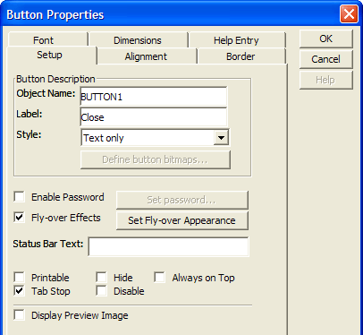
Setup Properties
Object Name
Any text description that you wish.
:formname.controlname.object.name as C
Label
The text that appears on the button.
:formname.controlname.text as C
Style
A button can have text, a bitmap, or text and a bitmap.
:formname.controlname.btn_appearance as C
Enable Password
Checking Enable password enables the Set password button, which displays the Set Button Password screen.
Fly-over Effects Set Fly-over Appearance
Check Fly-over Effects and click Set Fly-over Appearance to set horizontal alignment, vertical alignment, border, fill, font, and shadow properties to take effect when the cursor is above the button. Fly-over properties are not settable through Xbasic.
Status Bar text
The text that appears on the Status Bar when the button is clicked.
Always on Top
When checked the button is always on the top-most level of the form layout. No other form elements will over lap it.
:formname.controlname.object.always_on_top as L
Hide
When checked the button becomes invisible.
:formname.controlname.object.visible as L
Tab Stop
When checked causes allows the user to tab to the button.
:formname.controlname.object.tabstop as L
Disable
When checked the button becomes inaccessible.
:formname.controlname.object.enabled as L
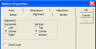
Alignment Properties
Horizontal Alignment
Determines whether the button label will be left, right, or center aligned.
:formname.controlname.align as C
Vertical Alignment
Determines whether the button label will be top, bottom, or center aligned.
:formname.controlname.vertical_align as C
Word Wrap
Determines whether the button label may wrap to move than one line.
:formname.controlname.word_wrap as L
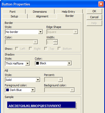
Border Properties
Border Style
Sets the border line style.
:formname.controlname.border.style as C
Border Color
Sets the border line color (using a color name or RGB value ).
:formname.controlname.border.color as C
Border Edge Shape
Sets the shape of the border.
:formname.controlname.border.style as C
Border Width
The width of the border line in pixels.
:formname.controlname.border.width as N
Show Left, Right, Top, Bottom
For edge shape "Square" determines which sides of the rectangle will display. For other edge shapes, determines which corners will be square or styled.
:formname.controlname.border.has_bottom_edge as L
:formname.controlname.border.has_left_edge as L
:formname.controlname.border.has_right_edge as L
:formname.controlname.border.has_top_edge as L
Shadow Style
Determines how much the shadow will be offset and its degree of shading.
:formname.controlname.shadow.style as C
Shadow Color
Sets the shadow color (using a color name or RGB value ).
:formname.controlname.shadow.color as C
Background Style
The fill color mode and translucency of the control's background.
:formname.controlname.Background_style as C
Fill
The style and color(s) of the control's background.
:formname.controlname.fill.backcolor as C
:formname.controlname.fill.forecolor as C
:formname.controlname.fill.style as C
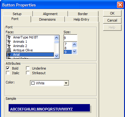
Font Properties
Face
Sets the font.
:formname.controlname.font.name as C
Size
Sets the point size.
:formname.controlname.font.size as N
Bold, Italic, Underline, Strikeout
When checked set the named attribute.
:formname.controlname.font.bold as  L
:formname.controlname.font.italic as L
:formname.controlname.font.strikeout as L
:formname.controlname.font.underline as L
Color
Sets the text color.
:formname.controlname.font.color as C
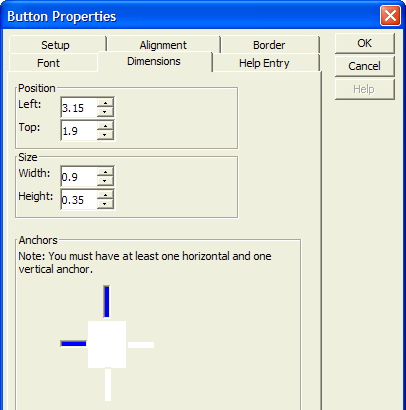
Dimension Properties
Left
Sets the horizontal position of the control.
:formname.controlname.object.left as N
Top
Sets the vertical position of the control.
:formname.controlname.object.top as N
Width
Sets the width of the control.
:formname.controlname.object.width as N
Height
Sets the height of the control.
:formname.controlname.object.height as N
Anchor
Determines the way the tabbed control will or will not stretch as the base form is resized. Possible attachment points are: 1 = top and right 2 = top, left, and right 4 = bottom and left 5 = bottom and right 6 = bottom, left, and right 8 = top, bottom, and left 9 = top, bottom, and right 10 = top, bottom, left, and right
:formname.controlname.object.anchor as N
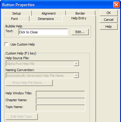
Help Properties
Bubble Help Text
Click Edit... to define the bubble help text that appears when you place the cursor over the control.
:formname.controlname.bubble_help as C
Help Source File
The path to and name of the compiled help file that contains the help topics.
:formname.controlname.help_filename as C
Topic Name
The name of the help topic in a compiled help file.
:formname.controlname.help_topic as C
Chapter Name
The name of the chapter name in an Alpha Anywhere help file.
:formname.controlname.chapter_name.help_topic as C
Topic Name
The name of the help topic in a compiled help file.
:formname.controlname.settings.help_title as C
See Also