Button Setup
Description
The properties involved in button setup.
Properties:
The Setup properties define the basic structure and look of a button.
Object Name
The name by which Alpha Anywhere will recognize this object. The name must be unique. Use the Genie's suggestion, or create your own name. This text does not appear on the button.
Label
Text that appears on the face of a button.
Style
How a button appears on screen. Choose from a variety of text and picture options. If you select one of the Bitmap Options, you'll need to specify an image to use by pressing the Define Button Bitmaps button.
Define Button Bitmaps
When you press the Define Button Bitmaps button, the Define Picture dialog appears, prompting you to identify the image to use. There are two tabs on the Define Picture dialog which refer to the state of a button:
Select the image type to use:
Embedded
Stores the images in your database.
File
Browse for the image. Alpha Anywhere will store the path information as an Image File Reference.
Internal
An image that is included in the Alpha Anywhere Software. This is the most economical choice, as it expends the least amount of resources.
Password
You can password-protect the actions you assign to a button. Use this feature to allow/disallow access to "administrator level" functions. To enable password-protection, check the check box and press the Set Password button. The Set Button Password dialog appears.
When the button is pressed at run time, the user will be prompted for the password:
Submitting the wrong password results in a "permission denied" message and the button's assigned actions will not execute.
If you disable the password feature, you'll be prompted to enter the existing password in order to disable it. Once disabled, the password for the button is deleted.
Other Properties
The check boxes at the bottom of the Setup tab let you specify additional features of a button. The following describe the result of activating (checking) these features:
Printable
When you print a the Form, the button appears on the print-out.
Tab stop
The button can receive focus using the tab key.
Hide
The button is not displayed on the Form.
Disable
Pressing the grayed-out button produces no result.
Always on top
The button is always on the top-most level of the form layout. No other form elements will over lap it.
Fly-over Effects
Enables appearance changes when the mouse is over the button. When selected, click the Set Fly-over Appearance button to edit the fly-over properties.
Display Preview Image
A preview of the currently configured button is shown in the dialog.
A preview of the currently configured button is shown in the dialog.
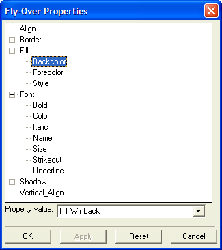
Use the property lists and Property Value to specify how the object should appear when the mouse is over it.