Tabbed Control Properties
- Setup Properties
- Object Name
- Tab Placement
- Tab Style
- Tab Appearance
- Printable
- Tab Stop
- Disabled
- Hide
- Horizontal Text
- Fixed Tab Width
- Always on Top
- Transparent Background
- Bold Current Tab Label
- Tab Height Tab Width
- Side Angle
- Tab Properties
- Tab Text
- Selected Color Unselected Color Page Color
- Change Image
- Font Properties
- Face
- Size
- Bold, Italic, Underline, Strikeout
- Color
- Dimension Properties
- Left
- Top
- Width
- Height
- Anchor
Description
The following Tabbed Control properties can be changed at run-time. After any operation that changes the size of the control or placement of the tabs, you should reset the control's height or width, either to the same or a new value, to complete the operation.
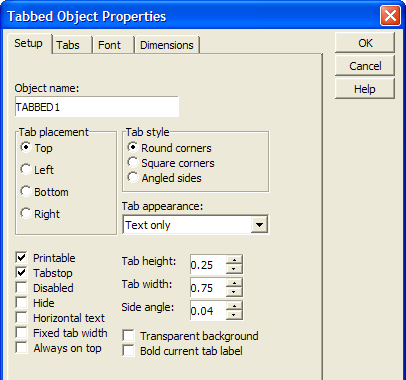
Setup Properties
Object Name
The name of the control.
:formname.controlname.object.nameas C
Tab Placement
Sets the location of the tabs on the control. Possible values are: "top", "bottom", "left", "right".
:formname.controlname.Tabs.Tab_position as N
Tab Style
Sets the style of the tabbed control's corners. Possible values are: "Round corners", "Square corners", "Angled sides".
:formname.controlname.Tabs.Tab_style as C
Tab Appearance
Sets the style of the tabs' labels. Possible values are: "text", "bitmap", "text&bitmap", "bitmap&text", "text/bitmap", "bitmap/text".
:formname.controlname.Tabs.Tab_appearance as C
Printable
Determines whether the tabbed control is printable.
:formname.controlname.Object.Printable as L
Tab Stop
Determines whether you can tab to the control.
:formname.controlname.Object.Tabstop as L
Disabled
Enables or disables the tabbed control.
:formname.controlname . Object.Enabled as L
Hide
Displays or hides the tabbed control.
:formname.controlname.Object.Visible as L
Horizontal Text
When tabs are positioned to the left and right sides of the tabbed control, Alpha Anywhere rotates the tab labels so they are written vertically. The horizontal text setting forces text to be written horizontally, regardless of the location of the tabs.
:formname.controlname.Tabs.Horizontal_text as C
Fixed Tab Width
Determines whether all tabs will have the same width, or will be sized to fit their labels.
:formname.controlname.Tabs.Tab_fixed_width as L
Always on Top
When checked the control is always on the top-most level of the form layout. No other form elements will over lap it.
:formname.controlname.object.always_on_top as L
Transparent Background
Sets the fill color of the tab control to transparent.
:formname.controlname.Tabs.Transparent_background as C
Bold Current Tab Label
Sets the character styles used for the tabs' text labels. .Tab_bold_current only works if .Bold is set to FALSE.
:formname.controlname. Tabs.Tab_bold_current as L
Tab Height Tab Width
Sets the width and height of the tab control's tabs. . Width is only used when .Tab_fixed_width is set to TRUE.
:formname.controlname.Tabs.Width as N
:formname.controlname.Tabs.Height as N
Side Angle
Sets the slant of the tabs' sides. .Width_delta is only used when .Tab_style is set to "Angled sides".
:formname.controlname.Tabs.Width_delta as N
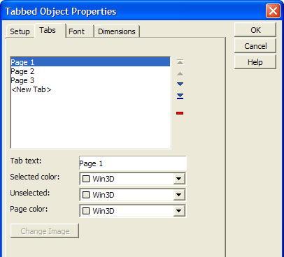
Tab Properties
Tab Text
Sets the text label of a tab.
:formname.controlname.Tabs.SheetN.Text as C
Selected Color Unselected Color Page Color
Sets the colors of the tab control's body and tabs in selected and unselected modes. Refer to A5.COLOR_ENUM().
:formname.controlname.Tabs.SheetN.Pagecolor as C
:formname.controlname.Tabs.SheetN.Selectedcolor as C
:formname.controlname.Tabs.SheetN.Unselectedcolor as C
Change Image
If the style of the tab label uses an image, the Change Image button is enabled. Sets the image used for the tab's label. A replacement image must be from the same library as the original image.
:formname.controlname.Tabs.SheetN.Hbitmap.bmptag as C
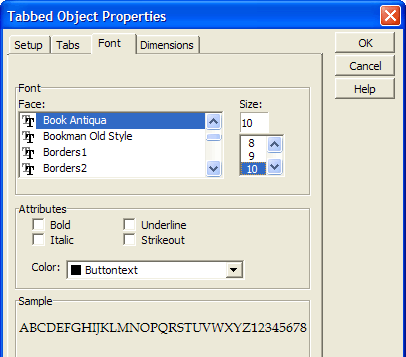
Font Properties
Face
Sets the font.
:formname.controlname.tabs.font.name as C
Size
Sets the point size.
:formname.controlname.tabs.font.size as N
Bold, Italic, Underline, Strikeout
When checked set the named attribute.
:formname.controlname.tabs.font.bold as L
:formname.controlname.tabs.font.italic as L
:formname.controlname.tabs.font.strikeout as L
:formname.controlname.tabs.font.underline as L
Color
Sets the text color.
:formname.controlname.tabs.font.color as C
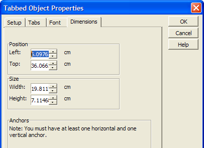
Dimension Properties
Left
Sets the horizontal position of the control.
:formname.controlname.object.left as N
Top
Sets the vertical position of the control.
:formname.controlname.object.top as N
Width
Sets the width of the control.
:formname.controlname.object.width as N
Height
Sets the height of the control.
:formname.controlname.object.height as N
Anchor
Determines the way the tabbed control will or will not stretch as the base form is resized. Possible attachment points are: 1 = top and right 2 = top, left, and right 4 = bottom and left 5 = bottom and right 6 = bottom, left, and right 8 = top, bottom, and left 9 = top, bottom, and right 10 = top, bottom, left, and right
:formname.controlname.object.anchor as N
See Also