Creating Help Windows for Components
- HelpID
- Creating a Help ID:
- Help Source
- Define a Help Source:
- Make a global project-level HelpTopics table:
- Procedure:
- Edit Help Text
- Create a Help Text:
- Special Command Directives
- Add a Window Size Directive:
- Language Directives
- Conditional Directives
- Add a Conditional Directive:
- Custom Help Windows in Action Javascript
- Custom Help For Individual Fields
Description
Covers a number of topics. Some of the subjects included are: creating a Help ID, defining a help source, making a global project-level HelpTopics table, creating a editing a help text, using action javascript in a help page, and creating custom help for individual fields.
HelpID
The HelpID is what allows the help for an item in your component to be located in the Help table. To find the HelpID in the UX Builder, go to the Design tab and in the Design menu under UX click on Controls. Select a control that has been created for your project and the look at the Controls page Properties list on the right. Find the Field Properties section in the Properties list and select the Has help property. The HelpID will open directly underneath the Has Help property.
In the Grid Builder you can find the HelpID in the Design tab by going to Grid, under the design page menu, and selecting the Properties page. Scroll down the list of Properties to the Record Navigator/Grid Toolbar properties list. Find the Help Window property and select it. The Help ID property will appear underneath Help Window. Note: If you have a grid Search Part or a Grid Detail Part then you can define help tables for those parts as well. In this case go to the Search > Properties page or the Detail View > Properties page and find Help ID listed there under Search Options (for the Search Part) or Display Options (for the Detail View Part).
Click the button '...' next to the HelpID property to open the Help ID dialog box. The Help Id dialog links to several powerful tool sets that make creating dynamic Help pages quite easy. The Edit Help Text for this Help Id button opens a text editor for your help pages that lets you shape the HTML in your help table to your liking and also insert special command directives. This in turn lets you create different help for different users, more on that later. The Browse Existing Help Topics button opens a dialog that lets you see all of the Help topics that you have created for your project, and easily link them to any given help event. The Define Help Source opens the Define Source for Help Text dialog.
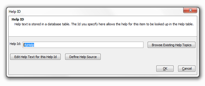
When the Help ID dialog opens the Help Id: textbox in the dialog will probably be blank. You can use any string for the Help Id: the Id is there simply to identify the help text. If you type in the Help Id: and then click Edit Help Text for this Help Id, you should get an error stating that you have not yet defined the Help Source.
Creating a Help ID:
Type a string into the Help Id: text-box.
Click Define Help Source, define the table you will use for your help (see Help Source).
Add Text to your Help Id by clicking Edit Help Text for this Help Id. (see Edit Help Text)
Alternatively, add an existing help topic by clicking the Browse Existing Help Topics button.
Click OK. Below is a picture of the Help ID:
When you click on the Help Window property that opens the Help ID, additional Help properties become available under Help ID. Help button icon gives you the ability to change the help icon. Unless stated otherwise, the help icon normally appears as a standard question mark on your components.
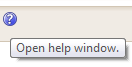
You can load the help icon you want to use by clicking on the button '...' and opening the Specify Image dialog, where you can enter the URL, built-in image, file path, or CSS icon of your choosing. Another useful property that opens along with Help ID is the Help button bubble help property.

This is the text that appears when you hover over the help icon.
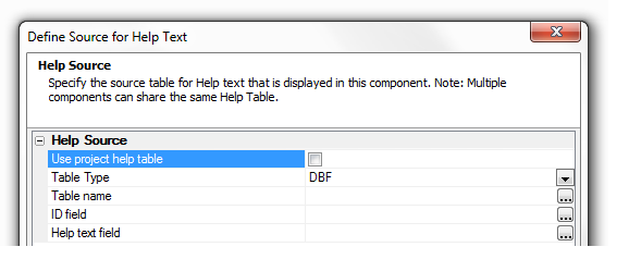
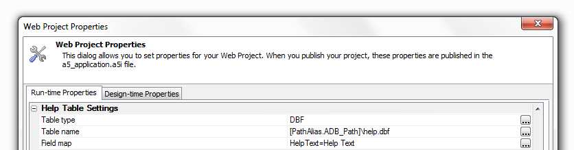
Help Source
The Help Source is the table where your help text is defined. You can use either DBF or SQL tables for your help definition. The Define Source for Help Text dialog is accessible directly from the HelpID property dialog when you click the Define Help Source button. You can access the Help Source in the UX Builder go to the Design tab. In the Design page menu click on UX Properties. Scroll down the properties list until you get to the 'Other' properties list. In the Other properties list find the Help Table definition property and click on the button '...' at the end of the row. This will load the Define Source for Help Text dialog.
To get to the same place in the Grid Builder go first to the Design tab. Under the Design menu tree find Grid and then Properties. Click on Properties and scroll down the Properties list until you get to Miscellaneous properties. You will find the Help Table definition listed here. Click the button '...' at the end of the row to open the Define Source for Help Text dialog.
Define a Help Source:
Open the Define Source for Help Text Dialog. The Help Source:
Type a string into the Help Id: text box
Click Define Help Source.
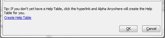
If you don't want to use a globally defined help table leave Use project help table unchecked.
If you want Alpha Anywhere to Create a Help Table for you click the Create Help Table button at the bottom of the screen. The Create Help Table Button
Alternatively, use the dropdown button to select either a DBF or SQL table for your Table Type. With SQL you will also need to define a Connection String.
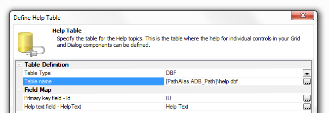
Click the Button '...' next to Table name to choose a help table from existing tables in your project.
Click the Button '...' next to ID field to select an ID field from existing fields in the table you selected.
Click the Button '...' next to Help text field to select a helptext field from the table you selected for you help.
Click OK.
Make a global project-level HelpTopics table:
In Alpha Anywhere you can define either a global project-level HelpTopics table or custom help topics tables for each component that you create. The global project-level HelpTopics table can be set in the Project Properties page in the Web Project Control Panel. In the Define Source for Help Text dialog, you can check Use project help table to use a global project-level HelpTopics table, or uncheck this box to define a different help table.
Procedure:
Set the global project-level HelpTopics table in Web Project Properties
Check the Use project help table checkbox in the Define Source for Help Text dialog.
Edit Help Text
The Edit Help Text dialog allows you to enter the HTML text that will be used in your help. You can access the HTML editor from this dialog simply by clicking the Edit in HTML Editor button at the bottom of the screen. This makes it easy to add images, change the text of your document, add hyperlinks, control the justification on text, and change the font type, color, and size. The Edit Help Text dialog also has a second more powerful feature. Namely, it lets you add directives to your help text. This makes it possible to create different help text for different users. For example, you can switch between different languages in your help simply by activating a Language Directive. You can also create Conditional directives that require a condition you set to be true before a user can access a certain help text. Alpha Anywhere allows you nest these conditional directive one inside another.
Create a Help Text:
Open the Help ID dialog. Create a string for the Help Id: textbox and define you Help Source.
Click the Edit Help Text for this Help Id button.
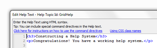
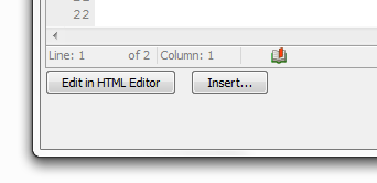
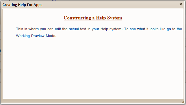
The Edit Help Text - Help Topic Id: Dialog will open. Fill in any HTML you wish to appear in your help. Add text to your help with HTML:
Optionally, open the HTML Editor by pressing the Edit in HTML Editor button.
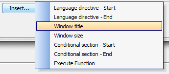
Optionally, add special command directives to make your help more dynamic by clicking the Insert button. Insert adds Command Directives
Special Command Directives
When you create the HTML help for a help topic, you can include the following directives in the text.
{LanguageStart:language name}
{LanguageEnd}
{WindowTitle: title text}
{WindowSize: width, height}
{ConditionStart: condition ID: logical expression}
{ConditionEnd: condition ID}
{ExecuteFunction: function name}
These directives let you define parts of your help system that can be turned on or off as needed. For example, by setting a Language directive to be active, you can make your Help System access text that only pertains to that directive. This gives you the ability to swap out different languages in your help system. The WindowSize directive lets you override the size of your help window. If you define a Window Size directive inside a Language directive, then when the Language Directive is active that WindowSize directive will also be active.
{WindowTitle: title text}
This directive takes control of the window title for a help window. You can nest WindowTitle directives inside other directives and thereby change the title of the window depending on which directive is active. Here is how you create a Window Title directive...
Add a Window Title Directive:
Open the Edit Help Text - Help Topic Id: Dialog.
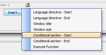
click the Insert button and choose the directive you want from the drop-down menu, this example uses Window title. Directive Menu
Replace the default entry in the directive with relevant data. In this case enter a new title.
Before:

After:

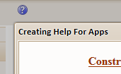
Click Save. If you go to Working Preview you should see a Window Title in your help dialog when you load it. Window Title.
{WindowSize: width, height}
The Window Size directive allows you to override the default window size and set a custom window size. Use CSS syntax for the size. Specify width and height. Example: {WindowSize: 6in,3in}
Add a Window Size Directive:
Open the Edit Help Text - Help Topic Id: Dialog.
Click the Insert button and choose the Window size directive.
Replace the filler text in the directive with the Width and Height you want.
Before:

After:

Click OK, and OK again, and Save. Go to the Working Preview to see your new Help dialog. A 6" Wide by 3" Tall Help Created with a Window Size Directive
Language Directives
{LanguageStart:language name} and {LanguageEnd}
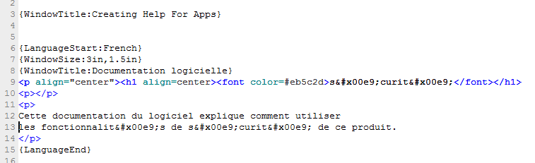
The language command directive helps create very dynamic help systems that function in different languages. A language command directive begins with a Language directive -Start tag and ends with the Language directive - End tag. All the information between these two language tags will be used in your help system when that language is active. If there is text outside a language directive than this text will be used as the default help text. The default help text will be used if no language is set to active or if the active language is set to . It is possible to place additional directive tags within your language tags, they will activate when that language tag is active. For example, you can place a Window title directive inside a Language directive that will work when that language directive is active. In the Grid Builder, the active language can be set from the Server-Side Events page under Code. Go to this page and under OnGridExecute you can add the required code to activate the language you want. You can use e.tmpl.ActiveLanguage = "French" or, if you want a special protected session variable, session._protected._activeLanguage = "French" to activate your language directive (in this case French). You can also set this property in the 'Override Settings' in the A5W page that loads you component.
Add a Language Directive
Open the Edit Help Text - Help Topic Id: Dialog.
Click the Insert button and choose the Language directive - Start.
The {LanguageStart:Enter_Language_Name_Here} directive will appear in the "Edit Help Text - Help Topic ID" Dialog
Delete the filler text in the directive and replace it with the name of the language you want to use. For example {LanguageStart:French}
Click Insert a second time and select Language directive - End. Your code should look something like this.
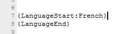
Everything inside these two language tags will be used when this language is active. Fill in the HTML and directives that you want to use. The French Language Directive
Now you need to activate the Language Directive. Go to the Design page menu and under Code select the Server-Side Events page.
From the list of Server-Side Events select OnGridExecute, it should be near the top of the list.
Copy and paste the following code into the OnGridExecute code displayed. If you identified a different language in {LanguageStart: } then use that instead of French.
e.tmpl.ActiveLanguage = "French"
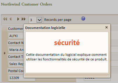
Go to the Working Preview and see the result. Success!
Conditional Directives
{ConditionStart: condition ID: logical expression} and {ConditionEnd: condition ID}
Like language directives, conditional directives can also be used to create highly dynamic help systems. They can, for example, be used to display entirely different help pages for someone who logs on to an application as an administrator versus someone who is in a managerial role. As with the Language Directive the Conditional Directive has both a ConditionStart and ConditionEnd tag. Unlike the Language Directive, the ConditionEnd tag must have the same id as the ConditionStart tag. This feature gives you the ability to nest Condition Clauses is very powerful ways.
Add a Conditional Directive:
Go to the Grid > Properties page, find the Record Navigation/ Grid Toolbar properties.
Check the Help Window box and open the Help ID property with the row button '....

Click the Edit Help Text for this Help Id button and open the Edit Help Text - Help Topic Id: Dialog.
Click the Insert button and choose the Conditional section - Start tag. Click on it to insert it in the dialog.
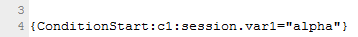
In the dialog, replace the filler text 'Enter_Condition_Id' in Condition section - Start tag with a unique id like 'c1' or any arbitrary string.
Before:

After:

Replace the 'Enter_condition_Expression' filler text in Condition section - Start with a condition to be tested, like session.var1="alpha"
Before:
After:
Add the help text, images, hrefs, ect... that you want to be displayed when the condition above is met.
Click the Insert button again and select the Conditional section - End tag.
Replace the filler text 'Enter_Condition_Id' in the Conditional section - End tag with the same id you entered for the Conditional section - Start tag.
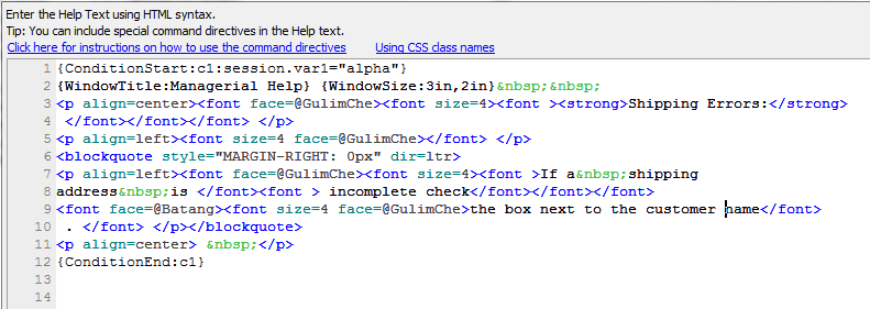
Click OK to exit the Edit Help Text - Help Topic Id: dialog. Click OK again to exit the Help ID dialog.
Since version 10 the security on session variables has changed. As a result if you try to activate the above code directly in your browser the Alpha Server will likely throw a 400 Error message. You will therefore need to use server-side Xbasic code to activate the Conditional directives above. There are multiple ways to go about doing this. The instructions below show how this can be done using an Action Button.Activate a Conditional Directive with an Action Button:
Now that you have defined a Conditional directive you need a way to activate it. In your Properties list, scroll down to Action Buttons and click the button '...'.
The Action Button Editor will open. Give your Action button a Name property, use the name SETGROUP
Under the Button Action property click the Javascript property button '...'.

The Edit OnClick Event dialog will appear. Click the Add New Action button.
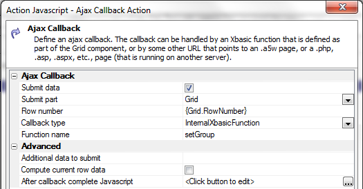
In the Action Javascript - Select an Action dialog, scroll down the Actions list on the Right and click on Ajax Callback.
Click OK.
The Action Javascript - Ajax Callback Action dialog will open. Under the Function Name property type setGroup. Click OK and Save.
Under the Button Appearance properties write 'Set Group' next to the Button text property.
Click OK to close the Action Javascript Editor.
In the Grid>Properties page Properties list Scroll down to the Freeform Edit Regions properties. Click the button to the right of the Above grid property.
In the Freeform Edit Regions dialog you should see a list of Available Placeholders with {ActionButton:SETGROUP} at the top of the list.
Double click on {ActionButton:SETGROUP} to add it to the HTML on the right. This will make your action button visible. Click OK to exit.

Now to link the action button with the Conditional directive. Go to the Design menu and under Code open the Xbasic Functions page. Copy and paste the following code into the Xbasic Functions page.
function setGroup as c(e as p)
session.var1 = "alpha"
end function
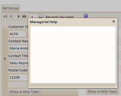
Go to Live Preview. Click Full Preview in the drop-down that opens. When your grid opens click on the Help icon. It will should load the default help. In this case the Default is empty
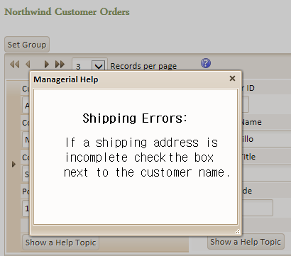
Now close the Help and click the Set Group action button that you defined. Go back and open the Help again. You should see you Conditional Directive text. The Conditional Dialog
 If you go back to the Design tab, open the Xbasic code Editor again and type session.var1="beta" in place of session.var1 = "alpha" then the help window will again appear empty if you click the Set Group button on your grid in the Live Preview. However, if you were to go back to the Help ID and define an additional Conditional directive called "beta", then all of the text for this directive would be loaded when you set session.var1="beta".
{ExecuteFunction: function name}
UDFs, or User Defined Functions, can return the result of a UDF as part of the text of the help window. This example will show how to create a new function that will return some dynamic text; that we would like to appear in the help window.
Add an Execute Directive:
In the Grid Builder, open the Design page and open the Grid Properties page.
Scroll down to the Miscellaneous properties and find the Xbasic function declarations property.
Click the button '...' next to Xbasic function declarations.
In the Xbasic Function Declarations dialog that opens enter the following code.
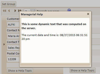
function myudf as c (e as p)
dim txt as c
txt = "
This is some dynamic text that was computed on the server."
txt = txt + "
The current date and time is: "+ now() + "
"

myudf = txt
end function
This function has to have a prototype that takes e as an argument so when this function executes this object e gets passed in and it contains request.variables and session.variable, and useful information. This udf will be called when the function text is fetched on the server.Go to the Grid > Properties page, find the Record Navigation/ Grid Toolbar properties.
Check the Help Window box and open the Help ID property with the row button '...'.
Click the Edit Help Text for this Help Id button and open the Edit Help Text - Help Topic Id: Dialog.
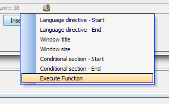
Click the Insert button and choose the Execute Function tag. Click on it to insert it in the dialog. The Execute Function Directive
In the Execute Function tag in the dialog, replace the filler text 'enter_function_name' with the function you just defined called myudf.
Before:

After:

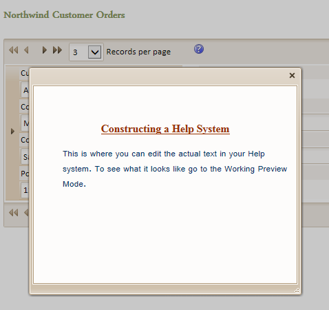
Now go to Working Preview tab or the Live Preview tab (using Full Preview from the drop-down) and click on one of your Help icons. When the help window is displayed you will see the directive has been replaced by the result of the call to the myudf function. You should see something like this...
Custom help feature pack to add custom help systems. Add a button to bring up a help page for a grid or help for individual fields that can be accessed through F1 key.
Custom Help Windows in Action Javascript
It is fairly straightforward to build help windows using action javascript. In this case you can access the Help Id property through the Javascript events listed in the Field Properties on the Grid > Fields page of the Grid Builder.
Using Action Javascript in a Help page:
On the Design tab menu go to the Grid list and click to open the Fields page
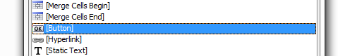
Click the Insert... text at the bottom of the Fields page. The Insert Special Control dialog will open
Click on [Button] and a button control will be added to your list.
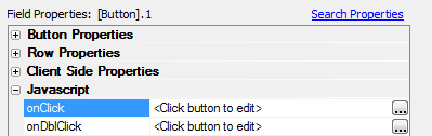
In the Field Properties list on the right go to Button Properties and in the Button label property row write 'Show a Help Topic'
Go down the Field Properties list to the Javascript properties. Select the onClick event property and click the button '...' next to it.
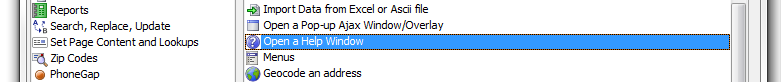
The Edit onClick Dialog will load. In the toolbar at the top of the dialog click the Add New Action button.
The Action Javascript - Select an Action dialog will open. Scroll down the Action list on the right and select the Open a Help Window action.
The Action Javascript - Display Help Topic in a Window will open.
Under Window Properties, go to the Help ID property and click the button '...' to open the now familiar Help ID dialog.
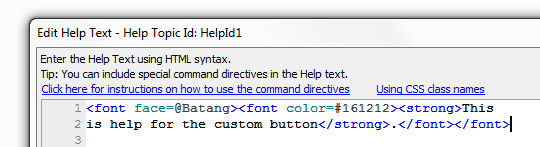
When the Help ID dialog opens place an id string in the Help Id: textbox, like HelpId1

Click the Define Help Source button and create a Help Source for your Help Id, if you don't already have one. The click on the Edit Help Text for this Help Id button and define some text for your help button.
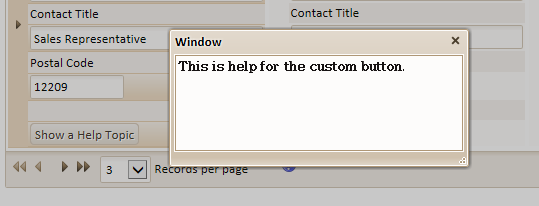
Click OK to close and click OK on the Help Id dialog to exit it as well.
Adjust the remaining Window Properties to shape your help window to your liking . Here you will find the standard properties that you see in all windows in action javascript. These properties let you set the type, size, and position of the window. You can also specify javascript events that take place if the help window gets moved, hidden, resized, and so forth.
Close, go to Working Preview and click on the Show a Help Topic button you created.
Custom Help For Individual Fields
So far this guide has mainly focused on accessing Help ID under the Grid > Properties menu. It should be noted , however, that you can add help to individual fields as well as you overall grid.
Add a Help Window to an Individual Field:
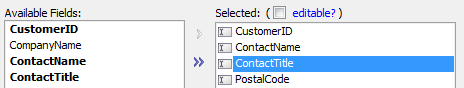
Go to the Grid Builder's Design page and under Grid click on Fields to open the Fields page.
Add a field to the Fields page Selected list. Then highlight that field. Making a Help Window for the ContactTitle field
With a field selected go to the Field Properties menu on the Right and find the Display Settings properties.
Under Display Settings find the Has Help checkbox and check it. This will open the Help ID. Click the button '...' to load the Help ID dialog and edit the field's Help.
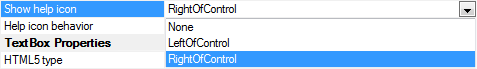
When you open the Has Help Window a Show Help icon property also appears. If you choose the default setting 'None' the only way to bring up the help will be to press the F1 key. Test it out in Working view. In a desktop application it is fairly well understood that F1 brings up help. However, in a web application this might be too subtle. You can make icon visible by clicking the dropdown button next to the Show help icon property and selecting either the RightOfControl or LeftOfControl option. Show help icon options
Once the icon has been made visible a property called Help icon behavior will appear underneath the Show help icon property. This allows you to either show a help window with either an OnClick event or a MouseOver event. If set to OnClick, when you click on the icon you will see the help.