This tutorial is deprecated and is not the best way to build mobile applications in Alpha Anywhere. Some portions of this tutorial are out of date. We strongly recommend you enroll in courses in the Alpha Software Learning Center to start learning Alpha Software.
Tutorial - Building the Sample Mobile Application
In this tutorial we will show you, step-by-step, how to create the sample mobile application that ships with Alpha Anywhere.
Some Background Information
Before we start the tutorial, let's just set the stage. The application we are going to build in this tutorial is based on the sample Northwind database that ships with Alpha Anywhere. This is a Microsoft Access database (Northwind.mdb). We chose to build the sample application using Northwind because so many developers are already familiar with the structure of this database.
NOTE: We are using a modified version of the Northwind database. Some image fields have been added to the Customer table.
If you are not familiar with Northwind's structure, don't worry. It's a simple database with tables for Customers, Orders, Order Details, Products, etc.
While Northwind is an Access database, the application we build would work in exactly the same way if your database is a MySQL, MS SQL Server, Oracle, Postgres or other supported SQL database.
In fact, if you prefer to follow along in this tutorial using another SQL database (such as MySQL) simply export the data in the Northwind.mdb file (in the MDBFiles folder where Alpha Anywhere is installed - typically <program files>\a5v12) to your SQL database. For more information about creating a MS SQL version of the Northwind sample database, please see these links: link1, link2, link3
The application covers tasks that are common to many different types of business applications. In the application we will cover tasks such as:
- Performing CRUD operations (create, update and delete actions) against tables in the database
- Searching for records in the database
- Showing related records (for example, showing all orders for a particular customer)
- Using the camera to take a picture, upload the picture to the server and store it in a record.
- Plotting a location on a map
- Creating a chart to display data
- Displaying reports.
You will notice that as you work through the initial lessons in the tutorial, we are focused on getting the basics of the application to work, rather than making it look like a mobile application. The initial lessons focus on creating a UX component to display data a SQL table, search for records, and then update records - the so called CRUD (create, update and delete) operations that are common to many business applications.
Once we have these basics all working, we start to 'mobilize' the application in lesson 8.
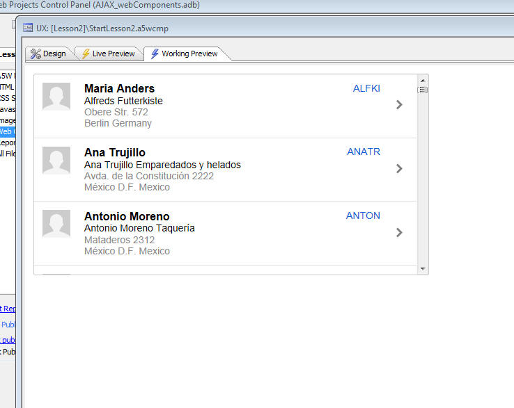
Lesson 1 - Creating a List to Show All Customers
In this lesson we will start off with a new UX component and we will add a List control to the component to show the customers in the Customer table in Northwind.
At the end of the lesson we will have created a simple UX component that looks like this:
Video Tutorial
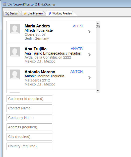
Lesson 2 - Adding Form Controls to the UX Component to View/Edit the Customer Data
In this lesson we will add controls to the UX component to allow us to edit the data in the Customer table.
At the end of the lesson our UX component will look like this:
Video Tutorial
NOTE: If you did not complete lesson 1, and want to start with this lesson, you can download the Lesson2_Start component to use as your starting point.
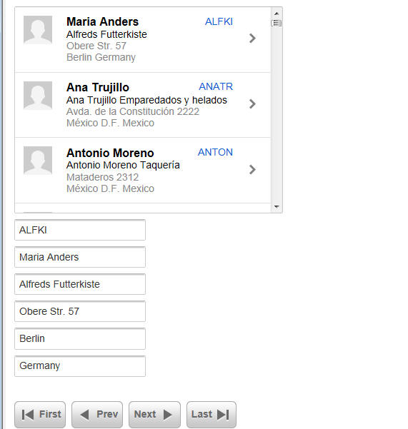
Lesson 3 - Binding the UX to a Table
In the previous lesson we showed how we add form controls to the UX component to edit records in the Customer table, but currently the UX component is not 'bound' to a database. So the controls on our UX component are not showing any data from the database.
In this lesson we will 'bind' the UX component to the Customer table in the Northwind database.
At the end of the lesson, our UX component will look like this and we will be able to scroll through the records in the Customer table by clicking on the record navigation buttons.
Video Tutorial
NOTE: If you did not complete lesson 2, and want to start with this lesson, you can download the Lesson3_Start component to use as your starting point.
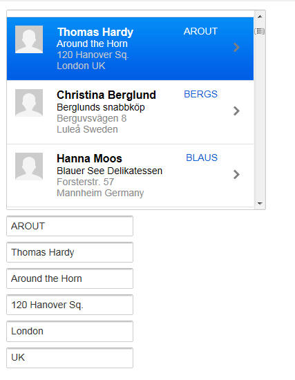
Lesson 4 - Navigating Records using the List Control
In the previous lesson we showed how the UX component could be bound to the Customer table in the Northwind database and then we placed buttons on the UX component to allows us to navigate from one record to another, showing data from the Customer table in the control on the UX component.
In this lesson we will show how the List control, which was added to the UX component in Lesson 1, can be used in place of the buttons to navigate through the records.
At the end of the lesson, our UX component will look like this and we will be able to navigate through the records by simply clicking on a row in the List and the data for the corresponding customer will be shown in the controls.
Video Tutorial
NOTE: If you did not complete lesson 3, and want to start with this lesson, you can download the Lesson4_Start component to use as your starting point.
Lesson 5 - Saving Changes to the Database
In the previous two lessons we learned how to bind the UX component to a database and how to configure the List control to act as a 'record navigator' so that we could navigate through the records in the Customer table by clicking on a row in the List control.
In this lesson we are going to learn how to save changes we make to fields in the Customer table. We will place Submit and Cancel buttons on the UX component to submit any edits we make to the server and we will write the server side code to save the edits to the Customer table (actually we won't have to actually write any code ourselves - we will use Server-side Action Scripting to write the code for us).
At the end of the lesson, your UX component will look like this, and you will be able to save edits you make to a Customer record by clicking the Submit button:

Video Tutorial
NOTE: If you did not complete lesson 4, and want to start with this lesson, you can download the Lesson5_Start component to use as your starting point.
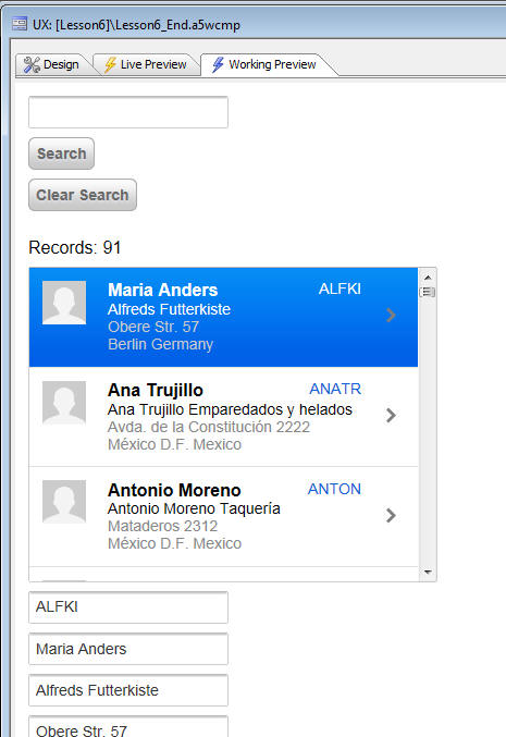
Lesson 6 - Searching the Customer Table - Adding a 'Keyword' Search Feature
In lesson 1 we added a List control to the UX component to show the customers from the Customers table in Northwind. The List shows all of the customers. In a real application with many hundreds, thousands, or even millions of records, it is essential to be able to search for particular customers.
In this lesson we show how you can add a 'keyword' search feature to find particular records.
NOTE: Alpha Anywhere allows you to create two kinds of searches - 'keyword searches', where multiple fields in the table are searched - for example search for the string 'smith' in the Lastname, City and Address fields. Or, 'explicit' searches, where you specify explicit search values for different fields - for example, search for records where Lastname is 'smith' and City is 'London' and Country is 'UK'.
At the end of the lesson, your UX component will look like this and you will be able to search the Customer table.
Video Tutorial
NOTE: If you did not complete lesson 5, and want to start with this lesson, you can download the Lesson6_Start component to use as your starting point.
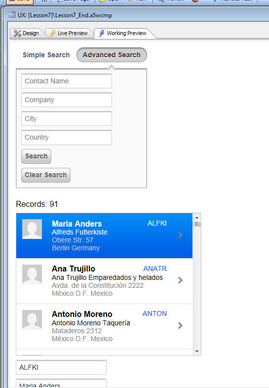
Lesson 7 - Searching the Customer Table - Adding an 'Advanced' Search Feature
In lesson 6 we added a keyword search feature to the UX component. In this lesson we will add an 'advanced' search feature that will allow the user to type in different search values for the ContactName, CompanyName, City and Country fields.
Both the simple search and advanced search features will be available and a tab control will allow the user to select which type of search they want to perform.
At the end of the lesson, our UX component will look like this:
Video Tutorial
NOTE: If you did not complete lesson 6, and want to start with this lesson, you can download the Lesson7_Start component to use as your starting point.
Lesson 8 - Mobilizing the Application - Adding 'Panels' to the UX Component
In lessons 1 through 7 we have designed some basic functionality for displaying records from a SQL database, searching and updating those records (the so called 'CRUD' actions). But at this point, our component does not 'look' or 'feel' like a modern, mobile application. It still looks and feels like a desktop web application.
In this lesson we will start to add Panels (Panel Cards, Panel Navigators and Panel Layouts) to our component to give it a mobile 'look and feel'.
At the end of the lesson, our component will look like this:
 |
 |
Video Tutorial
NOTE: If you did not complete lesson 7, and want to start with this lesson, you can download the Lesson8_Start component to use as your starting point.
Lesson 9 - Continuing to Mobilize the Component
In this lesson we continue to 'mobilize' our component.
Video Tutorial
NOTE: If you did not complete lesson 8, and want to start with this lesson, you can download the Lesson9_Start component to use as your starting point.
Lesson 10 - Creating a Dropdown 'Menu' Window
In this lesson we show how you can add a dropdown 'menu' window to present a list of options to the user. We will get the dropdown menu to display, but won't actually add any event handlers to the buttons in the menu. We will add the event handlers (i.e. the code that make the buttons actually do something useful) in a later lesson.
At the end of the lesson you will have create a dropdown 'menu' window that looks like this:
Video Tutorial
NOTE: If you did not complete lesson 9, and want to start with this lesson, you can download the Lesson10_Start component to use as your starting point.
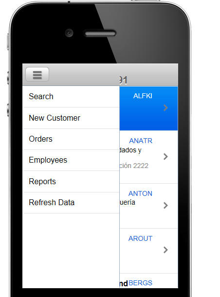
Lesson 11 - Creating a Slide-In 'Panel' Menu
In this lesson we will show how you can create a 'slide-in' menu as shown in the image below. This menu will be the 'main' menu of our application. It will allow us to navigate to other parts of the application. 'Slide-in' menus are a common pattern seen in many mobile applications.
Once we have the slide-in menu built, we will be able to remove the temporary 'Search' button we added to the Customer List panel and put the search functionality on the slide-in menu (in Lesson 12)
Video Tutorial
NOTE: If you did not complete lesson 10, and want to start with this lesson, you can download the Lesson11_Start component to use as your starting point.
Lesson 12 - Hooking Up The Event Handlers on the Slide-in Menu
In the previous lesson we created a slide-in menu to display the main menu of our application. The menu is actually a List control that displays the various menu choices and the menu List is displayed in a window that slides in from the right edge of the screen. However, at this point, when you tap on an item in the menu, nothing happens.
In this lesson we will show how you can add event handlers to this menu so that clicking on an item in the menu actually does something.
At the end of the lesson, your component won't look any different than it did at the start, but clicking on the 'Search' option in the slide-in menu will display the Search Panel.
Video Tutorial
NOTE: If you did not complete lesson 11, and want to start with this lesson, you can download the Lesson12_Start component to use as your starting point.
Lesson 13 - More on Mobilizing the Component - Animating the Search Panel into View From the Top of The Screen
In the previous lesson we hooked up the event handler for the 'Search' menu choice in the slide-in menu. When the user clicks on the 'Search' menu item in the menu, the Search Panel slides in from the left.
The reason that is slides in from the left is that the Panel that contains the search screen (PANEL_SEARCH) is one of the Panel Cards in the parent Panel Navigator (PANELNAVIGATOR_1), and the 'flow' of this Panel Navigator is set to 'LTR' (left-to-right).
However, in the Demo Mobile Application you will notice that the animation for the Search Panel is different. It shows the Search Panel animating into view from the bottom, not the right.
In this lesson we show how we can wrap the PANEL_CUSTOMERLIST and PANEL_SEARCH panels in their own Panel Navigator, and set the 'flow' direction of this child Panel Navigator to 'bottom-to-top' to achieve the animation effect that we want.
At the end of the lesson, your component won't look any different than it did at the start, but clicking on the 'Search' option in the slide-in menu will display the Search Panel animating in from the bottom of the screen.
Video Tutorial
NOTE: If you did not complete lesson 12, and want to start with this lesson, you can download the Lesson13_Start component to use as your starting point.
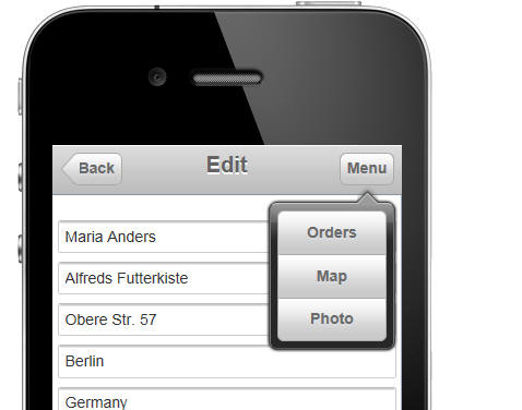
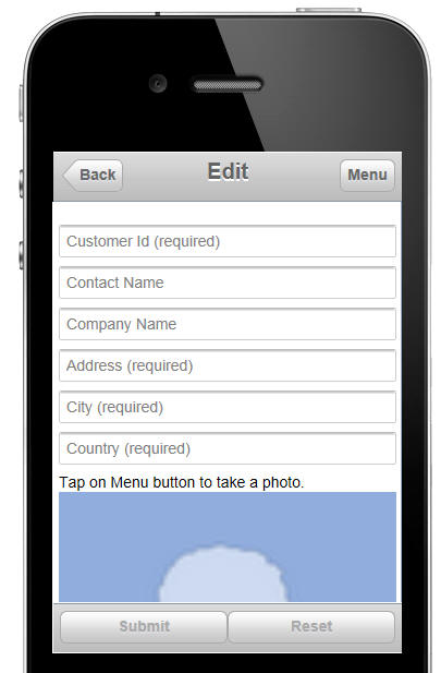
Lesson 14 - Accessing the Camera to Take and Upload Pictures
In lesson 10 we added a dropdown window menu for the 'Menu' button in the Panel Header of the PANEL_CUSTOMERFORM Panel Card. However, the items on the menu don't yet do anything.
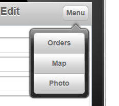
In this lesson we are going to show how the camera on the device can be accessed to take a picture when the user clicks on the 'Photo' button in the dropdown menu.
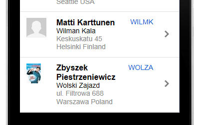
After the user has taken the picture (or selected a picture from the photo library on the device), the picture will be uploaded to the server so that it can be stored in the 'Image' field in the Customer table when the user submit edits to the Customer record.
At the same time that the image is uploaded to the server, we also want to create a thumbnail of the image, so that the thumbnail can be shown in the List control that displays the customer names.
At the end of the lesson, our Customer List control will be showing thumbnails of the picture associated with each customer record, and the image field on the PANEL_CUSTOMERFORM Panel Card will show a full-sized version of the image stored for each customer.
Video Tutorial
NOTE: If you did not complete lesson 13, and want to start with this lesson, you can download the Lesson14_Start component to use as your starting point.
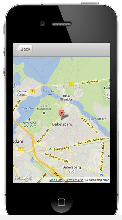
Lesson 15 - Adding a Map to the Component
In this lesson we will add a Panel Card to the UX component that contains a map control. When the user clicks the 'Map' button on the dropdown menu, shown below, the Panel Card that contains the map will be brought into focus and a marker will be placed on the map showing the customer location.
At the end of the lesson, you will have added a new Panel Card that looks like this:
Video Tutorial
NOTE: If you did not complete lesson 14, and want to start with this lesson, you can download the Lesson15_Start component to use as your starting point.
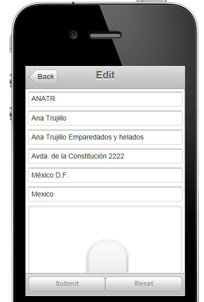
Lesson 16 - Entering New Customer Records and Defining Field Validation Rules
In lesson 11, when we defined the 'slide-in' menu, we added 'New Customer' to the menu, but did not define the event handler for this action.
We has shown in previous lessons how we can make changes to an existing customer record.
In this lesson we are going to hook up the event handler for the 'New Customer' menu action so that the user can enter new customer records.
At the end of the lesson, your UX component will show the customer form in 'enter record' mode so that you can add a new customer to the customer table. The customer form looks like this when it is in enter mode:
In addition to hooking up the 'New Customer' event handler, we are going to show how you can add validation rules to the controls on the UX component to validate the data (i.e. check that there are no data entry errors) before the edits are submitted to the database.
Video Tutorial
NOTE: If you did not complete lesson 15, and want to start with this lesson, you can download the Lesson16_Start component to use as your starting point.
Additional Information - Advanced Data Validation Options
In the lessons we showed how the 'Validation rules' property could be used to define validation rules for a control. The 'Validation rules' property allows you to define rules in a 'declarative' manner. But what if you wanted to define more complex rules that could not be specified in the 'validation rules' builder? Alpha Anywhere has several powerful options that are discussed in this video.