Alpha Stylesheet
Description
The Alpha style (which is a 'version 4' style) uses SVG icons (as opposed to CSS Icons which 'version 3' styles - such as iOS7, AndroidLight and AndroidDark used).
Discussion
The Alpha style is primarily intended for use with UX components.
When you select the Alpha style (or any 'version 4' style), the builder displays a prompt allows you to select the 'compact' version of the style. For mobile applications the standard version of the style is appropriate. For desktop web applications, you might find the standard version of the style to be too large. Selecting the compact version of the style will render the component using smaller text, buttons, icons, etc.

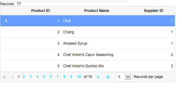
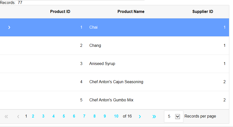
The images below show a grid using the Alpha style. The first image is using the compact version of the style.
Customizing Icon Colors
When you use the 'Alpha' theme in a Grid component, the color for the toolbar icons in the Detail View makes them difficult to see.
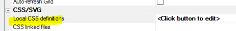
You can make the icons much clearer by applying some CSS to the SVG icons used in the toolbar. This is done by defining CSS in the Local CSS definitions property:
.grid .link .icon {
    fill: #333;
    stroke: #333;
}
This will change the color for the icons, making them easier to see:

Web Theme Parts
Alpha Anywhere Web Themes are broken into "Parts". Parts refer to style implementations for Components, controls, or general settings for the entire style sheet. Each part can have one or more sub-themes. Most Parts representing Controls must implement the "base" sub-theme, which is the default sub-theme applied unless otherwise specified using the sub-theme property for a control.
The "General" part does not support sub-themes. This is because General is used to configure settings specific to the Web Theme.
The Web Theme Parts are listed below.
General
Grid
UX
Tabbed UI
Panel Card
Panel Navigator
Panel Layout
Control Bar
Accordion
Tab
Tab Band
Menu
Menu Bar
Window
List
Spin List
Tree
Date Picker
Time Picker
Ink
Edit
Edit Button Group
Button
Button Dropdown
Button Split
Button List
Slider
Switch
Drag Scrolling
Scroller
Parts that do not have an implementation will appear greyed out in the Web Theme Builder. When you add a Part to your Web Theme, the base sub-theme is automatically created for you.
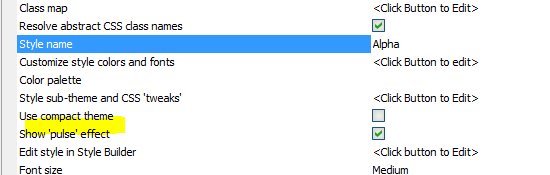
Adding Pulse Effects
The 'pulse' effect is available for ButtonList, Switch and List controls.
For the 'Alpha' style you can turn the 'pulse' effect on or off by setting the Show 'pulse' effect property.
Version 4 Styles vs Previous Versions
A notable feature of the 'version 4' styles is the change in the naming convention for the CSS selectors. In 'version 3' and older style sheets, the CSS selectors include the style name in the selector. For example, in the iOS7 style sheet there is a selector called:
iOS7Button
In 'version 4' style sheets, the CSS selectors do not include the style name. So, the CSS selector for a button is now simply
button
As a result of this change, when using a 'version 4' style, it will not be possible to have a page with two different components, each of which uses a different 'version 4' style. On the other hand it will now be possible to dynamically change the style of a component from one 'version 4' style to another 'version 4' style without having to re-render the component.