Getting Started With Alpha Anywhere - Build Your First Mobile App
Description
Follow this step-by-step guide to your first Alpha Anywhere application to run in a mobile web environment.
Important Notice for Community Edition Users
This tutorial was built using the full Alpha Anywhere Development Environment. Community Edition users may encounter screens that don't match their environment due to differences between the two development environments.
We strongly recommend starting with the tutorials in the Alpha Software Learning Center to start learning Alpha Anywhere.
Overview
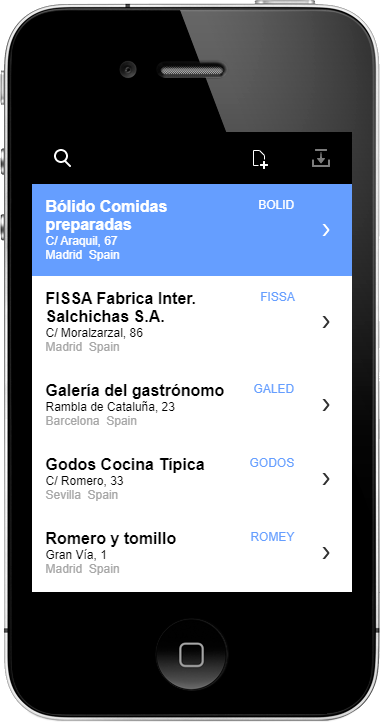
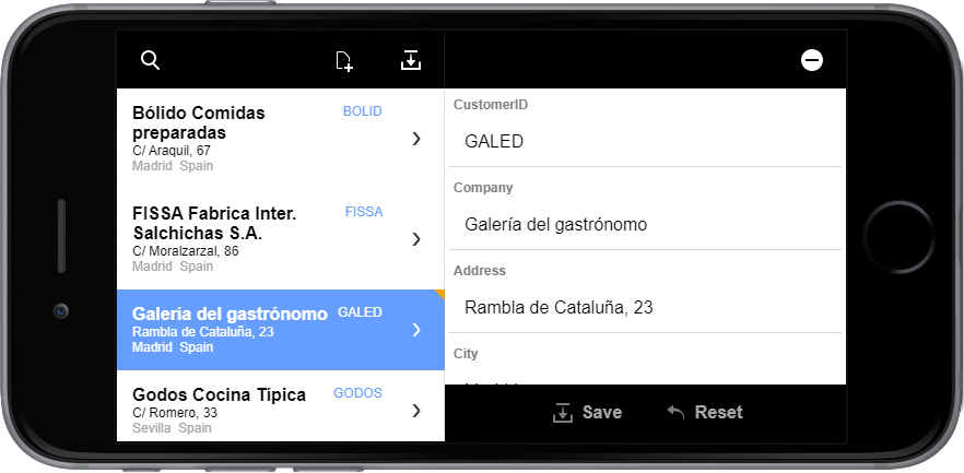
In this guide, you will build a mobile app with data integration and disconnected application support. Your app will include the ability to search, add, edit, and delete information in the Northwind database. It will also include a responsive layout design that can adapt to a mobile device's size and orientation.
The mobile application will be built using the UX Component. All applications in Alpha Anywhere are built using components. The UX Component is the core component for creating mobile applications. Features in the UX Component enable you to take advantage of native mobile functionality using a low-code rapid mobile app development approach with built-in support for offline data storage, responsive mobile design, optimized mobile forms, and more.
About This Guide
This guide is broken into three parts: Setting Up Your Workspace, Building Basic Functionality, and Creating the Responsive Mobile Layout.
Setting Up Your Workspace covers creating a new Alpha Anywhere workspace that will contain the files for your application and setting up the connection to the Northwind database.
Building Basic Functionality walks you through creating a new List control with a Detail View and Search Part using the List Control Quick Start Genie. The List control is the core building block of any Alpha Anywhere mobile app. It handles displaying records from a database and tracking any changes to that data. The Detail View is an interface for creating, editing, and deleting records in a List control. The Search Part is used to request the records of interest from the data source to display in the List control.
Creating the Responsive Mobile Layout details adding layout elements necessary to create a responsive mobile layout that adapts to a device's size and orientation.
At the end of this Tutorial, you will find an Appendix. The Appendix contains troubleshooting information and links to useful resources to add to your Alpha Anywhere development toolbox.
If at any point during this guide you need help, send an email to [email protected]
Setting Up Your Workspace
Lesson 1: Create a new Workspace
To build applications with Alpha Anywhere, you must first create a workspace. A workspace contains all of the files that your application needs, including files such as UX components, JavaScript libraries, images, HTML pages, .a5w pages, and style sheets.
Launch Alpha Anywhere.
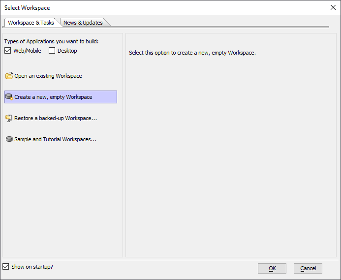
When the Select Workspace dialog appears, select the Workspace & Tasks tab. Then select Create a new, empty Workspace and click OK.
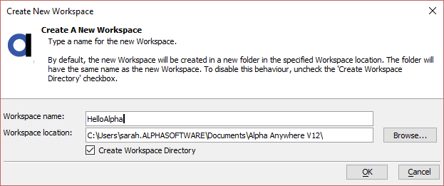
Enter "HelloAlpha" in the Workspace name box. Then click OK.
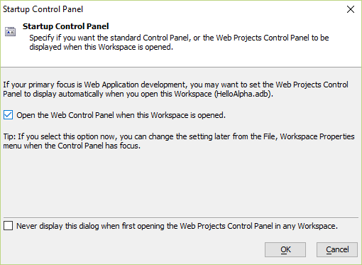
When you create mobile applications in Alpha Anywhere, all mobile resources are added using the Web Projects Control Panel. Check the box for Open the Web Control Panel when this Workspace is opened and click OK.
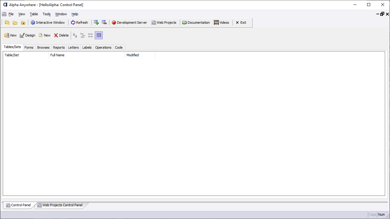
You have created a new, blank Alpha Anywhere workspace. You can now start building your mobile application.
The Web Projects Control Panel can be accessed at any time by clicking the Web Projects toolbar button when you are editing a component or have navigated away from the Web Projects Control Panel.
Lesson 2: Build a Database Connection String
The application you will be creating will interact with the Northwind database. Alpha Anywhere can communicate with databases using an AlphaDAO connection string. AlphaDAO stands for "Alpha Anywhere Data Access Object". AlphaDAO is an interface through which you access data stored in SQL, noSQL, DBaaS, SaaS, and other data sources, including static JSON and OData (Open Data Protocol) APIs. (See AlphaDAO Overview and AlphaDAO Objects for information on using AlphaDAO with Xbasic.)
Alpha Anywhere provides a predefined AlphaDAO connection string you can use to communicate with the Northwind database, a Microsoft Access database installed with Alpha Anywhere.
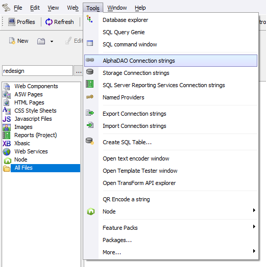
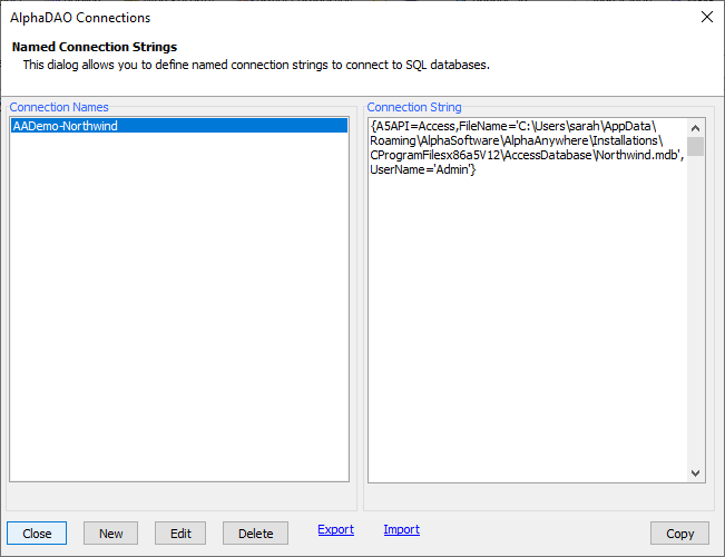
From the Web Projects Control Panel in Alpha Anywhere, open the Tools menu and select Alpha DAO Connection strings. This will open the AlphaDAO Connections dialog.
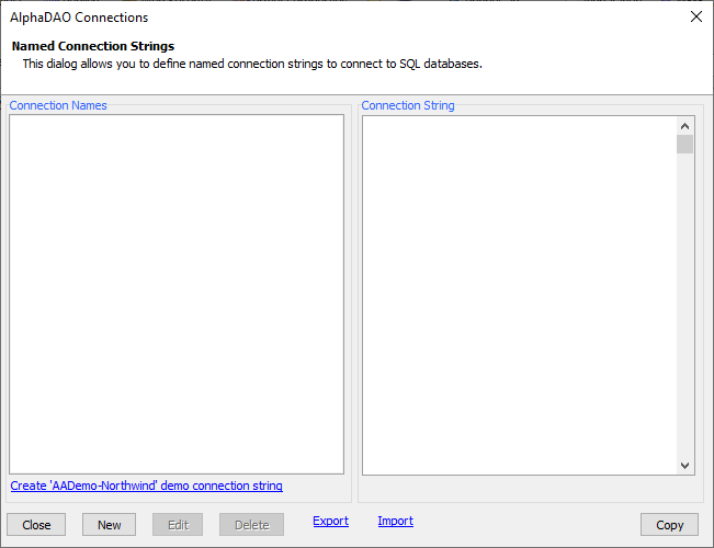
The AlphaDAO Connections dialog allows you to create and manage named connection strings in your Alpha Anywhere projects. "Named" connections are useful as they allow you to define a connection string to a database once and reference the AlphaDAO connection throughout your application using a "named" reference.
For this tutorial, we will be using the AADemo-Northwind connection string, which is a pre-built connection for the MS Access Northwind database that ships with Alpha Anywhere.
If the AADemo-Northwind connection string is not already listed, click the Create 'AADemo-Northwind' demo connection string link at the bottom of the AlphaDAO Connections dialog to create it.
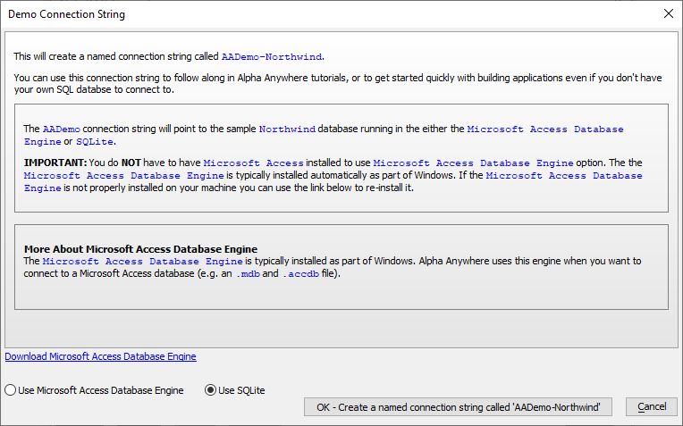
When prompted, click OK - Create a named connection string called 'AADemo-Northwind' to create the connection string.
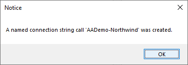
You will be shown a Notice confirming the connection string has been created. Click OK to close the Notice.
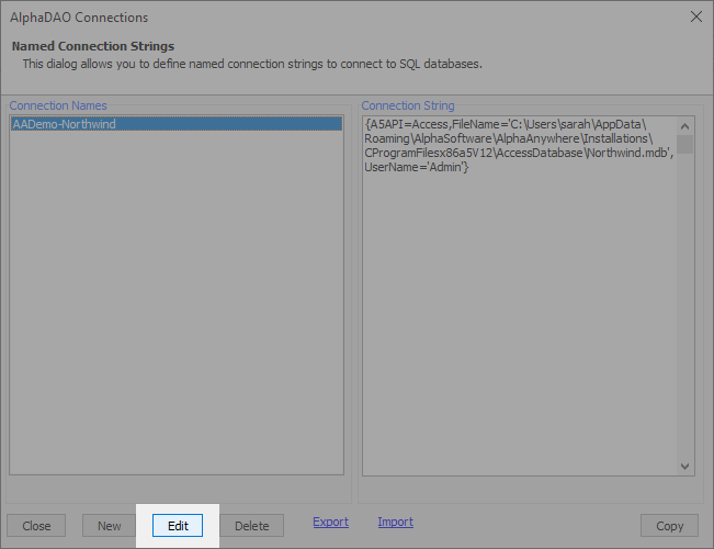
Next, we'll test the connection. Select the AADemo-Northwind connection from the list and click the Edit button.
Then, click the Test Connection link to test the connection.
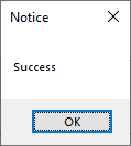
If the connection succeeds, you will see the Notice shown below.
If the connection fails, your system may be missing the Microsoft Data Access libraries required to connect to the database. If this happens, you will need to import the Northwind database into MySQL or SQL Server, or setup a test database on Alpha Cloud.
To avoid confusion later in this tutorial, name the connection AADemo-Northwind when setting up the Named AlphaDAO Connection for the Northwind database.
Tutorials on how to setup the Northwind database in other database management systems are listed below. The links will open in a new browser tab or window.
- Importing the Northwind Access Database into SQL Server
- Importing the Northwind Access Database into MySQL
- Setting up your Alpha Cloud SQL Database -- Create a MariaDB, PostgreSQL, or SQL Server database server and install the Northwind sample database.
When you finish setting up the database, return to this tutorial and proceed to the next step.
Don't forget to also test the connection for the database if you set one up on MySQL, SQL Server, or Alpha Cloud!
Click Close to close the AlphaDAO Connections dialog when you are done.
Congratulations! You have created a connection string that can be used to interact with data in the Northwind database. You are now ready to begin building your application.
Building Basic Functionality
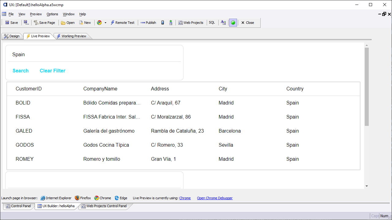
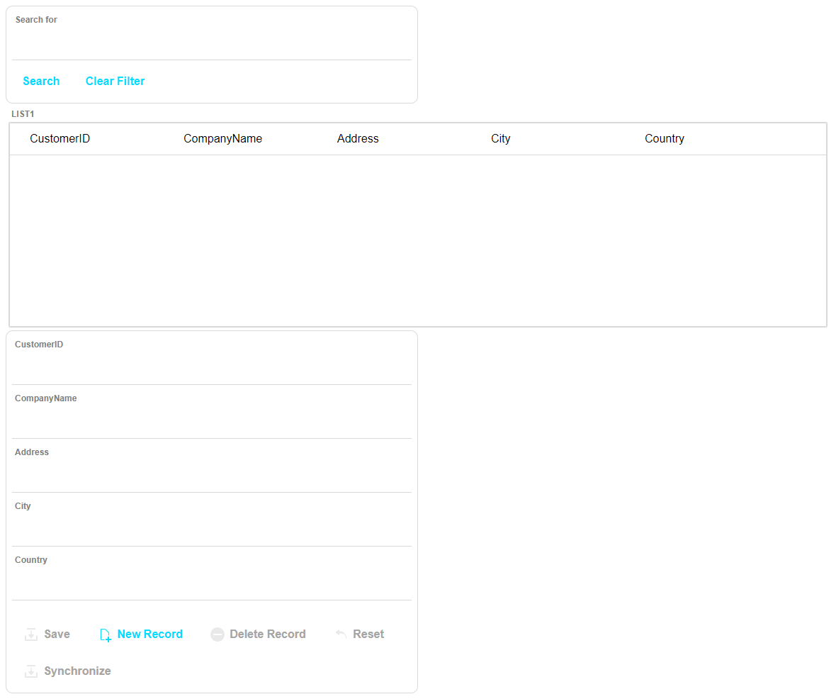
Next, you will create a List control with a Detail View and Search Part using the List Control Quick Start Genie. By the end of this section, you will have built an app that can perform Create, Read, Update, and Delete (CRUD) operations against the Customers table in the Northwind database, shown below.
Lesson 1: Add a UX Component to the Workspace
All applications built with Alpha Anywhere start with a component. Mobile applications are built using the UX Component. Let's start by adding a UX Component to the project.
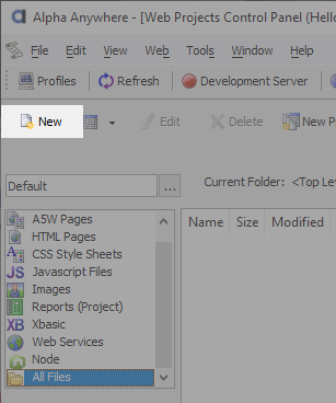
Add a new UX Component to the workspace by clicking the
 New button in the Web Projects Control Panel toolbar.
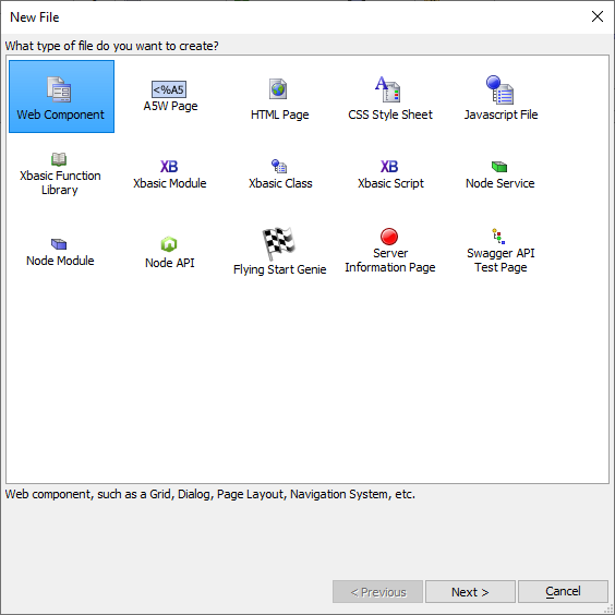
In the New File dialog, select Web Component and click the Next > button.
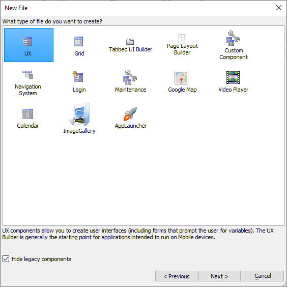
Select UX from the file types listed and click Next >.
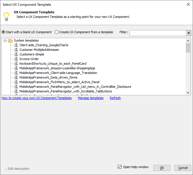
A number of templates for the UX Component are available. These templates make building some types of applications faster. You will be creating a blank UX Component to start. Select Start with a blank UX Component option and click OK.
Now that you have a UX Component, you can start creating the core functionality needed to interact with data in the Northwind database.
Lesson 2: Add a List Control
The List Control is one of the core building blocks in mobile applications. Using the  List Control - Quick Setup Genie, you will create a List with a Detail View and Search part for interacting with the Customers table in the Northwind database.
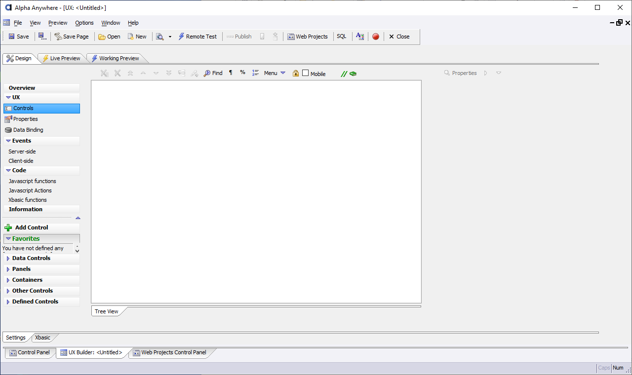
The interface for the UX Component is designed on the
 Controls pane, which is the pane shown when you create a new UX component.
Click the
 Controls button in the left-hand column of the UX Builder to open the Controls pane if it is not currently active.
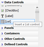
In the Data Controls section on the left-hand side of the builder, click
 [List] to insert a new List control into the UX Component's layout.
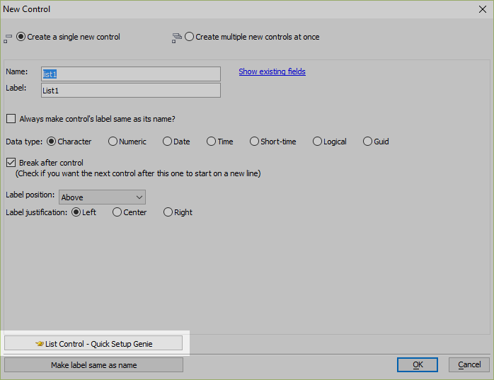
Choose Create a single new control. Click the
 List Control - Quick Setup Genie button to open the List Control Quick Setup Genie.
Lesson 3: Connect the List to a Database
Configure your List control to connect to the Northwind database using the AlphaDAO connection string you created in Build a Database Connection String.
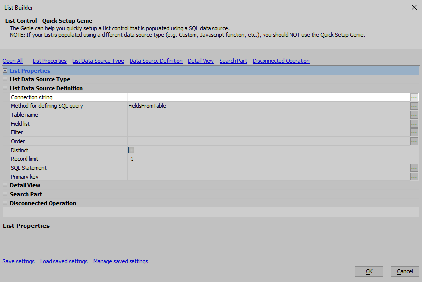
Click the
 button in the Connection string property to open the Connection String dialog.
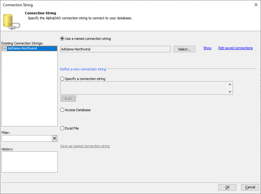
In the Connection String dialog, select AADemo-Northwind from the Existing Connection Strings column. Then click OK.
If you imported the Northwind database into MySQL, SQL Server, or installed the Northwind database on Alpha Cloud, select the connection string you created for that database. If you did not create a named connection string, create it now.
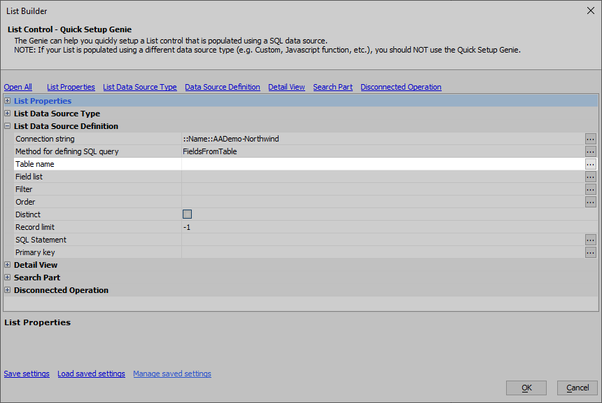
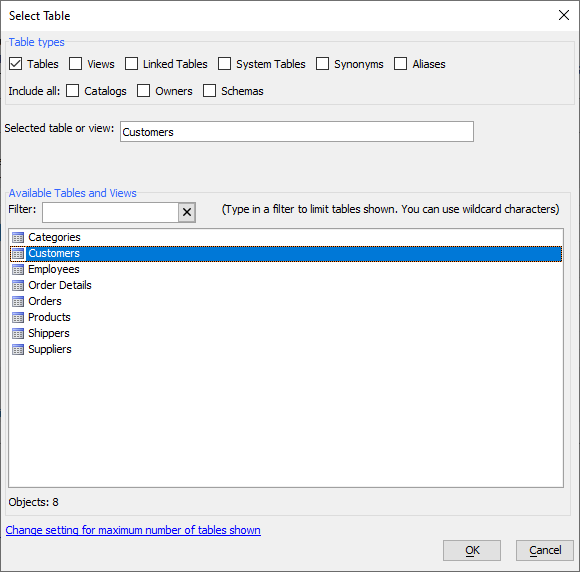
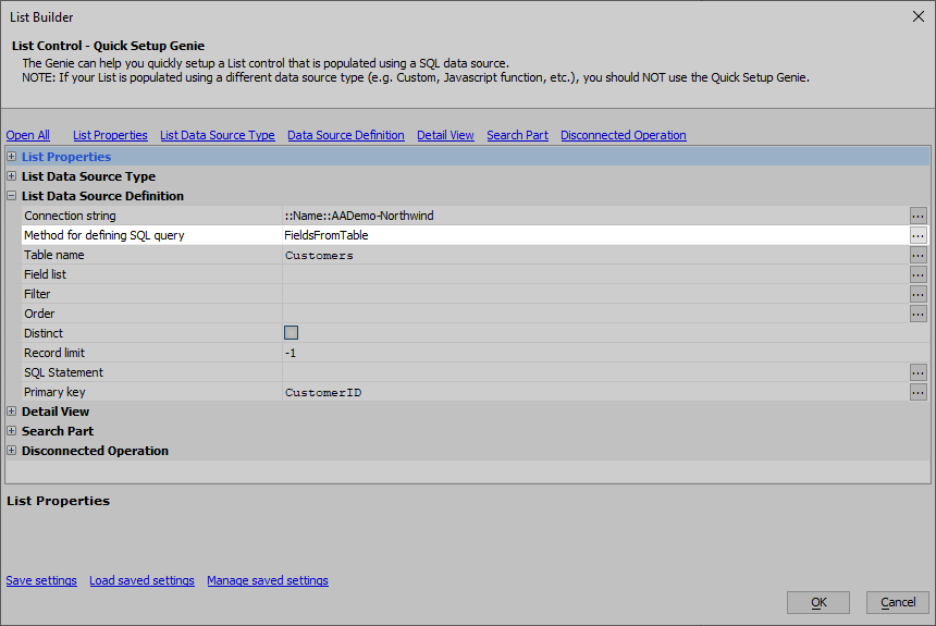
The Table name property defines what table in the database will be queried for records. Choose the
 Customers table from the list and click OK.
The Method for defining SQL query the list will use is FieldsFromTable. This means you will define the table and fields you wish to edit rather than creating a SQL query. Alpha Anywhere will generate the appropriate SQL query to pull the data from the Northwind database from the Table name, Field list, Filter, Order, Distinct, and Record limit properties.
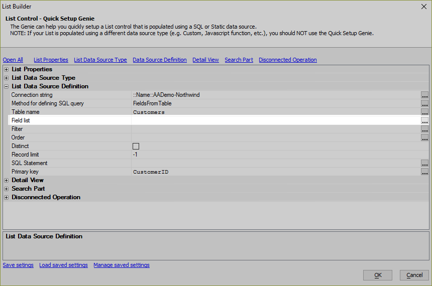
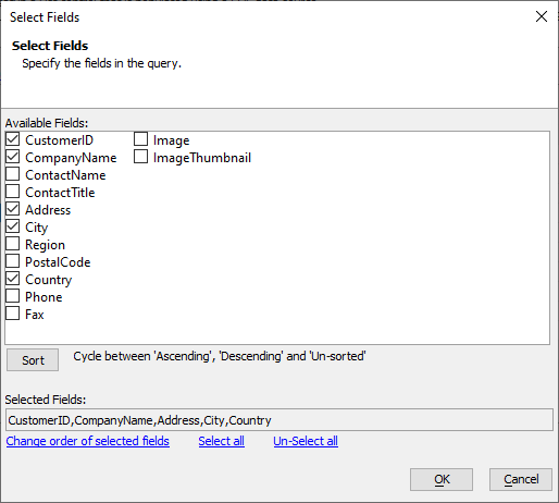
Next configure the Field list property. The Field list property determines what fields will be available for displaying, searching, and editing in the List. If you want to edit records in the table, the table's ID field must be included in the Selected Fields. The ID field for the Customers table is CustomerID.
Select the CustomerID, CompanyName, Address, City, and Country fields from the Customers table and click OK.
Lesson 4: Add the Detail View
Next, you will configure the List control's Detail View. The Detail View is an interface for editing or adding data in the List control.
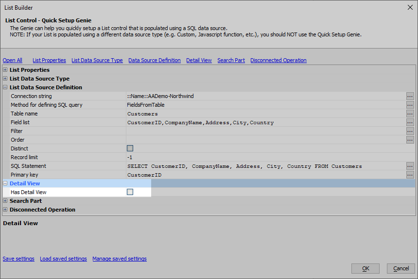
Find the Has Detail View box in the List Builder.
Check the Has Detail View box to add a Detail View to the List control. The default settings for the Detail View will open.
The default settings for the Detail View will generate everything your app needs to add, edit, and delete records from the Customers table in the Northwind database. New fields will be created for the CustomerID, CompanyName, Address, City, and Country fields. In addition, buttons will be created to Add, Save, Reset, Delete, and Synchronize records.
Lesson 5: Configure the Search Part
Now, you will configure a Search Part for the List control. The Search Part queries the Customers table and sends the results to the List control for display.
Find the Search Part Properties section in the List Builder.
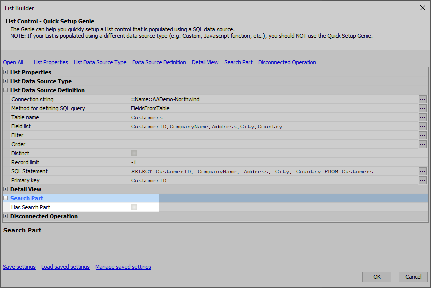
In the Search Part Properties section, click the checkbox for Has Search Part.
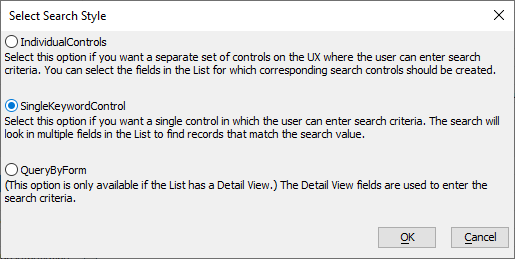
You will be creating a Keyword search part. For the Search Part type property, click the
 button.
Select SingleKeywordControl in the Select Search Style dialog and click OK.
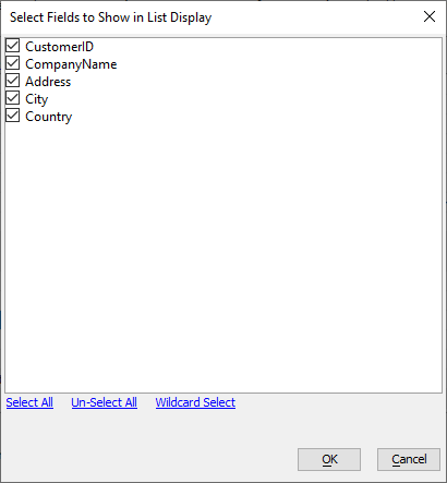
Next, find the "Search Part fields" property in the List control. These will be the fields that are queried when a search is executed. Click the
 button next to the Search Part fields property.
In the dialog that opens, select all of the fields and click OK.
When the List control is first rendered, the query to the server will return both the generated HTML to render the application and the results for the query in the List control's definition. While the Customers table in the Northwind database does not contain a large number of records, many databases have tables with millions of entries. Loading a million records when an app is first launched can take a long time and may even time out, creating the perception that your app is unreliable and doesn't work. In addition, the List control stores its data and edits to that data in local storage when disconnected application features are enabled. Local storage can only store up to 5MB of data.
To ensure your app loads quickly and reduce storage needs, Delay populate List till active search can be enabled, preventing any data from being loaded into the List control until an explicit query against the data source is made by the user.
Check Delay populate List till active search.
Lesson 6: Enable Disconnected Support and Generate the Controls
The final step in setting up the List control with Detail View and Search Part is to add Disconnected support. This allows your mobile app to continue to work when a connection to the data source is lost. Data in the List control, as well as any edits made to that data, will be persisted to local storage on the device. If a connection to the network is lost, or the app is closed, the List control will retain the records and edits to the records until a connection with the data source can be reestablished.
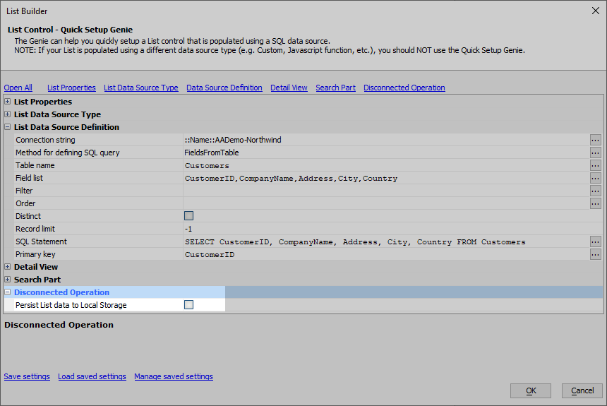
Expand the Disconnected Operation properties section under List Properties.
In the Disconnected Operation properties, check the box for Persist List data to Local Storage.
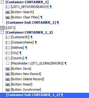
Click the OK button in the List Control - Quick Setup Genie. This will generate all of the controls necessary for the List, Detail View, and Search Part. Your UX Component should have a list of controls similar to the ones shown in the image below:
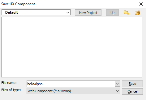
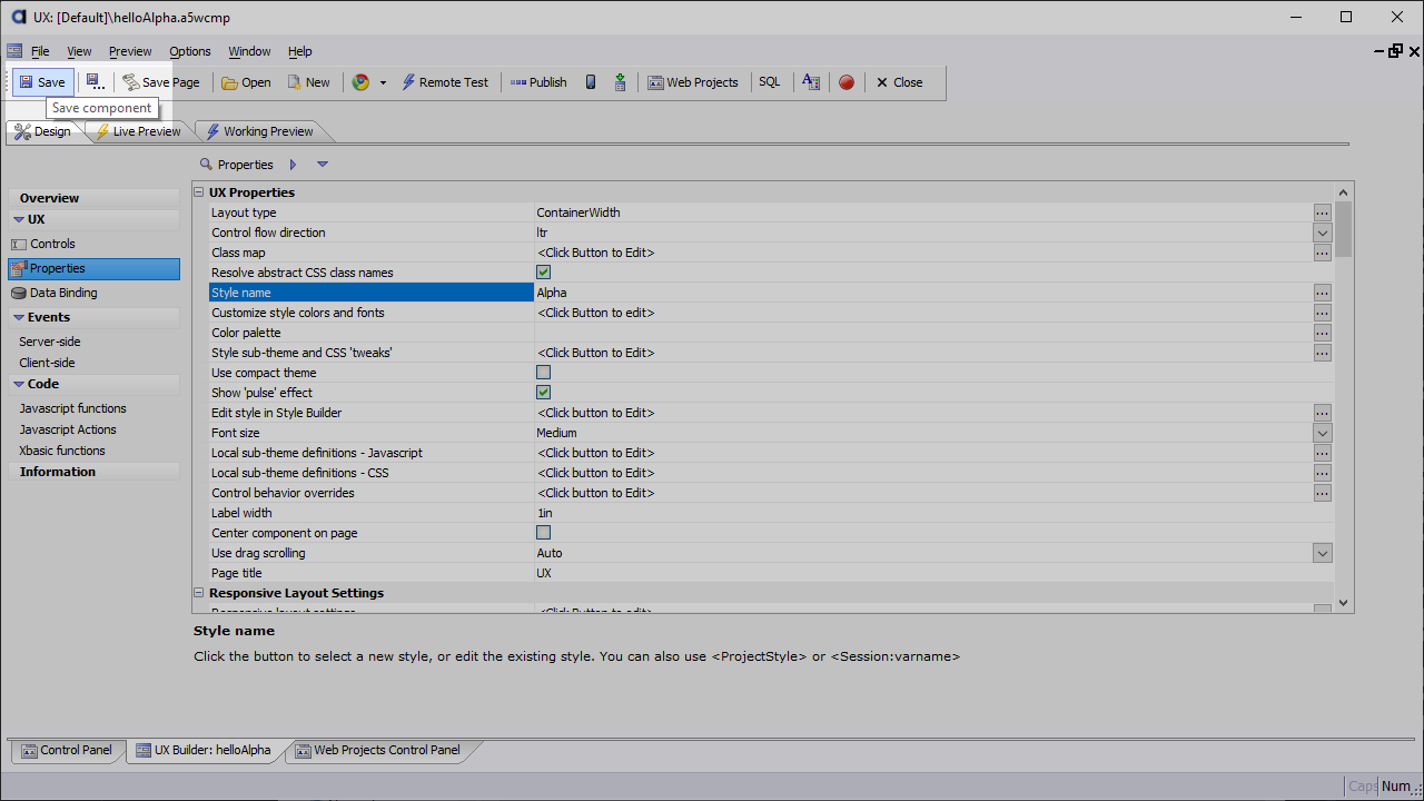
Save your component. Click the
 Save button on the toolbar at the top of the screen.
Lesson 7: Set the Component Style
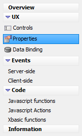
Click Properties in the left-hand list to open the Properties pane.
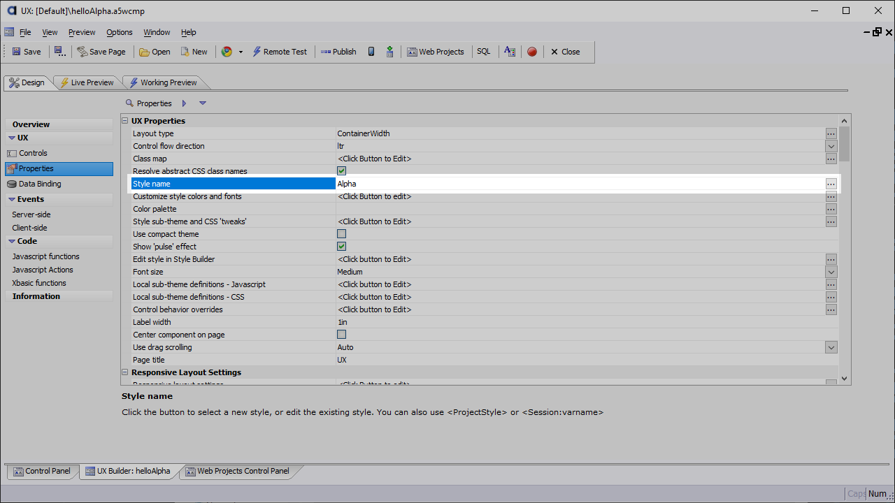
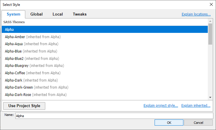
Locate the Style name property and verify that it is set to Alpha.
If the style is not set to Alpha, click the
 button for the Style name property to open the style picker. Select Alpha on the System tab and click OK.
Navigate back to the Controls pane and save your changes.
Lesson 8: Preview the UX Component
Now that the List control, Detail View, and Search Part have been created, let's preview the app and test it out to verify the basic functionality for viewing and editing records in the Customers table works.
Click on the  Live Preview tab located between the
  Design and
  Working Preview tabs at the top of the UX Builder.
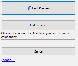
You will be asked what kind of Preview you would like. The options presented are Fast Preview and Full Preview. Since this is the first time you will be previewing your app using Live Preview, select Full Preview. This ensures all of the files you need to preview your app will be created.
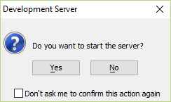
If the development server is not running, you may be prompted to turn it on. If asked if you want to turn on the development server, select Yes and click OK.
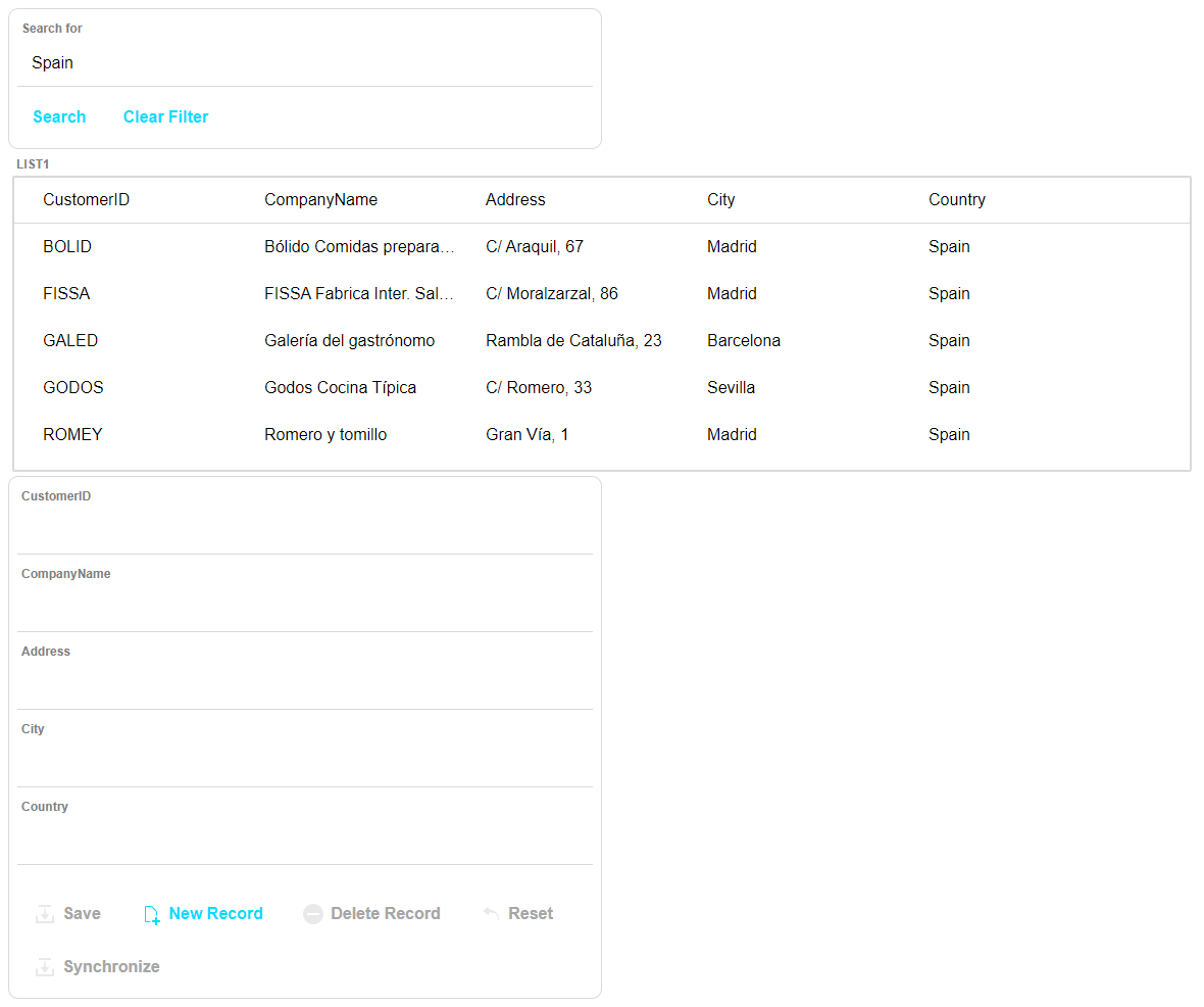
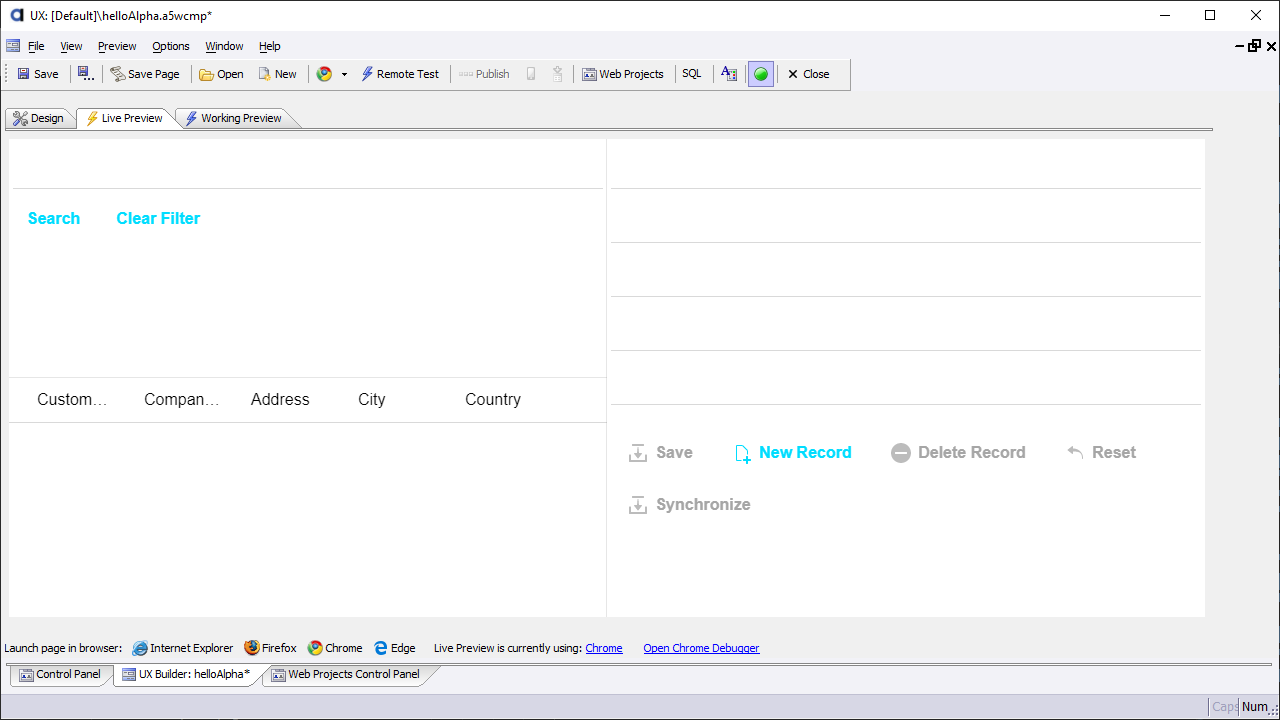
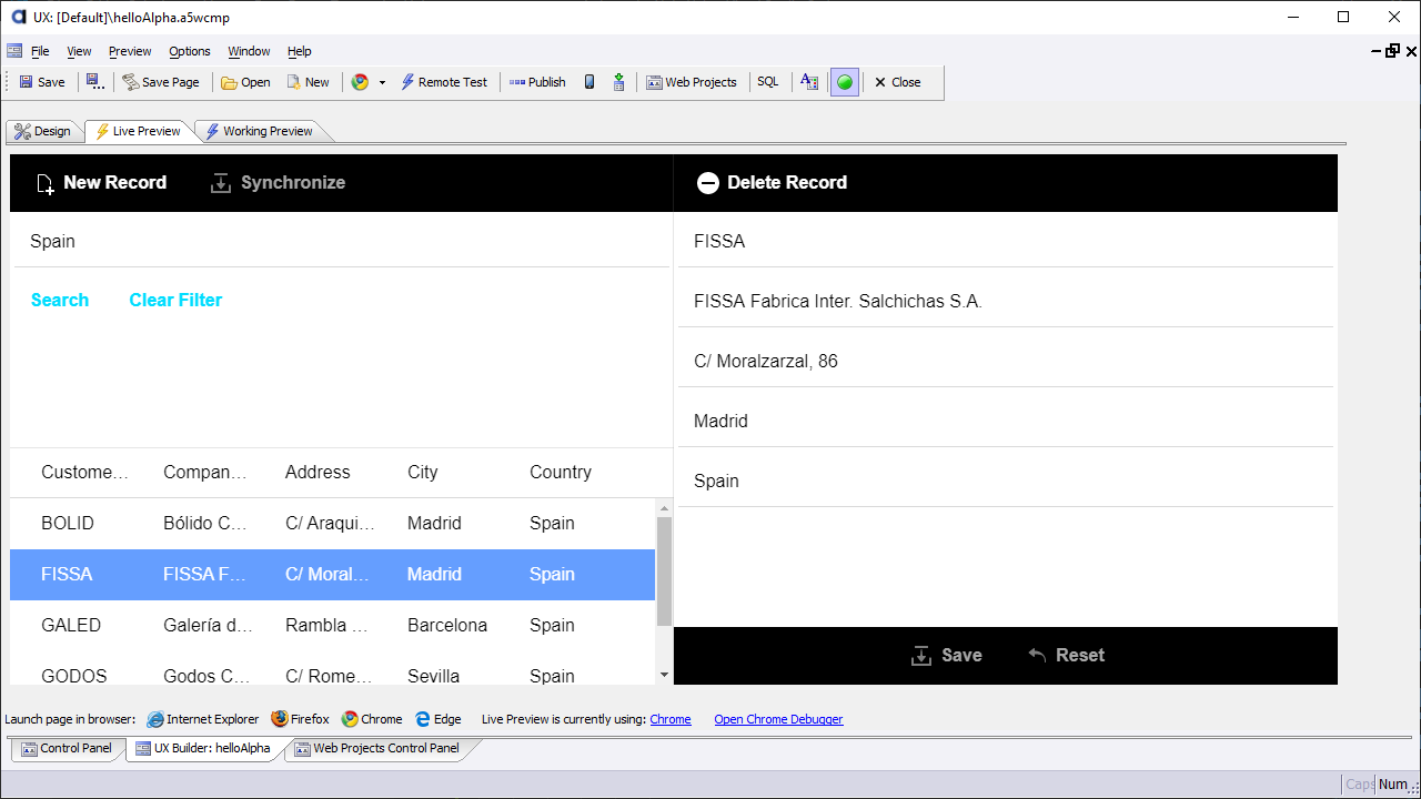
In Live Preview, the Search Part should appear above the List control on the left side of the screen. To the right of the List control, you should see several text boxes and several buttons. This is the Detail View.
The List control at this point should be empty. This is because there is no data in the List control. Remember that you enabled "Delay populate List till active search" in the List Genie. This means that no records will be available until a search is performed. Let's do a search to populate the list with some data.
Type "Spain" into the Search box and click the Search button.
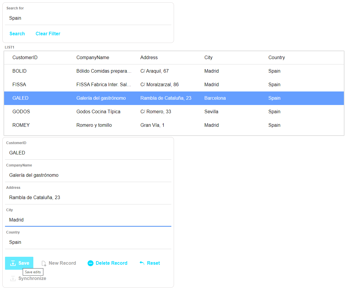
Several records should appear in the List control. When you click on a record, the Detail View will be populated with data from that record. Select a record by clicking on it in the List control to display it in the Detail View.
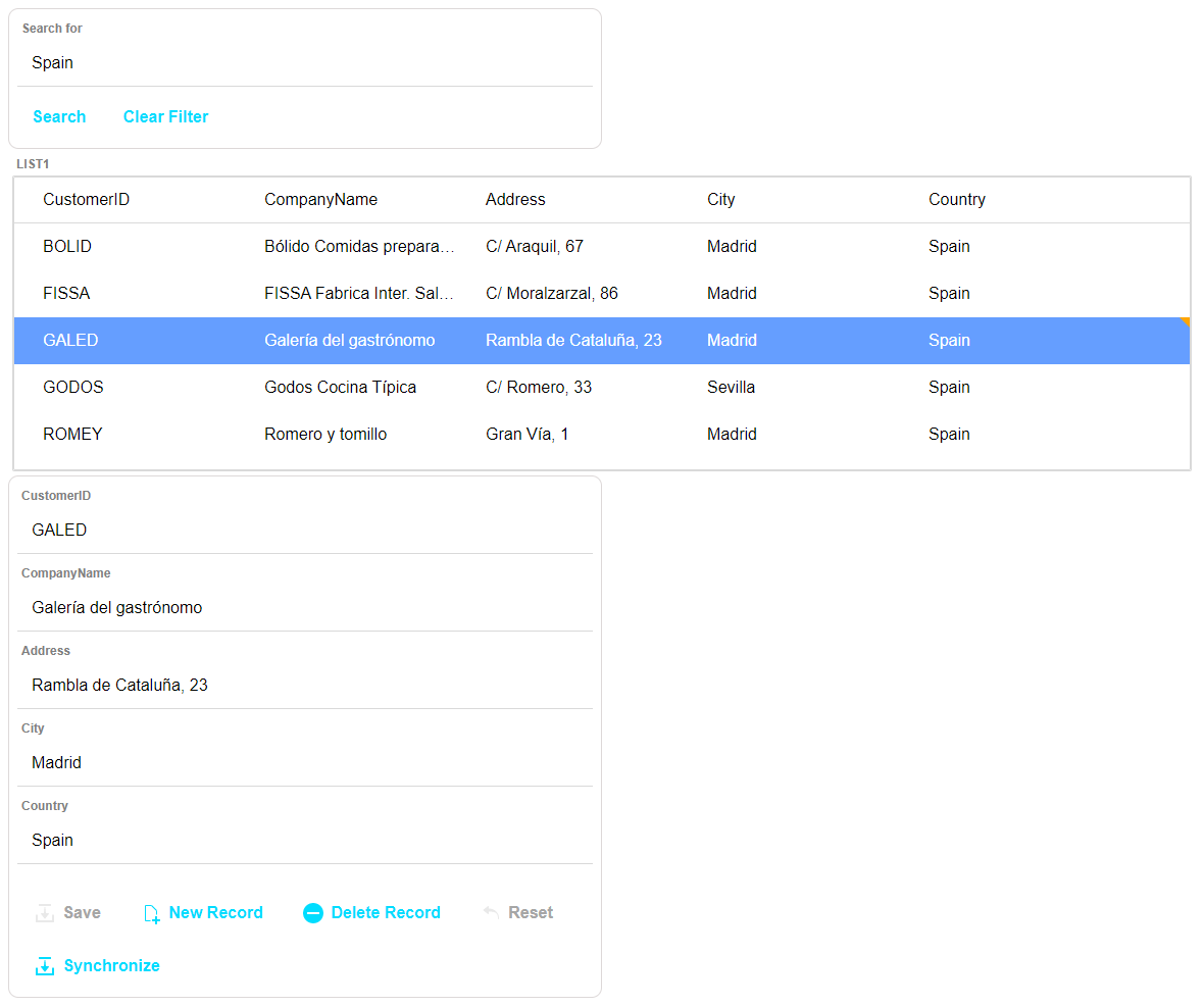
Edit the record you selected and click the  Save button to save your changes. A little yellow icon will appear next to the record in the List control. This icon indicates that the record has been modified but has not been persisted (ie, saved) to the Northwind database.
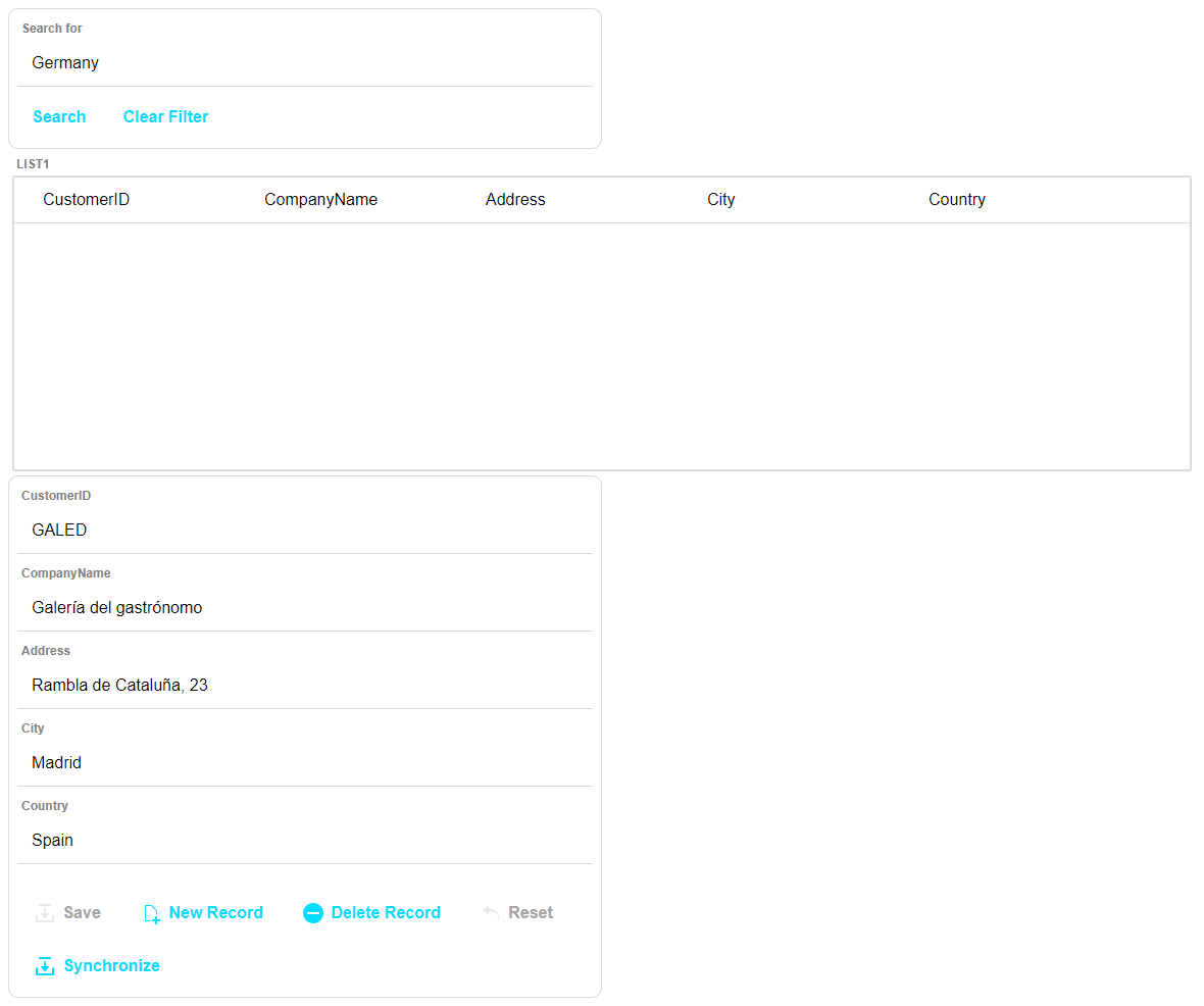
If there are any modifications to the data in the List control, no searches can be performed on the source data - eg, the Northwind database. If you tried searching for "Germany" now to pull up all the records from the Northwind database for Customers with a Country of Germany, no results will be displayed in the List control. In addition, you may notice that the Detail View remains populated with the last record you were editing. This is because the Search Part performed a local search on the data in the List and did not query the Northwind data source. This local search is performed to prevent losing changes to data in the List control.
If you want to perform a new search to retrieve a new set of records from the Northwind database, you must persist the changes in the List control with the Northwind database. To persist changes back to the Northwind database, click  Synchronize.
When disconnected application features are enabled, the List control will remember both the records in the List control and any changes you have made to those records when you exit  Live Preview. The data in the List control is saved in local storage. Click on the
  Design tab and then back on the
  Live Preview tab. The List control will remain populated with the data that was in it when you navigated away from
  Live Preview.
Now that you have the functional components of the mobile application working, let's configure the UX Component to look and feel like a mobile application.
Creating the Responsive Mobile Layout
In this section, you will add the layout elements necessary to create a responsive mobile application. Using Panels, you will create an application that adapts to a mobile device's size and orientation.
Alpha Anywhere's mobile emulation tools will help you understand how your app will appear and behave on various devices. You will also add a mobile style sheet to the project, which will give UX Component the look and feel of a native mobile app.
By the end of this section, you will have a mobile application that can be deployed using Ionic Appflow or Cordova CLI, or published to the web as a mobile web application.
Lesson 1: Add Panel Cards and Panel Layouts
All mobile applications built in Alpha Anywhere use Panels - Panel Cards, Panel Layouts, and Panel Navigators.
Panel Cards group controls into "screens" and provide the navigation between "screens" of your application.
Panel Layouts define the layout of the Panels within them. Panel Layouts can have a horizontal (eg, left to right) or vertical (eg, top to bottom) layout. Buttons can be defined to trigger navigation between panels in a Panel Layout.
Panel Navigators include built-in swipe navigation in addition to being able to specify a horizontal or vertical layout of Panels in the navigator.
Panel Layouts and Panel Navigators can be nested inside other Panel Layouts and Panel Navigators, allowing you to create very complex and sophisticated mobile application layouts. Watch Panel layouts, Panel Navigators, and Panel Cards Explained to learn more.
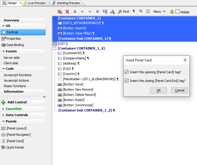
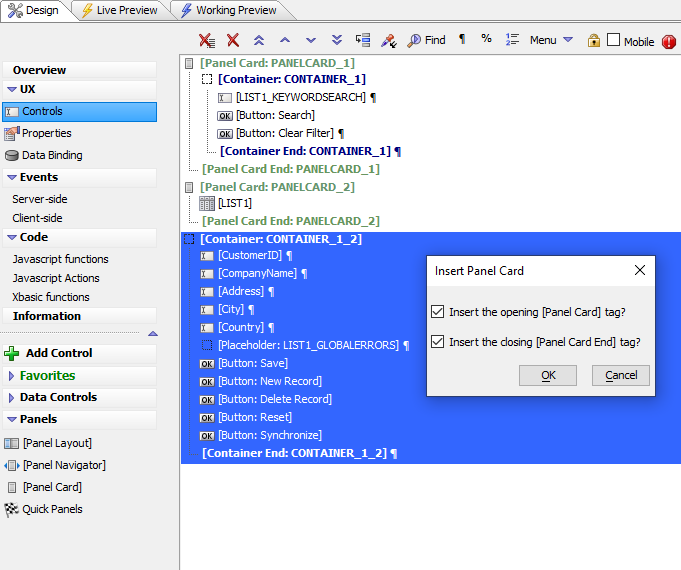
Select all of the Search Part controls in the UX Component. Click
 [Panel Card] listed in the Panels section. Click OK to insert the Panel Card around the selected controls.
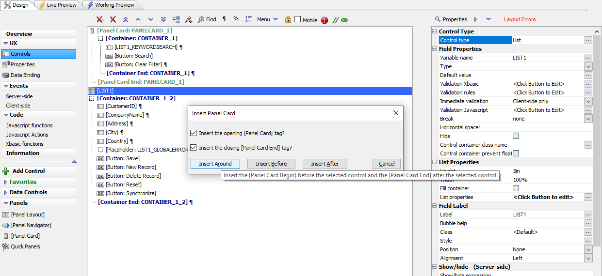
Next, wrap the List control in a Panel Card. Select the List control in the Tree View and click
 [Panel Card]. When prompted, click the Insert Around button to place the List inside the Panel Card.
Check the Fill container option so the List control will fill the Panel Card. This ensures the List control will take full advantage of the screen real estate available on the mobile device.
Add a Panel Card around the Detail View the same way as you did for the Search Part. Select all the Detail View controls and click
 [Panel Card]. Click OK.
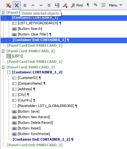
Now you must remove the Container controls from the UX. Select the [Container:CONTAINER_1] and [Container End:CONTAINER_1] controls and delete them by clicking the
 Delete selected objects UX Builder toolbar button.
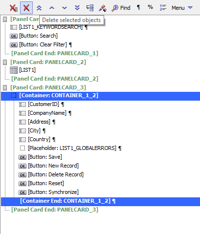
Select the [Container:CONTAINER_1_2] and [Container End:CONTAINER_1_2] controls and delete them as well by clicking the
 Delete selected objects UX Builder toolbar button.
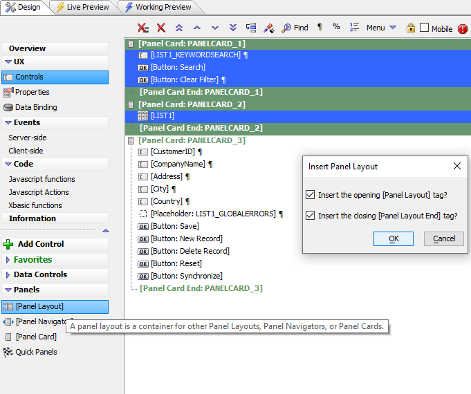
The Search Part should appear above the List control. Select PANELCARD_1 and PANELCARD_2, including all of the controls they contain and PANELCARD_2's Panel Card End control. Click
 [Panel Layout] in the Panels section to wrap the selected controls in a Panel Layout.
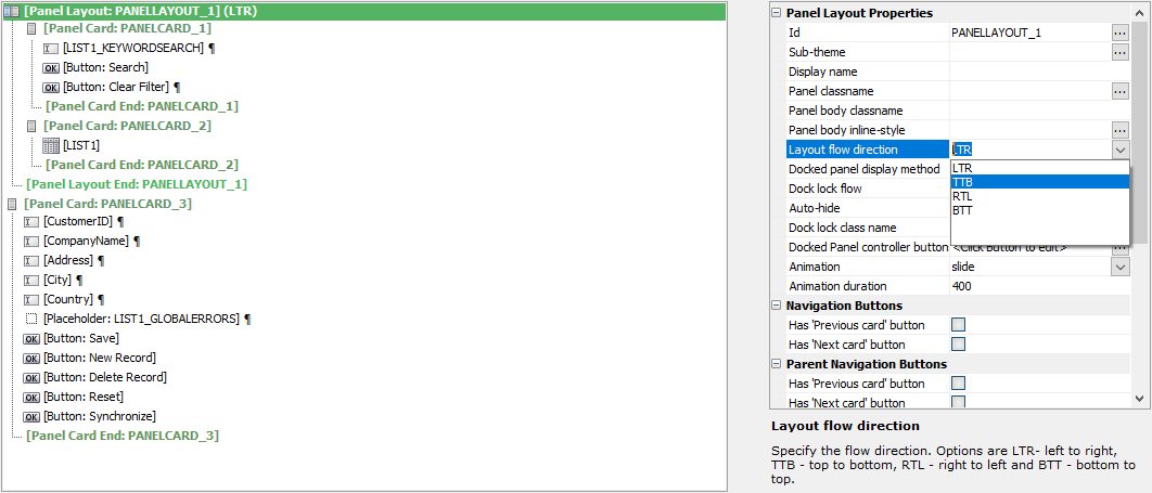
Next, change the layout direction for PANELLAYOUT_1 from Left-To-Right (LTR) to Top-To-Bottom (TTB). The Top-To-Bottom layout will position the Search Part above the List control.
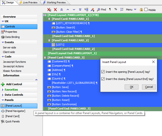
Next, add a Panel Layout that will contain both the Panel Layout for the Search Part and List as well as the Panel for the Detail View. Select all of the controls in the UX Component. Click
 [Panel Layout] in the Panels section to wrap all the controls in a Panel Layout.
Now that the controls in the UX Component have been encapsulated inside Panel Cards, you can add Panel Headers and Footers. The Panel Headers and Footers will contain the buttons for the Detail View. In a later lesson, you will add buttons for dynamically displaying the Search Part and navigating between the Detail View and List control to the Panel Headers.
Lesson 2: Add Panel Headers and Footers
Next, Panel Headers and Panel Footers need to be added. The Panel Headers and Panel Footers will contain the Detail View buttons and any other buttons that need to be added to navigate the mobile app.
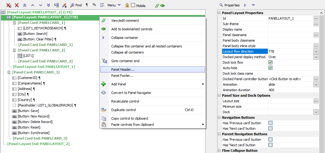
Right-click the
 [Panel Layout: PANELLAYOUT_1] control and select Panel Header... from the context menu. This will add a Panel Header to the Panel Layout.
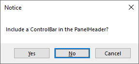
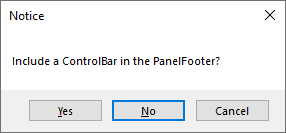
When asked if you would like to include a ControlBar in the PanelHeader, click No. A ControlBar is a toolbar control for adding buttons, text, icons, and other controls to display in a header or footer. You will be adding existing buttons to the Panel Header, so a ControlBar is not needed.
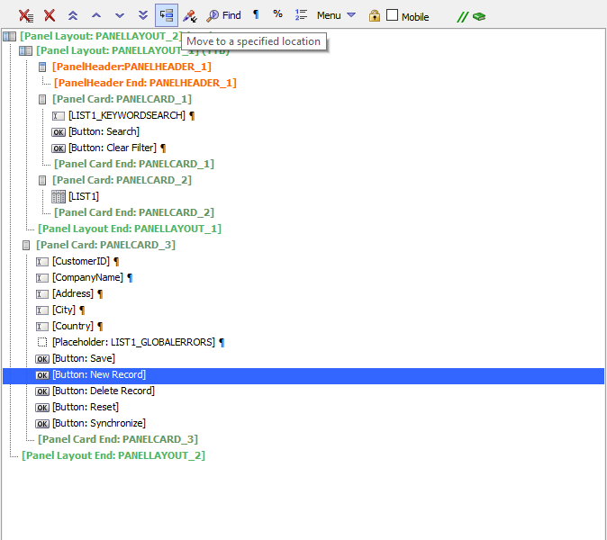
This Panel Header will hold the New Record and Synchronize buttons. Select the New Record button and click the
 Move to a specified location button on the UX Builder toolbar.
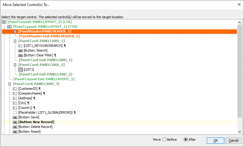
Select
 [PanelHeader: PANELHEADER_1] in the Move Selected Control(s) To.. dialog. Choose After for the Move action. Click OK to move the New Record button inside the Panel Header.
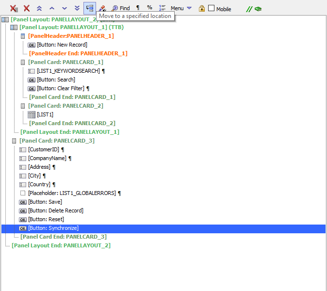
Now, move the Synchronize button into the Panel Header. Select the Synchronize button and click the
 Move to a specified location button on the UX Builder toolbar.
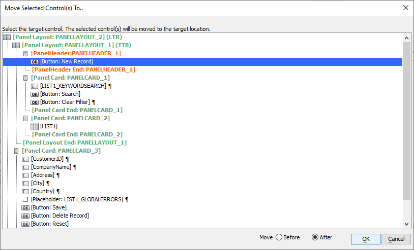
Select
 [Button: New Record] in the Move Selected Control(s) To.. dialog. Choose After for the Move action. Click OK to move the Synchronize button after the New Record button.
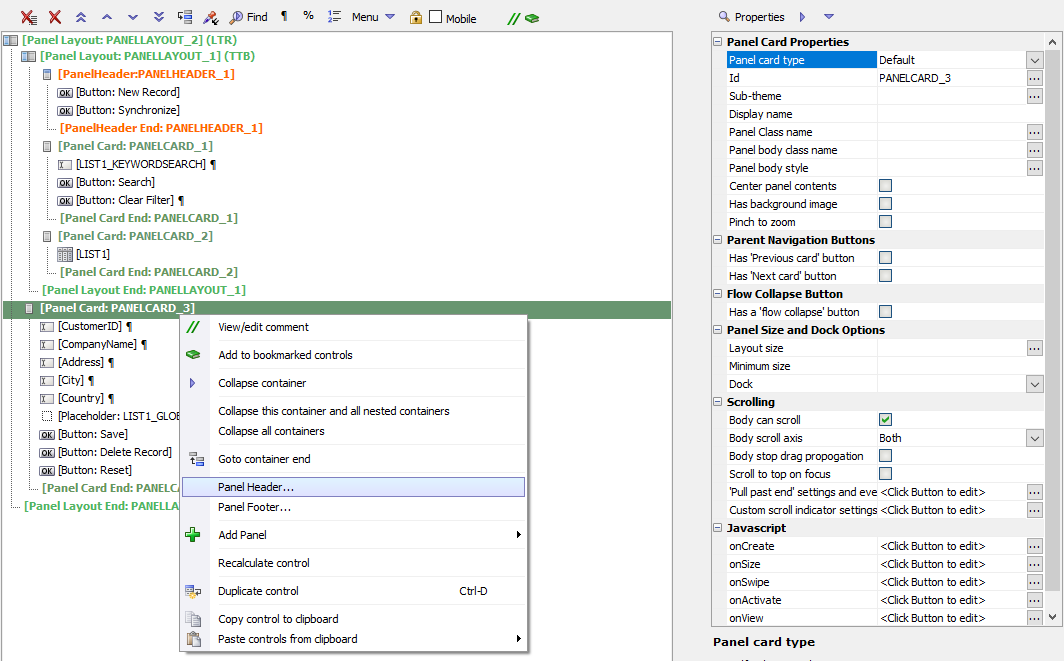
Next, add a Panel Header to the Detail View to hold the Delete Record button for the Detail View. Right-click the
 [Panel Card: PANELCARD_3] control and select Panel Header... from the context menu.
When asked if you would like to include a ControlBar in the PanelHeader, click No.
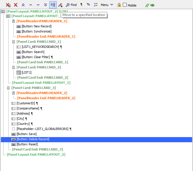
Move the Delete Record button into the header for the Detail View. Select the Delete Record button and click the
 Move to a specified location button on the UX Builder toolbar.
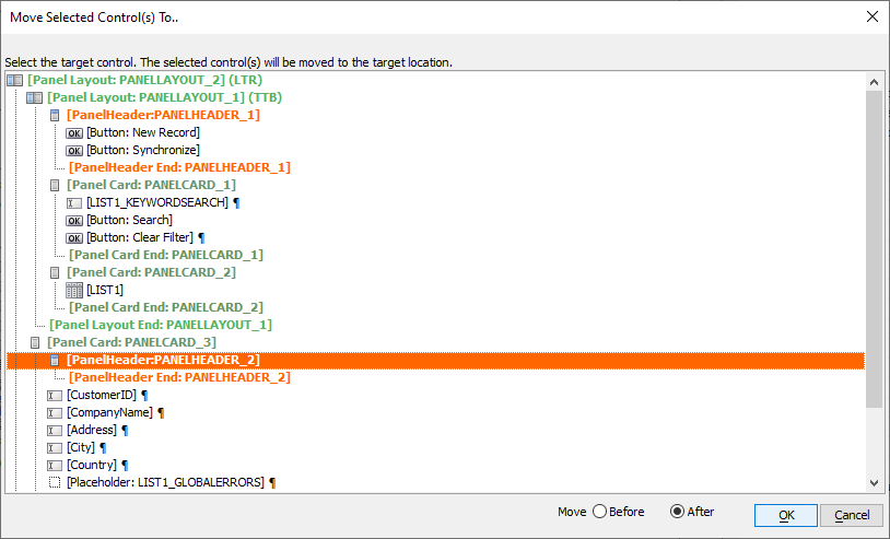
Select
 [PanelHeader: PANELHEADER_1] in the Move Selected Control(s) To.. dialog. Choose After for the Move action. Click OK to move the New Record button inside the Panel Header.
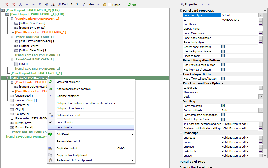
Next, add a Panel Footer to the Detail View. Right-click the
 [Panel Card: PANELCARD_3] control and select Panel Footer... from the context menu.
When asked if you would like to include a ControlBar in the PanelFooter, click No.
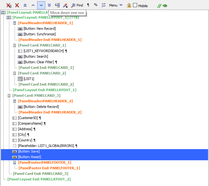
Select the Save and Reset buttons. Click [Down]Move down one row in the Containers controls to open the Insert Container dialog. Select Panel Footer from the list of container choices and click OK.
Select the
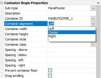
 [Panel Footer: PANELFOOTER_1] control. In the Container Begin Properties, change the Container alignment from Left to Center. This will center the Save and Reset buttons in the footer.
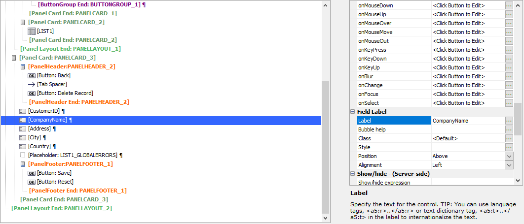
The controls in the UX Component have been organized into a Panel structure, with Panel Cards, Panel Layouts, Panel Headers, and Panel Footers. Next, you will add a mobile style sheet and enable mobile emulation for the application so you can visualize how the application will look and behave on a mobile device.
Lesson 3: Style the UX Controls for Mobile
In this lesson, you'll start styling the UX Component to fit on a mobile device. In the next 3 lessons, you'll define the space each Panel requires, which will force the Detail View to render on its own screen rather than side by side with the List control. The buttons in the Panel Headers will be modified to display just an icon, allowing more space for additional buttons to be added in Lesson 3-3 to provide navigation between the List control and Detail View Panels. You will also modify the Search Part's panel to display on demand.
Lesson 3-1: Enable Mobile Preview
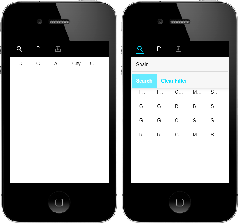
Alpha Anywhere includes the built-in tools for simulating your application on a Mobile device in  Working Preview and
  Live Preview. In order to style the app to look and feel like a native mobile app, mobile emulation helps visualize the space Panels and buttons require and navigation controls required to handle small screens. It also allows you to test actions, such as "swiping" within the Alpha Anywhere development environment.
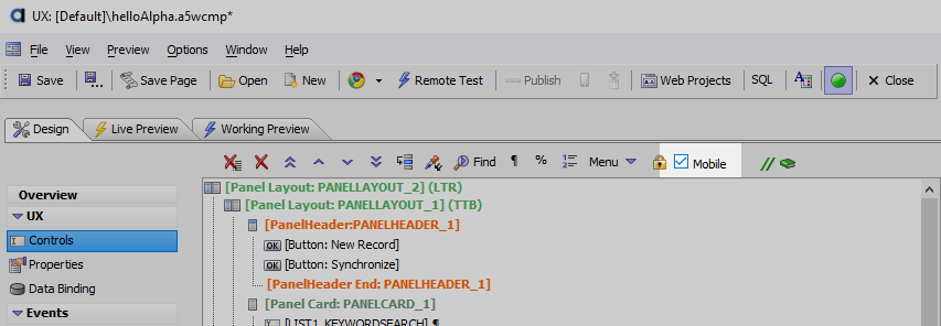
To preview your app on a variety of Mobile devices, first check the Mobile checkbox
 on the UX Builder toolbar.
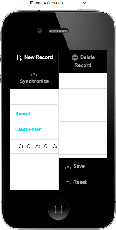
The Mobile device emulation tools will now be enabled when you test your app. Click on the
 Working Preview or
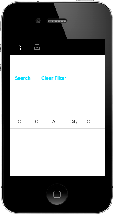
  Live Preview tab to preview your mobile app using the mobile style sheet with the mobile emulator turned on.
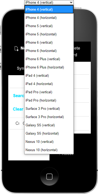
You can choose from a list of devices. Each device has an option for portrait or landscape orientation. Click on the dropdown box and select a different device option.
Lesson 3-2: Sizing Panels
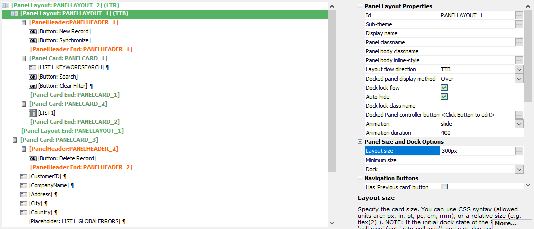
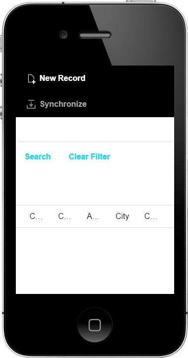
The next step in creating a responsive layout for your mobile application is to add size information to the panels. The Panels containing the Detail View and List need to have their Layout size defined. A Layout size for a Panel defines how much space the Panel requires to display its contents. On smaller devices, if two Panels' total required Layout size is greater than the space available on screen, only one Panel will be displayed at a time.
Select the
 [Panel Layout: PANELLAYOUT_1] control. In the Panel Size and Dock Options, set the Layout size to 300px.
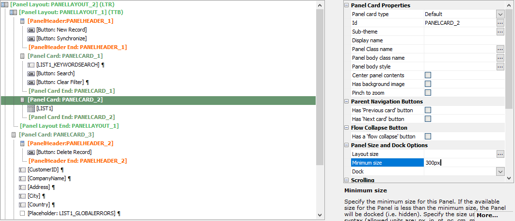
Next, select the List's Panel Card,
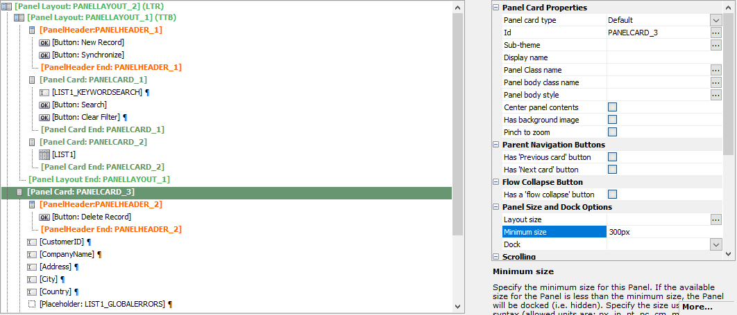
 [Panel Card: PANELCARD_2], and set the Minimum size to 300px in the Panel Size and Dock Options.
Finally, select the Detail View's Panel Card,
 [Panel Card: PANELCARD_3], and set the Minimum size to 300px in the Panel Size and Dock Options.

Lesson 3-3: Style the List Buttons
Next, you will modify the Detail View buttons to use images from the UX Component's style instead of text to fit in the headers and footer of the mobile layout.
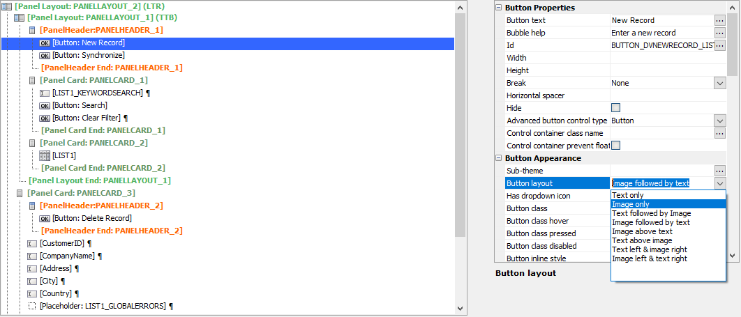
Select the New Record button and change its Button layout to Image only.
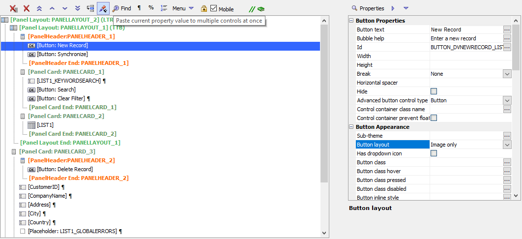
Click on the label for the Button layout property for the New Record button to select the property. Then, click on the
 Paste Properties button on the UX Builder toolbar.
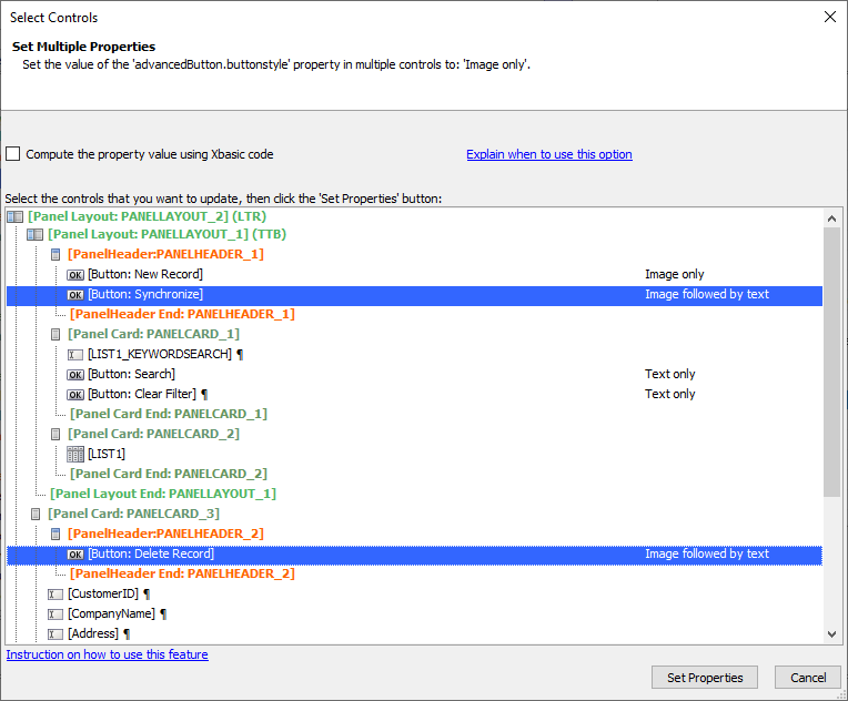
Select the Synchronize and Delete Record buttons in the Select Controls dialog and click Set Properties to set the selected controls' Button layout property to Image only.
Lesson 3-4: Dock the Search Panel
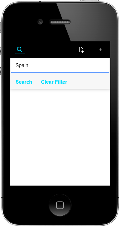
The Search Part only needs to be shown when the user wants to perform a search. The rest of the time, the Search Part can be hidden, or docked, off screen. By docking the panel, the content in the panel is only displayed when an explicit call to display the panel is made.
In this section, you will configure the Search Part's Panel to be a Docked Panel and add a button that can be clicked to show or hide the docked Search Part.
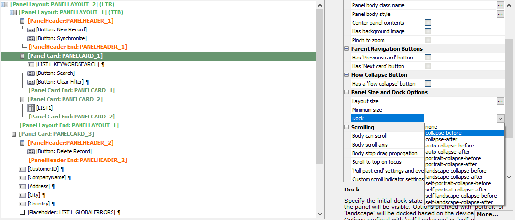
Select the Panel Card that contains the Search control and change the Dock property to collapse-before.
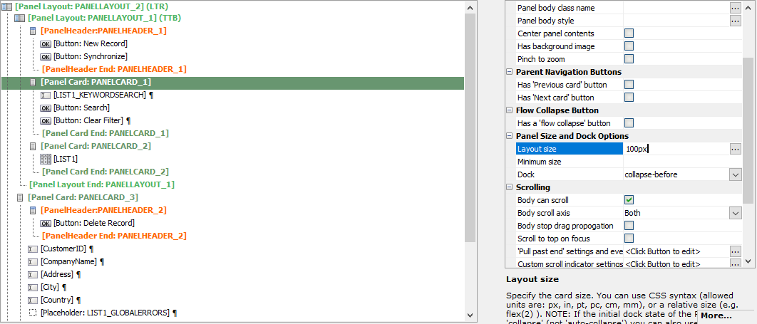
Next, set the Layout Size of the Panel Card to 100px.
Select the Panel Header Begin control for the header for the Search Part and List control. Click
 [Button] in Other Controls to insert a new button in the Panel Header. This button will be used to toggle the display of the Search Part.
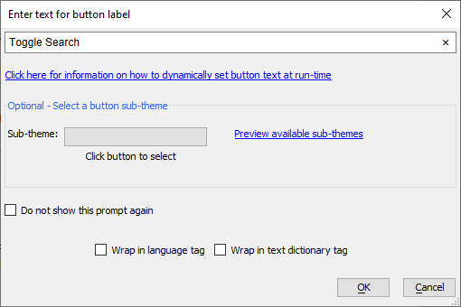
Optionally enter text for the button's label. We will be configuring this button to only display an image, so this text will not be shown in the mobile application. However, the text will be displayed in the UX Builder control layout, making it easier to locate the button.
Click OK to create the button.
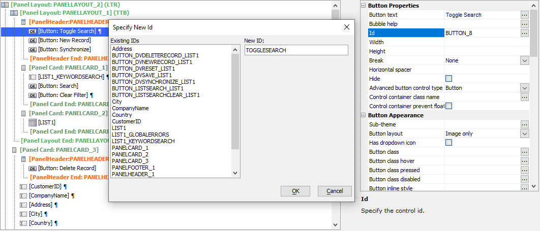
Change the Id for the new button. Select the button and click the
 button for the Id property. Type "TOGGLESEARCH" into text box for the button's ID.When specifying a new ID for a control, the New ID must be unique among the controls in the UX Component.
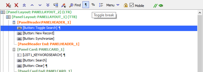
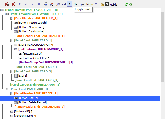
Remove the break after the Toggle Search button. Select the Toggle Search button and click the
 Toggle break button on the UX Builder toolbar.
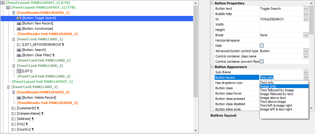
Select the Toggle Search button. In the Button Appearance settings for the Toggle Search button, change the Button layout to Image only.
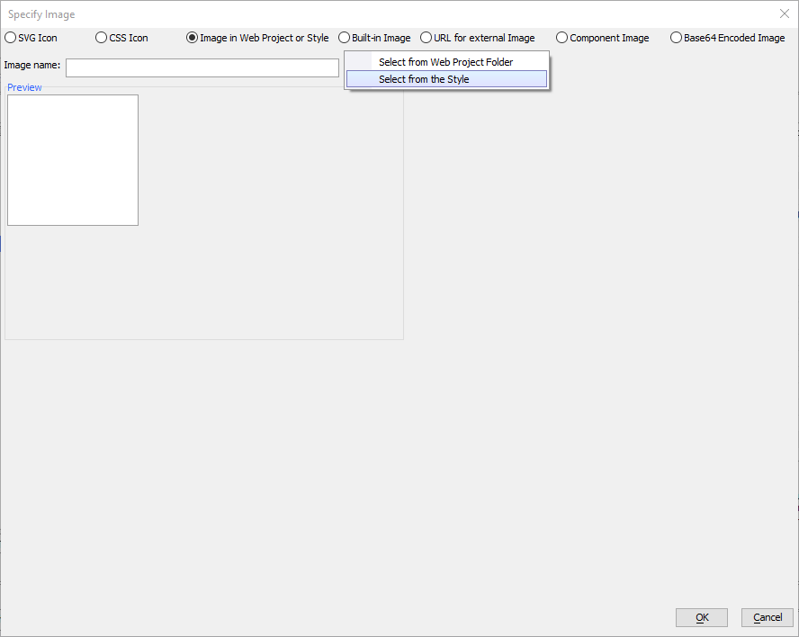
Add the Search icon image to the Toggle Search button by clicking on the
 button for the Image name property. This will open the Specify Image dialog. In the Specify Image dialog, select Image in Web Project or Style to pick an image from the UX Component's style. Then, click the Select button and choose the Select from the Style option.
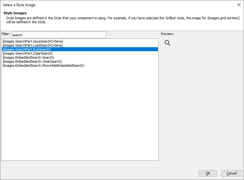
Using the Filter text box, search for the {images.SearchPart.RunSearch} option. Select {images.SearchPart.RunSearch} and click the OK button. Click OK in the Specify Image dialog to set the Image name property to the style image you selected.
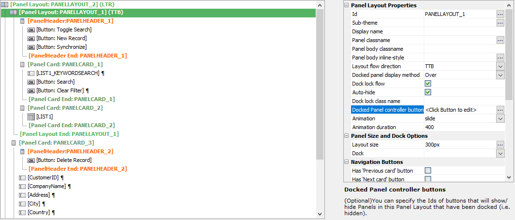
Select
 [Panel Layout: PANELLAYOUT_1] and click the
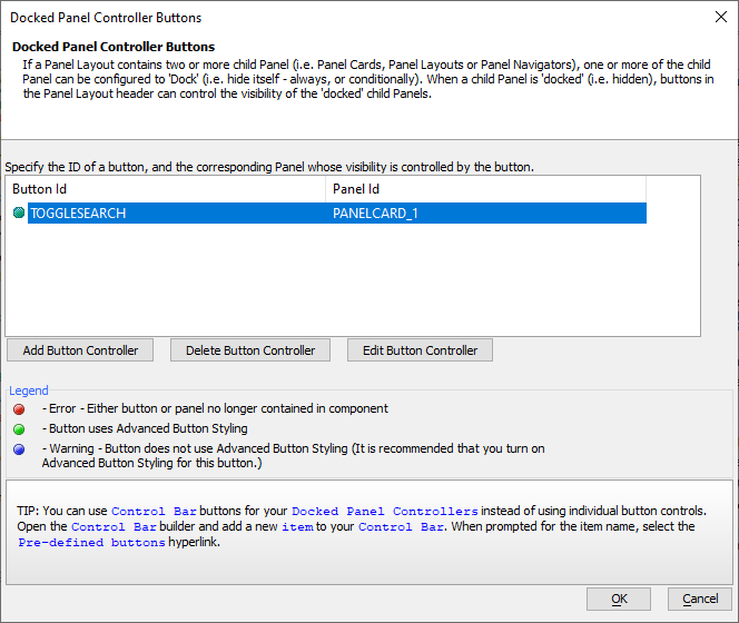
  button for Dock Panel controller buttons.
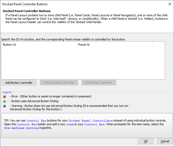
Click the Add Button Controller button to add a new Docked Panel Controller Button.
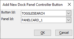
In the Add New Dock Panel Controller Button dialog, set Button Id to TOGGLESEARCH and Panel Id to the Panel Card for the Search Part, PANELCARD_1. Click OK.
Click OK to save the changes in the Docked Panel Controller Buttons dialog. The Search Part will now be shown when the TOGGLESEARCH button is clicked.
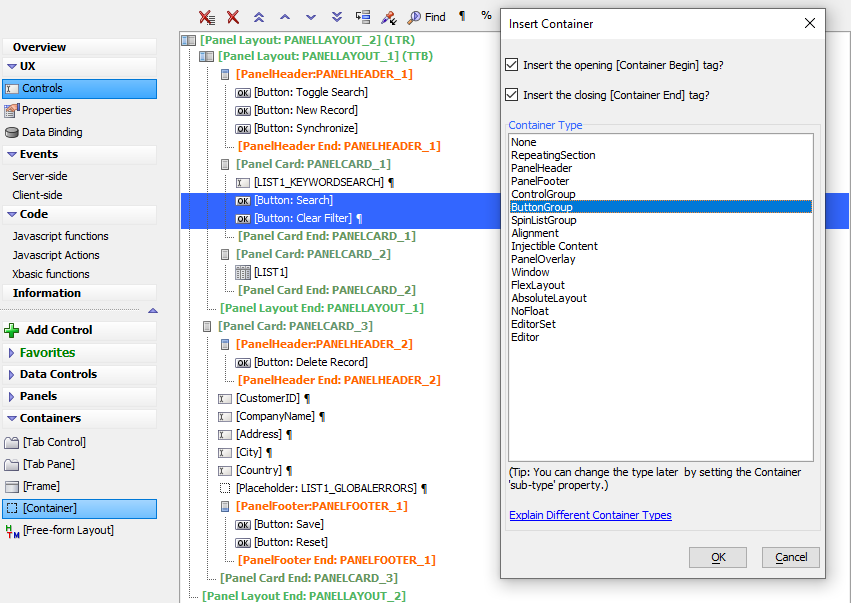
Select the Search and Clear Filter buttons. Click
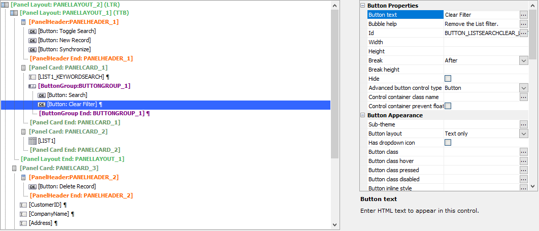
 [Container]. Select ButtonGroup from the list of options and click OK.
Next, we'll change the Button text for the Search Part's clear button to "Clear". Select the Clear Filter button and click the
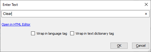
 smart field button for the Button text property:
Change the text from "Clear Filter" to "Clear". Then click OK.
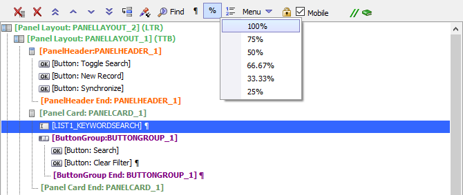
Select the LIST1_KEYWORDSEARCH control. Click the
 Set control width UX Builder toolbar button. Choose 100% from the list of options to resize the Search text box to 100% wide.
There are many options available for docked panel behaviors, allowing for a wide variety of uses. Panels can be docked on the edge of the screen relative to the panel layout. In a Top-to-Bottom layout, panels can be docked on the top or bottom of the screen. In a Left-to-Right layout, panels can be docked on the sides of the screen. Panels can also be configured to dock when the device is in a specific orientation (ie, landscape or portrait.)
In addition to overlapping other panels when shown, docked panels can push content off screen when they slide into view. For more information about docking panels and some use cases, check out these videos:
Showing a Docked Panel - How the docked panel is shown can be configured. Watch this video to learn about the options available.
Building a Docked Menu - A popup menu in a mobile application can be created using docked panels. Watch this 5 part video series to learn how to build a docked menu in Alpha Anywhere.
Now that the Search Part is docked, you need to add JavaScript to show the Detail View when a record in the List control is selected or the New Record button is clicked. On devices that do not have enough space to display both the List control and Detail View side by side, the Detail View is rendered off-screen.
In addition to navigating to the Detail View, you also need to add a button to navigate back to the List control from the Detail View.
Lesson 4: Add Navigation Between the List and Detail View
JavaScript can be used to navigate between the List control and Detail View when records are selected. On devices with more screen space, such as a tablet, the Detail View and List will be shown side by side. However, on smaller screens, such as smartphones, the Detail View is hidden on another "screen". You need to add JavaScript to show the Detail View when a record in the List control is selected or the New Record button is clicked.
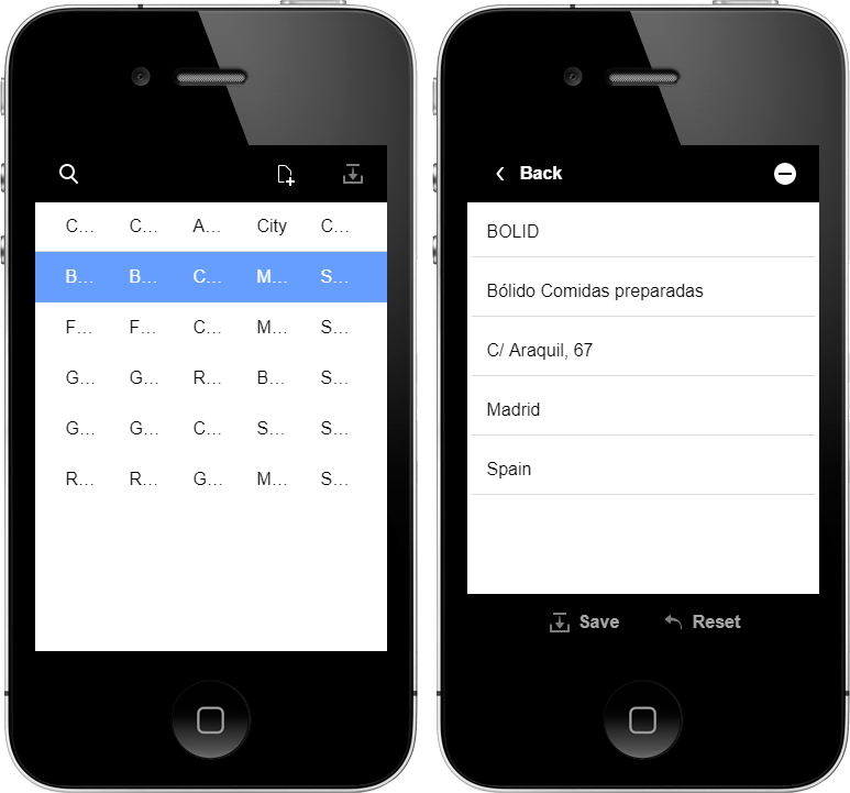
Lesson 4-1: Add JavaScript to Show the Detail View
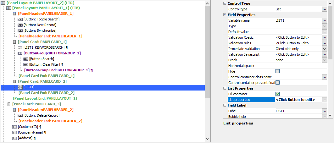
Open the List Builder for the List control by selecting the list and clicking the
 button for the List Properties in the
  Properties pane.
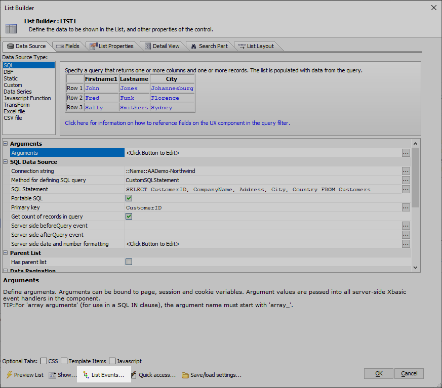
Click the
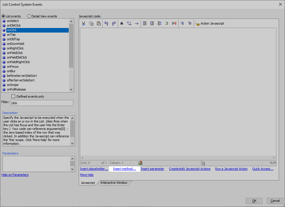
 List Events... button in the toolbar at the bottom of the List Builder to open the List Events Editor.
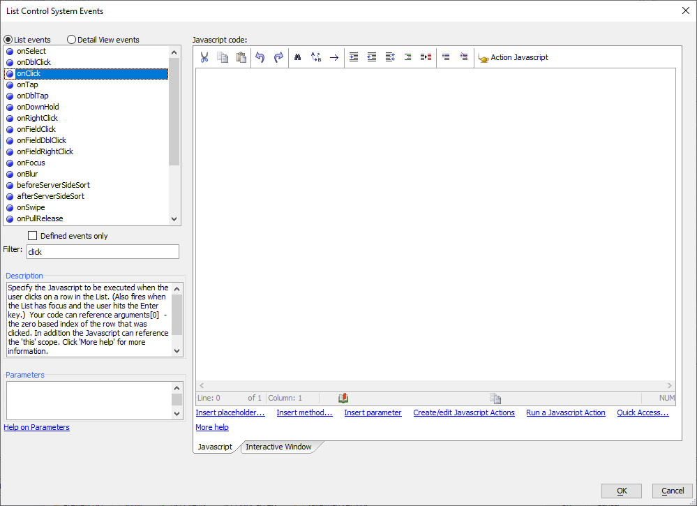
Search for the onClick event by typing "click" in the Filter text box.
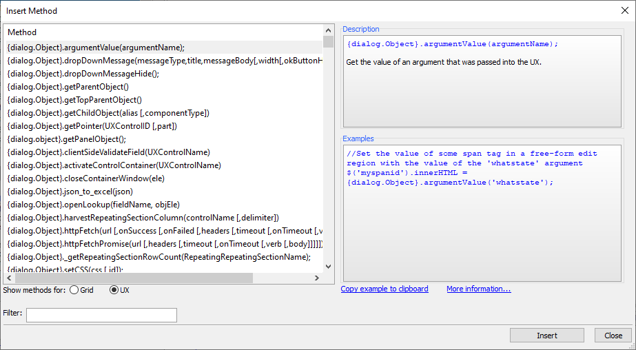
Click the Insert method... link at the bottom of the Javascript code editor. This opens the Insert Method dialog.
The Insert Method dialog lists JavaScript methods available for the UX Component and objects (List controls, maps, button lists, etc) in the UX Component. The placeholder, {dialog.object}, represents a JavaScript object for the UX Component. It has methods and properties that can be utilized to interact with the interface elements in the UX Component.
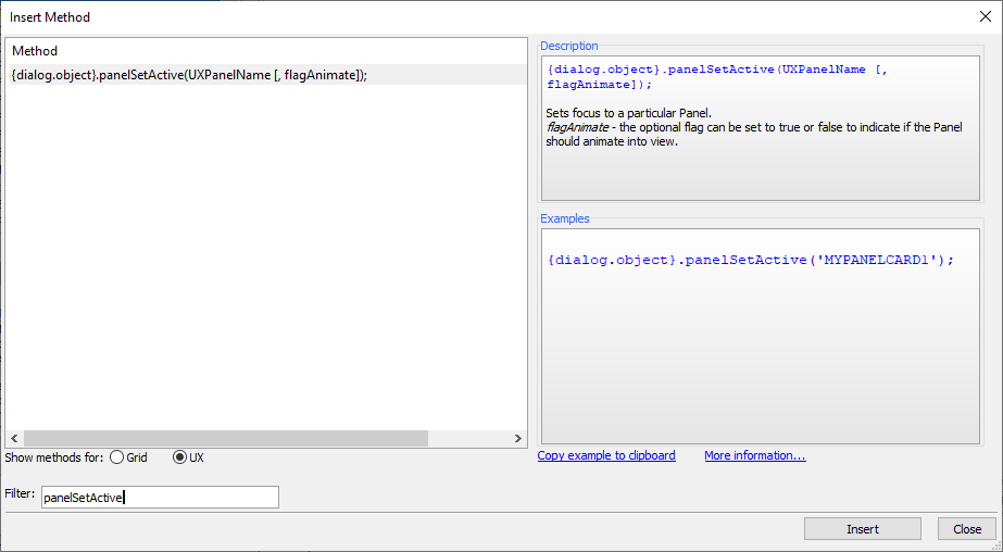
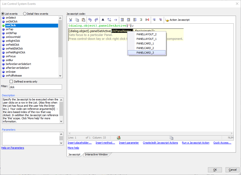
To show the Detail View panel when a List control record is clicked, you need to call the {dialog.object}.panelSetActive method. Search for "panelSetActive" in the Filter text box. Select {dialog.object}.panelSetActive(UXPanelName [, flagAnimate]); from the Method list and click Insert
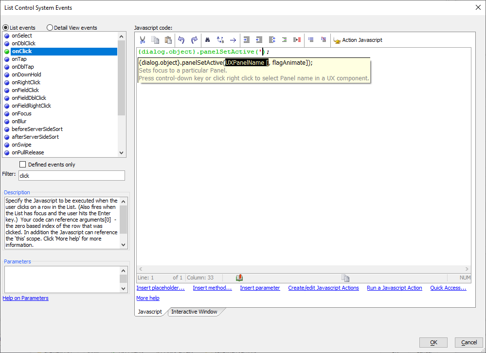
In the JavaScript code editor, delete the text "UXPanelName [, flagAnimate]" from between the opening and closing parentheses for the panelSetActive method. Type a single quote (') between the parentheses to activate the autocomplete system in Alpha Anywhere. Press the "Ctrl+Down key" on the keyboard to open a popup menu of available Panel objects that can be activated using the panelSetActive method. You can also right-click on the text in the popup to activate the menu. Select PANELCARD_3 from the list of choices to set the UXPanelName parameter for the panelSetActive method.
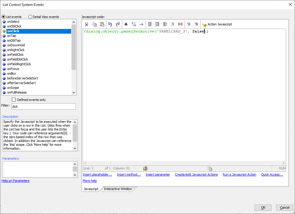
For the second parameter, flagAnimate, type in false. The flagAnimate parameter defines whether or not an animation should be used when activating the panel. A value of false means that no animation will be used.
The JavaScript to activate the Detail View in the List control's onClick event should look like the code in the example below. Click OK to save your changes.
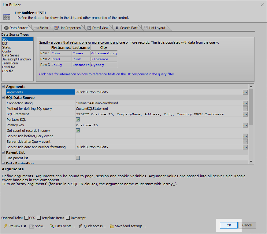
{dialog.object}.panelSetActive('PANELCARD_3',false);When you return to the List Builder, click the List Builder's OK button to save your change to the List control.
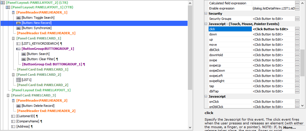
Select the New Record button in the UX Builder. Click the
 button to open the editor for the New Record button's click event.
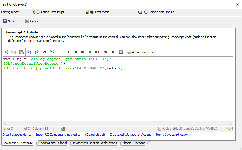
Add code to the click event for the New Record button to navigate to the Detail View's pane, PANELCARD_3, when the button is clicked. There are already 2 lines of JavaScript code in the button's click event. Add the same call to {dialog.object}.panelSetActive() created in the List's onClick event at the end of the script. Click
 Save to save your changes and close the Edit Event dialog.
var lObj = {dialog.object}.getControl('LIST1');
lObj.newDetailViewRecord();
{dialog.object}.panelSetActive('PANELCARD_3',false);
Lesson 4-2: Add a Back Button
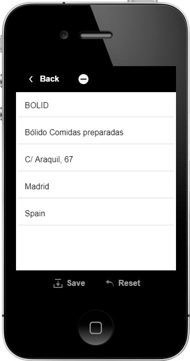
Now that you can navigate to the Detail View from the List control, a Back button needs to be added so that you can return to the List and Search Part from the Detail View.
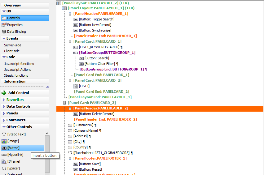
Select the
 [PanelHeader: PANELHEADER_2] control. In the Other Controls section, click
  [Button] to add a new button.
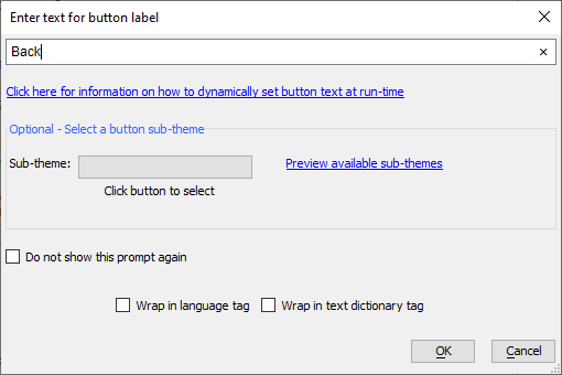
 Set the text for the button label to "Back" and click OK
Select the new back button and click the
 Toggle break button on the UX Builder toolbar to remove the break.
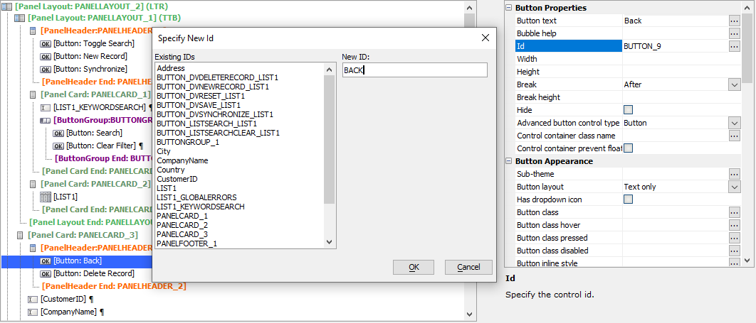
Change the button's Id to "BACK". Click the
 button for the Id property to open the Specify New Id dialog. Type in "BACK" in the New ID text box. Click OK to save the changes.When specifying a new ID for a control, the New ID must be unique among the controls in the UX Component.
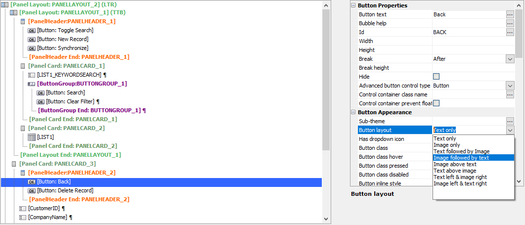
Under Button Appearance, change the Button layout to Image followed by text.
Click the
 for the Image name property to open the Specify Image dialog.
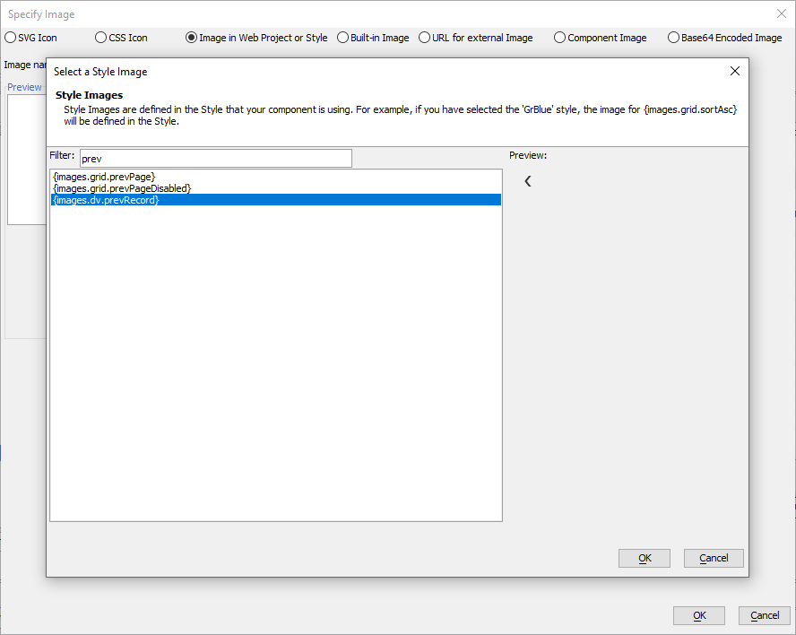
With Image in Web Project or Style select, click Select and select Select from the Style from the list of options. Search for "prev" and select the {images.dv.prevRecord} image from the style. Click OK to select the image. Click OK again to close the Specify Image dialog and save your changes.
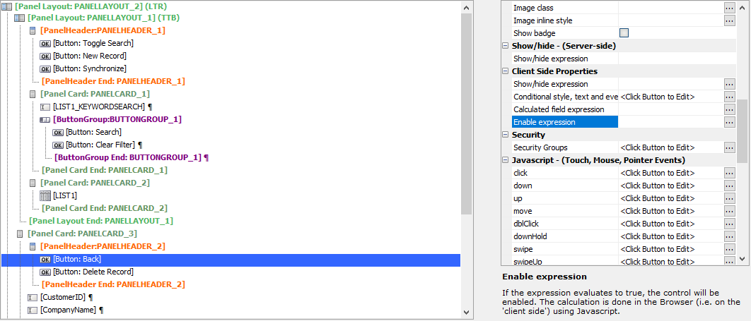
Add an enable expression to the Back button to prevent the user from going back to the List control if any changes have been made in the Detail View. In the Client Side Properties for the Back button, click the
 button for Enable expression
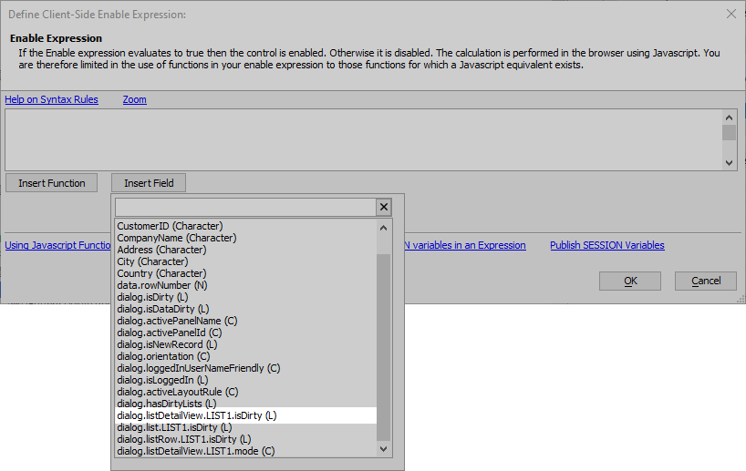
In the Define Client-Side Enable Expression dialog, click the Insert Field button. Select dialog.listDetailView.LIST1.isDirty from the list to insert it into the expression.
dialog.listDetailView.LIST1.isDirty is a logical variable that is true if the Detail View has been modified and false if no changes have been made. The Back button should only be enabled when the Detail View is modified, or when {dialog.listDetailView.LIST1.isDirty} is false.
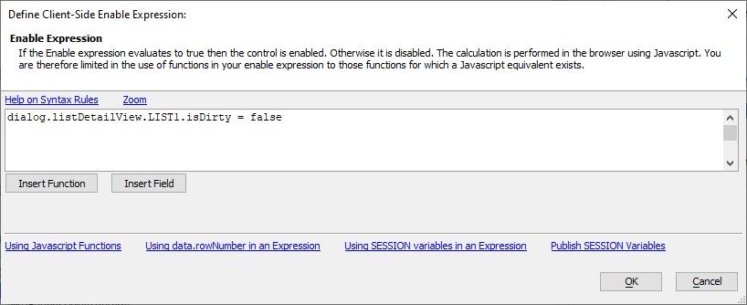
After {dialog.listDetailView.LIST1.isDirty}, type = false into the Enable Expression builder. You're Enable Expression should match the expression shown in the code example below. Click OK to save the Enable Expression.
dialog.listDetailView.LIST1.isDirty = false
Click the Help on Syntax Rules link above the text area to learn more about how to write a Client-side Enable Expression.
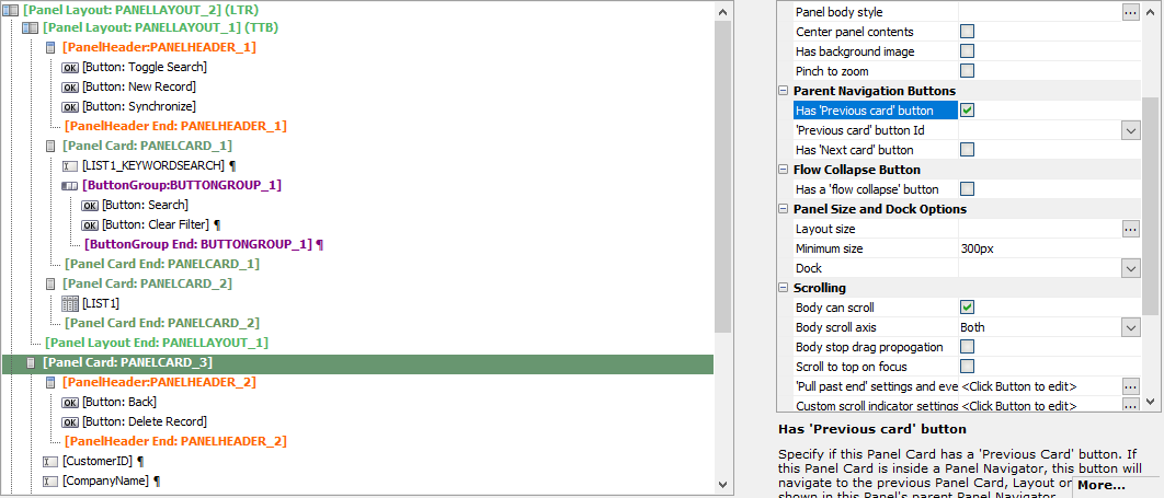
Select the Panel Card that contains the Detail View,
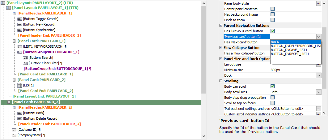
 [Panel Card: PANELCARD_3]. In the Parent Navigation Buttons properties, check the Has 'Previous card' button.
For the 'Previous card' button Id, select BACK from the dropdown.
Now that there is a Back button, you can return to the List control after viewing or modifying a record on the Detail View pane.
Lesson 4-3: Right Align Buttons in the Panel Header
In this lesson, you will add separation between the Toggle Search button and New Record button, making it easier to open the search part without accidentally tapping the New Record button. Similarly, space will be added between the Back button and the Delete Record button in the Detail View's Panel Header, reducing the chance of tapping the Delete Record button when navigating back to the List control.
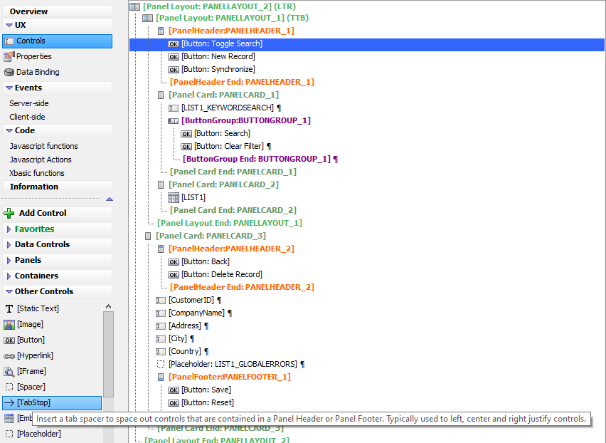
Select the Toggle Search button. Click
 [TabStop] to insert a Tab Stop control between the Toggle Search and New Record button. This will left align the Toggle Search button and right align the New Record and Synchronize buttons
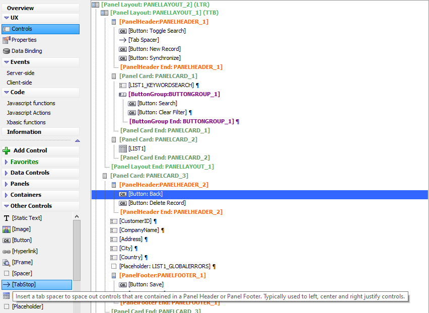
Repeat this for the Back and Delete Record buttons. Select the Back button. Click
 [TabStop] to insert a TabStop between the Back button and Delete Record button.
Lesson 5: Styling the List Control and Detail View
The final steps are to add a few styling elements to the List Control and Detail View so the controls are easier to read and use on a mobile device.
Lesson 5-1: Add a Freeform Layout to the List
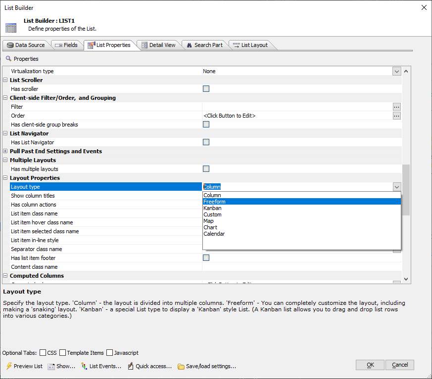
You will now add the layout and styling necessary to make the List records readable on a mobile device. This starts with converting the List's layout from a Column Layout to a Freeform layout, allowing you to take advantage of Client-side Templates to render the data in a mobile-friendly format.
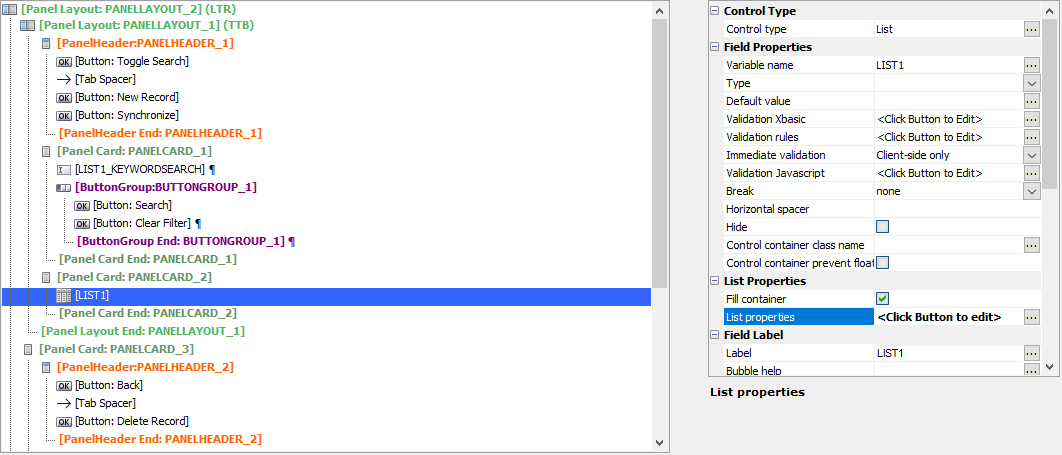
Select LIST1 and click the
 button for the List properties property to open the List Builder for the List control.
On the List Properties tab, change the Layout type property in Layout Properties from Column to Freeform
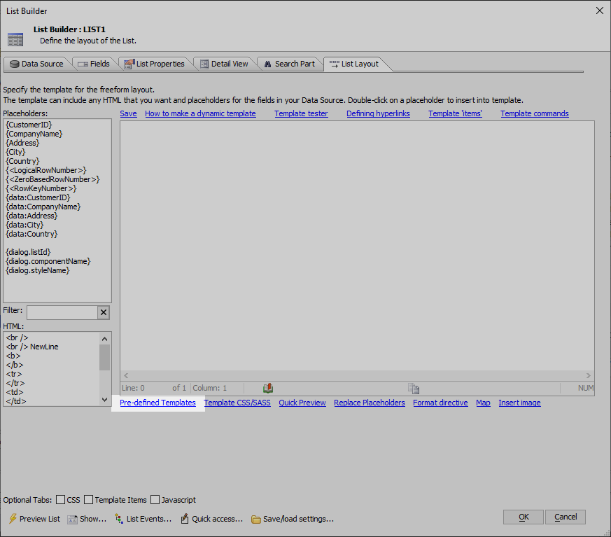
On the List Layout tab, click the Pre-defined Templates link located along the bottom of the Template editor. This will open the List Template Picker.
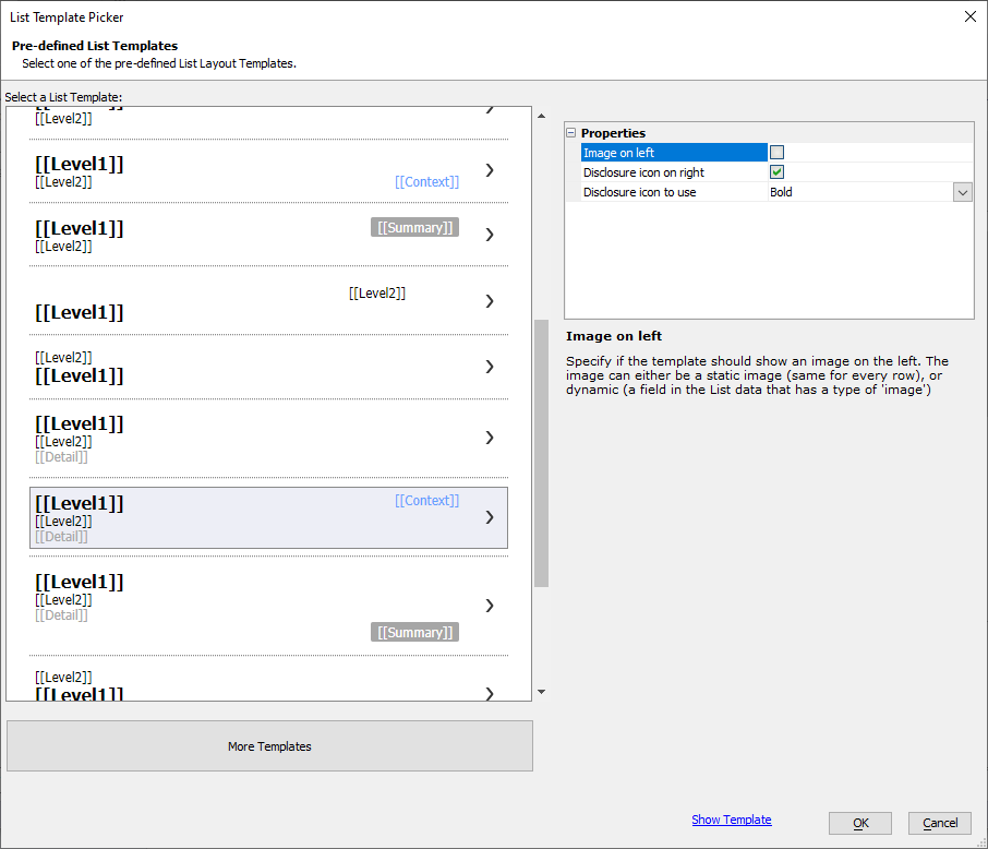
Select the template with Level1, Level2, and Detail on the left and Context on the right.
Watch Pre-Defined Free-Form List Templates to learn more about the pre-defined Freeform list templates available.
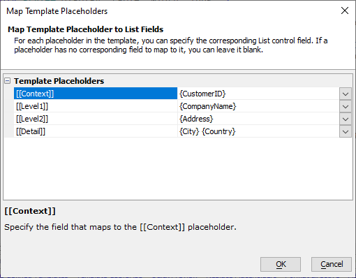
Assign the fields from the List control to the placeholders in the pre-defined template. You can select the fields from the dropdown controls or type them in manually. You can assign multiple fields to the same placeholder by typing them in.
- Assign the [[Context]] placeholder to {CustomerID}
- Assign the [[Level1]] placeholder to {CompanyName}
- Assign the [[Level2]] placeholder to {Address}
- Assign the [[Detail]] placeholder to {City} {Country}
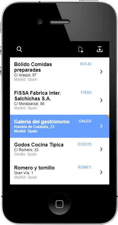
The placeholders in the list template will be replaced with the fields you picked. This will produce a template that will look similar to the template below. Click OK to save the layout.
<div style="display: table; width: 100%;">
	<div style="display: table-cell;">
		<div class="[theme:listBox.base.item.parts.contextClassName|{dialog.style}ListItemLabelContext]" style="float: right;">{CustomerID}</div>
		<div class="[theme:listBox.base.item.parts.mainClassName|{dialog.style}ListItemLabelMain]">{CompanyName}</div>
		<div class="[theme:listBox.base.item.parts.subClassName|{dialog.style}ListItemLabelSub]">{Address}</div>
		<div class="[theme:listBox.base.item.parts.contentClassName|{dialog.style}ListItemContent]">
			{City} {Country}<br/>

		</div>
	</div>


	<div style="display: table-cell; width: 40px; text-align: right; vertical-align: middle;">
		<img src="{images.dialog.listNav}" />
	</div>
</div>
Client-side templates allow you to define a dynamic layout for a List control that is calculated client-side, rather than server-side. This enables the List control to render new records when the mobile device is disconnected from the internet. Rendering data using client-side templates also offers speed advantages as it reduces the amount of data required to download from the server and can be done on the user's computer.
There are a rich variety of template directives available. Read Client Side Templates to learn more about the Client-Side Template syntax. You can learn more about Client-Side Templates by watching the videos below, as well.
Now that the List control is styled so data in the List is readable, you can style the Detail View's controls to render with a more mobile-friendly look.
Lesson 5-2: Mobilize the Detail View Controls
The final thing you need to do is to add labels to the Detail View's controls.
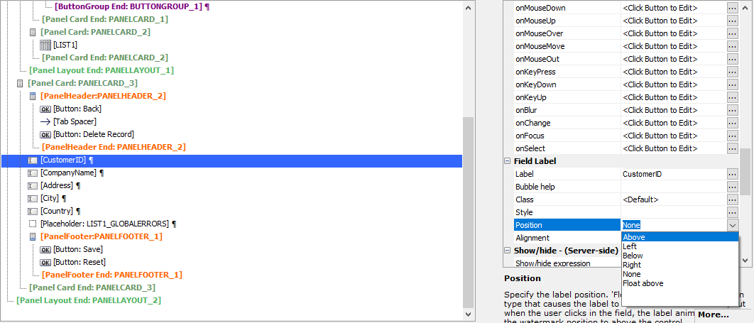
Select the CustomerID control. Change the Position in the Field Label properties to Above.
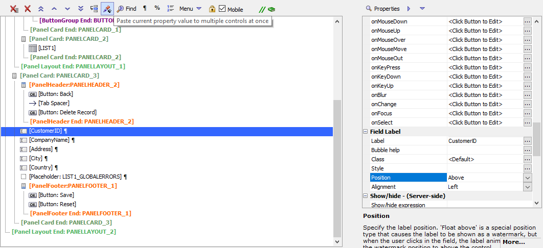
While the CustomerID control is selected, select the Position property. Click the
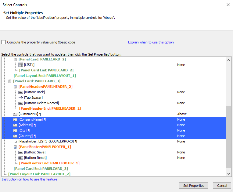
 Paste Properties UX Builder toolbar button to open the Set Multiple Properties dialog.
In the Select Controls dialog, select the CompanyName, Address, City, and Country controls. Click Set Properties to copy the label position from the CustomerID control to the selected controls.
Select the CompanyName control and click the
 smart field button for the Label property to open the text editor for the label.
Change the text from "CompanyName" to "Company" and click OK.
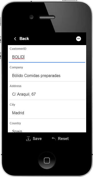
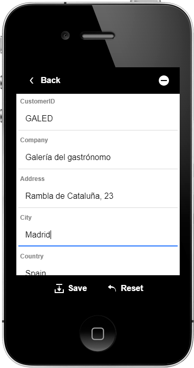
Now, when you view the Detail View, a label is shown for each field in the Detail View.
Congratulations! You have built your first Mobile App!
You have completed building your first mobile app. This app is ready to be deployed and will support a variety of mobile layouts. This app can be distributed as a mobile web application or published as a Mobile application and distributed through a private or public app store.
Before You Deploy: Remote Testing
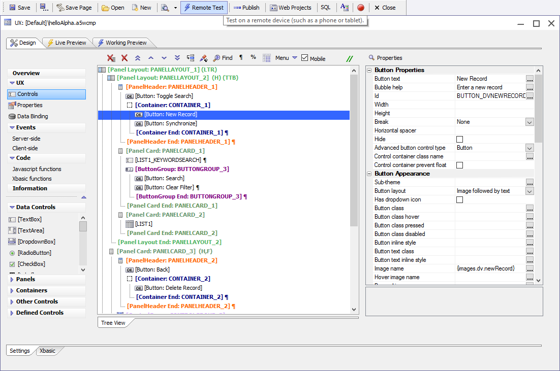
Before you consider deploying your application using Ionic Appflow or Cordova CLI, it's worth performing a Remote Test of your app on a mobile device.
Remote Testing is a way to test a mobile web application on a remote device. Remote Testing can be useful when trying to figure out layout and design elements for your mobile application. While the mobile emulator simulates several devices, it doesn't simulate all mobile devices on the market. With Remote Test, you can test your mobile and web applications on your devices.
Both the device and your development computer must be running on the same network. If they are not on the same network, remote testing is not possible.
Let's perform a Remote Test with the mobile application you have built.
Click the
 Remote Test toolbar button. This will open the Remote Test dialog.
If the development server is not running, you may be prompted to turn it on. If asked if you want to turn on the development server, select Yes and click OK.
Next, you will be asked what kind of Preview you would like. The options presented are Fast Preview and Full Preview. Since this is the first time you will be previewing your app using Remote Test, select Full Preview. This ensures all of the files you need to preview the app are published to a local testing directory.
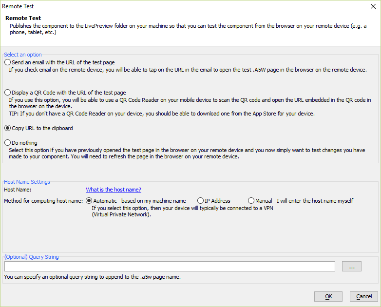
Next, you need to configure how the Remote Test URL will be generated and delivered. You can get the URL for the test page one of 3 ways: Send an Email, Display a QR Code, or Copy URL to the clipboard. The last option, Do nothing, should only be selected if you have made changes to the UX Component and want to test those changes on a device that already has a Remote Test active for the component.
If your device has a QR Reader, select the Display a QR Code with the URL of the test page option. Otherwise, choose Copy URL to the clipboard.
For the Host Name Settings, select Automatic and click OK.
If you chose to copy the URL to the clipboard, paste the URL into an application such as Notepad. You will need to type this URL manually in the address bar in the browser on your device. Do this now.
If you chose to display a QR code, the QR code should be on the screen. Open the QR reader on your device and use it to scan the QR code. The web browser on your device will open and navigate to the URL for the Remote Test.
You can now test your app on your remote device.
Appendix
Appendix A: Configure the Development Server
The Development Server is required to perform a Live Preview in the Alpha Anywhere IDE or do a Remote Test with another device on your network. The Development Server uses a local port on your computer to communicate with the browser. If that port is being used by another application, the port used by the Development Server needs to be changed otherwise the server cannot be started.
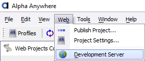
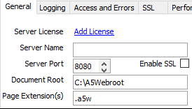
On the Web Projects Control Panel, open the Development Server Settings. They can be accessed under the Web menu. Select "Development Server".
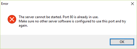
The Server Port is the port number that requests to the Alpha Anywhere Server are made. In a production environment, requests to the Alpha Anywhere Server will be made on port 80. However, in a development environment, port 80 is usually in use by other applications. If you start the development server using port 80, you will see an error message stating port 80 is already in use.
Change the Server Port to another port number. Pick a high-number port, such as 8080, for your Server Port setting.
Click Save to save the changes to the Development Server.
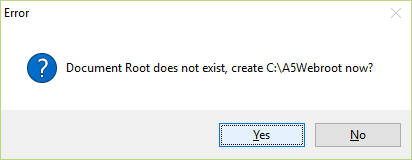
If this is the first time you start the development server, you will be asked if you wish to create the Document Root "C:\A5Webroot". This directory is where all files are published for local testing. Click Yes to create the directory.
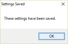
You will see a confirmation popup that the Development Server settings were saved. Click OK.
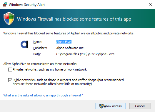
Windows Firewall may display a Windows Security Alert when the Alpha Anywhere application server starts. Click the Allow access button to allow Alpha Anywhere to communicate through the firewall. If access is not given to Alpha Anywhere, you may not be able to use some features, such as Remote Testing and Live Preview, on your system.
At this point, the Development Server should be running. Check the Server Status. The icon should appear green with the words "Running" next to it. Underneath the server status is the License State. The license state indicates how many simultaneous sessions you can have.
Click Close to close the Development Server Settings and return to the Web Projects Control Panel.
Now that the development server is configured and running, you can use Live Preview and Remote Test tools for testing Alpha Anywhere applications.
Appendix B: Helpful Resources
In addition to the Alpha Anywhere documentation system, located at https://documentation.alphasoftware.com/documentation, there are several other resources you may find useful for finding help or learning new tips and tricks about Alpha Anywhere:
- Where You Should Go
- Why You Should Visit
- Alpha Anywhere Video Library
https://www.alphasoftware.com/videos
Alpha Anywhere has a vast array of videos covering a variety of topics. Find how-tos, overviews, recordings of webinars and classes, and more.
- Alpha Users Forums
https://forum.alphasoftware.com
The Alpha Forum is a highly active users forum and is an excellent resource for any Alpha Anywhere developer. Collaborate with other Alpha Anywhere developers on problems and show off apps you've built. No question is too simple nor complex.
- Alpha Software Blog
https://www.alphasoftware.com/blog/
Learn the latest features and news from Alpha Software. Posts range from what's hot in the market to development tips and announcements of new features in Alpha Anywhere.
Appendix C: Help!
If you run into issues or have any questions, send an email to [email protected]. Our support staff will be happy to assist you.
See Also
