Data Field Control Properties
- Setup Properties
- Displayed Value
- Internal Value
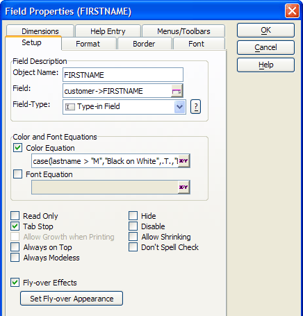
- Object Name
- Field
- Field Type
- Color Equation
- Font Equation
- Read Only
- Tab Stop
- Allow Growth when Printing
- Always on Top
- Always Modeless
- Hide
- Disable
- Allow Shrinking
- Don't Spell Check
- Show RTF Toolbar
- Fly-over Effects
- Format Properties
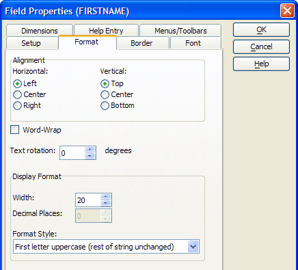
- Horizontal Alignment
- Vertical Alignment
- Word Wrap
- Width
- Decimal Places
- Format Style
- Border Properties
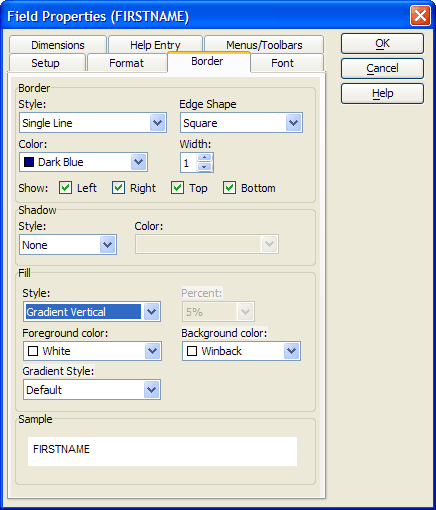
- Border Style
- Border Color
- Border Edge Shape
- Border Width
- Show Left, Right, Top, Bottom
- Shadow Style
- Shadow Color
- Background Style
- Fill
- Font Properties
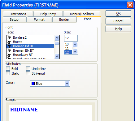
- Font
- Size
- Bold, Italic, Underline, Strikeout
- Color
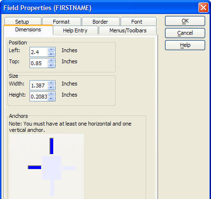
- Dimension Properties
- Left
- Top
- Width
- Height
- Anchor
- Bubble Help Text
- Help Source File
- Topic Name
- Chapter Name
- Topic Name
- Menu and Toolbar Properties
- Right Click Menu
- Choice Properties (Record List Controls)
- Table
- Return Value
- Filter Expression
- Columns in Record List
- Watch Expression
- Choice Properties (Other Controls)
Description
Properties are available for all form controls that are bound to a table field, variable, or a calculated value. Examples include:
Check boxes
Combo boxes
List boxes
Memo controls
Radio buttons
Rich Text Memo controls
Tree Controls
Type-In (text) controls
Setup Properties
Displayed Value
The text displayed on the form.
:formname.fieldname.text as C
Internal Value
The actual value stored internally.
:formname.fieldname.value as A
You cannot read the value of a blank numeric or logical field. If a field on a form or browse is edited, the .text property immediately reflects what the user typed into the field, but the .value property is only set when the field looses focus.Object Name
Any text description that you wish. The default value is the field name.
:formname.fieldname.object.name as C
Field
The table field or variable that supplies the control writes to.
:formname.fieldname.entry.name as C
Field Type
A wide variety of different formatting options to display the data and any selection options.
:formname.fieldname.field.style as C
Color Equation
You can assign Color Equations to your layouts. For example, you might have negative numbers appear in red to draw attention to them. A color equation is a conditional expression that determines the font color and field background color depending on the value of the displayed data. Click the button to open the Color Equation Genie. If you set a conditional font or color equation, the settings override any other font and color settings you have defined.
:formname.fieldname.field.colorequation as C
Font Equation
You can assign Font Equations to your layouts. For example, you might have negative numbers appear in bold to draw attention to them. A font equation sets different fonts, point sizes, and styles depending on the value of the displayed data. Click to display the Font Equation Genie to help you define the necessary font equation.
:formname.fieldname.field.fontequation as C
Read Only
When checked prevents the user from modifying any data visible in the field.
:formname.fieldname.field.readonly as L
Tab Stop
When checked causes allows the user to tab to the field.
:formname.fieldname.object.tabstop as L
Allow Growth when Printing
When checked allows the data to expand to fit on reports.
:formname.fieldname.object.growable as L
Always on Top
When checked the control is always on the top-most level of the form layout. No other form elements will over lap it.
:formname.fieldname.object.always_on_top as L
Always Modeless
When checked the control will always be in modeless data entry mode regardless of what the form's setting.
:formname.fieldname.field.non_modal as L
Hide
When checked the field becomes invisible.
:formname.fieldname.object.visible as L
Disable
When checked the field becomes inaccessible.
:formname.fieldname.object.enabled as L
Allow Shrinking
When checked allows the data to shrink to fit on reports.
:formname.fieldname.object.shrinkable as L
Don't Spell Check
When checked prevents the field from being spell checked.
:formname.fieldname.object.disable_spellcheck as L
Show RTF Toolbar
Rich Text Memo fields only. Whether to display the RTF Toolbar when the field has focus.
Fly-over Effects
Check Fly-over Effects and click Set Fly-over Appearance to set horizontal alignment, vertical alignment, border, fill, font, and shadow properties to take effect when the cursor is above the field. Fly-over properties are not settable through Xbasic.
Format Properties
Horizontal Alignment
Sets the horizontal alignment of the data in the field to "Left", "Center", or "Right".
:formname.fieldname.align as C
Vertical Alignment
Sets the vertical alignment of the data in the field to "Top", "Center", or "Bottom".
:formname.fieldname.vertical_align as C
Word Wrap
When checked allows text to word wrap to multiple lines. If disabled, text will be clipped to the field's width.
:formname.fieldname.word_wrap as L
Width
The width of the display in characters. This value can be greater than or less than the table field's width.
:formname.fieldname.entry.width as N
Decimal Places
For numeric fields, the number of characters to display after the decimal point; not necessarily equal to the number of decimal characters defined for the table field.
Format Style
Optionally, select one of many data display formats.
:formname.fieldname.entry.format as C
Border Properties
Border Style
Sets the border line style.
:formname.fieldname.border.style as C
Border Color
Sets the border line color (using a color name or RGB value ).
:formname.fieldname.border.color as C
Border Edge Shape
Sets the shape of the border.
:formname.fieldname.border.style as C
Border Width
The width of the border line in pixels.
:formname.fieldname.border.width as N
Show Left, Right, Top, Bottom
For edge shape "Square" determines which sides of the rectangle will display. For other edge shapes, determines which corners will be square or styled.
:formname.fieldname.border.has_bottom_edge as L
:formname.fieldname.border.has_left_edge as L
:formname.fieldname.border.has_right_edge as L
:formname.fieldname.border.has_top_edge as L
Shadow Style
Determines how much the shadow will be offset and its degree of shading.
:formname.fieldname.shadow.style as C
Shadow Color
Sets the shadow color (using a color name or RGB value ).
:formname.fieldname.shadow.color as C
Background Style
The fill color mode and translucency of the control's background.
:formname.controlname.Background_style as C
Fill
The style and color(s) of the control's background.
:formname.controlname.fill.backcolor as C
:formname.controlname.fill.forecolor as C
:formname.controlname.fill.style as C
Font Properties
Font
Sets the font.
:formname.fieldname.font.name as C
Size
Sets the point size.
:formname.fieldname.font.size as N
Bold, Italic, Underline, Strikeout
When checked set the named attribute.
:formname.fieldname.font.bold as L
:formname.fieldname.font.italic as L
:formname.fieldname.font.strikeout as L
:formname.fieldname.font.underline as L
Color
Sets the text color (using a color name or RGB value ).
:formname.fieldname.font.color as C
Dimension Properties
Left
Sets the horizontal position of the control.
:formname.fieldname.object.left as N
Top
Sets the vertical position of the control.
:formname.fieldname.object.top as N
Width
Sets the width of the control.
:formname.fieldname.object.width as N
Height
Sets the height of the control.
:formname.fieldname.object.height as N
Anchor
Determines the way the tabbed control will or will not stretch as the base form is resized. Possible attachment points are: 1 = top and right 2 = top, left, and right 4 = bottom and left 5 = bottom and right 6 = bottom, left, and right 8 = top, bottom, and left 9 = top, bottom, and right 10 = top, bottom, left, and right
:formname.fieldname.object.anchor as N
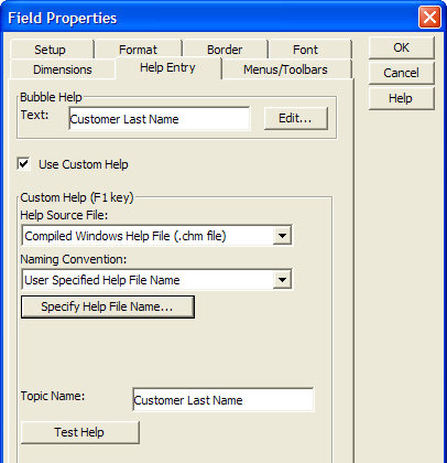
Bubble Help Text
The bubble help text that appears when you place the cursor over the control.
:formname.fieldname.bubble_help as C
Help Source File
The path to and name of the compiled help file that contains the help topics.
:formname.fieldname.help_filename as C
Topic Name
The name of the help topic in a compiled help file.
:formname.fieldname.help_topic as C
Chapter Name
The name of the chapter name in an Alpha Anywhere help file.
:formname.fieldname.chapter_name.help_topic as C
Topic Name
The name of the help topic in a compiled help file.
:formname.fieldname.settings.help_title as C
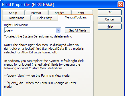
Menu and Toolbar Properties
Right Click Menu
Sets the menu that appears when you right click on the control.
:formname.fieldname.right_click_menu as C
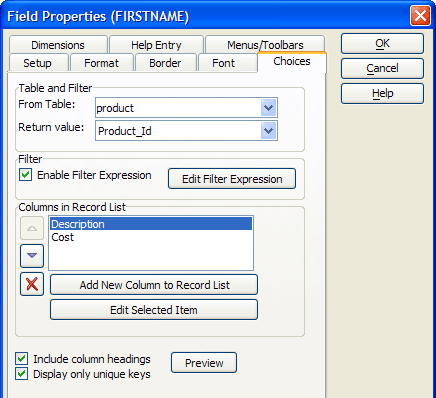
Choice Properties (Record List Controls)
Record List controls are bound to one or more fields in a specified table.
Table
The table which provides the data that is displayed.
:formname.controlname.table as C
Return Value
The value that will be returned to the form when a record is selected.
Filter Expression
An expression that selects which records will be displayed.
:formname.controlname.record_list.filter_expression as C
Columns in Record List
These fields that the list will display.
:formname.controlname.record_list.order_expression as C
Watch Expression
An expression that evaluates to a logical value to determine when the list should be refreshed. The Watch Expression is not enabled until there is a Filter Expression. If you do not have a need to select a subset of your table's records, give the Filter Expression a value of .T. (all records).
:formname.controlname.record_list.watch_expression as C
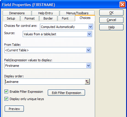
Choice Properties (Other Controls)
Lists of choices can be based on system objects (e.g. field names), table values, expressions, user written functions, or static lists. Refer to the following topics for more information.
Check boxes
Combo box
List box
Radio buttons
Two state buttons
See Also