Setting Control Properties
- Type-in Field
- Combo Box
- List Box
- Radio Button
- Multi state Button
- Tree Control
- Drop-down Tree
- Record List - List Box
- Record List - Combo Box
- Record List - Edit Combo Box
- Two state Button
- Check Box
- Email Alpha Anywhere
- Expression Builder
- Field Select
- File Select
- Filter Builder
- Order Builder
- URL
- Enabling Allow Shrinking
- Enabling Always Modeless
- Enabling Always on Top
- Setting the Display Font
- Setting Border Attributes
- Setting Shadow Attributes
- Setting Fill Attributes
- Setting Text Alignment
- Setting the Display Format
- Setting the Position and Size
- Enabling Dynamic Control Resizing
- Changing the Field Description
- Enabling and Disabling Miscellaneous Properties
- Specifying the Right-Click Menu
- Specifying a Help Topic
- Providing Bubble Help
- Creating Flyover Effects
Description
Some topics include: setting the field type, record list - list box, enabling allow shrinking, enabling always modeless, setting the display font, enabling and disabling miscellaneous properties, etc...
When you place a table field or calculated value on a layout, by default the new control has a Field Type of "Type-in Field". There are many other display modes for a control that provide special features.
Type-in Field
support the normal display and editing of text, number, date, time, and logical fields.
Combo Box
display a drop-down list of choices.
List Box
display an expanded multi-line list of choices.
Radio Button
select a single value from a small number of choices.
Multi state Button
select one of multiple choices.
Tree Control
organize and display an expanded multi-line hierarchy of structured choice values.
Drop-down Tree
organize and display a drop-down hierarchy of structured choice values.
Record List - List Box
display an expanded multi-line list of field values in a table.
Record List - Combo Box
display a drop-down list of field values in a table.
Record List - Edit Combo Box
display an editable drop-down list of field values in a table.
Two state Button
select one of two choices.
Check Box
select one of two choices.
Email
open your email client and place the field contents in the TO address line.
Email Alpha Anywhere
open your Alpha Anywhere email client and place the field contents in the TO address line.
Expression Builder
open the Expression Builder and display the resulting expression.
Field Select
select a field from the current table.
File Select
select a file and display its drive, path, and filename.
Filter Builder
open the Filter Builder and display the resulting expression.
Order Builder
open the Order Builder and display the resulting expression.
URL
display a URL and open it in your default browser.
Enabling Allow Shrinking
Select the control, choose Object > Properties and display the Setup tab.
Check Allow Shrinking.
Enabling Always Modeless
Select the control, choose Object > Properties and display the Setup tab.
Check Allow Modeless.
Enabling Always on Top
Select the control, choose Object > Properties and display the Setup tab.
Check Always on Top.
Setting the Display Font
Select the control, choose Object > Properties and display the Font tab.
Optionally, select a font from the Face list.
Optionally, select or enter an integer value for the Size of the font.
Optionally, check the Bold, Italic, Underline, and Strikeout style check boxes.
Optionally, select a color from the Color list.
Setting Border Attributes
Setting Shadow Attributes
Setting Fill Attributes
Setting Text Alignment
Select the control, choose Object > Properties and display the Format tab.
Set the Horizontal Alignment by clicking Left, Center, or Right.
Set the Vertical Alignment by clicking Top, Center, or Bottom.
Optionally, check Word Wrap to allow text to use more than one line. You must resize the control to make the extra lines visible.
Setting the Display Format
Select the control, choose Object > Properties and display the Format tab.
Enter or select a value in the Width field to set the number of display characters. This value includes the decimal point and numbers to the right of the decimal point.
In the case of numeric fields, enter or select a value from the Decimal Places field.
Optionally, select a Format Style. Refer to Display Formats.
Setting the Position and Size
Select the control, choose Object > Properties and display the Dimensions tab.
Enter or select a value in the Left field to set the horizontal location of the control on the form.
Enter or select a value in the Top field to set the vertical location of the control on the form.
Enter or select a value in the Width field to set the width of the control on the form.
Enter or select a value in the Height field to set the height of the control on the form.
Enabling Dynamic Control Resizing
- The form's Window properties must have the following two settings in the size area.
Width = Use Form's Width
Height = Use Form's Height
Click the horizontal and vertical lines of the anchor to turn them on and off. There must always be one vertical (top or bottom) and one horizontal (left or right) anchor point turned on.
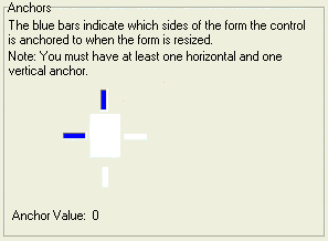
- Anchors Selected
- Effect When Form Resizes
- Left, Top
Unchanged
- Right, Bottom
Moves right and down
- Right, Top
Moves right
- Left, Bottom
Moves down
- Left, Right, Bottom
Stretches horizontally and moves down
- Left, Right, Top
Stretches horizontally
- Right, Top, Bottom
Stretches vertically and moves right
- Left, Right, Top, Bottom
Stretches horizontally and vertically
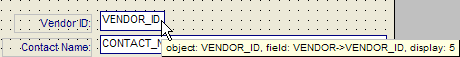
Changing the Field Description
Select the control, choose Object > Properties and display the Setup tab.
Optionally, change the Object Name. By default, the object name is the same as the table data field name. It is often useful to change this name to distinguish it from the underlying data field.
Optionally, change the data Field that is bound to the control.
1. Click the following to display the Field Select dialog box.

2. Select the table from the Table list.
3. Select the field from the Available Fields list.
4. Click OK to continue or Cancel to discard your inputs.
Optionally, change the variable that is bound to the control.
1. Click the following to display the Field Select dialog box.
2. To use an existing variable, select "Var" from the Table list.
3. Optionally, click Add Variable to display the Add Variable dialog box. Specify the Scope, Data Type, and Name of the new variable and click OK.
4. Select the variable from the Available Fields list.
5. Click OK to continue or Cancel to discard your inputs.
Optionally, change the calculated field that is bound to the control.
1. Click the following icon to display the Field Select dialog box.
2. To use an existing variable, select "Calc" from the Table list.
3. Select the calculated field from the Available Fields list.
4. Click OK to continue or Cancel to discard your inputs.
Optionally, change the system field that is bound to the control.
1. Click the following to display the Field Select dialog box.
2. To use an existing variable, select "System" from the Table list.
3. Select the system field from the Available Fields list.
4. Click OK to continue or Cancel to discard your inputs.
Optionally, change the Field-Type. Refer to Selecting a Field Data Control to understand the characteristics of the different options.
1. Click the 'down arrow' icon to display the different control formats.
2. Depending on the type of control selected, display the Choices tab and enter required information.
Enabling and Disabling Miscellaneous Properties
Select the control, choose Object > Properties and display the Setup tab.
Optionally, check Read Only if you do not want the user to be able to change the value of the field.
Optionally, clear Tab Stop if you do not want the user to be able to tab to the field.
Optionally, check Always on Top if you want the field to always be on top of any other layered controls.
Optionally, check Always Modeless if you want the user to be able to edit the field without putting it in change mode.
Optionally, check Hide if you want to make the field invisible.
Optionally, check Disable if you do not want the user to be able to edit or select the data in the field.
Optionally, check Allow Shrinking if the field can be made smaller during printing.
Optionally, check Don't Spell Check if you do not want the field to be eligible for spell checking.
Specifying the Right-Click Menu
Select the control, choose Object > Properties and display the Menus/Toolbars tab.
Click the down arrow icon to select an existing toolbar from the Right-Click Menu list.
Optionally, click Set All Fields to apply this toolbar to all fields on the form.
Specifying a Help Topic
Choose Object > Properties and display the Help Entry tab.
Check Use Custom Help.
Make a selection from the Help Source File list. The options are:
"Standard Windows Help File (.hlp file)"
"Compiled Windows Help File (.chm file)"
"Alpha Anywhere Help File"
If you selected either "Standard Windows Help File (.hlp file)" or "Compiled Windows Help File (.chm file)", refer to Linking to a External Help File Topic.
If you selected "Alpha Anywhere Help File", refer to Creating Alpha Anywhere Help Text.
Providing Bubble Help
Choose Object > Properties and display the Help Entry tab.
Optionally, check Free form XDialog if you would like to add images or other Xdialog controls to the bubble help.
If you checked Free form XDialog :
Enter Xdialog code into the Bubble Help Text field.
Click Preview to see how the bubble help will appear.
If you did not check Free form XDialog :
Optionally, enter the help text into the Bubble Help Text field.
Optionally, click Edit... to display the Bubble Help dialog box.
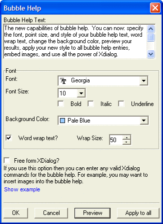
Enter the help text into the Bubble Help Text field.
Optionally, change the Font, Font Size, Bold, Italic, and Underline field settings.
Optionally, enable word wrap by checking Word Wrap Text?.
Optionally, change the default line length by entering or selecting a new value in the Wrap Size field.
Click Preview to see how the bubble help will appear.
Optionally, click Apply to all to set this as the bubble help for all fields on the form.
Click OK to save your changes or Cancel to exit.
Creating Flyover Effects
Choose Object > Properties and display the Setup tab.
Check Fly-over Effects and click Set Fly-over Appearance to display the Fly-Over Properties dialog.
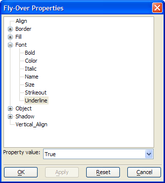
Expand the properties list as necessary and select the property you want to change.
Select the fly-over value from the Property value list at the bottom of the dialog.
Click OK to apply your changes or Cancel to quit without making any changes.