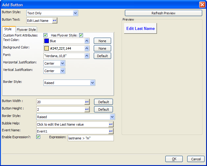
Add Button Dialog
Description
The Add Button dialog specifies the characteristics of a button used when setting Advanced Text Properties for a Conditional Expression.
Select the Button Style. The options are:
"Text Only"
"Bitmap Only"
"Bitmap-Text"
"Text-Bitmap"
"Text over Bitmap"
"Bitmap over Text"
If the Button Style uses text, enter it into the Button Text control. You may click 'xy' to use the Expression Builder to compose an expression that returns a text caption.
If the Button Style uses text, optionally enable Custom Font Attributes to specify additional text formatting options.
1. Optionally, click the 'up' arrow to select a color in the Text Color control.
2. Optionally, click the 'up' arrow to select a color in the Background Color control.
3. Optionally, click 'up' arrow to select a font in the Font control.
Optionally, select Horizontal Justification. The options are:
"Left"
"Center"
"Right"
Optionally, select Vertical Justification. The options are:
"Top"
"Center"
"Bottom"
Select a Border Style for the button. The options are:
"Raised"
"Flyover"
"Modern"
"None" - produces a round cornered button
If the Button Style uses a bitmap, click the 'up' arrow to select an image.
Optionally, enable Has Flyover Style and display the Flyover Style tab. Assign alternate style attributes for use when the mouse hovers over the button.
Optionally, change the Button Width. The measurement is in characters.
Optionally, change the Button Height. The measurement is in lines.
Optionally, enter Bubble Help that will appear when the mouse hovers over the button.
Optionally, check the Enable Expression control. Enter an expression that returns TRUE (.T.) or FALSE (.F.). This expression determines when the button is enabled.
Click OK to save your inputs and return to the Advanced Text Properties dialog.
Limitations
Desktop applications only.
