Custom Control Properties
Description
The Custom control is a control where the data contents and formatting of a column (or row) is defined by your Xbasic and HTML code.
A custom control can reference a number of grid component and data variables, including the value of data in other grid cells. A custom control can create its own variables to carry values between cells of the grid. There are no important constraints upon what the grid cell of a custom control can display, other than that it must contain valid HTML code. This means, for example, that row-by-row, the type of web control that appears in a grid cell could vary from label to textbox to drop down listbox.
Properties
- Definition
Specify the Xbasic code that computes the HTML for the custom control.
Create a Custom Control
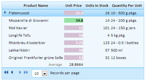
This section explains how to create a custom control similar to the one above. This is a custom control where Xbasic dynamically sets the font and background properties, depending on whether the Unit Price value is above or below the average. The Average for this grid is computed by simply adding an average Summary value to the component.
Open the Grid Builder and go to the Design tab. On the Data Source page choose either dbf or SQL.
On the Query(DBF) or Query(AlphaDAO) page connect to a Table that has some numeric fields in it.
From the Design menu open the Fields page. Move a number of fields from the Available Fields: list into the Selected: fields list.
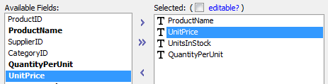
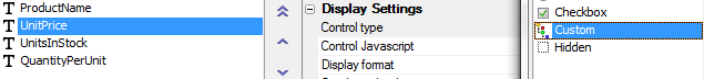
Select one of your numeric fields in the Selected list, this example uses a field called UnitPrice, and in its Field Properties list find the Display Settings section.
Under Display Settings find the Control type property and click the button next to it. Select the Custom option from the Select Control Type dialog.
The Field Properties list for custom controls will be displayed. In this list find the Custom Controls Properties section and under it the Definition property.
Click the
 button next to the Definition property.
The Define Xbasic for Custom Control: dialog will open. Delete the default code and replace it with the code below. If your field is not called UnitPrice, replace the name UnitPrice, wherever it occurs in this code, with the name of the field you are using.
function UnitPrice_render as c (data as p, args as p, PageVars as p)
with PageVars
if data.UnitPrice > args.summary. UnitPrice.average then
UnitPrice_render = <<%html%

%html% + data. UnitPrice+ "
"
else
UnitPrice_render = <<%html%

%html% + data. UnitPrice+ "
"
end if
end
UnitPrice_XbasicError:
UnitPrice_render = "Error in custom control Xbasic: " + error_text_get()
end with
end function
AlphaAnywhere will fill in some of the code above automatically, so if you wanted to you could just save the existing framework and fill in the blanks. In this example, the field name is UnitPrice. As a result, the function is named UnitPrice_Render(). If the name of your customized field is not UnitPrice then swap out UnitPrice for the name of the field you are using. The UnitPrice_Render() function will return a value that is composed of quoted HTML and unquoted Xbasic. In this example, the if and else clauses have similar content. Both are character strings that combine HTML coding and a reference to the quantity field, using the prefix " data. ". Although not a required technique, embedding the HTML inside the ... tags simplifies the coding. Likewise, embedding the tag inside the <<%html% ... %html string simplifies the coding by removing the requirement to escape special characters.You need to add an average summary value to your control. In the Field Properties list find the Summary values section and check the box next to the Average property.

Done. View your custom control in Live Preview.
Variables
You may dimension local variables of any type within the fieldname_render() function. However, if you want to create variables that have scope beyond the current grid cell, you must define it as an element of either the:
args pointer (valid for the grid page)
session pointer (valid for the session)
For example, this code is able to create a running total of the Extension field by adding values to session.rt.
if eval_valid(" session.rt") = .f. then
    session.rt = Data.EXTENSION
else
    session.rt = session.rt + Data.EXTENSION
end if
Define Xbasic For Custom Control Dialog
As the example above on creating a custom control demonstrates, getting to the Define Xbasic for Custom Control Dialog is fairly straightforward. After defining a grid table you go to the Fields page and add some fields to the Selected: fields list. You then go to the Field Properties list and change the Control type of the selected field control to Custom . From there you go to the Custom Controls Properties and click the button next to the Definition property.
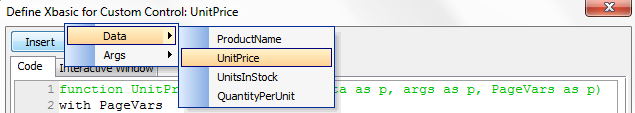
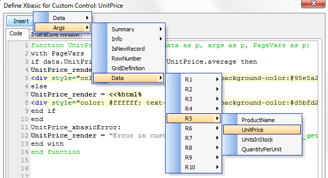
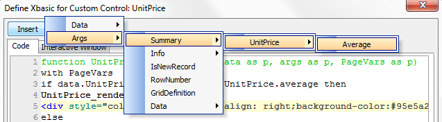
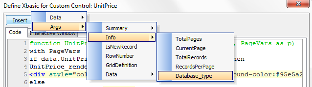
When the Define Xbasic for Custom Control dialog loads, you will see some code that lays out a default function for you based on whatever field you selected as your custom control. This is only a framework, you will have to create the code that determines what you want your custom control to do. There are, however, some tools to help make this task easier. The Insert button at the top of the dialog can add Row values, Grid Data Values, Summary values, and System variables to your function's code through a series of point and click events. To insert Current Row Values , i.e. the value of any field in the Current Row, click Insert select Data and then choose the FieldName that you want to add to your code . To insert Grid Data Values , or the value of any of the fields on any of the rows of the current grid page, click Insert > Args > Data > RowNumber > FieldName . If the grid has any Summary values , then you can insert any of them by clicking Insert, selecting Args, then Summary, FieldName, and finally the SummaryType you want. Finally, The Define Xbasic for Custom Control dialog provides several System variables that you can use in your calculations by clicking Insert > Args > Info > System variable .
Current Row Values:
Grid Data Values:
Summary Values:
System Variables
Available System Variables:
- Name
- Description
- Args.Info.TotalPages
Numeric. The number of grid pages required to display all records.
- Args.Info.CurrentPage
Numeric. The current grid page.
- Args.Info.TotalRecords
Numeric. The number of records returned by the current table query.
- Args.Info.RecordsPerPage
Numeric. The maximum number of records to display in a grid page.
- Args.Info.Database_type
Character. The type of database.
- Args.Info.HasEmptyRows
Logical. Does the current grid page have an empty row?
- Args.FirstEmptyRow
Numeric. The row number of the first empty row.
- Args.IsNewRecord
Logical. Are you processing a newly input record?
- Args.RowNumber
Numeric. The current row number.
- Args.Summary
Pointer. The values of various summary calculations.
Custom Controls on an Editable Grid
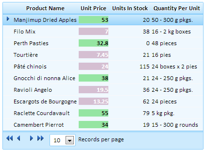
This topic illustrates several useful techniques when placing a custom control on an editable grid. The grid shown below displays the Extension field is in a custom control.

The code that creates the control is as follows. First, the standard boilerplate code.
function EXTENSION_render as c (data as p, args as p, PageVars as p)
with PageVars
on error goto EXTENSION_XbasicError
You cannot define the HTML for the new record rows in an editable grid. as a result, the first thing to do is test whether you are creating a new record. If Args.IsNewRecord is TRUE, then exit.
if Args.IsNewRecord = .t. then
exit function
end if
This example simply changes the background color of the cell if the value of the Extension field is greater than 100. What you have to do here is define code that can be placed into the cell of a table. The grid is, after all, just a table. Items that you can place into a table cell include:
formatted HTML text -
image -
table -
VariableContent- any legal HTML code
In this case the cell will contain a table. The cells will have different background colors ( bgcolor="#00FF00"and bgcolor="#FF0000") and right alignment ( align="right"). The alignment of the grid column has no effect inside this table, so, if you want right alignment, you need to explicitly define it. The table will be wide enough to contain any expected content ( width="80px"). The advantage of explicitly defining the table width is that it avoids having cell contents vary in width according to the data they contain; the behavior you see with label controls.
if Data.EXTENSION > 100 then
EXTENSION_render = <%html%
<table width="80px"><tr><td bgcolor="#00FF00" align="right"><strong>disp</strong></td></tr></table>
%html%
else
EXTENSION_render = <%html%
<table width="80px"><tr><td bgcolor="#FF0000" align="right"><strong>disp</strong></td></tr></table>
%html%
end if
disp = alltrim( str (Data.EXTENSION,250,2,"$(") )
EXTENSION_render = stritran(EXTENSION_render, " disp", disp)
end
EXTENSION_XbasicError
EXTENSION_render = "Error"
end with
end function
To simplify the formatting of the Extension amount, the HTML contains the string " disp", which the script replaces with alltrim( str( Data.EXTENSION,250,2,"$(") ).
Advanced use of custom controls in a grid
One of the control types available in the Grid is the custom control. This allows you to define an arbitrary Xbasic function to compute the HTML and Javascript for the control. In the example below, the grid is showing invoices. One of the cells in the grid shows the line items for the invoice. This could have been done using an embedded grid component, but the custom control is a lighter weight, faster solution.
- Part 1 | https://www.ajaxvideotutorials.com/V10Videos/CustomControlExample_Part1.mp4
- Part 2 | https://www.ajaxvideotutorials.com/V10Videos/CustomControlExample_Part2.mp4
See Also