Lookup PropertiesLookup Definition
Description
Lookup definition allows you to define what component and/or fields will be used in you Lookup, what filters will be used, and more.
Both dynamic and static filters can be applied to a Lookup depending on what type of Lookup it is. Using a dynamic filter will cause the lookup to be created from data already entered into the Grid. For example, if a user were to enter the state 'ma' then only customers in 'ma' will be shown when the lookup is open. Going a step further, the list of choices can be filtered based on other fields previously filled in. For example, say that you have defined a "city" field to be an auto-suggest field. If you previously entered "CA" into the "state" field, then when you enter a "city" field, the list of suggestions will only show cities in California. While Lookups require an Updatable grid there are some options in terms of user interface. Lookups can be configured to force a user to select from the lookup, while not permitting users to enter data into the field with the lookup.
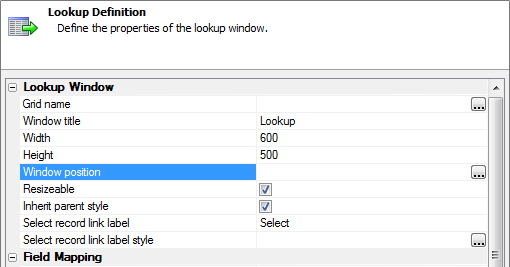
- Grid name
Specifies the name of the grid to display in the lookup window.
- Window title
Specifies the title of the lookup window.
- Width
Sets the width of the lookup window in pixels.
- Height
Sets the height of the lookup window in pixels.
- Window Position
Specify where the window will be shown
- Resizable
Enables or disables resizing of the lookup window.
- Inherit parent style
Specifies whether to use its style sheet or inherit the style sheet of the parent page.
- Select record link label
Specifies the text to display in the selection link.
- Select record link label style
Specifies style attributes that override the settings inherited from the style sheet. Click to define the In-line style. Refer to the ((Style Editor)) for details.
- Field map
A comma delimited list of the fields to retrieve from the lookup window or fields to write in the grid.
- Link type
Specifies whether to display text or a graphic as the link to the lookup window. The options are: "Text" and "Icon"
- Link label
Appears if the Link type is text, defines what text is displayed.
- Link label style
Specifies style attributes that override the settings inherited from the style sheet.
- Icon name
If icon is selected for link type, defines the text to display.
A text box control on a grid component or ux component may have an associated lookup window that can be used to set the values of one or more fields with a single click. If you want to define a lookup for a text box control that is on the Search Part of a grid, then go to the Search Properties page and in the Search Options section set the Search style property to "1" and the Allow 'Query By Form ' property to "False".
Creating a text box Grid Component type Lookup takes three steps.
First a Lookup grid needs to be defined. This is the "source" grid that will appear on the 'destination' when the Lookup is called. The Lookup grid can include all of the same or different tables as the destination grid. Being its own grid component it can also include such features as a Quick Search.
Secondly, you must set the properties of the field control that initiates the Lookup.
The final step is setting the properties of the field controls that will receive lookup values.
Create the Lookup Grid:
In the Grid Builder open the Design tab. On the Component Type page select Tabular from the Grid Layout menu. For the Grid is: selection click the Read only option.
Under Data Source select either dbf or SQL. On Query(DBF) or Query(AlphaDAO) connect the table you will use. This example uses the Northwinds Customerstable.
While on the Query page, click Select Primary Key and choose a field that you will use in your grid.
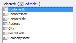
Open the Fields page. Move 5 fields from the Available Fields: list into the Selected: fields list using the right arrow key. These are the fields you want to retrieve when the Lookup is called.
Save your grid as something, like LookupOne.
Go to Live Preview . This is the Grid that you will use to define your Lookup. Close the component
Define the Destination grid and Lookup call:
Create a new grid component. Open the Grid Builder and go to the Design page.
On the Component Type page select Tabular on the Grid Layout menu. Click Grid is: Updateable .
Under Data Source connect to a table that you want to use.
On the Query(DBF) or Query(AlphaDAO) page connect to the a table. This can be the same table or a different table than the one used in your 'Source' grid.
On the Fields page move several fields from the Available Fields list to the Selected: fields list.
Select a TextBox control from the Selected: fields list. This is the field that will have the Lookup.
 You can use both TextBox and TextArea controls to initiate a Lookup field. By default, most fields added to an updateable grid appear as textbox controls automatically. When the destination grid is published, if a field is a lookup field, then an icon is shown to the right of the control. Pressing the icon opens a second browser window which displays the lookup window (the "source" grid component). When the user makes a selection in the lookup window, the 'source' grid will fill in one or more fields in the "destination" grid.
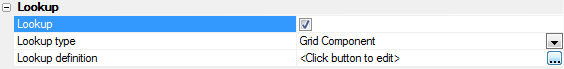
Now go to the Field Properties list for the TextBox you selected. Find the Lookup properties section and check the Lookup checkbox.
Under Lookup type select Grid Component .
Click the button next to Lookup definition. The Define Lookup Window dialog will open.
In the Define Lookup Window dialog find the Grid name property and click the button next to it. Select the Lookup grid that you created.
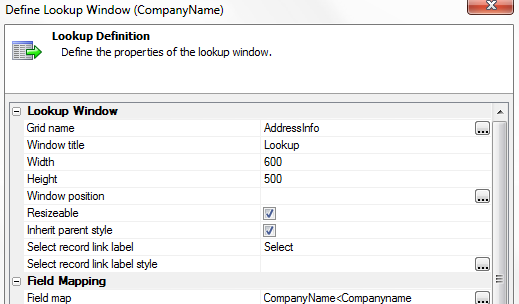
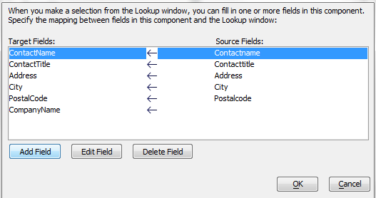
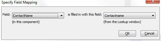
The Define Lookup Window dialog gives you the option to customize a number properties: For example, you can set the Window title field. By default, this property takes the column label of the field you selected in the "destination" grid. You can also set the Lookup Width and Height . You can change the Select record link label and click the button next to the Select record link label style property to open the Style Editor . This will allow you to define your own custom HTML coding.In the Field Mapping section of the Define Lookup Window dialog find the Field map property. Click the button next to it to open the Define Field Mapping dialog
The Define Field Mapping dialog allows you to specify a map between fields in the Lookup window and fields on your grid or dialog component. For example, your grid or dialog component might include these fields: ID, Fname, Lname, and Company. The Lookup window grid might have these fields on it: CustomerID, Firstname, Lastname, and CompanyName. You can map the CustomerIDfield to the IDfield, the Firstnamefield to the Fnamefield and so on. When the user makes a selection in the Lookup window, the Lookup window closes, and the corresponding data from the Lookup window is filled into the destination grid or dialog component. The Define Field Mapping dialog only shows fields that are displayed in text boxes in the Lookup window.
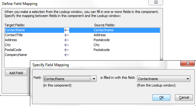
Click Add Field , select a destination Field: from the drop-down list at left, select the source field (from the Lookup window) list at right, and click OK .
Repeat for all the fields you wish to insert into a record.
Click OK to return to the Define Lookup Window dialog.
Find the Main Window of the Define Lookup Window dialog. Find Link type field and select "Text" or "Icon".
This field specifies the link that appears to the right of the textbox or textarea control and that opens the Lookup window. If the choice in the previous field was " Icon ", enter the relative path to the graphic you want to use. If the choice was " Text ", enter the text to using Link label field, also found in the Main Window part. Optionally, define an in-line HTML style for the link label text using the Link label style field.
Optionally, go to the Advanced section and click the button next to the Override settings property. This will display the Override Properties dialog. Use the Existing Properties tab and the Setting Grid Properties topic as references. Place new values into the Override Properties tab. 17. Optionally, add filter and order parameters into the Advanced > Query parameters property. This expression will select the records that appear in the lookup grid. For more information about formatting these expressions, see A5W Page Link, Filter, and Order Syntax and Automatically Populating Linking Field Values.
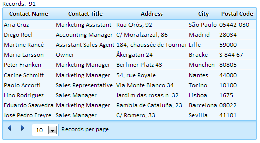
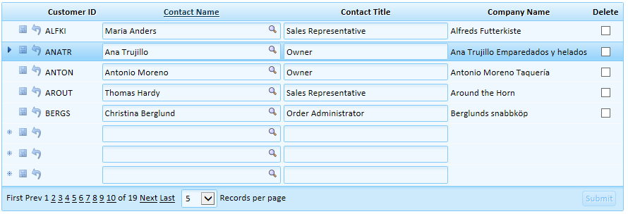
Click OK to return to the Grid Builder. Go to the Live Preview tab and click Full Preview. Your grid should look something like this:
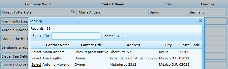 This example also has a Quick Search field.
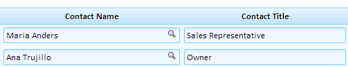
Clicking  next to a lookup field column will display the Lookup window. Clicking the Select link to the left of a row in the Lookup window copies all of the fields in that row to your page.
Position the Lookup Window:
Go back to the Fields page. Select the field control that initiates your lookup grid. Go to the Lookup section of the Field Properties list for this control.
Click on the button next to Lookup definition property and open the Define Lookup Window dialog.
In the Lookup Window section of the dialog, click on the button next to the Window position option.
This will open Window Position dialog. Select one of the Position options: In-View , Center , Absolute , or Relative .
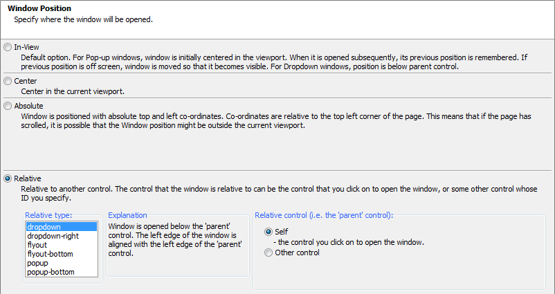
Click OK , OK , and Save your grid.
In order to be able to modify the data in fields, those fields must appear on a grid. This applies to cases where a lookup is used to populate a row. There are cases where you might not want all of the data that the Lookup inserts into a grid to be displayed. In these instances it is possible to hide these fields. The following example demonstrates how to do this.
Hiding Controls filled by a Lookup Grid Component:
In the Grid Builder open the Design tab. On the Component Type page select Tabular from the Grid Layout menu. For the Grid is: selection click the Read only option.
Under Data Source select either dbf or SQL. On Query(DBF) or Query(AlphaDAO) connect the table you will use. This example uses the Northwinds Customerstable.
While on the Query page, click Select Primary Key and choose a field that you will use in your grid.
Open the Fields page. Move 5 fields from the Available Fields: list into the Selected: fields list using the right arrow key. Save your grid as something, like LookupOne.
Go to Live Preview. This is the Grid that you will use to define your Lookup. Close the component
Create a second grid component. Open the Grid Builder and go to the Design page.
On the Component Type page select Tabular on the Grid Layout menu. Click Grid is: Updateable .
Under Data Source select the same data source that you used for the first grid component.
On the Query(DBF) or Query(AlphaDAO) page connect to the same table that you used to create the first grid component.
On the Fields page move the same five fields that you used in the first grid from the Available Fields list to the Selected: fields list.
Add two additional new fields to the Selected: fields list. In this example the new fields are CustomerIDand CompanyName.
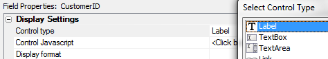
Select the first 'new' field and move it to the top of the Selected list using the up arrow. In the Field properties under Display Settings , change this fields Control type property to 'Label '.
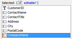
Select the second 'new' field, in this case CompanyName. Move it to the end of the Selected: fields list using the arrows.
With the field highlighted, go over to its Field Properties. Under the Display Settings properties, change the Control type to ' Labe l'.
In the Column Properties section check the Freeform layout property checkbox. Find the Freeform layout template property and click the [...] button to the right of it.

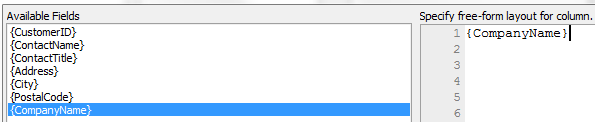
The Free-form Column Layout dialog will open. To the left is a list of Available fields created from the fields you selected.
Choose the name of the current field, i.e. the second 'new field that was added, in this case CompanyName. Double click on the field name to add it to the code area.
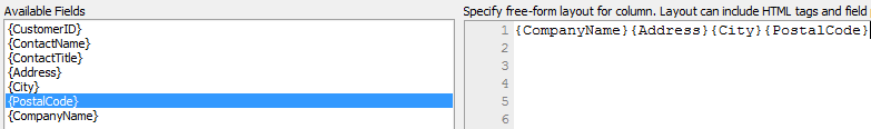
Next select three fields from the Available Fields list that you wish to hide and add them to the code area. Click OK .
Back on the Fields page again, for each field you wish to hide do the following. First click on the field in the Selected: fields list.
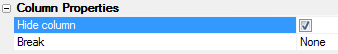
Next, go to the Field Properties list for each field. Under Display Settings, change the Control Type to ' Hidden '. Under Column Properties check the Hide column checkbox.
In your Selected: fields list there should now be two TextBox field controls, two 'Label' field controls, and three 'Hidden' field controls. Select the first TextBox field control.
Go to the Field Properties list and in the Lookup section check the Lookup checkbox.
Two more properties will appear. Under the first, Lookup Type , select Grid Component .
Click the button to the right of the Lookup definition property. This will open the Define Lookup Window dialog.
In the Define Lookup Window dialog, from the component list select the LookupOnegrid component that you created in steps 1 through 5.
Find the Field Map property, under Field Mapping , and click the button next to it. This will display the Define Field Mapping dialog.
Click the Add Field button.
Click OK and OK again. Go to Live Preview :
 In the Grid that calls the Lookup only 2 of the 5 Lookup fields are visible, 3 are hidden
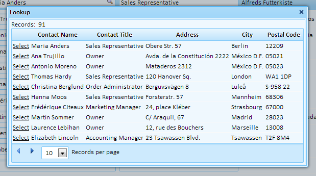 The Lookup displays all 5 fields

See Also