Lookup PropertiesLookup Type
Description
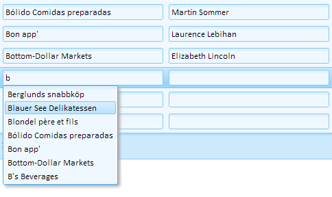
Lookup Type has a dropdown select list with these options: Grid Component, Auto-Suggest List, and Edit-Combo List. The Auto-Suggest list option creates Lookups that function much like a Google search toolbar.
Discussion
As you type in the textbox, a list of suggestions is supplied. With Grid Component Lookups, the suggestions can come from either a static list of values or, more commonly, from a table. Both the Auto-suggest and edit-combo controls allow you to enter multiple values in the field you are editing. For example, say you have a field called 'Send to' and you want to support a comma delimited list, such as 'Smith,Jones,King,Cohen' and you want the user to be able to select each entry in the list from the pick list. The edit-combo, or auto-suggest control can be used for this. For more info, check out the videos below.
Videos
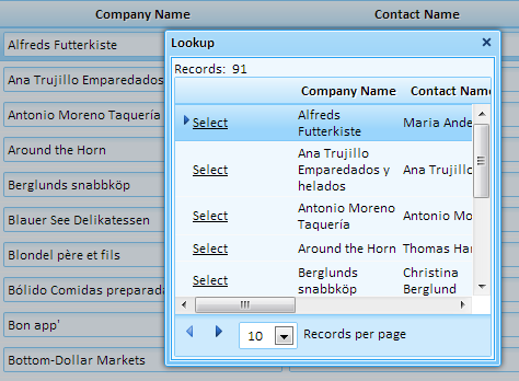
Lookups
A textbox can be configured to be a 'Lookup' field. A Lookup is a field that is populated by selecting from a list of choices. A Grid Component can be used to generate the list. In this video, we demonstrate how to create a Lookup field, including how to open the lookup in another window and applying dynamic filtering to the list of choices.
Auto-suggest fields works similarly to the Google Search toolbar. As you start typing in the textbox, a list of suggestions is supplied. The suggestions in the list can be statically defined or dynamically populated from a database or server-side variable. The list of choices can also be filtered on the value in other fields. For example, a 'City' field could be filtered to only display the cities for the selected 'State'.
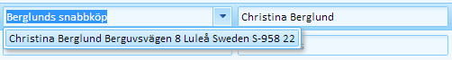
Standard HTML does not support an edit-combo box control. This video shows how you can include edit-combo boxes in your Grid components. You can use the edit-combo boxes in the Search, Grid, and Detail View parts.