Main View
Description
When you open the Alternate View Builder you will see a Main View tab to the left of the Alternate View tab. The Main View is the 'standard view' for your grid. This is where you define how an alternate view fits into the Grid Part of your component.
Main View Properties
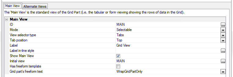
ID
The ID Property is always 'MAIN'. You cannot change this properties value.
Mode
The Mode property comes with two options, Selectable and Visible. Selectable creates a grid part where you have to click on something in order for the Alternate View to be visible. The Visible option simply displays the Alternate view on the same page as the grid. If you do select visible then you will need to create a freeform template to show where your Alternate View and your Grid should be placed in relation to each other. There are two pre-defined templates to help you do this.
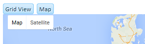
 Selectable Mode equals different pages
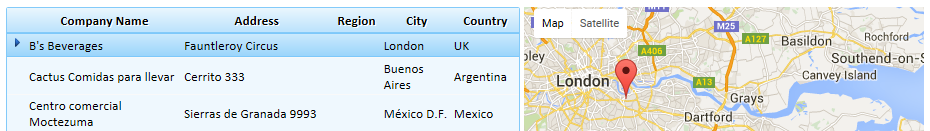 Visible Mode, everything is on the same page
View selector type
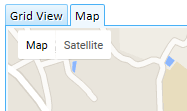
If you choose Selectable under as the Main View's Mode property, then you have the option of using Tabs, Buttons, or an Accordion to allow users to access the main view.
 Buttons
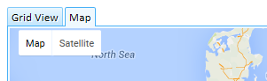 Tabs
Tabs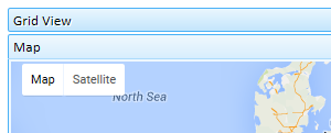 Accordion
Tab position
If you are working with Tabs as your selector type, you have the option of placing them on any side of your grid.
 Tabs on Top
 Tabs on Left
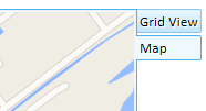 Tabs on Right
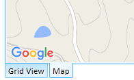 Tabs on Bottom
Label
This is the label that appears over you grid. You can edit this at will and insert your own HTML directly into the property itself. The default text is 'Grid View'.
Label in-line style
Show Main View
Initial view
This is what a user will first see when they run your component. Clicking the button next to this property will reveal a drop-down with a list with your Main View and all of your Alternate Views. Simply, click to select which view you want to be the initial one.
Has freeform template
A freeform template is code that describes how an Alternate View and a Grid View fit on to the same Grid Part. If your grid is visible then you will need to check the Has freeform template property. When you do this the Freeform template property, where you can define a template, will appear in the Main View list.
Freeform template
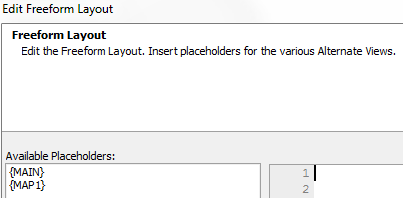
Clicking the button
 next to the Freeform template property will open an Edit Freeform Layout dialog. Here you can use basic HTML to shape how your page looks. The Grid View and Alternate View(s) that you have created for this project appear in the Available Placeholders: list on the left-side of the dialog. By incorporating these placeholders into your HTML you can add whatever Alternate or Grid View you want to your final grid component. Simply double click on an Available Placeholder and it will be copied into your HTML work area.
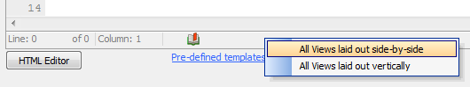
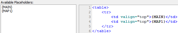
This property comes with two pre-defined templates that are displayed when you click the Pre-defined templates hyperlink at the bottom of the dialog. There are two options here, All Views laid out side-by-side and All views laid out vertically. All Views laid out side-by-side will inject HTML into the Edit Freeform Layout dialog that will make your Grid View and Alternate View appear next to one another horizontally. All Views laid out vertically will stack your Grid and Alternate Views on top of each other. The Grid and Alternate Views will appear from left to right or top to bottom in your final Grid Part in the same line-order that their respective Placeholders are added to your HTML code. If you want an Alternate View to appear to the left of a grid view in your final component, add the Alternate View placeholder to your HTML before you add the Grid placeholder.
Grid part's freeform text
When you build a grid part you have the option of creating freeform text. This is HTML that is displayed above, below, to the left, or to the right of the grid. It can include images, text, hyperlinks, and so forth. The Grid part's freeform text property lets you define whether you want this HTML to wrap around the Grid Part and the Alternate View (Using the WrapGridAndAlternateViews option) or simply display the freeform HTML around the Grid Part only (Using the WrapGridPartOnly option).