Customize icons
Description
Many of the icons used with certain images (e.g. the Row Expander icon) in a grid can be customized.
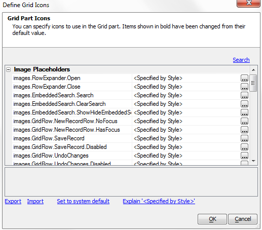
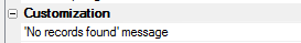
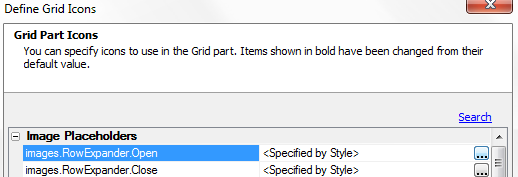
The ' Customize icons ' property in the ' Customization ' section in the ' Properties ' pane is where you can alter icons using the Define Grid Icons dialog. To open this dialog click the button [dot_img] next to the Customize icons property. When icons in the Define Grid Icons dialog are changed from their default setting they appear in bold. If you have defined a icon map that you would like to use in a different Grid, click the Export hyperlink button. You can also import maps using the Import hyperlink.
The Define Grid Icons Dialog:
The following example shows how to insert a customized icon into a grid placeholder using the Customize icons property. The placeholders being customized in this case are RowExpander.Open and RowExpander.Close. These instructions will also show how to create the RowExpander where the icons appear. Before proceeding it would be best to have at least one component pre-defined; to use with the row expander.
Customize a Grid Icon:
Create two simple icons using whatever paint or photoshop program works for you. These icons were created as 24 x 24 pixel png files.
 duck icon
 duck nest icon
From the Web Projects Control Panel open the Grid builder . On the Design tab's Component Type page under Grid Layout: menu select a Tabular grid.
On the Data Source page choose the type of data you want to display your grid. This example uses SQL .
Under Query(DBF) or Query(AlphaDAO) , select the table that you want to draw data from.
Go to Fields and add a number of fields to your grid by moving them from the Available Fields list to the Selected fields list.
Go back to the Query page. Find the Select Primary Key button and click it. A primary key is what you use identify records uniquely. It must be one of the fields defined in your grid; preferably one with differing entries.
The Select Primary Keys dialog will open. From the fields listed, check one that appears in your grid and click OK .
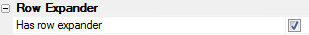
Now go to the Properties page. Scroll down to the Row Expander properties section and check the Has row expander property.
A list of Row expander properties will open. Find the Row Expander linked content property and click the button next to it.

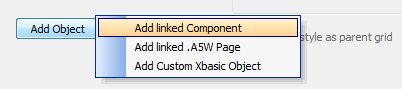
The Define Linked Content Dialog will open. Click the Add Object button and from the drop-down select Add Linked Component .
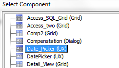
This will bring you to the Select Component Dialog, which will show you all of the components that you have created. Select a component from the list and click OK .
Click OK again to close the Define Linked Content dialog and scroll up the Properties page until you find the Customization properties section.
Find the Customize icons property and click the button [dot_img] next to it.

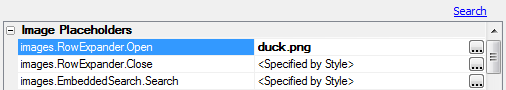
The Define Grid Icons dialog will open. In the list of icons find the images.RowExpander.Open Placeholder and click the button [dot_img] next to it.
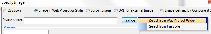
The Specify image dialog will open. Click the Image in Web Project or Style radio button and then hit the Select button and choose the Select from Web Project Folder option.
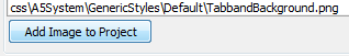
A Select Image dialog will open. Click the Add Image to Project button.
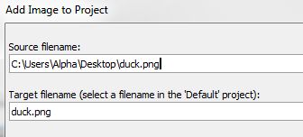
The Add Image to Project dialog will appear. Click the 'up' button next to Source filename: and navigate to where you stored your first simple icon on you computer.
Click OK , OK , and OK again to get back to the Define Grid Icons page. The altered icon should appear in bold lettering.
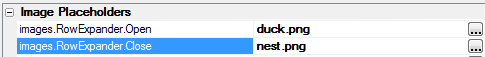
Next Select the images.RowExpander.Close Placeholder and click the button [dot_img] next to it.

Repeat steps 17 through 19 for this placeholder only this time add a different icon in step 18. Your Define Grid Icons dialog should look something like this.
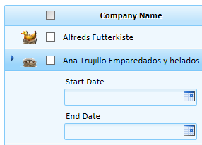
Click OK and go to Working Preview or Live Preview. You should now see your new Row Expander icon. Click on it and you should see it change to the second icon you defined.
New Row Expander Closed 'Duck' Icon

New Row Expander Open 'Nest' Icon