Master Layout Template Style
Description
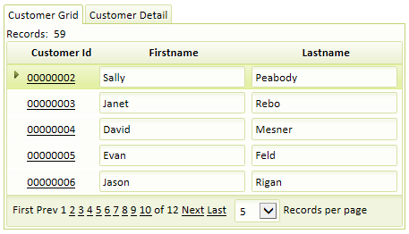
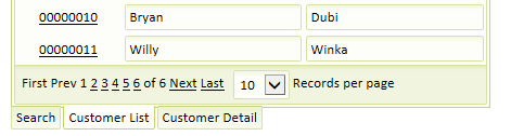
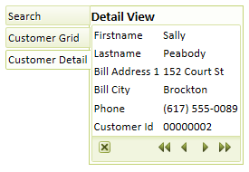
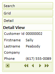
If your grid component contains a Search and or Detail View Part this will give you more template style options. You can add Search and Detail 'parts' on the Component Type page of the Grid Builder . There are a number of pre-defined master layout templates that you can use to style your grid.
Selecting Table - Vertical Layout will stack the search, grid, and detail parts vertically on the page in that order. Similarly, the Table - Horizontal Layout option will place the parts of your grid side by side. The Table - (Search and Grid) over (Detail View) option will place the Search and Grid parts next to one another horizontally and then add the Detail View below them. Selecting Tab Container - Tabs on Top places the grid, detail, and search parts on individual tabs that appear at the top of the grid component. You can choose other positions to place these tabs by choosing one of the Tab Container - Tabs on Bottom , Tab Container - Tabs on Left , or Tab Container - Tabs on Right options. The Accordian Container option adds a title bar above each part. You can then click on the title of each part to either close or expand it. It is also possible define your own custom master layout template by selecting the Custom option.