Control type
Description
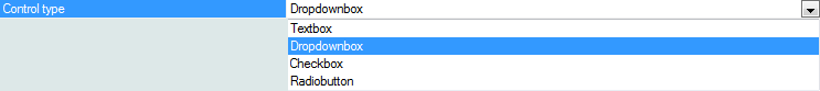
While most of the examples here have used a simple textbox for the Quick Search feature, there exist other options. The Control type property lets you quickly swap out the default ' Textbox ' Quick Search control for a ' Dropdownbox ', ' Radiobutton ', or ' Checkbox ' control and visa versa.
It should be noted that for some of these controls it is necessary to define search options. This feature can be advantageous in that you can auto-submit a search when a value in a dropdownbox, radio button or check box control changes. For example, you might have a Quick Search on a State field; that describes all of the states in the United States. You would have a dropdownbox showing every state. When the user makes a selection in this dropdownbox, a new search runs immediately, without the user having to click a Search button. Below are some of the control specific properties:
Choices
The choices property is available if the Control type is "Dropdownbox", "RadioButton", or "Check box".
tmpl.QuickSearch .Check box.Choices as C
.Dropdownbox.Choices as C
.Radiobutton.Choices as C
Has ShowAll radio button
Only applies if the Control type property is set to "Radiobutton". Specifies if the radio buttons should include a button to show all records. This is necessary to "turn off" the search after you have done a quick search. With other control types, you can turn off the search by doing a search on a blank value.
Has ShowAll radio button
tmpl.QuickSearch
.Radiobutton.HasShowAllButton as L
ShowAll button label
Only applies if the Control type property is set to "Radiobutton". Defines the label for the "ShowAll" radio button.
ShowAll button label
tmpl.QuickSearch
.Radiobutton.HasShowAllButton as L
Dropdownbox height
Only applies if the Control type property is set to "DropDownBox". Specifies the height of the dropdownbox. If the height is greater than 1, you can allow the user to select multiple entries.
Dropdownbox height
tmpl.QuickSearch
.Dropdownbox.Size as N
Dropdownbox select style
Only applies if the Control type property is set to "DropDownBox". Specifies if the user can select multiple entries, or just a single entry. The choices are: "Single" and "Multiple"
Dropdownbox select style
tmpl.QuickSearch
.Dropdownbox.SelectStyle as C
Orientation
Only applies if the Control type property is set to "Radiobutton" or "Check box". Specifies the orientation of the Quick Search control. The options are:"Horizontal" or "Vertical"
Orientation
tmpl.QuickSearch
.Check box.Orientation as C
.RadioButton.Orientation as C
Auto submit
Only applies if the Control type property is not set to "TextBox". Specifies whether, when the user makes a selection in the Quick Search, the search be performed immediately or when the user clicks the "Search" button?
Auto submit
tmpl.QuickSearch
.AutoSubmit as L
Freeform layout
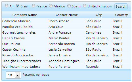
Applies only if the Has freeform layout property is set to True. Specifies the freeform layout for the Quick Search. You can specify any HTML for the text that surrounds the Quick Search. A Quick Search using radio buttons with predefined values.
Freeform layout
tmpl.QuickSearch
.freeFormLayout as C
Add a Static Quick Search Dropdownbox Control:
From the Web Projects Control Panel open the Grid Builder , go to the Design tab, and u nder Data Source choose either .dbf or SQL .
On the Query(DBF) or Query(AlphaDAO) page and select a table from which to draw data.
Open the Fields page and use the arrows to add fields from the Available Fields: list to the Selected fields list.
In the Properties page, scroll down the list of properties until you find the Quick search section. Check the Has Quick Search checkbox.
Go to the Field(s) to Search property and select some fields for your Quick Search control to search.
Find the Control type property and from the dropdown select the ' Dropdownbox ' control.
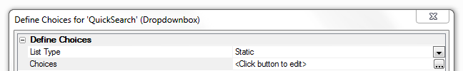
Find the Choices property, directly below the Control type property, and click the [dot_img] button next to 'Choices'.

The Define Choices for 'QuickSearch' (Dropdownbox) dialog will open. Leave the List Type drop-down set to Static. Click the button next to the Choices option.
The Specify Choices dialog will open. Enter the list of static choices you want the user to see. You can sort the list alphabetically using the ' Sort Ascending ' or ' Sort Descending ' buttons.
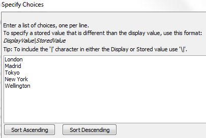
Click OK to save and close the Specify choices dialog. Click OK again to close the Define Choices for 'QuickSearch' (Dropdownbox) dialog.
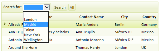
Run your grid in Live Preview or Working Preview mode and see how the control looks.
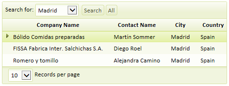
A Static Drop-down Quick Search control
Result after clicking the Search button