Defining a Quick Search
Description
The Quick Search feature allows you to make a search control part of a grid.
The grid may also have a regular search part. That is, when you create a grid in the Grid Builder, you can check the "Grid contains a 'Search' part?" option on the Component Type page. This will create a search box that is separate from your grid and that has its own fields and properties that you can define. In comparison, a Quick Search actually fits inside or above your grid and is defined inside the grid itself. It can be placed in a grid regardless of whether you checked the "Grid contains a 'Search' part?" box or not. Quick Search comes with a number of design options including multiple field selection. You can see all of these by opening the Grid Builder.
With your workspace loaded, go to the Web Projects Control Panel and click the ' Create a new Grid Component ' button on the left side of the toolbar. The Grid Component Template will load. Click the ' Start with a Blank Grid Component ' radio button and click OK . The Grid Builder will open. You can breeze through the Component Type page and the Data Source page shown in the tree menu on the Grid Builder; what you enter here will not affect if you can use the Quick Search control. Under Query(DBF) or Query(AlphaDAO) you will need to establish a Table to link to, as there needs to be data to search. For more information on how to do this see this Introducing the Grid Builder or Define an AlphaDAO SQL Querypage. Assuming you have a working table in place, it is time to add a Quick Search to your grid:
A Quick Search control.

Procedure:
Display the Grid > Properties page.
Scroll down to the Quick Search heading in the properties menu.
Select the Quick Search > Has Quick Searchcheck box.
Make a selection in the Quick Search > Positionlist. The control may be:
"Above Grid"
"In Grid"
If you selected "In Grid" in step 4, select the alignment of the search control in the Quick Search > Alignmentlist. The options are:
"Left"
"Center"
"Right"
Click [dot_img] in the Quick Search > Field(s) to searchfield to display the Select Fields(s) to Search dialog. If you select more than one field then the program will search in all of the specified fields. For example, if you specify Firstname, Lastname, Company in this property, and then search on 'John', Alpha Anywhere will search for 'John' in all three fields. Records containing 'John' in any of these fields will be returned.
1. Select whether you want to Search in a single fieldor Search multiple fields.
2. If you selected to search in a single field, select it from the list and click OK.
3. If you selected to search in multiple fields, place checkmarks next to the selected field names and click OK.
Optionally, select Quick Search > Allow QBF styleto indicate whether QBF style searches be allowed. With QBF style searches, "A,B,C" searches for "A", "B", or "C". "A..C" searches for entries between "A" and "C". "C.." searches for entries greater or equal to "C". "..C" searches for entries less than or equal to "C".
Optionally, choose a search style in the Quick Search > Search stylelist. The options are:
"Wildcard" - search for an exact match, ignoring case and length (wildcard characters * and ? are allowed).
"Exact" - search for an exact match, ignoring case and length.
"Contains" - search for value anywhere in field (no need to use wildcards in search string).
"Starts with" - search for value at the beginning of field (no need to use wildcards in search string).
Select the control type in the Quick Search > Control typelist. The options are:
"Textbox"
"Dropdownbox"
"RadioButton"
"Check box"
If you selected "Dropdownbox", "RadioButton", or "Check box" in step 9:
a. Click [dot_img] in the Quick Search > Choicesfield to specify the choices to show in the control.
b. In the Quick Search > Maximum number of choicesfield specify the maximum number of choices to show. Set to 0 for no limit. This option is only meaningful if the control is populated dynamically from a database and you don't know how many records the query that populates the control will return. For example, a page that showed 50 choices for a check box control would be unwieldy, and you would want to limit the number of choices shown.
Optionally, select Quick Search > Has 'ShowAll' radio button. This is only applies if the control type property is set to "Radiobutton". Specify if the radio buttons should include a button to show all records. This is necessary to turn off the search after you have done a quick search. With other control types, you can turn off the search by doing a search on a blank value.
If you enable the Quick Search > Has 'ShowAll' radio button, specify the ShowAll button label.
Optionally, specify the initial selection in the Quick Search > Initial selection field. Leave this field blank if all records should be shown when the Grid is initially displayed. If you specify a value, then when the Grid is initially displayed it will be appropriately filtered (according to the search query). For example, say that your Quick Search does searches on a Statefield, and when the Grid is displayed initially, you want to show records for "MA".
Optionally, click [dot_img] in the Quick Search > Control inline stylefield to specify the inline style for the Quick Search control.
If you selected "Dropdownbox" in step 9, specify the Quick Search > Dropdownbox height. If the height is greater than 1, you can allow the user to select multiple entries.
If you selected a value greater than 1 in step 15, choose the Quick Search > Dropdownbox select style.Specify if the user can select multiple entries, or just a single entry.
If you selected "Textbox" in step 9:
1. Specify the width of control in the Quick Search > Textbox sizefield.
2. Specify the maximum number of characters that the user can enter into the Quick Search > Textbox maximum lengthfield. Set to -1 for no limit.
If you selected "RadioButton" or "Check box" in step 9, specify the orientation of the Quick Search control in the Quick Search > Orientationfield. The options are:
"Horizontal"
"Vertical"
If you selected "Dropdownbox", "RadioButton", or "Check box" in step 9, in the Quick Search > Auto submitfield specify whether the search should be performed immediately, or only when the user clicks the Search button.
If auto submit in step 19 is notselected, specify the label for the Search button in the Quick Search > Search button labelfield. This is This is the button that the user clicks to perform the Quick Search.
Specify the Quick Search > Quick Search label. This is the text that appears to the left of (or above) the search control.
Optionally, click [dot_img] to specify the Quick Search > Quick Search label style.
Optionally, select Quick Search > Has freeform layout. This will allow you to specify any HTML for the text that surrounds the Quick Search. Freeform layout.
If you want a freeform layout for the Quick Search, in the Quick Search > freeform layoutfield click to display the Freeform Column Layoutdialog. You can specify any HTML for the text that surrounds the Quick Search.
Examples
The following example shows a text Quick Search field embedded in the grid. In this case the Quick Search field has been defined as a combo box showing unique values from the Sales Rep table field.

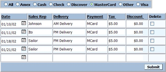
In the following example the search field shows unique values from the Payment field as radio button selections. The current selection is "MasterCard", which was set to correspond to a value of "MCard" in the table. In this case the Quick Search field is outside the grid component.
Define Quick Search Choices
Select "Dynamic" in the Define Choices > List Typelist.
Select "DBF-Table" in the Data Source > Data source typelist.
Select "customer" in the Data Source > Table namelist.
Enter "Bill_State_Region" in the Data Source > Display value field/ex pressionfield.
Click OK to continue.
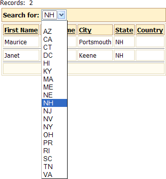
The Previewtab of the Grid Buildershould show something like the following.

Publish the page with the grid and select "NH" from the drop down list.
This is what the grid would look like when using a check box control for the Quick Search. In this case the number choices was limited to 5. as you can see, this style has the benefit of making multiple selections easy to apply.
