Customize Grid toolbar template
Description
The Grid has always allowed you to customize the layout of the record navigator, but now, you can customize the entire Grid Toolbar and you can add your own custom buttons to perform actions that you define.
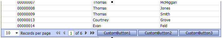
For example, this image shows how we have added 3 custom buttons to the toolbar.
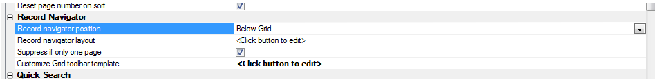
To customize the toolbar, click the smart field for the 'Customize Grid toolbar template' property.
The Genie lets you customize the toolbar for when the Grid is read-only and when it is editable. You can make modifications to the HTML template. The placeholders in curly brackets are used for the different parts of the toolbar.
To get started, click the hyperlink to insert the default template.
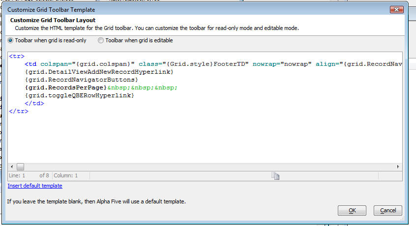
To add a button to the template you would have to do
<button class="{grid.style}Button" onclick="foo()">ButtonText</button>foo() would be a javascript function defined in javascript function declarations.
The video below demonstrates this method:
Moving a Button from the grid row to the Navigation Bar or Free-Form Edit Region
When you place a button in a grid row, the button repeats for every row in the Grid. You might prefer to put the button in the Grid's Navigation Bar, or in a free-form edit region. This video shows a simple technique for putting a button in the Navigation Bar or free-form edit regions (Note: The techniques shown in this video are no longer necessary if you use Action Buttons, which automates the process of placing buttons in the Grid toolbar).
It is possible to replace the navigation buttons on the detail view. By simply replacing the graphics of an applications with some readily available icons, you can completely change the look and feel of the app.

First Record Label
Defines the text that appears for the first record label.
tmpl.RecNav.First_Label as C
Next Record Label
Defines the text that appears for the next record label.
tmpl.RecNav.Next_Label as C
Previous Record Label
Defines the text that appears for the previous record label.
tmpl.RecNav.Prev_Label as C
Last Record Label
Defines the text that appears for the last record label.
tmpl.RecNav.Last_Label as C
Show First Record Image
Determines whether an image replaces the first record label.
tmpl.RecNav.Has_First_Button as L
Show Next Record Image
Determines whether an image replaces the next record label.
tmpl.RecNav.Has_Next_Button as L
Show Previous Record Image
Determines whether an image replaces the previous record label.
tmpl.RecNav.Has_Previous_Button as L
Show Last Record Image
Determines whether an image replaces the last record label.
tmpl.RecNav.Has_Last_Button as L
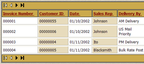
The Webform Style Builder changed the column headings and background colors of the grid's stylesheet. The Webform Button Genie modified the navigation buttons, which are now located both above and below the grid.