Component Type Page
Description
The Component Type page defines the major characteristics of a grid. You can easily access this page by clicking the Component Type icon at the top of the Component Type tree menu on the left.
There are a number of dependencies within in the Component Type Page. What you choose here will determine what options you have going forward in designing you web component.
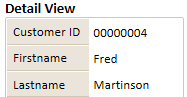
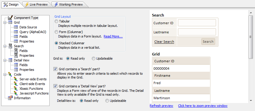
Clicking Grid is: Read only will cause the grid's fields to be displayed in label controls that users will be able to read but not change. Clicking this will also open the 'Grid contains a Detail View part?' option on the Control Type page. If checked, this option will create a form that displays information about one of the records in the grid. It will also allow the Detail View options to appear in the Component Type Tree, which will let you design the detail view and how you would like the fields within it to be presented.
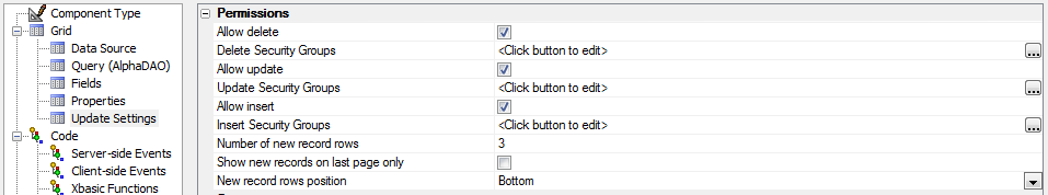
Clicking Grid is: Updateable will enable features that display text box controls and let users update information in the grid. Clicking this option will make Grid > Update Settings appear in the Component Type tree. This will let you let you make a number of choices about how information on your grid is updated and who is allowed to update information.
Checking the Grid contains a 'Search' part? check box will create a search box that will let users search your grid for specific records. Clicking this will also enable the Search > Fields and Search > Properties options in the Component Type menu. Among other things, these options will let you design the search box to your liking and choose what fields you want to allow it to access.
Component Type Options
Grid Layout
Defines the style of the grid and whether it will have search and/or detail parts.
Grid is: Read only
Causes the search fields to be displayed in label controls.
Grid is: Updateable
Causes the search fields to be displayed in text box controls.
Grid contains a 'Search' part?
Displays the Search > Fieldsand Search > Propertiesmenus.
Grid contains a 'Detail View' part?
Displays the Detail view > Fields and Detail view > Properties menus.
DetailView is: Read only
Causes the detail view fields to be displayed in label controls.
DetailView is: Updateable
Causes the detail view fields to be displayed in text box controls.