Grid Fields Pane
Description
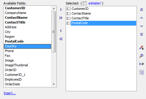
The Grid Fields pane shows the fields that have been returned by your table or view selection or SQL query. You move these fields from the Available Fields list to the Selected Fields list to display them on the grid. See also Selecting the Fields to Display.
Available and Selected Fields Lists
The tools in the Grid Fields pane
- Grid is Editable?
Allows you to change a read-only grid to an editable grid.
- Available Fields List
Contains a list of the fields available. These fields are determined from the Grid's Data Source query.
- Selected Fields List
Contains a list of the fields in the order they appear in the grid. The top to bottom list order is the same as the left to right display order. Fields not added to the Selected pane will not be rendered in the Grid component.
 Add Field
Adds the selected fields in the Available Fields list to the Selected fields list.
 Add All Fields
Adds all fields in the Available Fields list to the Selected fields list.
 Remove Field
Removes selected fields from the Selected fields list.
 Remove All Fields
Removes all fields from the Selected fields list.
 Field to Top
Move the selected field to the top of the Selected Fields list.
 Move Field Up
Move the selected field up in the Selected Fields list.
 Move Field Down
Move the selected field down in the Selected Fields list.
 Field to Bottom
Move the selected field to the bottom of the Selected Fields list.
 Paste Property Value
Paste current property value to multiple controls at once. See "Using Paste Property Values" below.
 Search
Search for a Control in the Grid.
 Field Number
Go to field number.
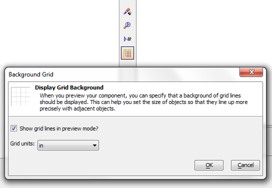
 Grid Lines
Display grid lines in Working or Live Preview modes to help set the size of controls. See "Background Grid Lines" below.
- Insert...
Insert special controls, such as spacers, buttons, hyperlinks, static text, images, and Linked Grids. See "Inserting Special Controls" below for more information.
Using Paste Property Value
The Paste Property Value icon allows you to paste the currently selected property in the Property Grid to selected controls. For example say that you want to repeat a Bubble Help property across multiple fields. Here is how you would do this:
Open the Grid Builder . Go to Design and under the Data Source page select either .dbf or SQL.
On the Query(DBF) or Query(SQL) page connect to the table that you will pull your data from.
Go to the Fields page. Select a number of fields from the Available Fields: list and move them to the Selected: fields list using the right arrow between the two lists.
Select one of the default Label controls in the Selected: fields list and then look at the Field Properties list to the right. Scroll down to the Column Properties.
Click on the Bubble Help Text property and write some text next to this property.

Click the Paste Property Value
icon. The Select Controls dialog will open showing the selected property for all of the controls in the component. Select the control(s) that you want to paste the Bubble Help property on to by clicking on them. Hold down Shift and click to select more than one control.
Click Set Properties and you are done. Go to Live Preview. You should see all of the columns in your grid have the same property
Background Grid Lines
When you are designing a Grid with a Detail View, or a UX component, it can be helpful to turn on a background set of grid lines to see the dimensions of different objects. To turn grid lines on/off, click the icon highlighted in the screen below.
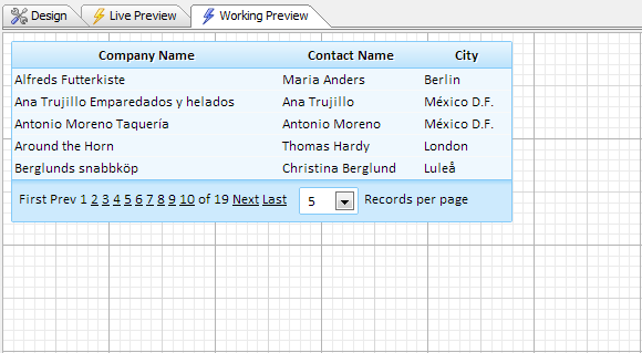
To learn more about grid lines, watch the video below.
Placing Grid Lines on the Background in Preview Mode to Help Set Control Sizes
When you layout a component, getting aligning the right edge of controls can involve quite a bit of trial and error. This video shows how you can make the process easier by displaying grid lines as a background to the component when you are in Working or Live Preview.
Inserting Special Controls
Special controls, such as buttons, static text, and containers, can be inserted into the Grid Component's layout using the Insert Special Control dialog. This dialog is opened by clicking the Insert... link located below the Available Fields list.
To add a control, select the desired control insert into the Grid Component's layout from the Insert Special Control dialog. The control will be inserted after the selected control in the Selected fields list.
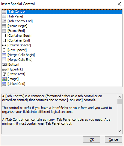
The following controls can be inserted into the Grid Component's layout:
 [Tab Control]
A container that can hold one or more tab panes. The [Tab Control] can display panes as individual tabs or as an accordion layout. This control is only available in Grid Components configured to have a Form (Columnar) layout.
 [Tab Pane]
Defines the start of a new pane in the [Tab Control]. This control is only available in Grid Components configured to have a Form (Columnar) layout.
- [Tab Control End]
Marks the end of a [Tab Control]. This control is only available in Grid Components configured to have a Form (Columnar) layout.
 [Frame Begin]
Marks the beginning of a frame that contains one or more controls. All controls between a [Frame Begin] and [Frame End] will be placed in a frame when the Grid Component is rendered. This control is only available in Grid Components configured to have a Form (Columnar) layout.
- [Frame End]
arks the end of a frame that contains one or more controls. All controls between a [Frame Begin] and [Frame End] will be placed in a frame when the Grid Component is rendered. This control is only available in Grid Components configured to have a Form (Columnar) layout.
 [Container Begin]
Marks the beginning of a container that contains one or more controls. A container is a way of grouping a collection of fields into a logical container. This control is only available in Grid Components configured to have a Form (Columnar) layout.
- [Container End]
Marks the end of a container that contains one or more controls. A container is a way of grouping a collection of fields into a logical container. This control is only available in Grid Components configured to have a Form (Columnar) layout.
 [Column Spacer]
Inserts empty columns into a layout. Do not use the [Column Spacer] to insert blank space between Tabs, Frames, or Containers (aka 'containers'). Use the container's spacing property instead.
 [Row Spacer]
Inserts a blank row into a layout.
 [Merge Cells Begin]
Marks the beginning of a group of controls to merge together into a single table cell. If the first control after the [Merge Cells Begin] control is hidden, all controls will be hidden.
- [Merge Cells End]
Marks the end of a group o f controls to merge together into a single table cell.
 [Button]
Inserts a Button control.
 [Hyperlink]
Inserts a Hyperlink control.
 [Static Text]
Inserts a Static Text control.
 [Image]
Inserts an Image control.
 [Linked Grid]
Inserts a Linked Grid. See the video "Grid with an Embedded Grid in a Cell" below.
Grid with an Embedded Grid in a Cell
Grids are completely recursive. That means that Grids can be placed inside other Grids up to any depth that you want. In this example, we have a simple Grid showing customers. One of the columns in the Grid contains an embedded Grid showing the Invoices for that customer. This embedded Grid, in turn, has a row expander. When you open the row expander, it shows all of the invoice items for the selected invoice. Normally, each cell in a tabular Grid contains a single field. But in this example, instead of placing a single field in a column cell, we have placed an entire Grid.
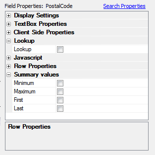
Field Properties
As you select a field in the Selected Fields list, you will see its properties displayed in the Field Properties control. There are many properties for each field, which you can set. Here is where you define the presentation of your data. For more information, see Setting Control Properties.