Introducing the Tabbed UI Builder
Description
Creating a well designed user interface is an important step in the process of developing an application. Once all of the components, records, forms, A5W pages, and other parts of your application have been created, it is necessary to pull them all together into one well organized structure. In Alpha Anywhere, the Tabbed UI Builder is what allows you to build a complete user interface for your application.
Overview
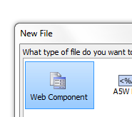
In the Web Projects Control Panel click the New Component or File button.

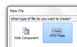
The New File dialog will open. Select Web Component and click Next >.
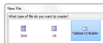
Select Tabbed UI Builder and click Next >.
Page Menu
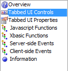
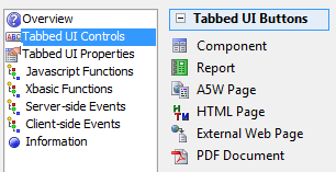
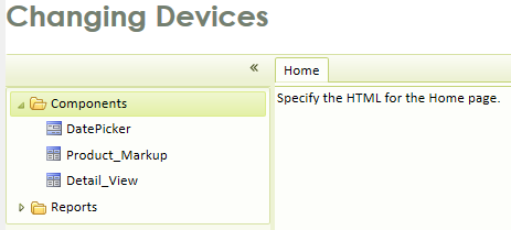
The Page Menu for the Tabbed UI Builder is fairly straightforward. The Overview page gives you a brief explanation of the Tabbed UI Builder. The Tabbed UI Controls page allows developers to bring individual files into their application's user interface. It also provides tools to define the look, feel, and functionality of these files in the Tabbed UI. The Tabbed UI Properties page contains additional and higher level tools for customizing your application. For example, it includes an easy way of adapting a user interface from a desktop application to work on a mobile device. The remaining pages in the menu, Javascript Functions, Xbasic Functions, Server-side Events, and Client-side Events can be used to add greater complexity to an application and make the user interface more dynamic. Finally the Information page can store data concerning when a given Tabbed UI Component was updated, who updated it, a description of what it does, and additional contains room for additional comments.
- Menu
- Description
- Overview
Basic description of the Tabbed UI builder.
- Tabbed UI Controls
Define the controls users will use to navigate your user interface.
- Tabbed UI Properties
Define the properties of your user interface
- Javascript Functions
-
- Xbasic Functions
-
- Server-side Events
-
- Client-side Events
-
- Information
Allows you to record information about the Tabbed UI
Getting Started:
The Tabbed UI Builder lets you specify a number of different buttons. These buttons correspond to the different parts of your application. When the user clicks a button, a new Tab Pane appears on the screen, displaying the Grid component, Report, PDF, A5W Page, document, or external Web Page associated with that button. You can switch instantly between any of the open Tab Panes and there is no limit to the number of Tab Panes you can use. The buttons in your UI will appear in the 'Buttons Panel' which can either be on the left or right of the screen. The panel itself can also be hidden to create more screen space.
On the Design tab and select the 'Tabbed UI Controls' pane, then open the 'Tabbed UI Buttons' section in the toolbox.
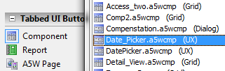
Add objects(Grids, Reports, A5W pages, HTML Pages, External Web Pages, and PDF Documents). Each object you add puts a new button in the 'Buttons Panel'
You can control the formatting of the buttons in the 'Buttons Panel' by selecting objects from the 'Containers' and 'Other Controls' section of the toolbox. For example, you can organize your buttons into Tabs, and Accordions. You can put frames around similar buttons to group them together, and you can put static HTML and images on the Buttons Panel to enhance its appearance.
Select the 'Tabbed UI Properties' section to define the top banner of your Tabbed UI, to define the contents of your home page, and to define other properties of the object.
Tabbed UI Controls
The Tabbed UI Controls page is where you bring all of your components, reports, PDF files, A5W pages, HTML pages, and external web pages into your application. These files can be added as buttons in a Tabbed UI, each button linking to its respective file. The Tabbed UI Buttons toolbox is the location on this page that allows you to do this. The Tabbed UI Controls page also contains some powerful tools to help you customize your user interface. One of these tools is a Properties list. This list allows you to adjust the look, feel, and action of individual component links. The Containers toolbox holds a number of controls that let you organize Tabbed UI Buttons into tabs and/or tree menus, to create frames around parts of your UI, and to add containers. This page also contains an Other Controls toolbox that allows you to add images, static text, and hyperlinks to your user interface, much like other component builders.
Tabbed UI Controls Toolbar Functions
Delete all objects
This will clear your UI of all controls. A prompt will ask you if you really want to delete everything

Delete selected objects
Click on an object to highlight it and then click delete to remove it.

Move to top
Moves a selected control to the top of your Tabbed UI.

Move up one row
Move selected control up one row on the Tabbed UI.

Move down one row
Move selected control down on row on the Tabbed UI.

Move to bottom
Move selected control to the bottom of the Tabbed UI.

Move to a specified location
Choose the exact spot in the Tabbed UI where you want a control to live.

Eye dropper
Allows you to paste current property value onto multiple controls in one go.

Find a control
Allows you to find and/or select all controls with a specific property value.

Toggle Break
Allows you to quickly toggle the paragraph break after a control to on or off.

Menu
Opens menu with more options, like the ability to copy and paste controls into other components.

Promote
Move the branch of a tree closer to its root.

Demote
Move the branch of a tree control deeper into the tree.

The Eye Dropper
The 'Eye dropper' icon allows you to paste the currently selected property in the Property Grid to selected controls. For example say that you want to change the width of all buttons in the Tabbed UI to 2 inches. Here is how you would do this:
Open the Tabbed UI Builder. Go to Design and open the Tabbed UI Controls page.
In the Tabbed UI Button toolbox, click on the icons and add multiple Buttons to your tabbed UI.
Highlight one of these buttons. On the Tabbed UI Controls page there should be a Properties list on the right.
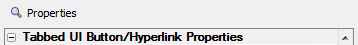
In the Properties list find Tabbed UI Button/Hyperlink Properties and underneath it find the Style property.
Click the '...' button next to the Style property. This will open the Style Editor.

In the Style Editor, scroll through the Property tab until you find Width under the Positioning and Size properties
Width Setting:
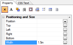
1.5 inch Tabbed UI
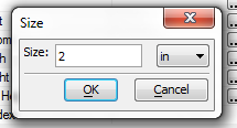
Click the '...' button next to Width. Set the Width to 2in in the Size dialog and then click OK. Click OK again to close the Style Editor.
Click the 'Eye dropper' icon. The Select Controls dialog will open showing the selected property for all of the controls in the component. Select the controls you want to paste the 2 inch property on to:
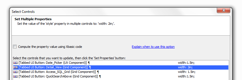
Select the control(s) to which you want to paste the property by clicking on them. Hold down Shift and click to select more than one control.
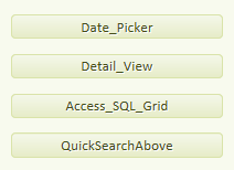
Click Set Properties and you are done. Final 2 inch Tabbed UI:
Menu
The drop down menu in the Tabbed UI Controls toolbar contains additional tools that allow you to manipulate controls and code once they are added to the work area. Some of these tools might be useful for applications with a very large number of parts.
Recalculate selected controls.
-
Recalculate all controls.
-
Copy controls to Clipboard
Allows you to copy code onto a clipboard and then paste it into another component.
Paste controls from Clipboard
Allows you to take text copied into the clipboard and paste it into components
Select all controls in current container
This will automatically select all the controls in any container in your user interface. You must first define a container before you can use this feature.
Go to control number
Allows you to select a control based on the row number in which it appears on the Tabbed UI Controls page.
Show current control number
Allows you to see what row a controls is on.
Move Javascript Code to different event
Allows you to move Javascript code from one event to another. This is often required when converting a desktop application to a Mobile application. In this case you will want to move code from an in-line Javascript event (like onClick) to an abstract event (like click).
Internationalization Utilities
Automatically adds Language () tags or Text Dictionary () tags to various properties in the UX component. For more on multi-language support go here.
Create Static HTML Files
-
Security and Server-side show/hide settings in component
-
Show the value of the selected property in a controls
Click on one of the Properties listed on the right side of the Tabbed UI Controls page. Then click on this dropdown option. The value of the property you selected will be displayed for all of the controls in your UI. If you select the Style property, for example, the Style property values for all of your controls will be displayed in a separate dialog.
Tabbed UI Buttons Toolbox
Component
Add a predefined Grid or UX Component to your Application

Record
Add a Record to your Tabbed UI.

A5W Page
Add an A5W page to your application.

HTML Page
Add an HTML page to your Tabbed UI.

External Web Page
Add an External Web Page to your application

PDF Document
Add a PDF to your Tabbed UI.

PDF Document Properties
In Alpha Anywhere you have control over how a PDF is displayed when a user views it in your application. Initially PDF documents in the Tabbed UI Builder are displayed in the manner the PDF viewer thinks best. To adjust properties go to the Design tab and visit the Properties list under the Tabbed UI Controls page. Go to the PDF Document properties and click the button next to PDF open parameters. This will open the PDF Open Parameters dialog that will let you change the initial PDF settings. The Page property allows you to set which page on the PDF will be the first to open. The View property allows you to set how the PDF document conforms to the screen. The Search property leads the PDF reader to automatically execute a search. Any text written next to the Search property will be highlighted in the PDF if it appears in the document. For more information check out this video on PDF property options
Procedure:
Go to the Design page of the Tabbed UI Builder and open the Tabbed UI Controls page.
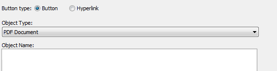
Open the Tabbed UI Buttons toolbox and click on the PDF Document button .
The Insert Tabbed UI Pane dialog will load. Any loaded PDF Document should appear in the Object Name: list.
If the Object Name box is empty click on the 'Copy PDF Document into Web Project Folder' button at the bottom of the dialog.
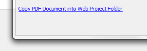
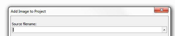
This will open the Add PDF File to Project dialog, specify the Source filename: and click OK.
Then click OK to close the Insert Tabbed UI Pane dialog.
Go over to the Properties on the Tabbed UI Controls page.
Scroll down to the PDF Document properties and click the '...' button next to PDF open parameters.
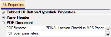
This will open the PDF Open Parameters dialog. Change the parameters to fit your liking. Page Number will open the PDF on a given page.
Click OK to close the PDF Open Parameters dialog and click Save.
Go to Live Preview and click Full Preview to see the results.
Containers Toolbox
[Tab Control]
Container for buttons placed on Tab Panes. Useful if there are many buttons.

[Tab Pane]
Defines a new page or section within a Tab Control

[Frame]
Place a frame around objects in your UI

[Container]
Group a collection of objects into a logical container

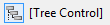
[Tree Control]
Organizes buttons in your application into a tree.

[Tree Branch]
Starts a Tree Control branch inside a Tree Control

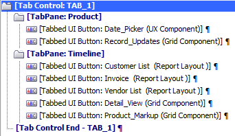
Tab Controls and Tab Panes
[Tab Control]
A [Tab Control] is a container that contains one or more [Tab Pane] controls. Tab Controls can be formatted either as a tab or an accordion control. The Tab Control is useful if you have a lot of Buttons and you want to organize them into different logical sections. A [Tab Control] can contain as many [Tab Pane] controls as you need. At minimum it must contain one [Tab Pane] control.
[Tab Pane]
A [Tab Pane] control defines the start of a new page or section within a [Tab control]. You must select a [Tab Control] before you can select any [Tab Pane] controls. There is no [Tab Pane End] control because Tab Pane Ends are implied whenever a new [Tab Pane], [Tab Control], or [Tab Control End] control is encountered.
Create a Tab Control
In the Tabbed UI Builder's Design tab, open the Tabbed UI Controls page.
Open the Tabbed UI Buttons toolbox and add a number of Buttons to your user interface.
Highlight a group of 4 to 5 buttons.
Click on the Containers toolbox in the Tabbed UI Controls page. With the 4 to 5 buttons still selected click the [Tab Control].
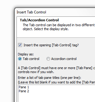
The Insert Tab Control dialog will open.
Check the Insert the opening [Tab Control] tag? option
Click the Display as: Tab control radio button.
In the box titled 'Enter a list of tab pane titles (one per line)' enter the names of the tab pane controls you want to use inside the [Tab Control].
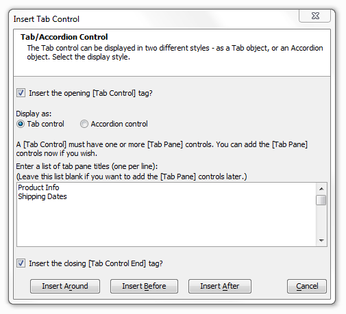
Check the 'Insert the closing [Tab Control End] tag?' box and click Insert Around.
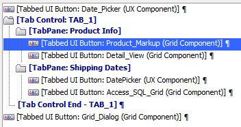
You should now see the [Tab Control] grouped around the buttons you highlighted in step 3.
If a tab pane is empty click a button control and use the arrows in the toolbar to move buttons into the [Tab Pane].
Go to the Working Preview to see the [Tab Control] in operation.
[TabPane:Product Info]
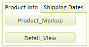
[TabPane: Shipping Dates]
Tab Control Animation
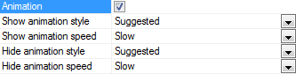
If you have built a tab and/or accordion control you can animate it in the Tabbed UI Controls page's Properties list. You can control the animation method to both hide and show panes. The animation styles available include Slide, Blind, Clip, Drop, Explode, Fold, Puff, Scale, Pulsate, and None. You can use one method to show the pane, and another method to hide the pane. For example, you might choose to 'slide' the pane into view, but 'fade' it out of view. You can also animate the showing and hiding of the menu panel on the Tabbed UI Component. To enable animation, check the 'Animation' property in the 'Tabbed UI Properties' pane. There is only one animation method for this, but you can control the speed.
Implement a Tab Control Animation:
First Create a [Tab Control] with two [Tab Pane] controls inside it. Place some buttons in the tab panes.
On the Tabbed UI Controls page click on the new [Tab Control] to highlight it. Then look over at the Properties list on the right side of the same page.
Under Tab/Accordion Control Properties check the Animation property. Additional properties should open up that will let you adjust the show and hide animation speeds of tab controls.
See also JQuery Support
Frames
You can use this container to place tabbed UI buttons inside a frame. This is a nice way to visually separate groups of buttons that share similarities with one another. To see frames being implemented watch the end of video 1 and the beginning of video 2.
Create a Frame
In the Tabbed UI Builder's Design tab, open the Tabbed UI Controls page.
Open the Tabbed UI Buttons toolbox and add a number of Buttons to your user interface, around 8.
Highlight a 4 buttons that you want to place inside a frame.
Open the Containers toolbox inside the Tabbed UI Controls page and click on the [Frame] control.
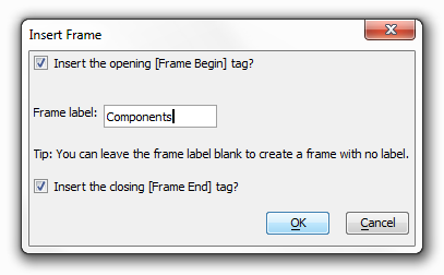
The Insert Frame dialog will open. Leave the [Frame Begin] and [Frame End] checkboxes checked, fill in a Frame label, and click OK.
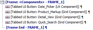
The Frame control will be inserted around the buttons you selected...
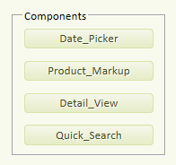
Go to Working Preview. You should now be able to see the frame.A Frame control:
Frame Properties
Once you have inserted a frame control it is possible to alter it to look exactly the way you want. To do this go to the Tabbed UI Controls page in Design and click on any frame begin control that you have already inserted into you user interface. Under the Properties section of the Tabbed UI Controls page you should see a number of Frame Begin Properties listed. Here you can insert background images, change the border size and style, select different fonts for use with labels, alter colors, and much more.
A Frame with an Image background
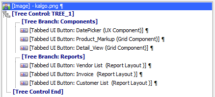
Tree Controls
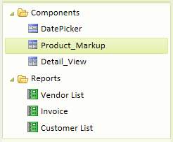
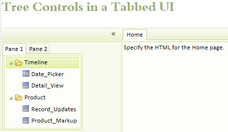
Tree controls can be used to create very attractive new looks for a tabbed UI component. This section will describe how to build a tree control in the Tabbed UI Builder, how to create branches for a tree control, and how you can move these branches to adjust the structure of your tree. Secondly, it will look at some of the tree control properties that can be adjusted to customize their appearance in your application. Finally, it will look at how to place multiple tree controls within a Tabbed UI framework. For more information also visit this video on 'Creating a Tree Control' or this video on 'Placing two Tree Controls in a Tabbed UI'. A Tree Control UI with Branches:
Create a Tree Control
In the Tabbed UI Builder's Design tab, open the Tabbed UI Controls page.
Open the Tabbed UI Buttons toolbox and add a number of Buttons to your user interface.
Highlight a group of buttons. Then go to the Containers toolbox and, with the buttons highlighted, click [Tree Control].
The Insert Tree Control dialog will open. Check the 'Insert the opening [Tree Control] tag?' option and the 'Insert the closing [Tree Control End] tag?' option.
Click OK. The [Tree Control] should now look something like this in the Design view...
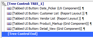
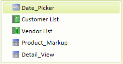
Go to Working Preview to see you tree control. Without branches the [Tree Control] should appear similar to this...
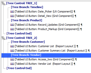
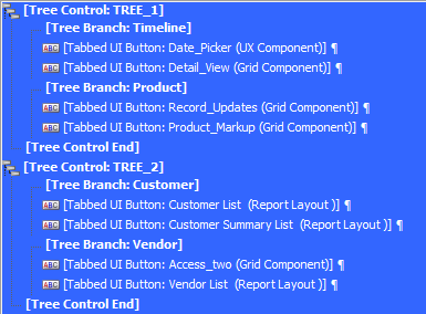
Creating Tree Branches
Go to the Design tab in the Tabbed UI Builder and open the Tabbed UI Controls page where you created your [Tree Control].
Select a Button from your Tabbed UI list and then open the Containers toolbox.
Click on the [Tree Branch] control option in containers.
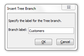
The Insert Tree Branch Dialog will open. Select a name for your new tree branch and click OK.
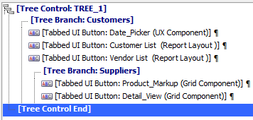
Now select a second Button in your Tabbed UI tree. Go to the Containers toolbox and add another [Tree Branch] control to your tree.

- A dotted line connecting to your [Tree Branch] control should show what buttons and/or branches the tree branch contains. If you want to move a button inside a tree branch use the up and down arrow keys on the Tabbed UI Builder toolbar.
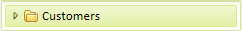
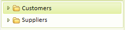
Go to Working Preview, you should now see branches in your tree. Closed Branches:
Closed Branches
Open Branches
Manipulating Tree Branches
To create or eliminate nested branches on your tree go to Design view and open the Tabbed UI Controls page.
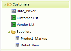
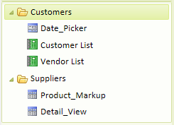
Select one of the Tree Branches that you created. In this example a branch named 'Suppliers' is selected.
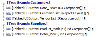
To move a nested branch, like 'Suppliers', to the same level as a branch above it, click the Promote entry button in the Design toolbar.
In this example, this will change the structure of the tree to look like this. Branches no longer nested:
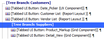
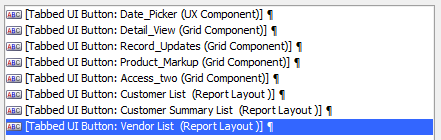
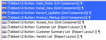
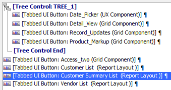
 To move a branch so that it is nested within another branch, use the Demote entry button '>' in the Design page toolbar.
In Working Preview this structure will produce something like this...
Closed Branches
Open Branches
If you click on a tree branch that you have inserted into your user interface on the Design page, you will notice that under the Properties list there are several Tree Branch Properties. Here you can change the name of your branch using the Branch label property. Bubble help lets you set text that will appear when a user hovers over a tree branch with their mouse. You can also set whether a user first sees a branch open or closed when looking at your application by adjusting the Initial State property. The Expanded icon property displays an icon next to the tree branch control when it is open.
The default icon for this in many windows applications is an open folder but you can insert whatever icon you want.

Similarly, the Collapsed icon can be adjusted for when the tree branch control is closed.

The Tree level property lets you specify the nesting level of a control in the tree. It has two options 'SameLevelAsPrevious' and 'Outdent'. 'SameLevelAsPrevious' makes the selected control a sibling of the control before it. If you have a tree branch below another branch on a list, clicking 'SameLevelAsPrevious' on the second branch will move it underneath the first, much like clicking the Demote entry button. The Outdent property sets the level of the control at some level equal to above the branch in the tree before it, much like the Promote entry button moves an entry outward. An Outdent setting of 0 means the tree branch is outdented all the way to the top level.
Creating a Tabbed UI with two tree controls
Go to the Tabbed UI Controls page in Design and open the Tabbed UI Buttons toolbox.
Add a number of buttons, at least 8, to the user interface from your existing components, records, A5W pages, ect...
Highlight the first four buttons, open the Containers toolbox, and click on [Tree Control].
Click OK in the dialog that opens to add the tree control tags around the four buttons.
Highlight the last four buttons in your user interface and add a second tree control.
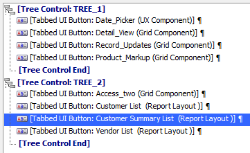
If you want, add [Tree Branch] controls inside of your tree controls.
Use the arrow keys to move the branches into place.
Also use the Promote entry < and Demote entry > keys to nest branches as you would like them to be nested.
Example:
Now select everything in the Tabbed UI; all of the buttons, tree controls, and tree branches. Simply click on the first control in your list, hold down the Shift key, and select the last control in your list.
Go to the Containers toolbox and click on [Tab Control]. The Insert Tab Control dialog will open. Add two [Tab Pane] titles to the pane title textbox and click OK.
Move the [Tab Pane] controls so that each tab pane is placed above a [Tree Control] on your Tabbed UI.
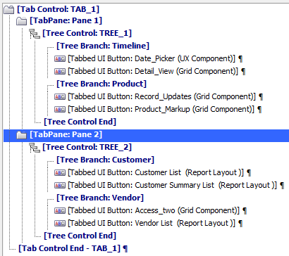
Finished! Now go to Working Preview or Live Preview and see how the Tabbed UI with two tree controls looks...
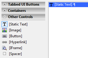
Other Controls Toolbox
[Static Text]
Insert a Static Text Control into your user interface

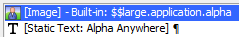
[Image]
Inserts an image control.

[Button]
Inserts a button into your user interface

[Hyperlink]
Inserts a hyperlink into your user interface

[IFrame]
Insert an IFrame into your user interface

[Spacer]
Insert vertical and/or horizontal space between controls

Placing Controls Side by Side
You can use the Break Property with a number of tools in the Other Controls Toolbox. This property lets you set controls side by side. For example, if you have a image that you want to place next to some text set the Break property on the first control to None. First you add the two controls to your user interface, in this case an [Image] control and a [Static text] control.
Next, click on the first control and go to its Properties list on the Tabbed UI Controls page. Set the Break property on the first control to None.
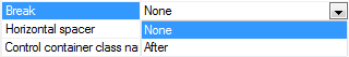
The [Image] control should now be set next to the [Static text] control
Add an Image to your Project and Tabbed UI
In the Tabbed UI Builder under the Design tab open the Tabbed UI Controls page.
Open the Other Controls Toolbox and click on [Image] to add an image control to your user interface.
Use the arrow buttons to move the image to where you want it to be in the Tabbed UI Panel.
A Simple [Image] control added to the Tabbed UI menu.
In the Properties list, on the Tabbed UI Buttons page, find the Image Properties section.
Click the '...' button next to the Image name property.
The Specify Image dialog will load. Click the Image in Web Project or Style radio button and hit Select.
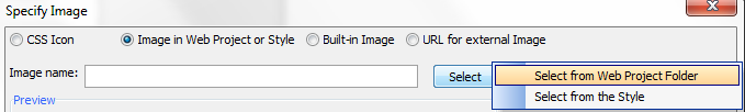
In the Dropdown menu choose Select from Web Project Folder.
The Select Image dialog will open. Click the Add Image to Project button.
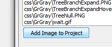
The Add Image to Project dialog will open. Click the up button next to the Source filename: textbox. Navigate to the image you want to add and add it.
Click OK to close the Add Image to Project dialog.
Now in the Select Image dialog again, Adjust the height of your image and how you want it to fit on the screen using the Preview and Size Panels.
Click OK and OK again. Now go to Live Preview and see how the image control looks. The same control in Live Preview
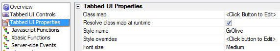
Tabbed UI Properties
There are a number of very useful properties in the Tabbed UI Properties list. The Buttons Panel location property lets you set the Tab menu to be on either the Left or the Right side of the screen. You can use the Buttons-padding properties to specify the amount of space between your buttons and the edges of the button panel. You can also use the Buttons panel style to adjust the properties of the panel itself, such as color and border properties. You can also change the Header text property to the name of your application.
Layout mode allows you to optimize your tabbed UI to work in either a mobile or desktop user interface. If you choose the MobileDevice option from the Layout mode dropdown, you might also want to select one of the Mobile System styles that can be set under the Style name property dialog. For more on mobile settings watch this video. The Home page properties are useful if you want to build a Tabbed UI that has a homepage instead of a panel.
The Can collapse buttons pane property allows users to hide the Tabbed UI menu when they want more screen space. The Auto hide buttons pane property does this automatically. Permanently hide buttons pane completely eliminates the buttons pane from the user interface.
Optimize a Tabbed UI for a Mobile Device
Build a simple Tabbed UI component or open an existing Tabbed UI Component in the Web Projects Control Panel. For example,
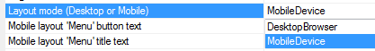
In the Tabbed UI Builder open the Tabbed UI Properties page. Under the Tabbed UI Properties list find Layout mode (Desktop or Mobile).
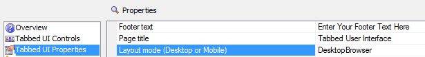
Click the dropdown in the Layout mode (Desktop or Mobile) property and change it to MobileDevice.
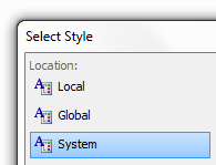
Under Tabbed UI Properties find the Style name property and click the button '...' next to it to open the Select Style Editor.
In the Select Style Editor click on System in the Location menu.
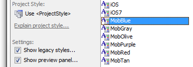
This should open a range of styles. Choose a mobile style (prefixed with Mob), like MobBlue or MobOlive
 The mobile style renders all text slightly larger.
Now go to Live Preview, Run a Full Preview and then run the Tabbed UI in a Browser window. Scale the browser window down to the size of a tablet.
Tabbed UI Component Menu as a 'Mobile Device'
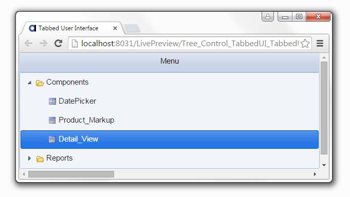
Component in the Tabbed UI Menu
The menu buttons now take up the whole screen. When you select an item, the menu buttons go away and the selected component is shown. Clicking on the Menu button in the top toolbar returns to the Menu page.
NoScript Property
When a Search Engine indexes an .a5w page that contains a Tabbed UI component, there is not much content on the page for the Search Engine to index. That's because the bulk of the page contents comes from Ajax callbacks that populate the various tabs on the page. You can now put text into a new 'Noscript content' property in the component. The text that you enter here is wrapped in tags, and placed in the BODY section of the .a5w page that runs the Tabbed UI component. This text can be seen and indexed by Search Engines. Note that you can place any A5W content in this section. So, for example, you might want to populate this section from a database query, and/or use replaceable strings to display static content in different languages. Search engines typically do not support JavaScript, one of the requirements for Ajax, which is why they will see the contents of the section and not the dynamic grid contents. They will see the saved HTML preview for the grid, but that content is static. By using a database query in your section, you can show the search engine the latest information that your application can display. In general, search engines will give a higher ranking to pages with current content than pages with outdated content.

Using Javascript with Tabbed UI
You can set event handlers for events on individual controls in the Tabbed UI Controls page. For Example, with the [Tab Pane] you can set onBeforeChange, onChange, onRightClick, onDynamicLoad, onBeforeLeave, and onLeave events by highlighting a [Tab Pane] control and viewing its Javascript events properties in the control's Properties list. Most of the controls in the Containers toolbox, Tabbed UI Controls toolbox, and the Other Controls toolbox have Javascript events that can be manipulated in a similar way. In the case where a [Tab pane] is showing a Grid component, in your Javascript event handler, you can get a pointer to the Grid object that is shown in the pane as follows:
var gridObj = windowpaneObj.name + '_GridObj';
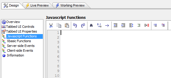
Once you have a pointer to the Grid object, you can then call methods on the Grid. You can easily define Javascript Functions by opening the Javascript editor from the Design page menu.
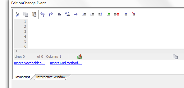
An Edit Event dialog opens when you want to edit an event.
The Javascript Functions editor.
Using Xbasic Functions with Tabbed UI
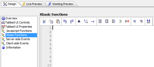
The Tabbed UI Builder also has easy access to an Xbasic Function editor where you can write Xbasic functions to run in your application. This is useful for writing code that runs on the server, as opposed to the client.
The Xbasic Function Editor
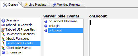
Using Server-side Events with Tabbed UI
The Tabbed UI contains a few top level events. One is the onTabbedInitialize event that fires when the Tabbed UI is initialized. Also included is an onLogin event that fires when a user clicks the login button on the login dialog. Finally there is the onLogout event which fires when a user clicks on the hyperlink that closes the application. Server-side events can be useful for going against a data source that is on the back end of a database or file. It can also be used for assigning session variables in response to an event, printing reports, and creating an action that goes and gets data from some source on the server.
The Server Side events editor
Additional Features
The Tabbed UI Builder makes it easy to add some additional customizations to your user interface. You can add parameters to reports to make them searchable and limit what is displayed on the screen. You can also add multiple languages to your Tabbed UI so that people can use your application in different languages. It is also possible to create a page layout using the Tabbed UI.
Implementing Parameters for Reports
You can make information within a report searchable by making a few changes on the Tabbed UI Controls Properties page. These changes will create a prompt within your Tabbed UI that users of your application will see at runtime. When a user enters different parameters into the prompt it will alter what they see in the report. You can use different controls to prompt for these parameters. The prompt dialog can use a textbox control, dropdown boxes, radio buttons, and logical checkboxes. The choices for the controls can be dynamically populated from a .dbf or SQL table. In the case of date/time parameters, the textbox where the user enters the parameter value can have a date picker as well. You can follow the guide below to see how to implement parameter control. To see how to implement different types of controls watch this video Part 1 and Part 2. This video also has some information on parameters.
Creating a Prompt from a Dynamically Generated List
Using AlphaSports workspace go to the Design page of the Tabbed UI Builder and open the Tabbed UI Controls page.
Open the Tabbed UI Buttons toolbox and add these the Customer List to your Tabbed UI Component.

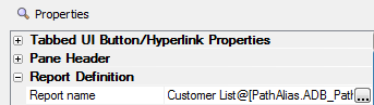
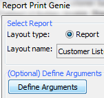
In the Properties list on the Tabbed UI Controls page scroll down to Report Definition and click the button '...' next to the Report name property.
This will open the Report Print Genie. Click the Define Argument button.
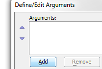
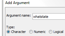
This will open the Define/Edit Arguments dialog. Click Add.
The Add Argument dialog will load. Give the argument a name like 'whatstate' and set the Type to 'Character'. Click OK.
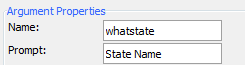
Back in the Define/Edit Arguments dialog, change the Prompt: to something like 'State Name'.
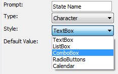
Click on the Dropdown list next to Style: and change it to a Combo box. Click the Define Choices button that becomes active.
This will open the Define Choices dialog. Click the Define/Edit Dynamic Choices button.
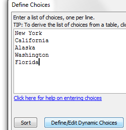 If you wanted to generate you own set of choices for the runtime prompt you should enter a list of the choices to display in the Define Choices textbox. Each choice should be separated by a carriage return as shown above. If you fill in some choices and then decide to use the Define/Edit Dynamic Choices option then you will get a warning asking if you want to overwrite the choices you entered by hand. If so click Yes to proceed.
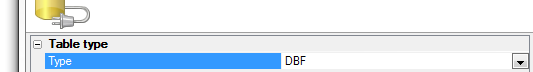
The Define Dynamic Choices dialog will load. Under Type select DBF.
 The Define Dynamic Choices dialog lets you choose if you want your dynamic list to be generated from a SQL or DBF database.
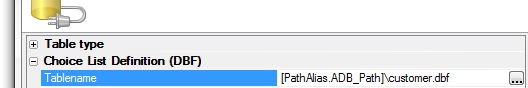
Click the button '...' next to Tablename. Select the customer.dbf file in Alpha Anywhere from the Select Table dialog.
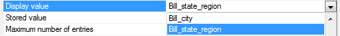
Click the dropdown button next to the Displayed Value setting and select Bill_State_Region field.
Click the Preview choices button at the bottom of the Define Dynamic Choices dialog to see that the dynamically generated choices are correct.
Click OK, and OK, and OK again to bring you back to the Report Genie dialog.
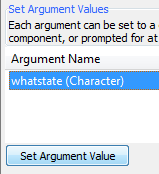
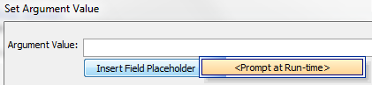
In the Set Argument Values list at the bottom of the dialog click on the argument you defined, in this case 'whatstate'. Click the Set Argument Value button.
The Set Argument Value dialog will load. Under the Argument Value: textbox, click the Insert Field Placeholder button and click .
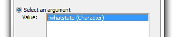
Click OK. Returning to the Report Genie dialog, click the Build button next to the 'Filter:' textbox.

The Filter Builder will open. From the fields list select the bill_state_region field and from the comparison list select 'is equal to'.

Click the up button to load the Value dialog. Check the Select an argument value radio button and highlight ':whatstate(Character)'
Click OK, OK, OK, and Save.
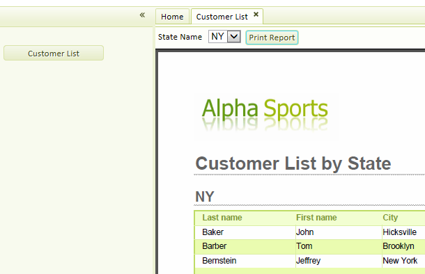
Go to Live Preview and click the customer list tab. You should see the prompt for the state name that was created from the dynamically generated table. Select a state and click Print Report. You should see the data change to reflect every state.
Printing Reports
You can reference session variables in the report filter without binding an argument to the session variable and then using the argument in a filter. While this method still works (and is preferred), some users might find it more convenient to reference the session variable directly in the report filter. There is a distinct advantage to using arguments (as opposed to referencing session variables directly in the filter), because all type conversion issues are automatically handled for you by Alpha Anywhere. If you reference a session variable in the filter directly, you are responsible for data type conversion. Example report filters that use session variables:
state = "session.whatstate"
For a numeric field:
balance = session.whatamount
For a time field (assuming that session.whattime is a character variable):
orderdate = ctodt(session.whattime)
Multiple Language Support in Tabbed UI
When building an application it is often highly desirable to make it as accessible as possible to a diverse range of people. As a result, it is often necessary to implement multiple language support at both the component and user interface level. The Tabbed UI Builder makes this task easy. As with the Grid component, the Tabbed UI Builder uses language definition strings to allow developers to add as much multiple language support as is desired. Every string in the component can be tagged with an tag which can then be assigned to any given language or languages. For more information see the guide below or Watch the Video.
Creating Multiple Language Support
Open the Tabbed UI Builder, go to Design, and open the Tabbed UI Controls page.
Open the Tabbed UI Buttons toolbox and add some number of buttons, 3 or 4, to your Tabbed UI.
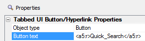
Click on one of the Buttons you defined. Still on the Tabbed UI Controls page, Go over to the Properties list for that button,
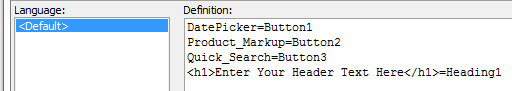
Find the Button text property. Place tags around the text.
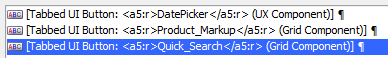
Repeat this procedure for each button in your Tabbed UI. Place tags around each Button's Button text property.
Go to the Tabbed UI Properties page.
Under the Tabbed UI Properties list, find the Header text property. Put tags around the text.

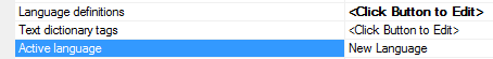
Still in the Tabbed UI Properties, scroll down to the section marked Other and find the Language Definitions property.
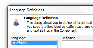
Click the button '...' next to Language Definitions to open the Language Definitions dialog.
In the Language Definitions dialog press Refresh List of Placeholders button, You should see all of the buttons and the Header text that you tagged appear in the dialog.
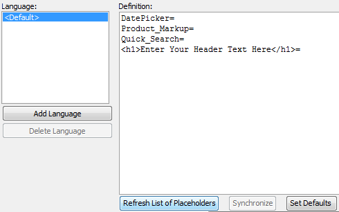
Your language is highlighted. Assign the default language values for each button in the list. For example '
Assigning Values to the Default Language
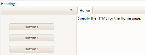
The Language in Working Preview
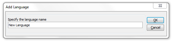
Click the Add Language button on the Language Definitions dialog. Add the new languages name, in this example 'New Language', and click OK.
Now click Refresh List of Placeholders button again and assign values to the language you added. For example,
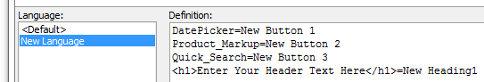
In Tabbed UI Properties page in the Other section find the Active language property. Set the active language to be the language you added, in this case 'New Language'
 In a real setting this language would be set in a protected session variable. You can add as many languages as you want to the user interface. While this example just used filler text it would be simple to swap this for French, Spanish, German, Italian, ect...
Now go to Working Preview. You should see all of the new language values appear on your Tabbed UI Controls. New Language Tabbed UI:
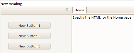
Using a Page Layout for Tabbed UI Buttons
A page layout has a page or several pages that contain all of the buttons that open the components, reports, and other parts of an application. This is different from the standard Tabbed UI layout in which all of the buttons to open new tabs are placed permanently on one side of the screen. It is possible to create a page layout user interface in a Tabbed UI component where buttons displayed on a given page open new tabs that do not contains a menu. To do this it is necessary to first make a Page Layout component. This component is the brought into Tabbed UI component to create a Page Layout with Tabbed UI buttons. Watch the Video.
Creating a Page Layout for use in a Tabbed UI
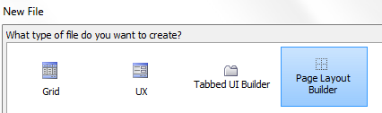
In the Web Projects Control Panel click on the New component or file button in the toolbar.
The New File dialog will open. Select Web Component and click Next >.
Click on the Page Layout Builder option. Click Next >.
The Page Layout Builder will open. Go to the Design Tab and in the menu click on Page Layout Parts page.
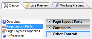
On the Page Layout Parts page open the Page Layout Parts toolbox.
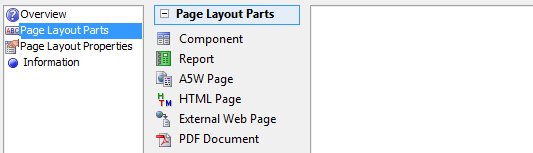
Add some parts, say 6 parts, to your page by clicking on the Component, Report, A5W Page, HTML Page, External Web Page, or PDF Document buttons the same way you would with a Tabbed UI. Simply select the thing you want to add and click OK.
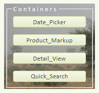
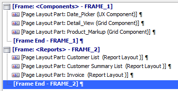
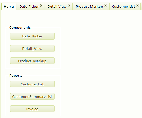
Select the first three parts and open the Containers toolbox. Click on the [Frame] Control. Give the Frame a name, in this case the name is 'Components'
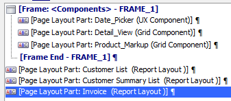
Select the remaining parts in your Page Layout and add a second [Frame] control around them.
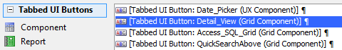
Click on the first Page Layout Part, in this case Date_Picker. On the Page Layout Parts page go to the Properties list.
Under Embedded Object Properties find the Show mode property. From the dropdown select 'When button is clicked'.

Repeat step 10, changing the Show mode property in all of your remaining Page Layout Parts to 'When button is clicked'.
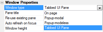
In the Page Layout Parts page Properties menu find Window Properties and under it the Window type property.
If you want the tab that a Page Layout Part is on to have a title, write that title in Window Properties next to the Pane title property. The 'Re-use existing pane' option is also checked. This means that if you press the button to launch the component, and it has already been opened, the Tabbed UI pane that contains the component will simply get focus.From the Window type dropdown select 'Tabbed UI Pane' option for all of your Page Layout Parts.
Save your Page Layout Component with a name, say Pagelayout, and close the Page Layout Builder.
Next the Page Layout is converted into an A5W page that will be imported into a Tabbed UI.Convert a Page Layout into an A5W page
In the Web Projects Control Panel click on the New component or file button again. This time choose the A5W Page option. Click Next >.
Select Blank Page and Click Next >. When the HTML Editor opens for the A5W Page, go to File and Save the file as pl_menu_page.a5w.
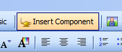
Now click the Insert Component button in the toolbar. The Insert Component dialog will open.
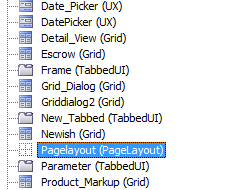
Hit the Select button and from the Select Component dialog that opens choose the Page Layout component you saved in step 14, in this case it was saved as Pagelayout. Then click OK.
Click OK again to close the Insert Component dialog. Then click File and Save and close the HTML editor.
Use the Page Layout in a Tabbed UI Page
In the Web Projects Control Panel click on the New component or file button. Select Web Component and click Next >.
Select a Tabbed UI Builder and click Next > to open the Tabbed UI Builder.
In the Design tab, go to the Tabbed UI Controls page, and open the Other Controls toolbox.
Add a [Static Text] control. require at least one control in the tabbed UI.
The Tabbed UI Builder requires that you define one control for your Tabbed UI. This is why it is necessary to insert a [Static Text] control.Go to the Tabbed UI Properties page. In the Tabbed UI Properties list find the Button panels style property.
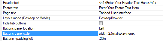
Set the Button panels style property to display:none; This way the button panel will not be visible.

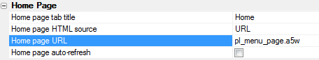
Under the Home Page properties find the Home Page HTML source dropdown. Select URL.
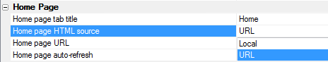
The Home page URL property will become visible. Set the URL to pl_menu_page.a5w. This is the a5w page that contains the page layout component you defined.
Now go to Live Preview and click Full Preview. You should see a Page Layout a Tabbed UI.
The Home Page Tab
A Tab without a Tab menu