Using Customized Radio Buttons in an Absolute Layout Container
Description
Radio-buttons can be used when there is a need to limit the users of an application to selecting one choice from a number of options. When using radio-buttons inside an absolute layout container, the button choices displayed inside to radio-button control can be customized to appear as individual checkboxes.

The standard radio button control has a series of circles placed next to a number of choices, usually displayed either horizontally or vertically. When the user selects one of the items in the radio-button control, the other items are de-selected. This can be useful in situations where only one option can apply, such as marital status on a 1040 form or the shipping options on a customer order.
One of the main advantages of the 'AbsoluteLayout' container is that it allows you to place controls that are inside the container anywhere that you want to in the container's layout. With radio-button controls, however, we want the ability not to just position the whole control inside the layout, but to also position and style each of the choices that the radio-button control contains. The guide below demonstrates how to do this, as does this video.
Create the Control's Choices and an Absolute Layout Container
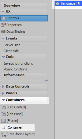
In the UX Builder on the UX Controls page open the 'Data Controls' menu. Click on the [RadioButton] option to add a radio button-control to the component. Give the control the name and label of 'Language'.

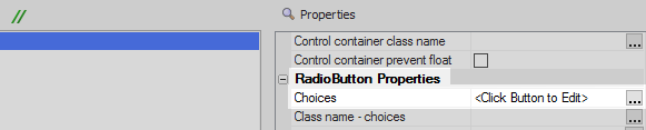
Highlight the radio-button and view the properties list. Click the [...] button next to the 'Choices' property.
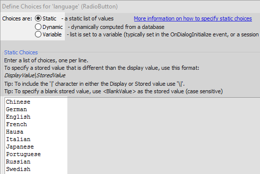
Check the 'Static' radio-button option in the 'Choices are:' menu. Add the following choices to the 'Static Choices' list. Click OK.
Chinese
German
English
French
Hausa
Italian
Japanese
Portuguese
Russian
Swedish
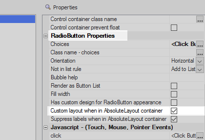
Scroll down to the 'RadioButton Properties' section and check the 'Custom layout when in AbsoluteLayout container' checkbox.
With the radio-button control still highlighted, open the 'Containers' menu and click on the [Container] option.
From the Container Type list select the 'AbsoluteLayout' option and click 'Insert Around'.

Create a Background Image for the AbsoluteLayout Container
Create an image to use for the container layout, or use this one:

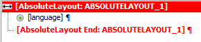
On the UX Controls page highlight the 'AbsoluteLayout' container's opening tag, [AbsoluteLayout: ABSOLUTELAYOUT_1].
In the properties list on the right check the 'Has background image' checkbox in the 'Container Begin Properties' section.
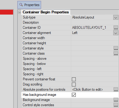
Click the [...] button next to the 'Background image' property, that should open in the same properties section.

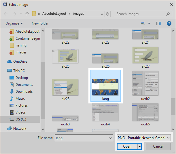
Select the 'Image in Web Project or Style' radio button and click the 'Select' button. Choose the 'Select From Web Project Folder' option.

Click the 'Add Image to Project' button and then click the up arrow next to the 'Source filename:' checkbox.

Set the file extension in the lower right of the 'Select Image' dialog to 'PNG' and navigate to the image you will use. Click Open, then OK, OK, and OK again.
Add the Custom Radio-Button Choices to the Layout
The opening 'AbsoluteLayout' container tag should still be highlighted in the controls tree. In the properties list on the right click the [...] button next to the 'Absolute positions for controls' property.

The 'Set Absolute Position and Size' editor will open. The AbsoluteLayout container's layout size is represented by the dotted rectangle in the editor's middle panel. Use the grey triangle in the lower right-hand corner of this rectangle to make the layout the same size as your image.

Highlight the first radio-button choice, 'language:1', in the controls list on the left-hand panel of the editor.

Place the mouse cursor inside the container's layout panel. Hold down the left mouse button and drag until the control for the first radio-button choice is the right size.
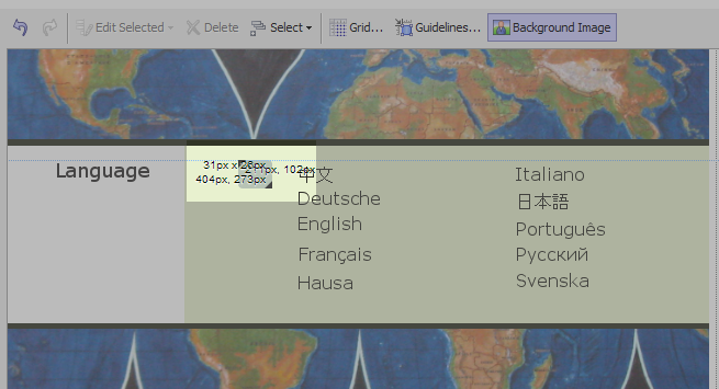 The label for the custom radio button will not be shown when the component is run in Live Preview. This information will be displayed using the background image. It is only necessary to make the size of the choice control to be approximately the size of an individual radio button.
Place the remaining radio button choices on the layout. Click OK

Highlight all of the choice controls in the layout panel by holding down the shift key on the keyboard and clicking on each control in the layout using the left mouse button. Click the 'Edit Selected' drop down in the toolbar and use the alignment and sizing options to make the control uniform.

Run the component in Live Preview. The radio button choice controls should appear as they were placed on the layout.

Change the Styling on the Radio-Button Choices
Return to the Design pane's UX Controls page. Highlight the radio-button control in the controls tree. In the properties list on the right check the 'Has custom design for RadioButton appearance' checkbox in the 'RadioButton Properties' section.

Click the [...] button next to the 'Custom appearance designer' property.

The 'Customize RadioButton Style' editor will open. To change the radio buttons to be square, instead of circular, set the 'Checkmark border radius' property to be '0'.
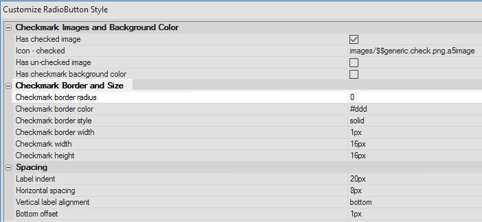
Use the 'Checkmark Border and Size' properties to set the color, size, and style of the radio-button borders

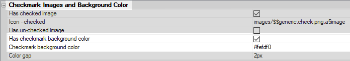
Use the 'Checkmark Images and Background Color' properties to change the image that fills the radio button. By default the custom image is a checkmark. Click OK to close the editor.
 To set the background color of the radio-buttons, first highlight the radio-button control in the controls tree. In the properties list click the [...] button next to the 'Style' property in the 'Field Properties' section. Click the [...] button next to the 'Background Color' setting to set the color.
Click OK to close the editor and run the component in Live Preview.