Create Cascading Lists Inside an Editor
Description
You can create multiple cascading lists using an editor container that contains a single list control. These lists can be used to populate a form view control with different types of data.
Create a Simple List Control
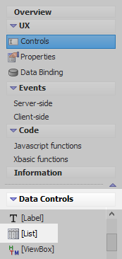
In the UX Builder on the UX Controls page open the 'Data Controls' menu. Select the [List] option to add a list control to the component.
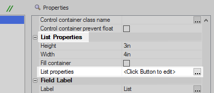
Highlight the list control in the controls tree. Click the [...] button next to the 'List properties' property in the properties list on the right. The list builder will open.
In the Data Source pane set the 'Data Source Type' menu select the 'Static' option.
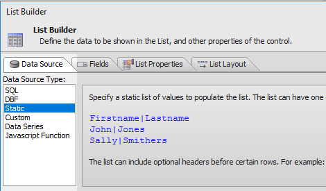
Click the [...] button next to the 'Static data' property.
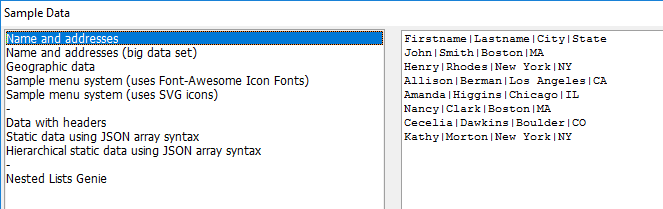
In the Static Choices dialog click the 'Sample data' hyperlink in the lower left.
In the Sample Data dialog select the 'Name and addresses' option and click OK and OK again.
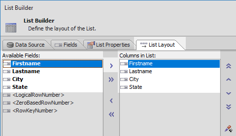
Open the 'List Layout' pane and highlight the 'Firstname', 'Lastname', 'City', and 'State' fields in the Available Fields list. Use the blue > arrow icon to move the fields from the Available Fields list to the Columns in List. Click OK to close the list builder.
Define JSON data to use as a Filter
In the UX Builder's main menu open the 'Events' section and open the Client-side page.
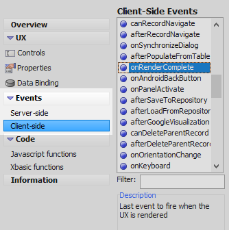
In the 'Client-Side Events' list select the 'onRenderComplete' event and add the following JSON definition.
{dialog.object}._cities = [
  {
     "City": "Boston",
     "State": "MA"
  },
  {
     "City": "Cambridge",
     "State": "MA"
  },
  {
     "City": "New York",
     "State": "NY"
  },
  {
     "City": "Los Angeles",
     "State": "CA"
  },
  {
     "City": "Chicago",
     "State": "IL"
  },
  {
     "City": "Springfield",
     "State": "IL"
  },
  {
     "City": "Boulder",
     "State": "CO"
  },
  {
     "City": "Ithaca",
     "State": "NY"
  }
];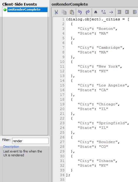
Define Javascript Functions
In the 'Code' section of the UX Controls page open the 'Javascript functions' page. Add the following javascript code defining a getSates() function and a getCities() function.
function getStates() { var _d = {dialog.object}._cities; var s = []; for(var i = 0; i < _d.length; i++) { if(s.indexOf(_d[i].State) < 0) { s.push(_d[i].State); } } s = s.sort(); return s; }; function getCities(state) { var _d = {dialog.object}._cities; var c = []; for(var i = 0; i < _d.length; i++) { if(_d[i].State == state) { if(c.indexOf(_d[i].City) < 0) { c.push(_d[i].City); } } } c = c.sort(); return c; };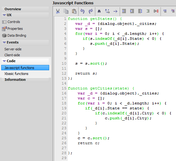 The getCities() function returns an array of cities for a particular state.
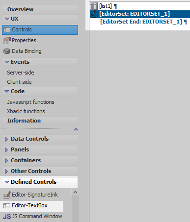
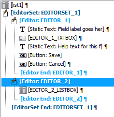
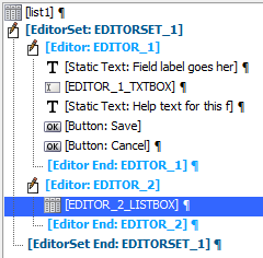
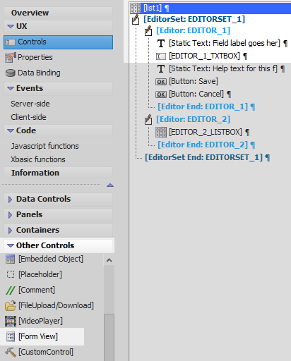
Create the Editors and EditorSet
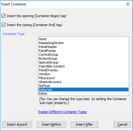
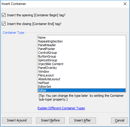
On the UX Controls page open the 'Containers' menu. Click on the [Container] option.
From the 'Container Type' list select the 'EditorSet' option. Click Insert After.
Highlight the opening EditorSet tag, [EditorSet:EDITORSET_1]. Open the Defined Controls menu and click on the Editor-TextBox option. The name of this editor should be 'EDITOR_1'
Highlight the closing tag of the first editor, [Editor End:EDITOR_1]. Open the Containers menu and click on the [Container] option.
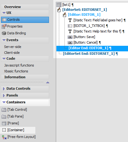
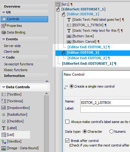
From the 'Container Type' list, select the 'Editor' option and click the Insert After button. The Editor should be named 'EDITOR_2'
Highlight the opening tag for the EDITOR_2 container, [Editor:EDITOR_2]. Open the 'Data Controls' menu and click on [List] to add a list control to the second editor. Give the list the name 'EDITOR_2_LISTBOX'.
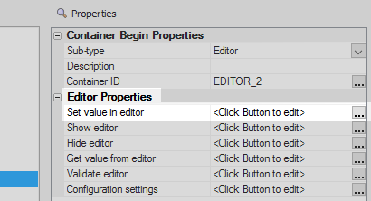
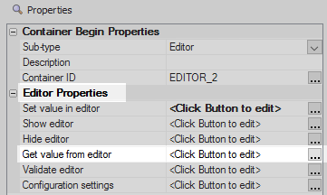
Highlight the opening tag for the EDITOR_2 container, [Editor:EDITOR_2], a second time.
In the properties list on the right click on the [...] button next to the 'Set value in editor' property.
Add the following definition to the 'Set value in editor' property. Click OK.
if(settings['fieldName'] == 'State') {
    var choices = getStates();
} else if(settings['fieldName'] == 'City') {
    var state = settings.formView.data.State;
    var choices = getCities(state);
}
var _d = [];
for(var i = 0; i < choices.length; i++) {
    _d.push({listData: choices[i]});
}

var lObj = {dialog.object}.getControl('EDITOR_2_LISTBOX');
lObj.populate(_d);
lObj.refresh();

{dialog.object}.setValue('EDITOR_2_LISTBOX',value);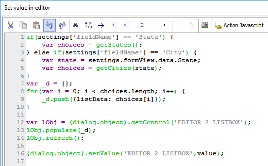
The set value in editor definition allows you to populate the editor's list control. In this example, both the state and city fields use this same editor-list, so it is necessary to determine which data is being set. This is determined by looking inside the settings object at the fieldName setting. The fieldName setting will be defined inside the form view editor and will have a value of 'City' for the City field and 'State' for the State field. When a user clicks on one of these two fields in the formview, the corresponding 'City' or 'State' value is then passed to the editor-list.
The choices variable is created to represent an array of these values, whether they are a list of cities or a list of states. In order to actually populate the list, however, we need an array of objects. We can do this by defining a single static field for the list control inside a list-editor. This field will represent a property for each object in the array of objects. In this example, this field is called 'listData' and it is defined later in this section. because that is the name of the field specified for the Editor-List.
"var _d" is a variable assigned to an empty array that will become an array of objects; that will populate the editor-list. The 'for' loop loops over all of the items in the choices array, that contains all of the values that need to become objects, and then pushes an object that has the listData property, filling the previously empty _d object array. The editor-list is now ready to populate.
The "lObj" variable get a pointer to the list control. This pointer the uses the populate() function to populate that list control using the _d object array. Finally, a refresh method is called in order to refresh the list; which is a good practice to have whenever there is a hidden list control that you need to show. The list is populated whenever a user clicks on a row in the list.
Click the [...] button next to the 'Get value from editor' property.
Add the following definition to the 'Get value from editor' property and click OK.
var fieldsToBlank = settings['fieldsToBlank']; if(typeof fieldsToBlank != 'undefined') { var _data = []; for(var i = 0; i < fieldsToBlank.length; i++) { _data.push(''); } {dialog.object}.formViewUpdate(settings.formView.name,fieldsToBlank,_data) } return {dialog.object}.getValue('EDITOR_2_LISTBOX');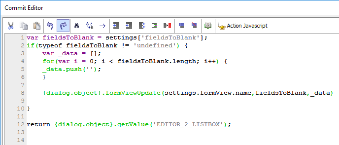 Before returning the value from the editor-list, the code goes through all of the fields to blank out and blanks out any values assigned to a 'fieldsToBlank' array. This is an array that is defined on individual fields inside the form view builder. A 'for' loop loops over all of the fields in the fieldsToBlank array[] and creates an empty array that has the same length as the fieldsToBlank array. The form view update method is then called. This method takes the name of the form, the list of fields that you want to update, and an array of data that will be used to update the fields; "settings.formView.name" gets the value from the Form View control. The last line of code returns the value of the listData field in the currently selected row.
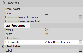
Highlight the second editor's list control, EDITOR_2_LISTBOX.
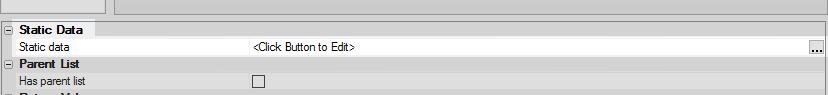
In the properties list on the right click the [...] button next to the 'List properties' property. The list builder will open.
Open the List Builder's Data Source pane. In the 'Data Source Type' list select 'Static'.
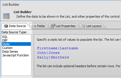
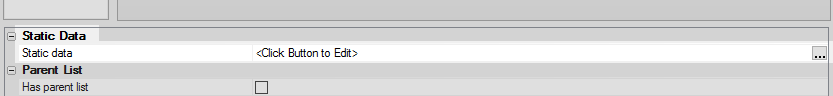
Click the [...] button next to the 'Static data' property
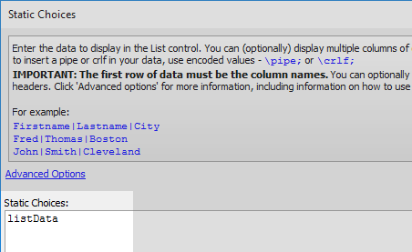
In the 'Static Choices' dialog type 'listData' into the Static Choices section. Click OK.
listData
 The 'listData' field is the only field defined for this list control. This is the data that is be passed into the list whenever the list-editor is used.
Set the 'Return value type' dropdown in the 'Return Value' section to be 'Field'.
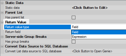
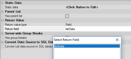
Click the [...] button next to the 'Return field' property. Select 'listData' and click OK.
 Assigning the 'Return field' to be 'listData' makes it possible to link this field with the 'Set value in editor' and 'Get value from editor' property definitions in the Editor-List container, EDITOR_2; to set and retrieve the current row in the list.
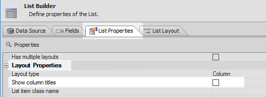
Open the 'List Properties' pane. Scroll down to the 'Layout Properties' section. Make sure the 'Show column titles' is not checked.
Scroll down to the 'Javascript - Run Time' section. Click the [...] button next to the OnClick property.
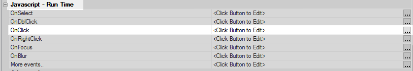
Add the following definition to the onClick event.
var edObj = {dialog.object}._EDITOR_EDITORSET['EDITOR_2']; var es = ''; if(typeof edObj != 'undefined') es = edObj.editorSet; if(typeof es == 'undefined') es = ''; if(es != '') { var closeEditorAfterCommit = true; {dialog.object}.editorCommit(es,closeEditorAfterCommit); }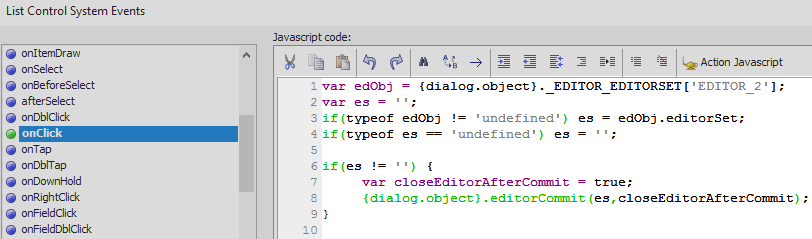 This is the code that commits the choice in the list control back to the form view control. This is the same code that you would see on the 'Save' button from the pre-defined Editor-List control available in the 'Defined Controls' section. Tying this code to the onClick event for the editor list allows users to save a change to the form view simply by selecting an item in the list, instead of selecting a row and then clicking 'Save'.
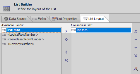
Open the 'List Layout' pane and use the blue > arrow to move the listData field from the 'Available Fields' list to the 'Columns in List'. Click OK to close the list builder.
Create and Define the Form View Control
On the UX Controls page highlight the list control, list1, at the top of the controls tree. Open the 'Other Controls' menu and click on the [Form View] control option.
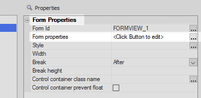
Highlight the Form View control and click the [...] button next to the 'Form properties' property. The Form View Builder.
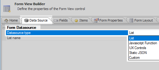
Open the 'Data Source' pane and select the 'List' option from the Datasource type option.
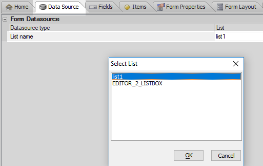
Click the [...] button next to the 'List name' property. Select the list control that you defined in the first section, list1, and click OK.
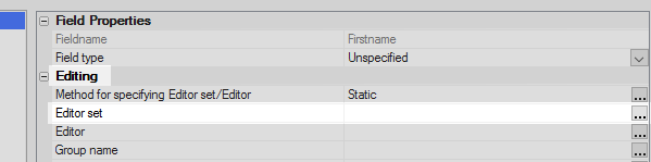
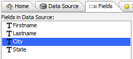
Open the Fields pane in the Form View Builder. Highlight the Firstname field.
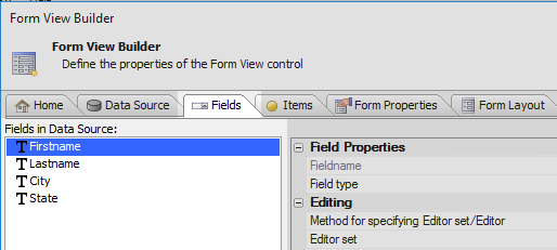
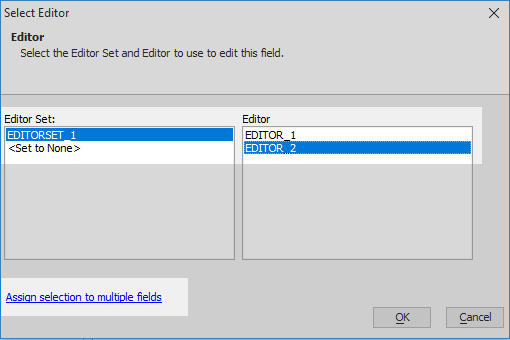
In the properties list click the [...] button next to the 'Editor set' property.
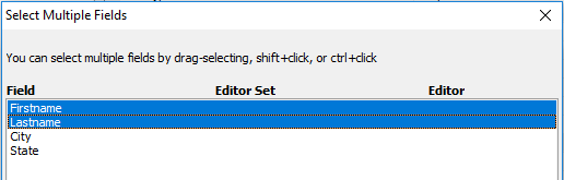
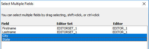
In the Select Editor dialog select 'EDITORSET_1' in the "Editor Set" section and 'EDITOR_1' in the Editor section. Click the 'Assign selection to multiple fields' hyperlink.
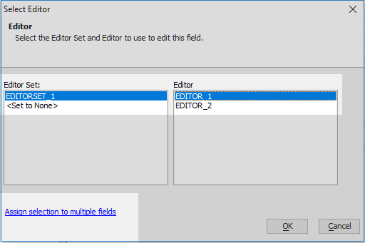
Highlight the 'Firstname' and 'Lastname' fields and click OK.
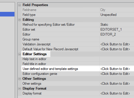
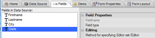
Highlight the 'City' field in the Fields in Data Source list.
Click the [...] button next to the 'Editor set' property.
Under 'Editor Set' select 'EDITORSET_1. In the 'Editor' section select 'EDITOR_2'. Click the 'Assign selection to multiple fields' hyperlink.
Highlight the 'City' and 'State' fields and click OK.
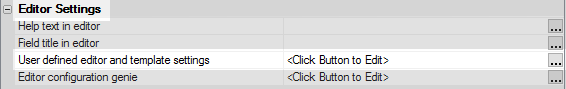
With the 'City' field highlighted, click the [...] button next to the 'User defined editor and template settings' property.
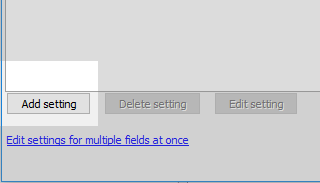
Click the Add setting button.
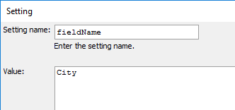
In the Setting dialog write 'fieldName' in the 'Setting name' textbox. Give 'fieldName' the value 'City'. Click OK.
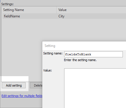
Click the 'Add setting' button again. Set the 'Setting name' to read 'fieldsToBlank'. Click OK.
 The fieldsToBlank setting is used to blank out related fields where necessary. For example, when a new state field is choosen before a city is selected, the city field will need to be blanked out as the old data is no longer relevant. If the city field is selected first, then the state field can remain the same and does not need to be blanked out. Because both fields use the same list editor, both must have a 'fieldsToBlank' setting. In order to not blank out the state field when a city is being edited, the fieldsToBlank setting is not assigned a value here.
Highlight the 'State' field in the 'Fields in Data Source' list.
Click the [...] button next to the 'User defined editor and template settings' property.
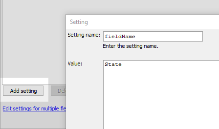
Click the 'Add setting' button. Create a setting with a 'Setting name' of 'fieldName'. Give the 'fieldName' setting the value 'State'. Click OK.
Click the 'Add setting' button again. Write 'fieldsToBlank' in the 'Setting name' control and give the setting the value ['City']. Click OK and OK again.
['City']
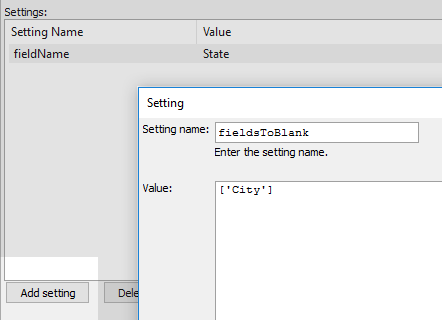 By giving the fieldsToBlank setting the value of ['City'], the 'City' field is blanked out whenever a new state is selected. Other fields can be blanked out as well simply by adding them to this array. For example giving fieldsToBLank the value ['City', 'Firstname'] will blank out both the city and firstname fields when a new state is choosen.
Open the 'Form Layout' pane and click the 'Add item' button in the lower left corner.
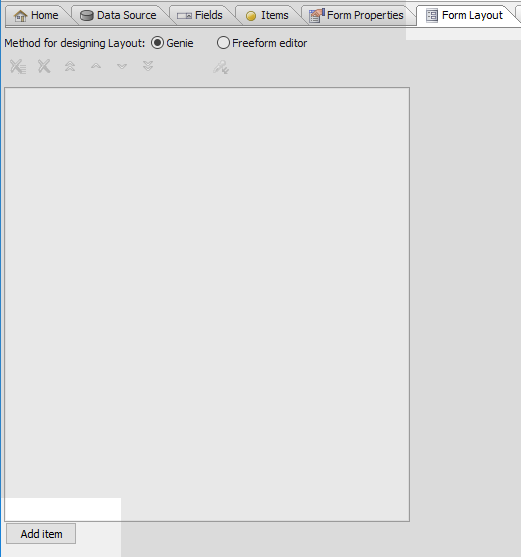
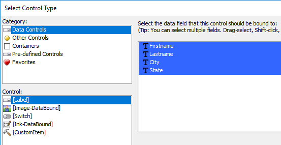
In the 'Select Control Type' dialog select 'Data Controls' under 'Category', [Label] under 'Control', highlight all of the fields in the list on the right and click OK. Click OK again to close the Form View Builder.
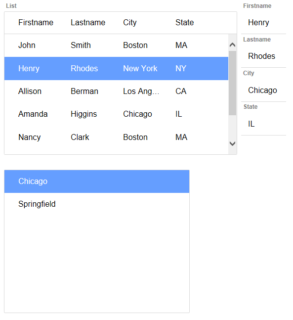
Run the component in Live Preview. Click on a row in the list control. The Form View control will open displaying information in the row.
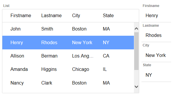
Click on the 'State' field. The List-Editor will display a list of states. Click on a state to save it to the form view.
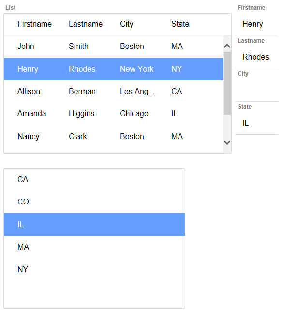
Click the 'City' field in the form view. Only cities in the selected state should be displayed.
See Also