Using a Button List Control to set Active Panes in a Tab Control
Description
A common design in a tab control is to have a series of tabs along the border of the control. When the user clicks on a tab a corresponding pane opens. The Button list control can be used to replace the tabs on a tab control, such that clicking on a given button will open a corresponding pane.
For a visual explanation on how to do this watch this video or read the guide below.
Construct a Tab Control with Three Panes
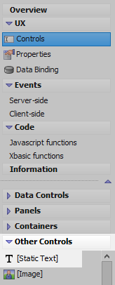
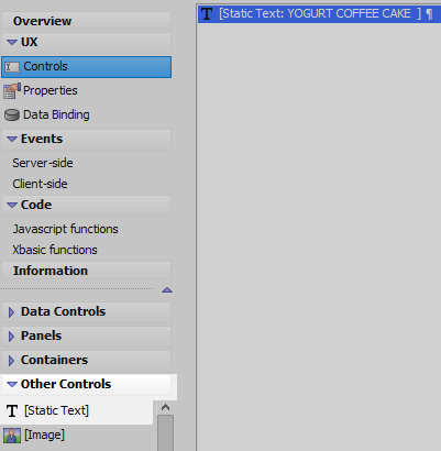
In the UX Builder on the UX Controls page open the 'Other Controls' menu. Click on the [Static Text] option to add some static text to the component.
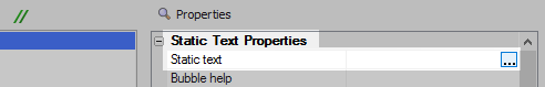
Highlight the static text control in the controls tree. In the properties list on the right click the [...] button next to the 'Static text' property in the static text properties section.
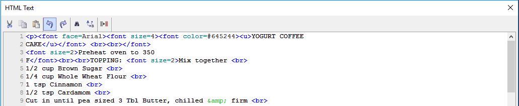
Add the following HTML to the static text definition and click OK.
<p><font face=Arial><font size=4><font color=#645244><u>YOGURT COFFEE CAKE</u></font> <br><br></font> <font size=2>Preheat oven to 350 F</font><br><br>TOPPING: <font size=2>Mix together <br> 1/2 cup Brown Sugar <br> 1/4 cup Whole Wheat Flour <br> 1 tsp Cinnamon <br> 1/2 tsp Cardamom <br> Cut in until pea sized 3 Tbl Butter, chilled & firm <br> Optional: mix in about 1/2 cup Walnuts, coarsely ground <br></font><br> BATTER: <br> <font size=2>2 Eggs -beaten (3) <br> Mix in 1/4 cup Canola Oil (3/8) <br> 1 cup Yogurt (1-1/2) <br> 1 tsp Vanilla extract (1-1/2) <br> Sift in 1 cup Whole Wheat Flour (1-1/2) <br> 1/2 cup All Purpose Flour (3/4) <br> 1/3 cup Sugar (1/2) <br> 1/2 tsp Salt (1) <br> 1 tsp Baking Soda (1-1/2) <br> 1 tsp Baking Powder (1-1/2) <br></font><br> <font size=2>Beat together and pour BATTER into greased 9x9 pan.<br> Spread TOPPING over the BATTER; bake about 30 minutes. <br> NOTE: If using 9x13 pan, increase all ingredient by half and bake 45 minutes.</font> </font><font size=2> </font></p>
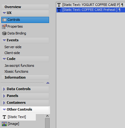
Return to the 'Other Controls' menu. Add a second [Static Text] control to the component.
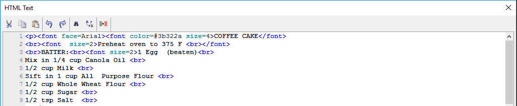
Highlight the second static text control in the controls tree. Click the [...] button next to the 'Static text' property in the control's properties list. Add the following html to the second [Static Text] control's definition.
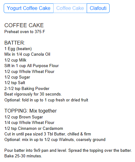
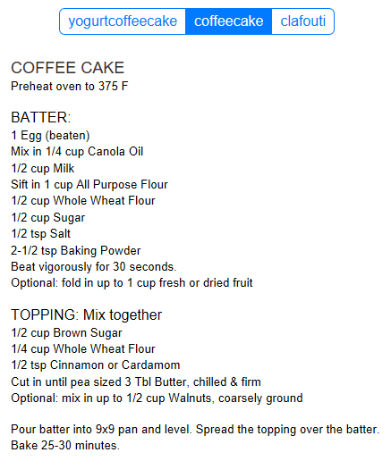
<p><font face=Arial><font color=#3b322a size=4>COFFEE CAKE</font> <br><font size=2>Preheat oven to 375 F <br></font> <br>BATTER:<br><font size=2>1 Egg (beaten)<br> Mix in 1/4 cup Canola Oil <br> 1/2 cup Milk <br> Sift in 1 cup All Purpose Flour <br> 1/2 cup Whole Wheat Flour <br> 1/2 cup Sugar <br> 1/2 tsp Salt <br> 2-1/2 tsp Baking Powder <br> Beat vigorously for 30 seconds. <br> Optional: fold in up to 1 cup fresh or dried fruit</font><br> <br>TOPPING: Mix together<br> <font size=2>1/2 cup Brown Sugar <br> 1/4 cup Whole Wheat Flour <br> 1/2 tsp Cinnamon or Cardamom <br> Cut in until pea sized 3 Tbl Butter, chilled & firm <br> Optional: mix in up to 1/2 cup Walnuts, coarsely ground </font></font></p> <p><font size=2 face=Arial>Pour batter into 9x9 pan and level. Spread the topping over the batter. <br> Bake 25-30 minutes.</font></p>
Add a third [Static Text] control to the component.
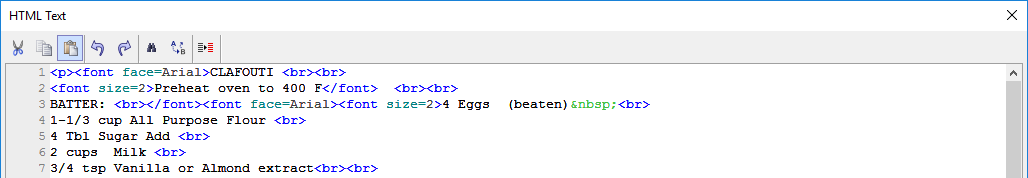
Click the [...] button next to the third static text control's 'Static text' property. Add the following html to the third static text control's 'Static text' property.
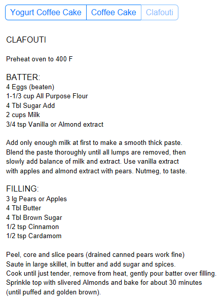
<p><font face=Arial>CLAFOUTI <br><br> <font size=2>Preheat oven to 400 F</font> <br><br> BATTER: <br></font><font face=Arial><font size=2>4 Eggs (beaten) <br> 1-1/3 cup All Purpose Flour <br> 4 Tbl Sugar Add <br> 2 cups Milk <br> 3/4 tsp Vanilla or Almond extract<br><br> Add only enough milk at first to make a smooth thick paste.<br> Blend the paste thoroughly until all lumps are removed, then <br> slowly add balance of milk and extract. Use vanilla extract <br> with apples and almond extract with pears. Nutmeg, to taste.</font> <br><br> FILLING: <br></font><font face=Arial><font size=2>3 lg Pears or Apples<br> 4 Tbl Butter <br> 4 Tbl Brown Sugar<br> 1/2 tsp Cinnamon <br> 1/2 tsp Cardamom</font> <br><br></font> <font size=2 face=Arial>Peel, core and slice pears (drained canned pears work fine) <br> Saute in large skillet, in butter and add sugar and spices. <br> Cook until just tender, remove from heat, gently pour batter over filling. <br> Sprinkle top with slivered Almonds and bake for about 30 minutes <br> (until puffed and golden brown).</font> </p>
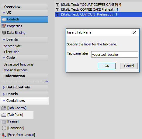
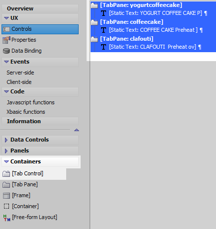
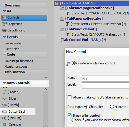
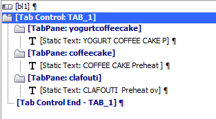
Open the 'Containers' menu and click on the [Tab Pane] option. Give the tab pane the name 'yogurtcoffeecake'.
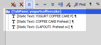
Highlight the tab pane. Use the double 'up' arrows in the Controls page toolbar to move the tab pane to the top of the controls tree.
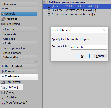
Highlight the first [Static Text] control in the controls tree. In the 'Containers' menu click on the [Tab Pane] control again to add a second tab pane. The second tab pane should appear underneath the first static text control. Give the [Tab Pane] the name 'coffeecake'.
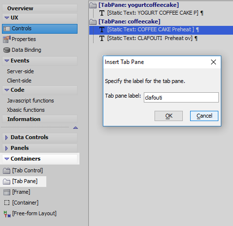
Highlight the second [Static Text] control in the controls tree. Click on the [Tab Pane] option in the 'Containers' menu to add a third tab pane under the second [Static Text] control. Give this [Tab Pane] the name 'clafouti'.
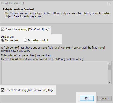
Highlight everything in the controls tree. In the 'Containers' menu click on the [Tab Control] option.
Select the 'Tab Control' radio button option in the 'Display as' menu and click OK.
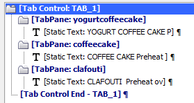
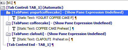
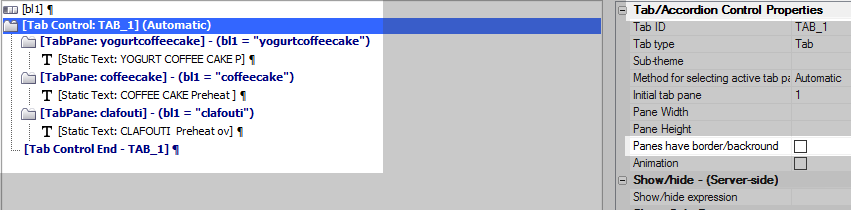
The controls tree should look like this.
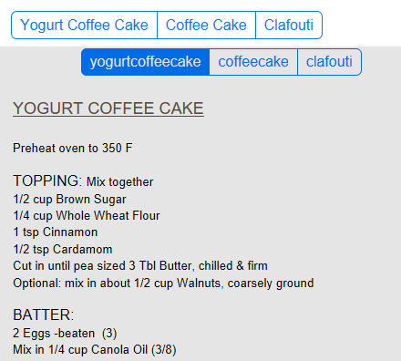
Run the component in Live Preview. Click on the tabs to open the different tab panes in the control.
Create a Button-list Control
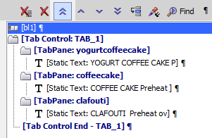
Return to the UX Builder's Design tab and to the UX Controls page. Open the 'Data Controls' menu and click on the [Button List] option to add a button list control to the component. Give the button list the name 'bl1'. Leave the label blank.
Highlight the button list control in the controls tree. Use the double 'up' arrows in the Controls page toolbar to move the button list control to the top of the controls tree.
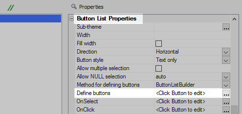
With the control highlighted, go to the 'Button List Properties' section on the right. Click the [...] button next to the 'Define buttons' property.
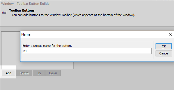
Click the 'Add' button in the 'Window - Toolbar Button Builder'. Give the button the name 'b1'.
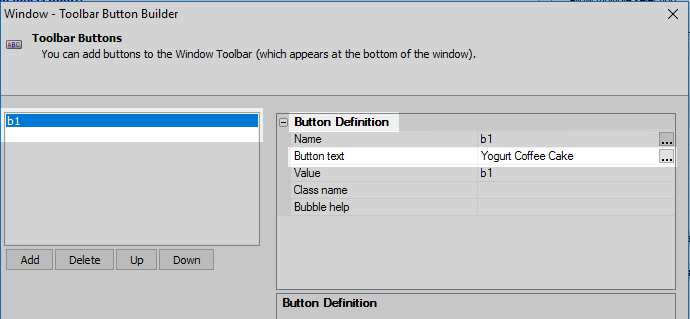
Highlight 'b1' in the button builder. In the 'Button Definition' properties on the right, set the 'Button text' property to read 'Yogurt Coffee Cake'.
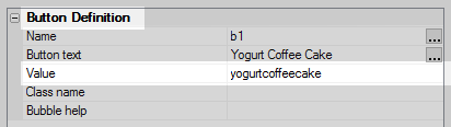
Set the 'Value' property in in the 'Button Definition' properties to be 'yogurtcoffeecake'.
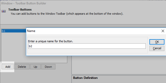
Add a second button with the name 'b2'.
Highlight the 'b2' button in the list and then set the 'Button text' property to read 'Coffee Cake'.
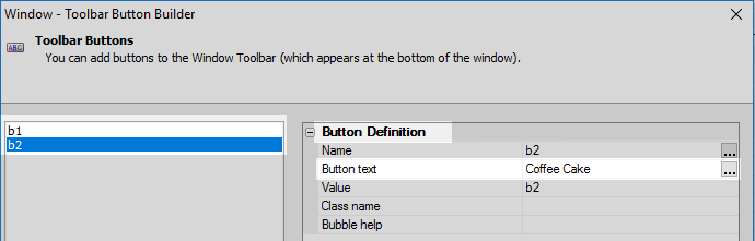
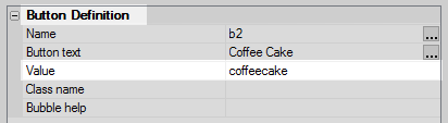
Set the 'Value' property of the 'b2' button to be 'coffeecake'.
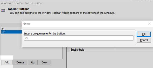
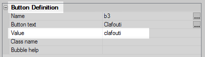
Click the 'Add' button again to add a third button to the button-list control. Give this button the name 'b3'
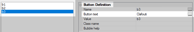
Set the 'Button text' of the 'b3' button to be 'Clafouti'.
Set the 'b3' button's 'Value' property to be 'clafouti'. Click OK to close the Button Builder.
Run the component in Live Preview. You should see the Button-list control appear above the tabs for the tab control, although the buttons do not yet do anything.
Make the Button-list Control set the Active Pane
On the UX Controls page. The existing 'tabs' need to be set so that they are hidden from the user at runtime. To do this, first highlight the opening tab control tab in the controls tree, [Tab Control:TAB_1].
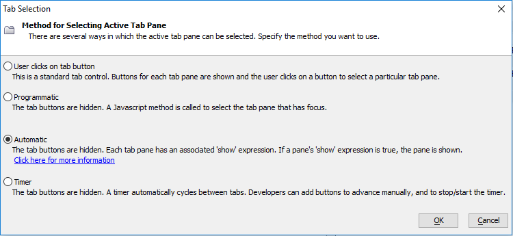
In the tab control's properties list click the [...] button next to the 'Method for selecting active tab pane' property.
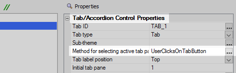
Select the 'Automatic' radio button option and click OK.
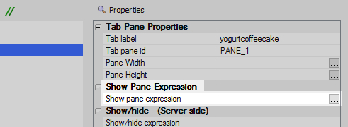
Highlight the first [Tab Pane] control in the controls tree.
In the tab pane's properties list click the [...] button next to the 'Show pane expression' property in the 'Show Pane Expression' section.
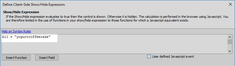
Add the following expression to the 'Define Client-Side Show/Hide Expression' dialog and click OK.
bl1 = "yogurtcoffeecake"
Highlight the second [Tab Pane] control.
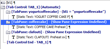
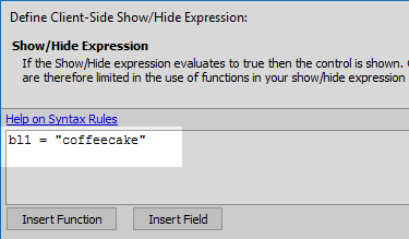
In the properties list click the [...] button next to the 'Show pane expression' property to open the 'Define Client-Side Show/Hide Expression' dialog for the second tab pane.
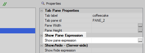
Create the following expression for the second tab pane and click OK.
bl1 = "coffeecake"
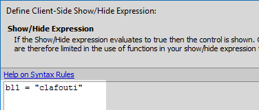
Highlight the third [Tab Pane] in the controls tree. In the properties list click the [...] button next to the 'Show pane expression' property.
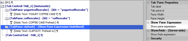
Add the following expression and click OK.
bl1 = "clafouti"
Highlight the opening tab control tag, [Tab Control:TAB_1](Automatic). As a last step, uncheck the 'Panes have border/background' property in the tab control's 'Tab/Accordion Control Properties' section. This will remove any border that appears around the static text in each pane.
Run the component in Live Preview. When you click on a button in the button-list, the specified tab pane should be set to active.