Create a Chart in the UX Component
Description
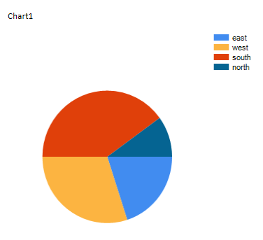
This example shows how to create a simple pie chart with a Static data series.
This example is also demonstrated on this video.
Adding a Chart Control to a Component
Open the UX Builder
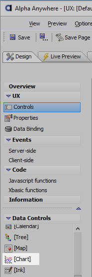
On the UX control page, open the Data Controls menu and click on the Chart control.
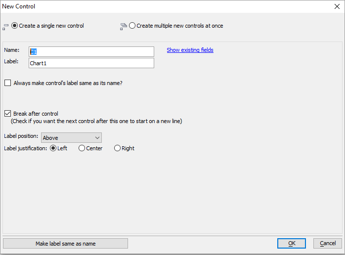
The New Control dialog will open. Give the control a name and click OK
The control will be added to the Component
Define a Static data series in a Control
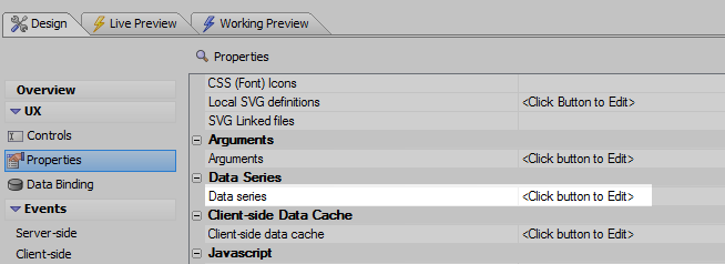
Open the UX properties page and under the Data Series section open the Data series property
Click Add Data Series. Give the series the name 'Series One'. Click OK and OK again if a notice appears.
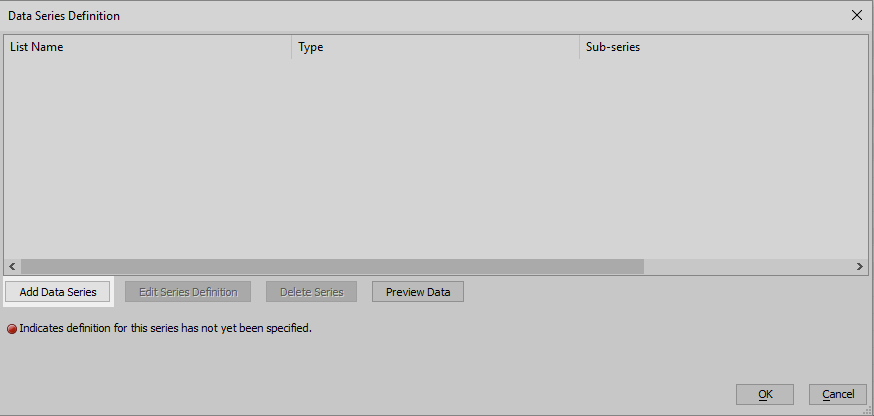
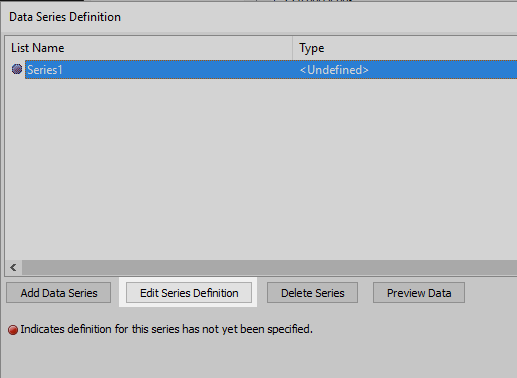
Click Edit Series Definition
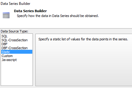
There are a selection of Data Source Types that you can use to define a series. For this example click Static.
Click the
 button next to the Static Data property. The Static Choices dialog will open. Enter your own data series
sales|region
                      10|east
                      15|west
                      20|south
                      5|north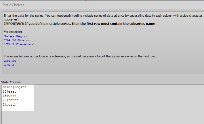
Click OK, OK, and Click OK again.
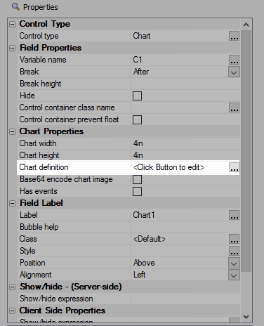
You can define as many subseries as you wantGo back to UX Control page and highlight the Chart control. In the Controls properties section find the Chart Properties section, then click on the 'Chart definition'' peoperty.
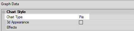
Under Chart Style find the Chart Type property and set it to Pie.
Under Chart Data section click on the
button next to the Data property. The 'Pick Series to Display' dialog will appear. Check Add.
Select the series you defined and then click OK. You will be prompted to select a sub series, choose 'Sales' and click OK and OK again.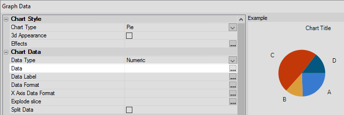 The Data property
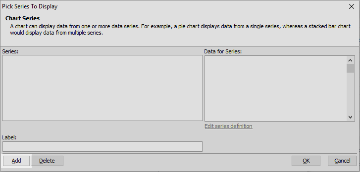 Check Add
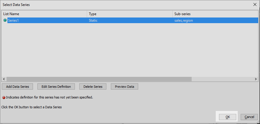 Add the Data series you defined
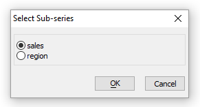 Sub Series
Under the Chart Data section click the
button next to the Data Label property.The Data Label Expression will open add the following
chart.category
Under Chart Category click the
button next to category. Again add Section1 data series to the chart,
only this time when prompted for a subseries select 'region'.
Run the Chart in Live Preview
See Also