Customizing an Ink Overlay
Description
The Ink Overlay is defined using an html template. As a result it is easy to add new buttons to an overlay and then define new actions to execute when these custom buttons are used..
For a visual explanation on how to customize and ink overlay watch this video or follow the guide below.
Set the Project Style
Not all project styles have the css classes necessary to run an ink overlay. Use either the iOS7, Android, or Alpha style in the 'Style name' property.
In the UX Builder open the UX Properties page. In the 'UX Properties' section click the [...] button next to the 'Style name' property.
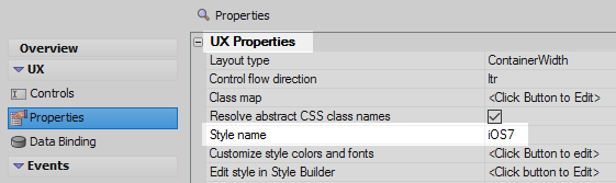
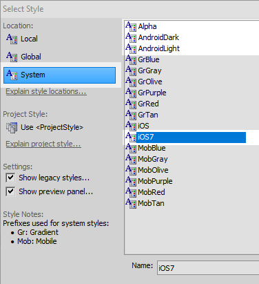
In the 'Location' menu select the 'System' option. Select the iOS7, AndroidLight, AndroidDark, or Alpha style in the style list. Click OK.
Create an Ink Control with an Overlay
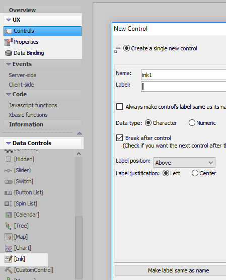
In the UX Builder on the UX Controls page open the 'Data Controls' menu. Click on the [Ink] option to add an ink control to the component.
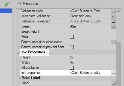
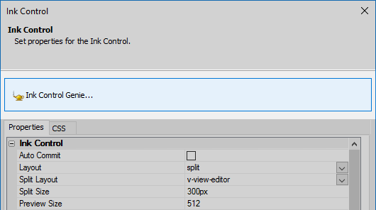
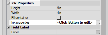
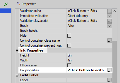
Highlight the ink control in the controls tree. In the properties list on the right, scroll down to the 'Ink Properties' section. Click the [...] button next to the 'Ink properties' property.
In the 'Ink Control' dialog click the big 'Ink Control Genie...' button at the top of the dialog.
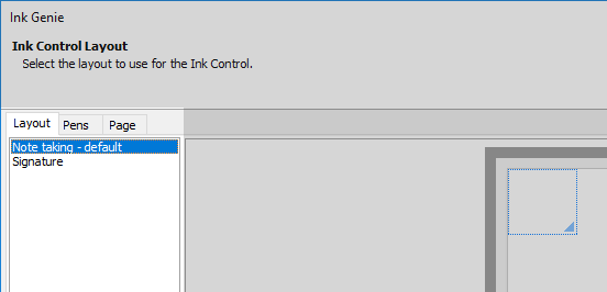
On the 'Layout' tab menu select the 'Note taking - default' option on the right. Click OK and OK again.
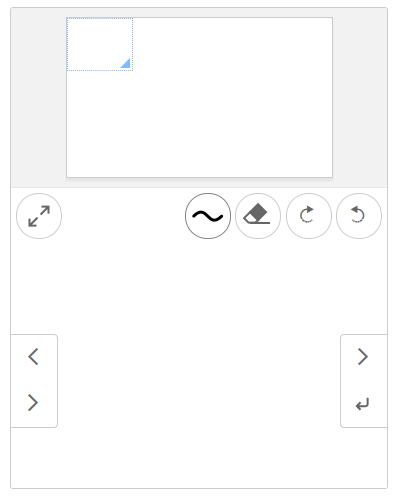
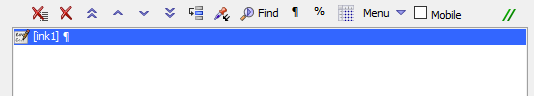
Run the component in 'Live Preview'. The Overlay should be visible.
Add a Button to the Overlay
Return to the UX Controls pag, highlight the ink control in the controls tree, and click the [...] button next to the 'Ink properties' property to open the ink properties dialog again.
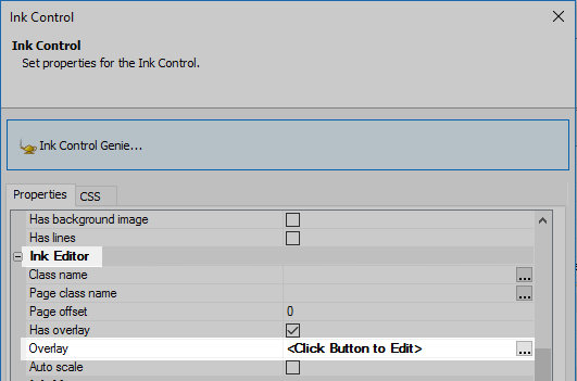
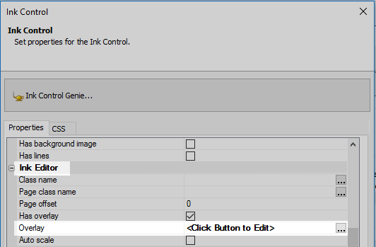
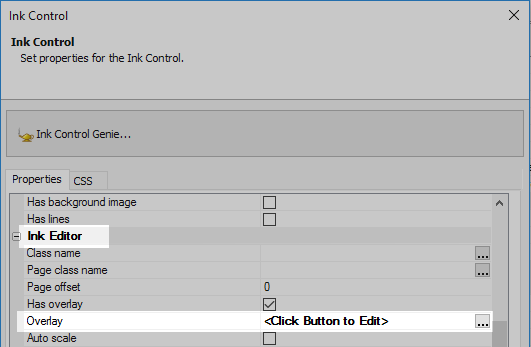
Scroll down to the 'Ink Editor' properties section. The 'Has overlay' property should already be checked. Click the [...] button next to the 'Overlay' property.
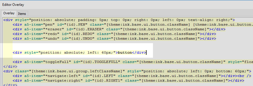
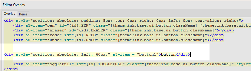
The 'Editor Overlay' dialog should appear. Open the 'Overlay' tab. This tab contains the html for the overlay that was generated when we used the ink genie. Add the following <div> to the overlay under the existing button definitions. Click OK.
<div style="position: absolute; left: 60px;">button</div>
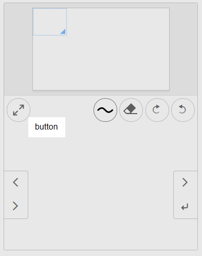
Run the component in Live Preview. The new button should now appear in the Ink Overlay. However, it is only labeled as 'button' and doesn't' actually do anything.
Add an Action to the Button
Highlight the ink control in the controls tree a click on the 'Ink properties' property to reopen the Ink Control dialog.
Click the [...] button next to the 'Overlay' property to open the 'Editor Overlay' dialog again.
On the 'Overlay' tab locate the <div> that contains the button you defined. Inside the <div> tag assign the button to an a5-item named 'button1': a5-item = "button1". Like this:
<div style="position: absolute; left: 60px;" a5-item = "button1">button</div>
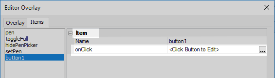
Click on the 'Editor Overlay' dialog's 'Items' tab to open it.
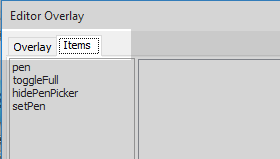
Click the 'Add' button on the items tab.

Next to the new item's 'Name' property type 'button1'.
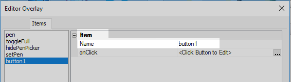
Click the [...] button next to the 'onClick' property.
Define the following onClick event definition. Click OK, OK, and OK again.
alert('New overlay tool');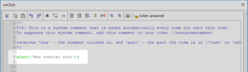
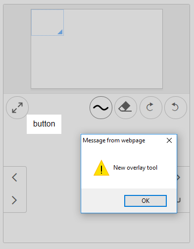
Run the component in Live Preview. When you click on the custom button now you should see the javascript alert fire.
Use an Icon for the Button
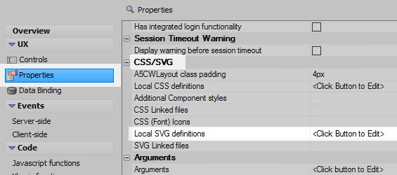
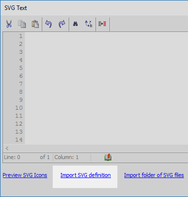
Open the UX Properties page. Scroll down to the 'CSS/SCG' section. Click the [...] button next to the 'Local SVG definitions' property.
Click the 'Import SVG definition' hyperlink at the bottom of the 'SVG Text' dialog.
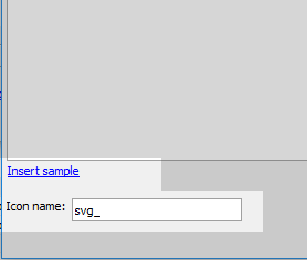
Click the 'Insert sample' hyperlink and give the sample the icon name 'svg_'. Click OK and OK again.
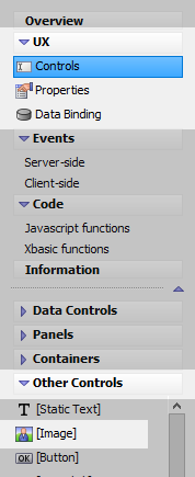
On the UX Controls page open the 'Other Controls' menu. Click on the [Image] option to add an image to the component.
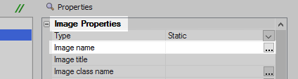
Highlight the image in the controls tree. In the properties list on the right click the [...] button next to the 'Image name' property in the 'Image Properties' section.
Select the 'SVG Icon' radio button option in the Specify Image dialog and click 'Select'.
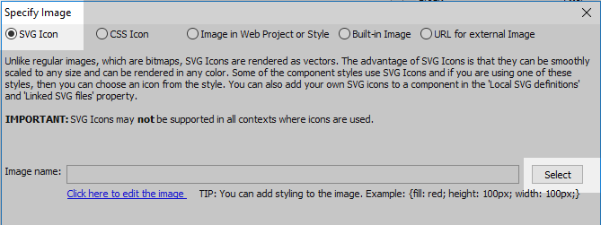
The sample SVG icon that was generated from the 'Local SVG definitions' property should appear under the 'Local SVG Icons' heading. Highlight the icon.

Click the up arrow on the 'Fill color' control in the top right corner of the 'SVG Icon' dialog. Pick a color from the color picker to change the color of the icon.
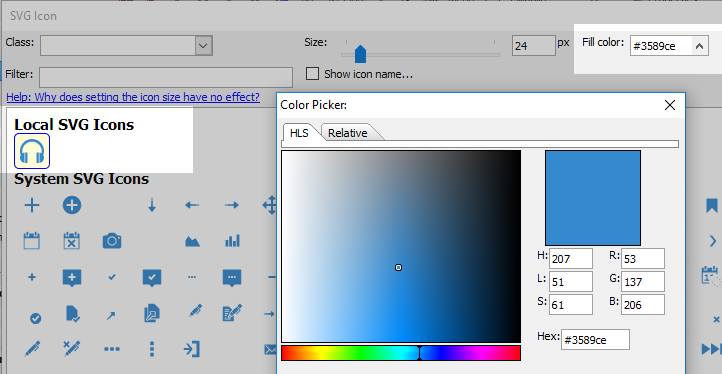 The fill color control will change the color of all of the icons in the dialog. This should not change the appearance of icons in your project that are defined elsewhere. Changing the color here only impacts the current instance of the selected icon.
Click OK once. In the 'Specify Image' dialog copy the generated path for your icon that appears next to the 'Image name' control, then click OK.
svgIcon=#svg_:24{ fill: #3589ce;}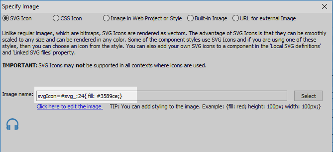
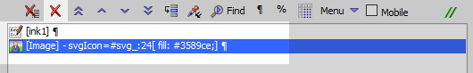
Highlight the [Image] control in the controls tree and click the red 'X' icon in the Controls page toolbar to delete the image control.
Highlight the ink control in the controls tree.
In the properties list click on the 'Ink properties' property to open the Ink Control dialog.
Click the [...] button next to the 'Overlay' property in the Ink Editor section.
Find the button that was defined previously and replace the text definition with the svg icon that you copied from the 'Image name' property. The svg icon should be placed inside an <img> tag as its source 'src'. The resulting image tag should look like this:
<img src="svgIcon=#svg_:24{ fill: #3589ce;}">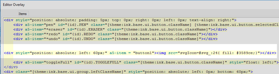
Click OK and OK again. Run the component in Live Preview. The custom button that was added to the overlay should now appear as an icon.

See Also