Alphabet Buttons Search
Description
Alphabet Button Search adds a series of buttons to the List that filter the List control when clicked.
Discussion
Alphabet Button Search can be added to a List control that allow the user to quickly filter the List's records. When you click on a button, a search is performed for all records that have a specified field that starts with the letter you clicked on. For example, if the search field is set to City and you click the "P" button, all records where the city starts with P are shown.
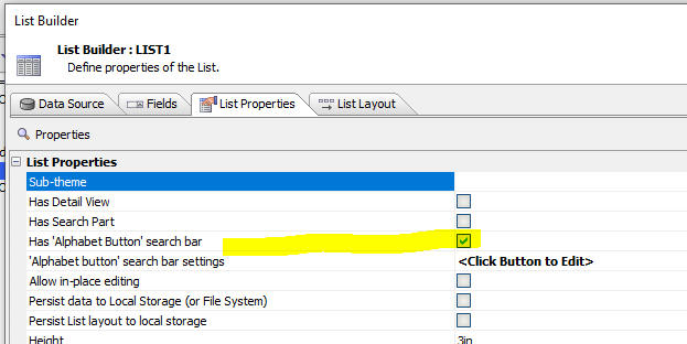
To turn on the alphabet bar search, check the Has 'Alphabet Button' search bar property.
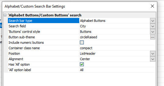
Then, click the 'Alphabet button' search bar settings property's  smart field to configure the settings for the search bar.
'Alphabet button' search bar settings
Properties in the builder include:
Search bar type
Can be either Alphabet Buttons or Custom Buttons. If you choose the Custom Buttons option, you can specify a series of custom buttons (e.g. 'Customers with overdue accounts', 'Active Customers', etc.) and then for each custom button you can specify the search expression to use.
Custom search definition
This property is only available if Search bar type is set to Custom Buttons.
Custom buttons are defined in the Custom search definition. Each button is defined using the following syntax:
Button text = search expression
The Button text is the text shown on the button in the Alphabet Button Search bar. If you want to include the equal sign (=) in the button text, you can escape it using a backslash:
\=
The search expression is the filter to use when the button is pressed. The expression can reference the search field using the {searchField} placeholder. This placeholder will be replaced with the search field defined in the Search field setting.
The search expression is specified using either DBF or SQL syntax. If the List's data source is a DBF table, you must use DBF syntax. Otherwise, you must use SQL syntax.
For example:
A..C =  upper(left({searchfield},1)) >= 'A'  AND   upper(left({searchfield},1)) <= 'C'
D..F =  upper(left({searchfield},1)) >= 'D'  AND   upper(left({searchfield},1)) <= 'F'
G..I =  upper(left({searchfield},1)) >= 'G'  AND   upper(left({searchfield},1)) <= 'I'
M..O =  upper(left({searchfield},1)) >= 'M'  AND   upper(left({searchfield},1)) <= 'O'
P..R =  upper(left({searchfield},1)) >= 'P'  AND   upper(left({searchfield},1)) <= 'R'
S..U =  upper(left({searchfield},1)) >= 'S'  AND   upper(left({searchfield},1)) <= 'U'
V..X =  upper(left({searchfield},1)) >= 'V'  AND   upper(left({searchfield},1)) <= 'X'
Y..Z =  upper(left({searchfield},1)) >= 'Y'  AND   upper(left({searchfield},1)) <= 'Z'
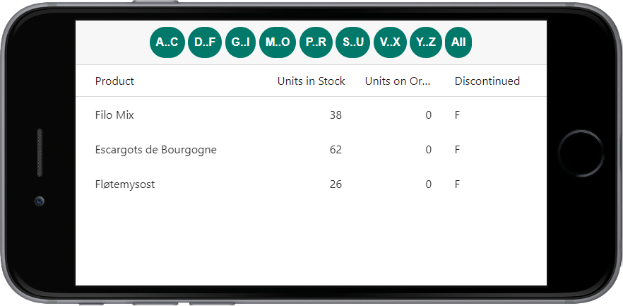
The custom definition above defines buttons that perform a range search when a button is clicked. E.g. when the user clicks the button labelled "D..F", all records with a search field that starts with "D", "E", or "F" will be shown in the List.
Search field
The field to search when a button is clicked in the Alphabet Button Search bar.
'Buttons' control style
Defines how the search options are rendered. If set to Hyperlinks, the Alphabet Button Search bar is rendered as a list of hyperlinks. If set to Buttons, the Alphabet Button Search bar is rendered as a list of buttons.
Button sub-theme
Allows you to select a sub-theme for the button appearance. In the image above the circleRaised sub-theme has been selected.
Include numeric buttons
This property is only available if Search bar type is set to Alphabet Buttons.
If checked, adds buttons for numbers 0 through 9.
Container class name
This property is only available if 'Buttons' control style is set to Buttons.
One or more optional classes to apply to the buttons in the Alphabet Button Search bar. Set this property to "compact" to display the buttons in their compact style.
Position
The location to render the Alphabet Button Search bar:
- Position
- Description
- ListHeader
Places the Alphabet Button Search bar in the header for the List control.
- ListFooter
Places the Alphabet Button Search bar in the footer for the List control
- Placeholder
Places the Alphabet Button Search bar in a Placeholder control in the UX component.
Alignment
The alignment of the Alphabet Button Search bar within the specified Position. Can be Left, Right, or Center.
Has 'All' option
If checked, adds an "All" button to the Alphabet Button Search bar. When clicked, removes any Alphabet Button Search bar filter applied to the list.
'All' option label
This property is only available if 'Buttons' control style is set to Buttons.
The text shown on the "All" button.
See Also


