Custom Styling for Radio Buttons
Description
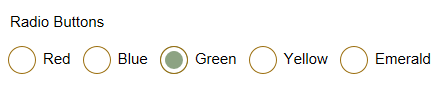
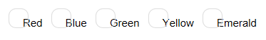
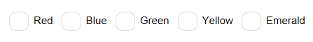
While the default HTML radio buttons work well for a number of applications it is sometimes useful to be able to customize the size, shape, and color or radio buttons. This ability is particularly useful for mobile applications which rely on an onPress event; where the normal size radio buttons might be too small for some fingers.
To see a video explanation of this guide see this video.
Customizing Radio Buttons
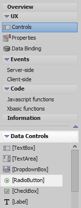
In the UX Builder on the UX Controls page open the 'Data Controls' menu and click on the [RadioButton] option to add a radio button control to the component.
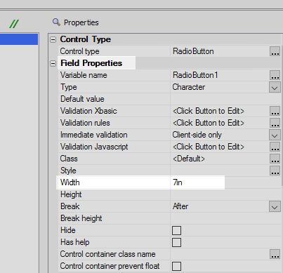
Highlight the Radio Button control. In the properties list scroll down to the Field Properties section, set the 'Width' property to 7in.
In the 'RadioButton Properties' section click on the
 button next to the 'Choices' property.
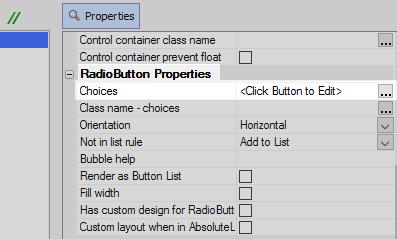
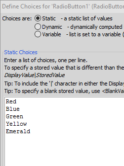
From the 'Choices are' menu select 'Static'
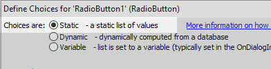
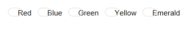
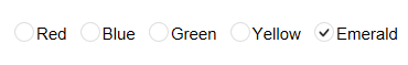
Enter a list of choices to appear next to each radio button. Add one choice per line. Click OK.
Check the 'Has custom design for Radio Buttons' checkbox.
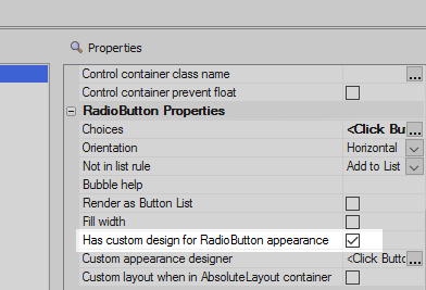
Click the
button next to the 'Custom appearance designer' property.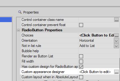
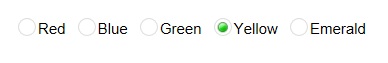
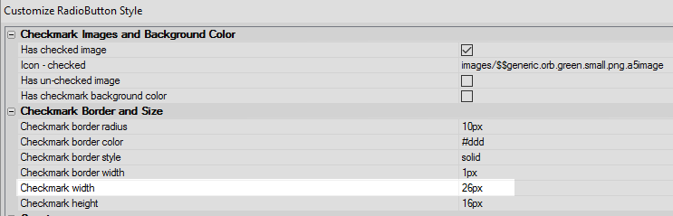
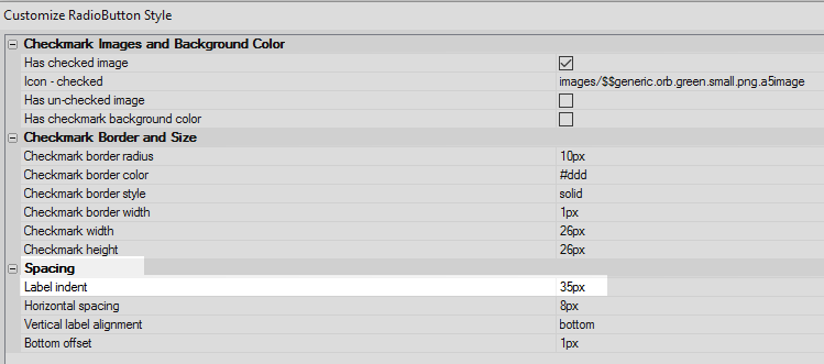
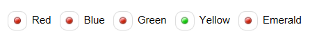
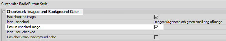
Check the 'Has checked image' property. By default custom radio buttons have a checkmark for this image.
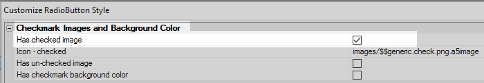
 A checked image
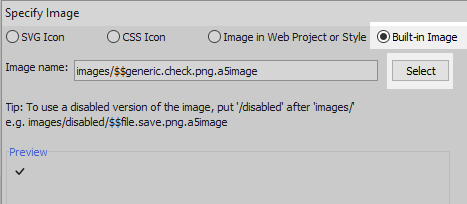
Click the
button next to the 'Icon - checked' property.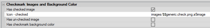
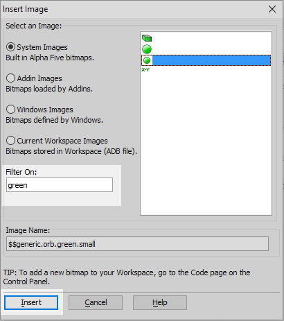
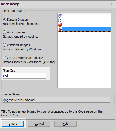
Select the 'Built-in Image' radio button and click 'Select'.
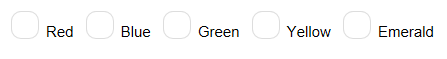
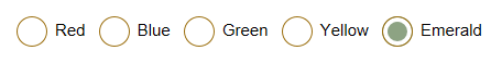
Type 'green' into the Filter On textbox. Select the small green orb from the icon menu and click 'Insert'. Click OK.
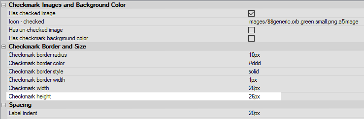
Change the 'Checkmark width' property to be 26px.
Change the 'Checkmark height' property to be 26px.
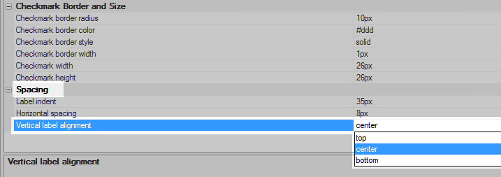
Change the 'Label indent' property to be 35px.
Set the 'Vertical label alignment' to 'center'.
Check the 'Has un-checked image' checkbox. This is the image that will fill a radio button that is not selected.
Click the
button next to the 'Icon - not checked' property.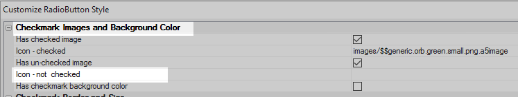
Choose the 'Built-in Image' radio button again an click 'Select'.
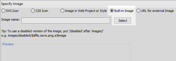
Type 'red' into the 'Filter On' textbox and select the small red orb that appears in the menu. Click 'Insert' and OK.
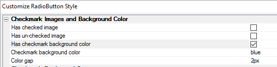
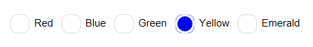
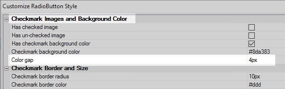
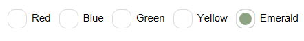
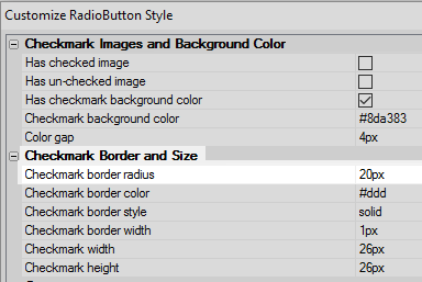
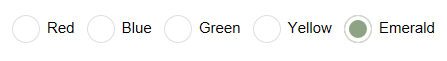
Uncheck both the 'Has checked image' and 'Has unchecked image' property. Check the 'Has checkmark background color' property.
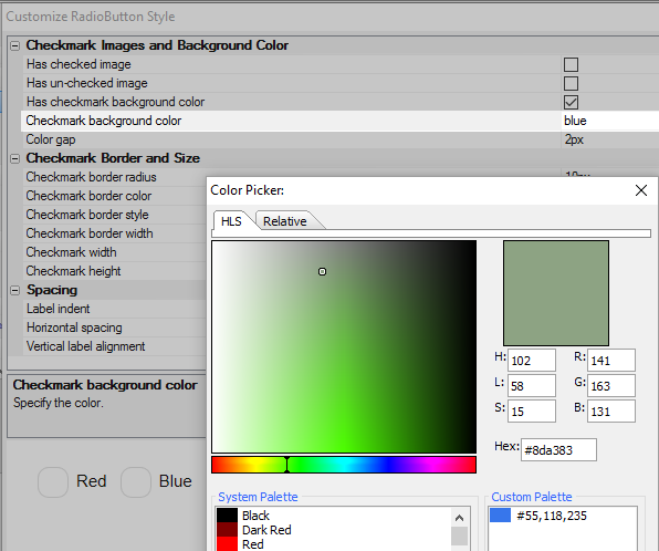
Click the
button next to the 'Checkmark background color' property. From the color pallet
select a desirable color.
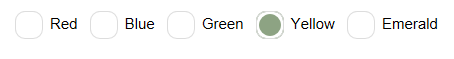
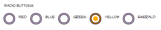
Change the 'Color gap' property to be 4px. This should shrink the size of the background color checkmark.
Change the 'Checkmark border radius' property to be 20px. This will make the radio button appear more like a circle.
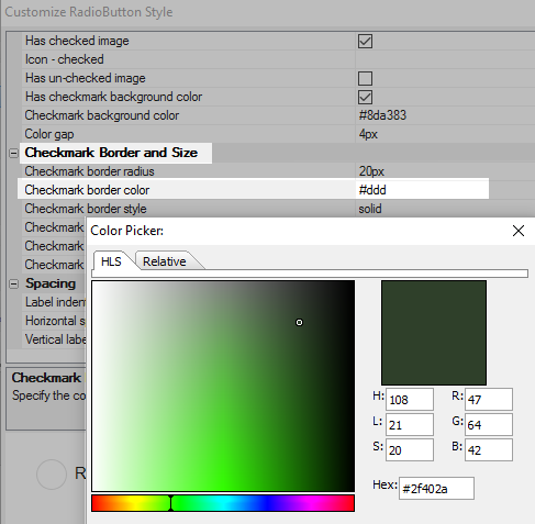
Click the
button next to the 'Checkmark border color' property and
select a suitable color from the color picker. Click OK and OK again
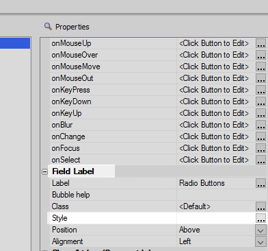
On the UX Controls page highlight the Radio Button control. In the 'Field Label' section of the properties list click on the
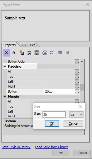
button next to the 'Style' property.
In the Style Editor's properties list scroll down to the 'Padding' section. Set the Bottom property to be 20px and click OK.
Run the component in Live Preview