Editor-NumericKeyPad
Description
Displays a numeric keypad for entering number values.
Discussion
The [Editor-NumericKeyPad] control can be added to a UX Component to add a custom numeric keypad for entering numeric values.
The editor, as shown below, displays a keypad that allows the user to enter numbers. When editing a value using the numeric keypad, the native keyboard on a mobile device is not used.
A configuration genie allows you to specify various settings for the keypad.

To insert a Numeric Key Pad editor, select [Editor-NumericKeyPad] from the list of controls in the Defined Controls section.

Configuring the Editor
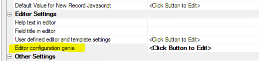
To configure the Numeric KeyPad editor, click the smart field for the Editor configuration genie property in the FormView builder on the Fields tab.
The configuration genie (shown below) allows you to configure various settings for the keypad.

Editor Settings

- Maximum number of characters
The maximum number of characters the user can enter. Set to -1 for no limit.
- Align
Defines the alignment of value in the display area. Can be left, center, or right.
- Scale
If the value is longer than can fit in the display area, the text can be automatically scaled so that the full value can be seen. If unchecked, the text can be scrolled.
- Allow negative values
If checked, adds the "-" symbol to the keypad so negative values can be entered.
- Allow decimal values
If checked, adds the Decimal character to the keypad so decimal values can be entered.
- Maximum decimal places
Defines the maximum number of decimal places the user can enter. Enter -1 for no limit. This option is only available if Allow decimal values is checked.
- Decimal character
The decimal character to use. This option is only available if Allow decimal values is checked.
- Has custom keys
If checked, up to two additional custom keys can be added to the keypad.
- Show primary custom key
If checked, the primary custom key will be shown in the keypad. This option is only available if Has custom keys is checked.
- Primary custom key label
The label shown for the Primary custom key. This option is only available if Show primary custom key is checked.
- Primary custom key value(s)
Enter one or more values in a comma delimited list. If you enter more than one value,when the user taps on this key, a pop-up menu showing all custom values will be shown. This option is only available if Show primary custom key is checked.
- Show secondary custom key
If checked, the secondary custom key will be shown in the keypad. This option is only available if Has custom keys is checked.
- Secondary custom key label
The label shown for the Secondary custom key. This option is only available if Show secondary custom key is checked.
- Secondary custom key value(s)
Enter one or more values in a comma delimited list. If you enter more than one value,when the user taps on this key, a pop-up menu showing all custom values will be shown. This option is only available if Show secondary custom key is checked.
See Also