Adding a Button-List to a ControlBar
Description
A common pattern in mobile apps is to have a button bar at the bottom of the screen with a series of buttons that allow you to select the active Panel that is shown on the device. Typically, these buttons are spread out so that they fill the width of the screen. The button-list control is ideal for implementing this pattern.

To see how a Button-List can be configured to fill the width of the screen, and to select a Panel Card in a Panel Layout when one of the buttons in the Button-List is tapped,follow the guide below or watch this video:
Adding a Button-List to a ControlBar
A common pattern in mobile apps is to have a button bar at the bottom of the screen with a series of buttons that allow you to select the active Panel that is shown on the device. Typically, these buttons are spread out so that they fill the width of the screen.
The button-list control is ideal for implementing this pattern.
In this video we show how a Button-List can be configured to fill the width of the screen and to select a Panel Card in a Panel Layout when one of the buttons in the Button-List is tapped.
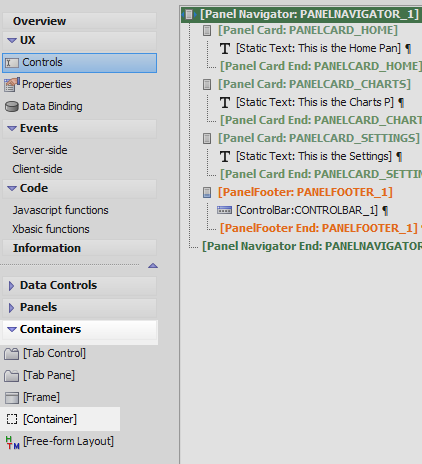
Create a Panel Navigator with Panel Cards and a ControlBar
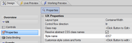
In the UX Builder open the Properties page. In the UX Properties section click the
 button next to the 'Style name' property.
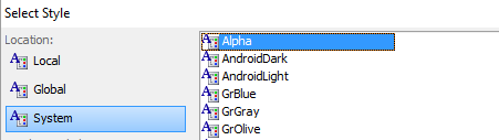
In the 'Location' menu select 'System' and then choose the 'Alpha' style. Click OK
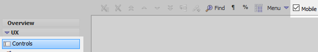
Open the UX Controls page and check the 'Mobile' checkbox.
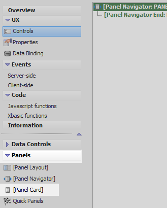
Open the 'Panels' menu. Select the [Panel Navigator] option to add a Panel Navigator to the component.
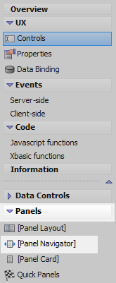
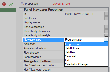
Highlight the Panel Navigator. In the properties list, on the right, change the 'Navigator type' property to 'Programmatic'.
 The layout error will be resolved in the next step.
Open the Panels menu again and click on [Panel Card] and 'Insert After' to add a Panel Card to the Panel Navigator.
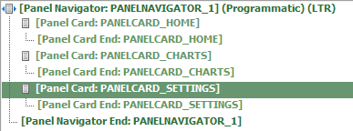
Name this panel card 'PANELCARD_HOME'. This can be done by highlighting the panel card and then changing the name of the 'Id' property in the Panel Card Properties section to a new id.

Highlight [Panel Card End: PANELCARD_HOME]. Click on the [Panel Card] option and select 'Isert After' again to add a second panel card to the component. Give this panel card an Id of 'PANELCARD_CHARTS'.
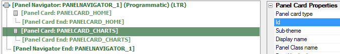
Highlight [Panel Card End: PANELCARD_CHARTS]. Add a third panel card to the component. Change this panel card's Id property to be 'PANELCARD_SETTINGS'.
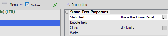
Highlight PANELCARD_HOME. Open the 'Other Controls' menu and click on the [Static Text] option to add a static text control to PANELCARD_HOME.

Highlight the static text property. In the Static Text Properties section on the right change the 'Static text' property to read 'This is the Home Panel'.
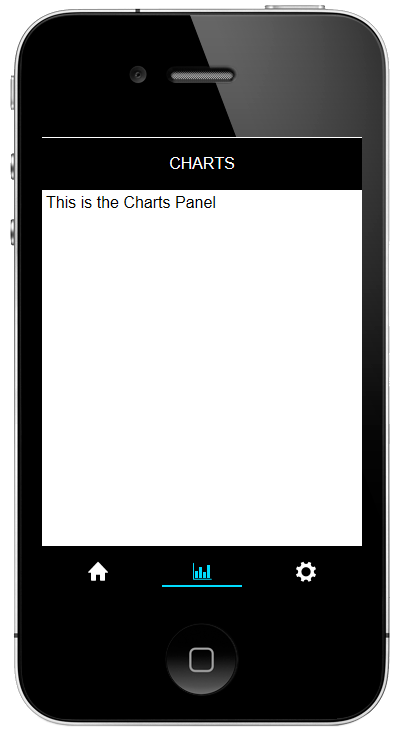
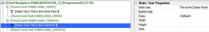
Highlight PANELCARD_CHARTS. Click on [Static Text] again to add a static text control to PANELCARD_CHARTS. Set the 'Static text' property to read 'This is the Charts Panel'
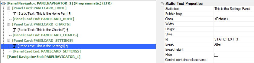
Highlight PANELCARD_SETTINGS. Add a [Static Text] control to this panel card and set the 'Static text' to read 'This is the Settings Panel'.
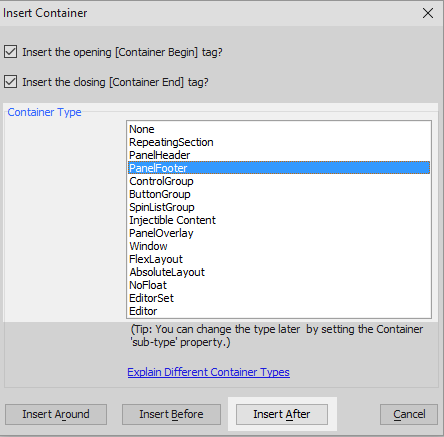
Highlight [Panel Card End: PANELCARD_SETTINGS]. Open the Containers menu and click the [Container] option.

From the Container Type list select the 'PanelFooter' option and click 'Insert After'.
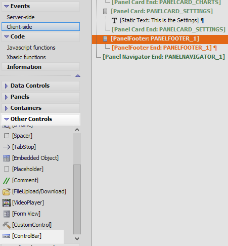
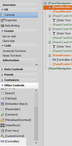
Highlight the Panel Footer and open the 'Other Controls' menu. Select the [ControlBar] option to add a ControlBar to the Panel Footer.
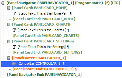
The UX Component tree should now look like this:
Add a Button-list to the ControlBar
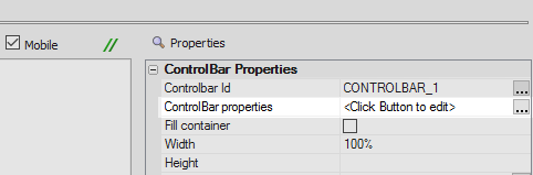
Highlight the ControlBar. In the properties list on the right click the
button next to
the 'ControlBar properties' property to open the ControlBar Builder.
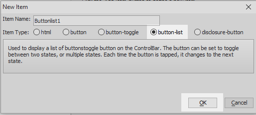
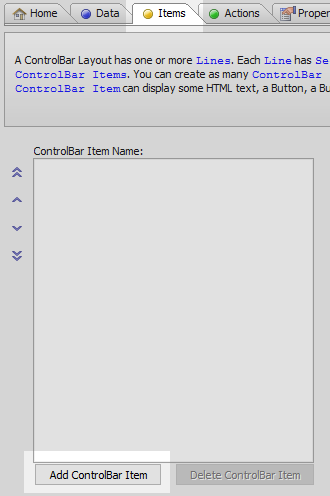
In the ControlBar Builder open the 'Items' pane. Click the 'Add ControlBar Item' button.

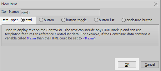
From the 'Item Type' list check the 'button-list' radio button and click OK.
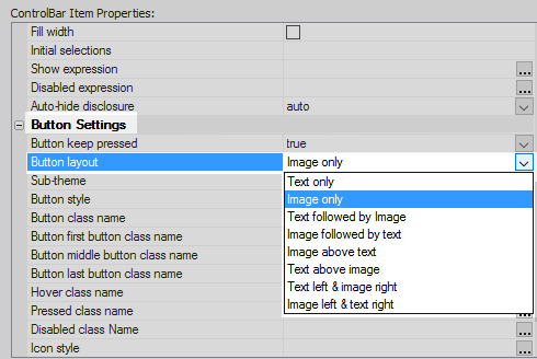
Highlight the button-list item in the ControlBar Item Name menu. Scroll down the properties list on the right to the Button Settings section. Change the 'Button layout' property to be 'Image only'.
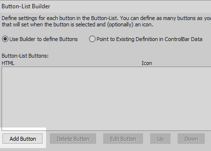
In the Button-List Settings section click the
button next to the 'Button-list Settings' property.

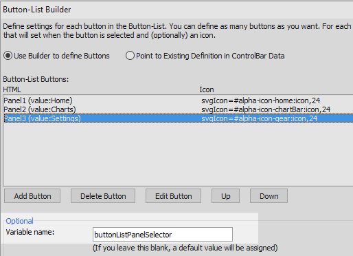
Click the 'Add Button' button in the Button-List Builder.
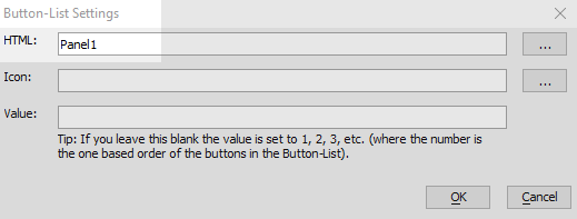
Set the HTML: for this button to be Panel1
Click the
button next to 'Icon:'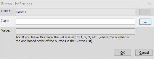
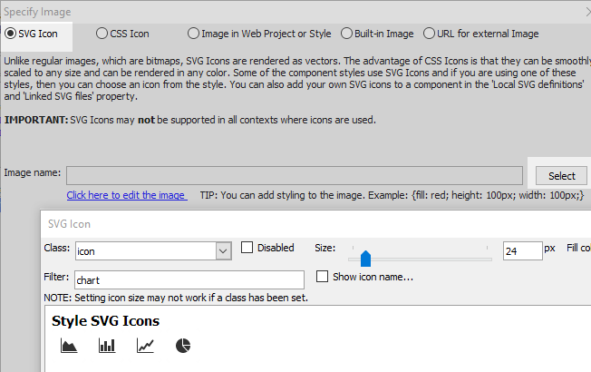
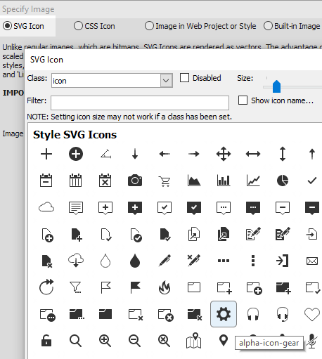
Click the 'SVG Icon' option and click Select
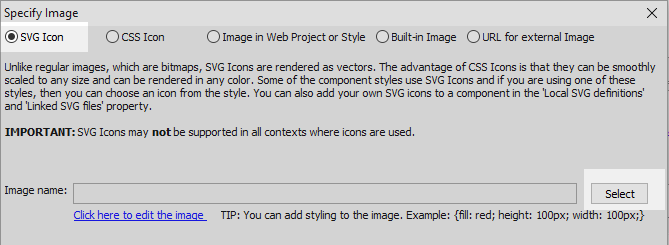
Select the 'Home' icon. This can be done by typing 'home' into the filter. Click OK and OK again.

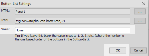
Set the Value: of this button to be 'Home' and click OK.
 These built-in icons are visible when the 'Style name' property on the properties page is set to 'Alpha'.
Click The Add Button again.

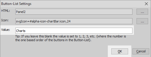
Set HTML: to be Panel2 and then Click the
button next to 'Icon'
Click the 'SVG Icon' option again and hit 'Select'. For this panel choose a 'Chart' icon, then click OK and OK again.
Set the value for the second button to be 'Charts' and click OK.
Click the 'Add Button' button a third time. Set the HTML for this button to be 'Panel3'.

Click the
button next to Panel3's Icon setting. Select the 'SVG Icon' and click 'Select'.
Choose the 'Settings' icon from the built-in SVG icons. Click OK and OK again.
Set the value of this button to be 'Settings'. Click OK.
In the Button-List Builder's 'optional' section set the Variable name: textbox to be the following and then click OK to close the Button-List Builder:
buttonListPanelSelector
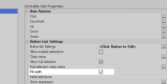
Still on the Items pane with the Button-list highlighted go to the 'Button-List Settings' section. Check the 'Fill width' property. This will expand the button-list to fill the entire footer.
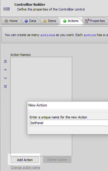
Open the 'Actions' pane and click the Add Action button. Give the new action the name 'SetPanel'.
Place the following javascript code in the SetPanel action's definition area:
var target = this.data.buttonListPanelSelector.value[0]; var panelName = 'PANELCARD_' + target.toUpperCase(); {dialog.object}.panelSetActive(panelName);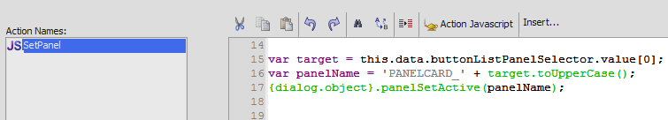 The target variable will get the value of the button that was clicked. The panelName variable uses the target value to create a string that matches the name of one of the existing panel cards in the panel navigator. The panelSetAcvtive() method then uses this panelName to set that particular Panel Card as active so that the user will see it.
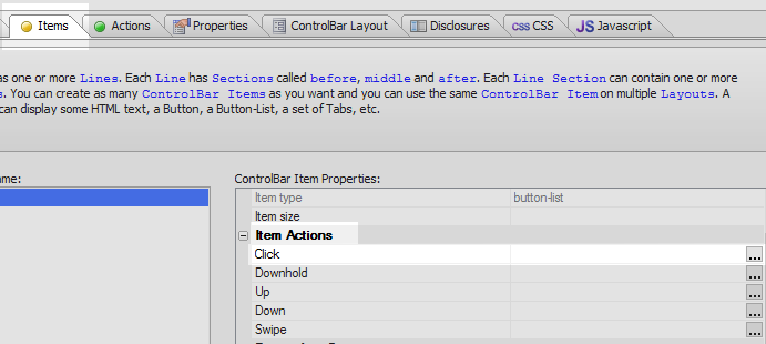
Open the 'Items' pane again. Highlight the Buttonlist item and click the
button next tp the 'Click' action.
This should be under the Item Actions section of the properties list.
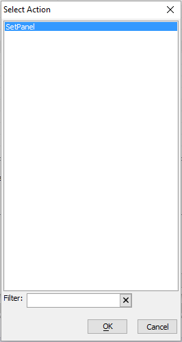
Select the SetPanel action that you just defined.
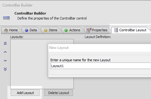
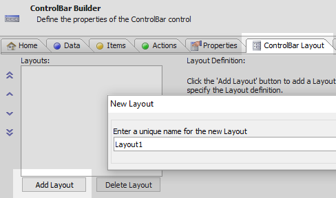
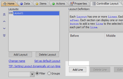
Open the 'ControlBar Layout' pane. Click the Add Layout button. Give the layout a name, like 'Layout1' and click OK.
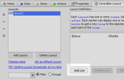
With the layout highlighted click the 'Add Line' button
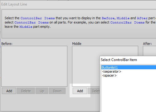
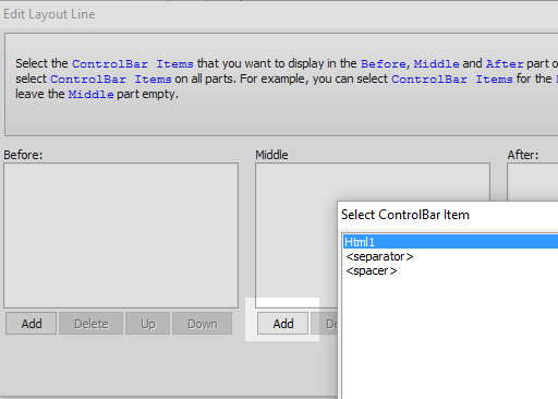
In the Edit Layout Line dialog click the 'Add' button under the middle section. Select Buttonlist1 and click OK and OK again.
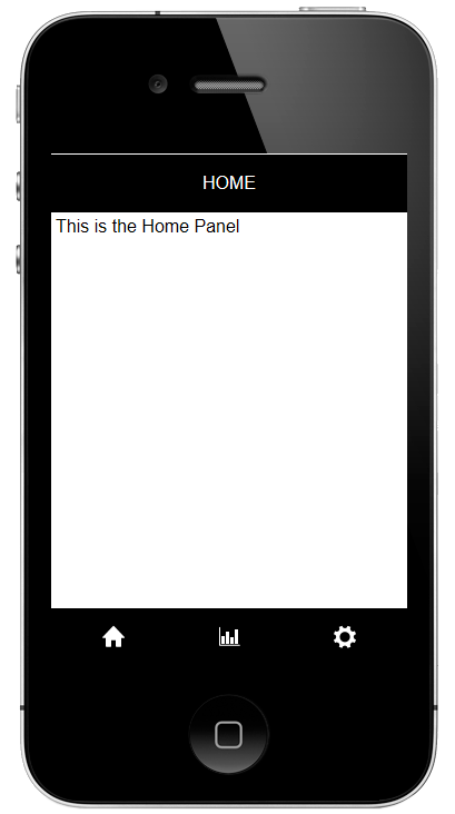
Click OK to close the ControlBar Builder and run the component in Live Preview.
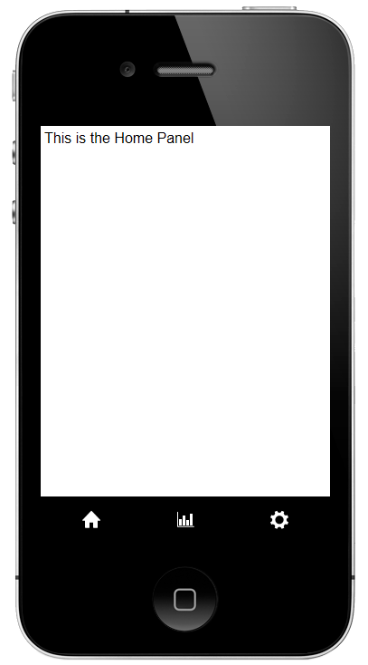
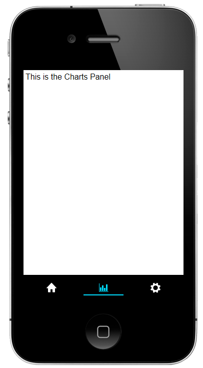
When you click on the icons in the control bar's Button-list the Panel Cards should update to match the change.
Create a Second ControlBar that Displays the Active Panel's Title
Highlight [Panel Navigator:PANELNAVIGATOR_1] and open the 'Containers' menu. Click on the [Container] option.
From the Container Type list select the 'PanelHeader' option and click 'Insert After'.

Highlight the PanelHeader. Open the 'Other Controls' menu and click on [ControlBar] to add a control bar to the panel header.
Highlight the ControlBar. Click on the
button next to the ControlBar properties property.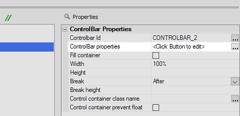
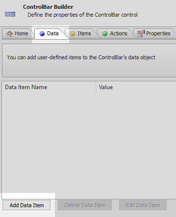
On the 'Data' pane click on the 'Add Data Item' button.
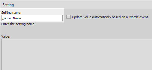
For the 'Setting name:' write 'panelName'.
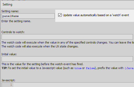
Check the "Update value automatically based on a 'watch' event" checkbox.
A Javascript work area will open up. Add the following code to this area and click OK:
var name = dialog.activePanelName; name = name.split('_')[1]; return name;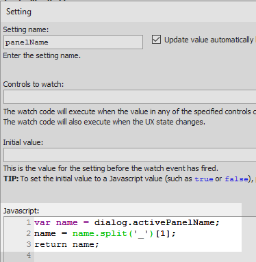 In the previous section a controlbar in a panel footer set the active panel, based on which button was selected from a button-list. Here 'dialog.activePanelName' gets that active panel and then assigns its value to a variable called 'name'. The full name of the active panel will look something like this: 'PANELCARD_HOME'. This does not make a good header. In the second line of code, "name.split('_')" takes this string and splits it where the underbar '_' appears. This produces two strings, in this example 'PANELCARD' and 'HOME'. These two strings are stored in an array with two elements. Because javascript arrays are 0 based, the first element in the array is written as [0] and the second as [1]. This second element is assigned to be the new value of name variable and this is the value that is returned in the third line of code.
Open the 'Items' pane and click the 'Add ControlBar Item' button.
From the Item Type options select the 'html' radio button and click OK.
Highlight the Html Item. Click the
button next to the 'HTML text' property in the HTML Settings section.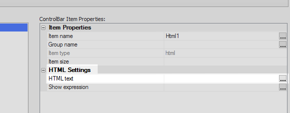
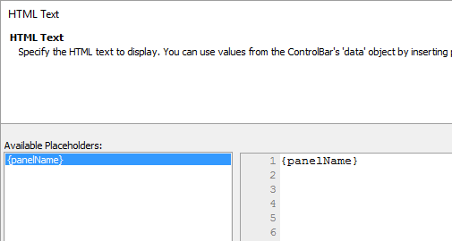
Double click on the {panelName} placeholder in the 'Available Placeholders:' list to add it to the editor and click OK.
Open the ControlBar Layout tab. Click the 'Add Layout' button and give the new layout a name, like 'Layout1'.
Click the 'Add Line' button.
Click the 'Add' button under the 'Middle' section of the Edit Layout Line dialog. Select the Html1 option that you defined. Click OK and OK again to close the ControlBar Builder.
Run the component in Live Preview.
Try changing the panel in the component, the ControlBar header should update to reflect the active panel.