Hooking Data Controls to ControlBar Disclosures
Description
You can display standard UX controls (such as Lists, Buttons, Input controls, etc.) in a disclosure. This means you can use controls to create menus, maps, ink surfaces, etc... that pop up at the click ok a button in a ControlBar.
For a explanation on how this is done follow the guide below and/or watch this video.
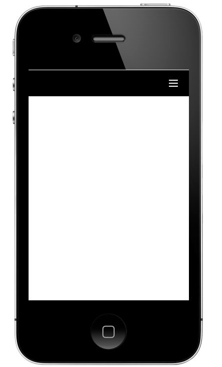
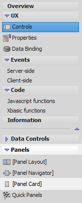
Create a Component with a ControlBar and List Control
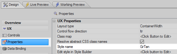
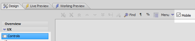
In the UX Builder open the UX Properties page and click the [...] button next to the 'Style name' property.
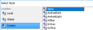
From the 'Location' menu select 'System' and from the style options select the 'Alpha' style. Click OK.
Open the UX Controls page and check the 'Mobile' checkbox.
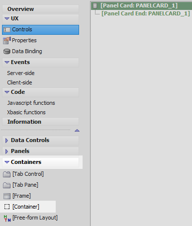
Open the 'Panel' menu and select the [Panel Card] option to add a Panel Card to the component.
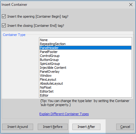
Highlight the Panel Card in the tree. Open the Containers menu and click on the [Container] option.
From the Container Type list select 'PanelHeader' and then click the 'Insert After' button.
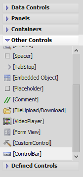
Highlight the panel header and open the 'Other Controls' menu. Click on the [ControlBar] option to add a controlbar to the panelheader.
Highlight [Panel Card End: PANELCARD_1] and open the Containers menu again. Click on the [Container] option.
From the Container Type list select the 'Injectible Content' option and click 'Insert After'.

Highlight the Injectible Content container and open the 'Data Controls' menu. Click on the [List] option. Give the list the name 'listMenu' and click OK to add the list control to the injectible content container

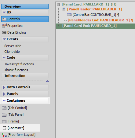
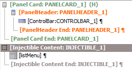
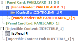
The component tree should now look like this:

The List Control
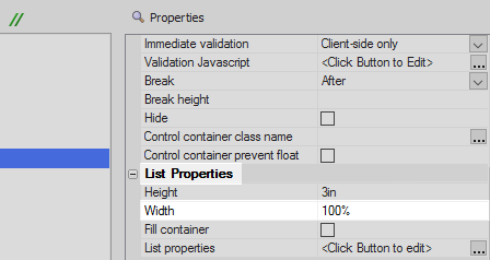
Highlight the List control. Scroll down the properties list to the List Properties section. Set the 'Width' property to be 100%
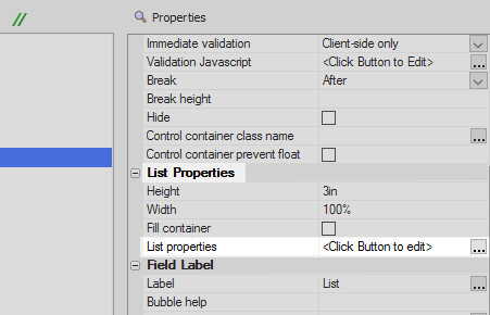
Click the [...] button next to the 'List properties' property to open the List Builder.
In the List Builder's 'Data Source' pane select 'Static' from the 'Data Source Type' menu.
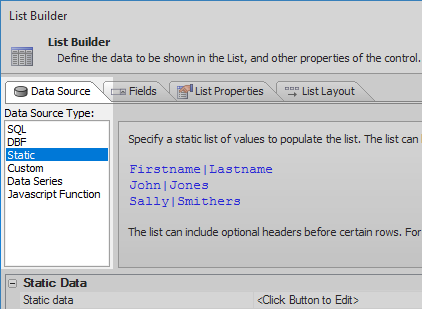
Click the [...] button next to the 'Static data' property.

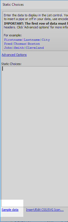
Click the 'Sample data' link.
From the 'Sample Data' dialog click on the 'Sample menu system (uses Font-Awesome Icon Fonts) option and click OK.

In the 'Static Choices' dialog erase the text underneath the sample data and click OK.
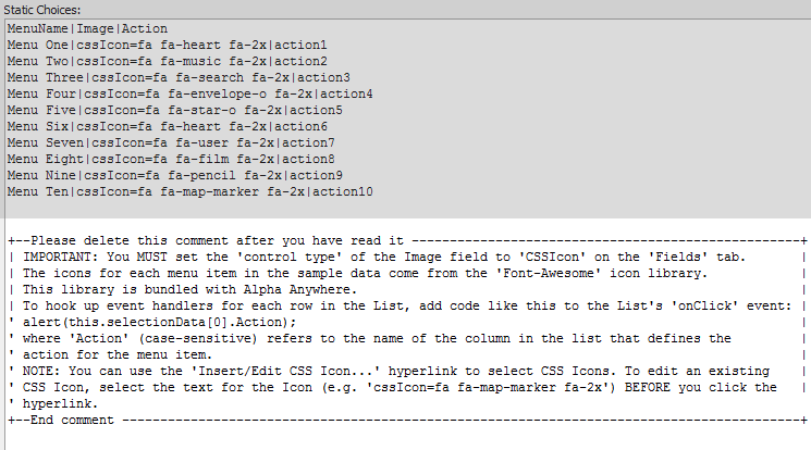
Open the 'Fields' pane and highlight the 'Image' field.

In the properties list on the right set the 'Control type' property to be CSSIcon. This should be in the Client-side section.

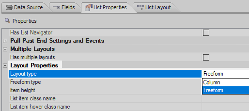
Open the 'List Properties' pane. In the Layout Properties section set the Layout type to be 'Freeform'.
Scroll down to the 'Javascript - Run Time' section and click the [...] button next to the 'OnSelect' property.
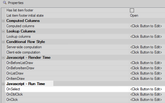
In the 'List Control System Events' dialog set the OnSelect event to be the following and click OK.
var cbObj = {dialog.object}.getControl('CONTROLBAR_1');
cbObj.hideDisclosure();
When a row is tapped in the list this code will get the controlbar and then hide that control bar's disclosure. The controlbar is defined in the next section.
Open the 'List Layout' pane. Add the following HTML to the template section and click OK to close the List Builder.
<div style="display: table; width: 100%;">
	<div style="display: table-cell;">
		<div class="{dialog.style}ListItemLabelMain">{Image} {MenuName}</div>
	</div>

	<div style="display: table-cell; width: 40px; text-align: right; vertical-align: middle;">
		<img src="{images.dialog.listNav}"/>
	</div>
</div>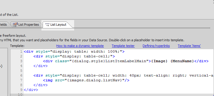
On the UX Controls page highlight the [Injectible Content: INJECTIBLE_1] container.
In the Container Begin Properties section on the right find the 'Container style' property and add the following CSS:
color: #000000; background-color: #ffffff;
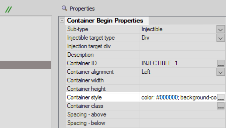 If you don't apply a color and a background to the injectible container the list will be invisible unless it is hovered over.
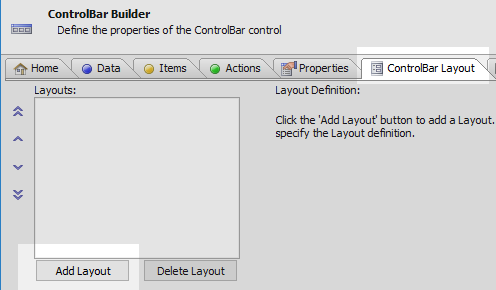
The ControlBar control
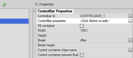
In the UX Controls page highlight the ControlBar control.
In the properties list click on the 'ControlBar properties' property to open the ControlBar Builder.
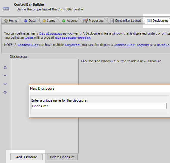
In the Disclosures pane click the 'Add Disclosure' button. Leave the name as 'Disclosure1' and click OK.
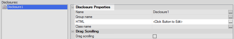
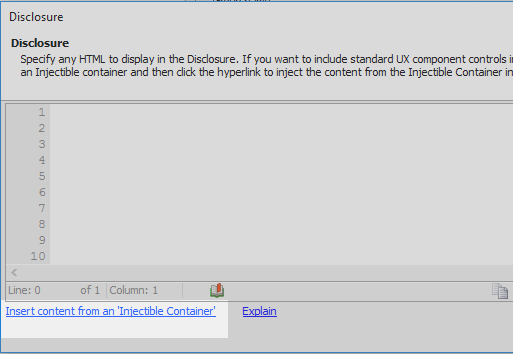
In the properties list click the [...] button next to the HTML property, under the 'Disclosure Properties' section
Click the 'Insert content from an 'Injectible Container' button.
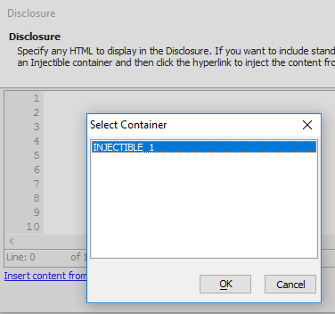
Select the 'INJECTIBLE_1' option and Click OK.
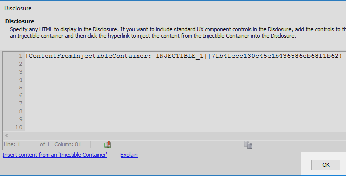
Click OK again.
Click on the [...] button next to the onSize property in the Events section of the properties list.

Define the following Javascript for the onSize event and click OK:
var lObj = {dialog.object}.getControl('listMenu'); $(lObj.contId).style.height = ele.offsetHeight+'px'; lObj.resize()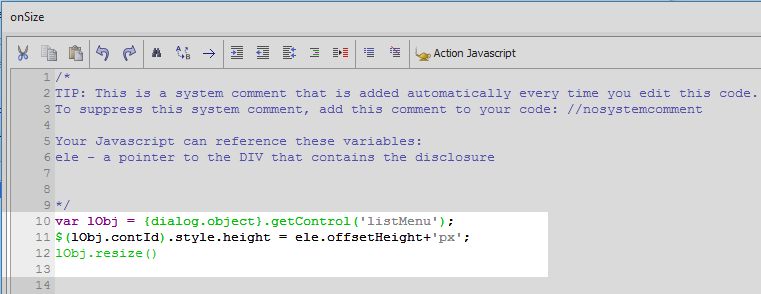 The onSize event fires when the disclosure is shown. This code resets the height of the list to the height of the disclosure. Here 'ele'' is a pointer to the div that contains the disclosure.
Open the Items pane. Click the 'Add ControlBar Item' button.
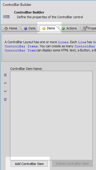
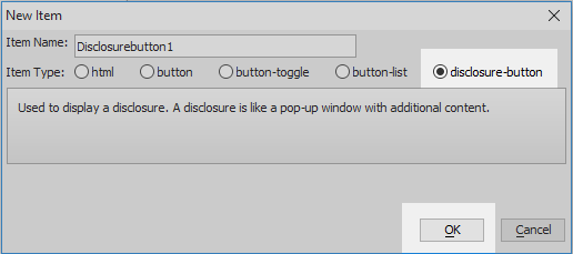
From the 'Item Type' choices select the 'disclosure-button' option and click OK.
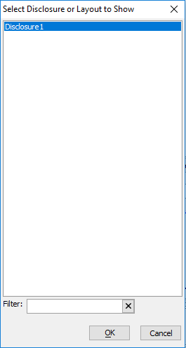
Click the [...] button next to the 'Disclosure name' property, in the properties list under Disclosure Settings section.

Select Disclosure1 and click OK.
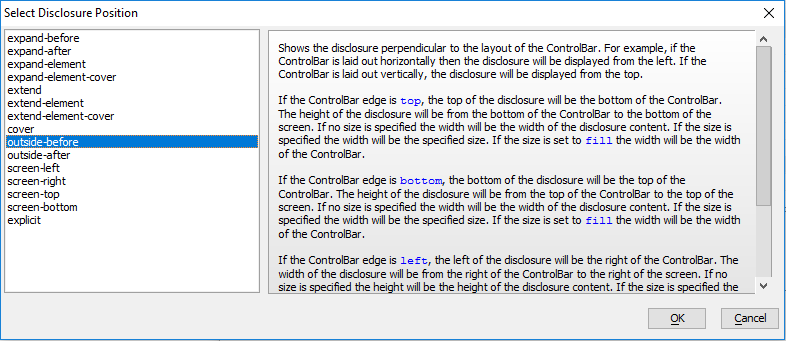
Click the [...] button next to the 'Display type' property.
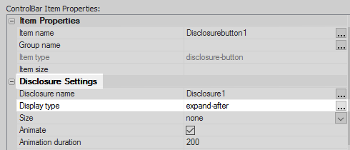
Select 'outside-before' and click OK.
In the Disclosure Settings section set the 'Size' property to be 200px.
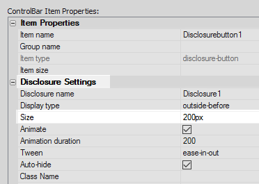 This is the size of the disclosures width, due to the fact that the Display type has been set to be 'outside-before'.
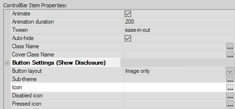
Scroll down the ControlBar Item Properties list to the 'Button Settings' section. From the dropdown next to the 'Button layout' property select 'Image only'.

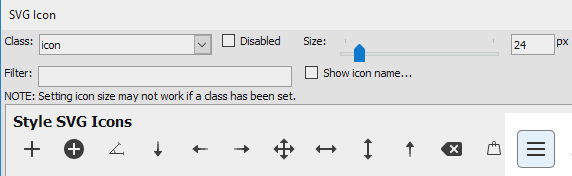
Click the [...] button next to the 'Icon' property.
Choose the 'SVG Icon' option and hit 'Select'.
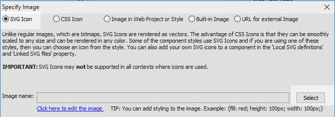
From the built-in icons select the 'bars' option and click OK and OK again.
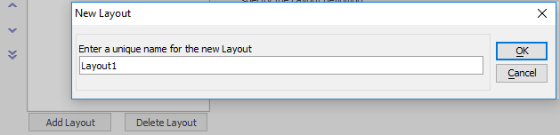
Open the ControlBar Layout pane and click the Add Layout button.
Leave the layout name as 'Layout1' and click OK.
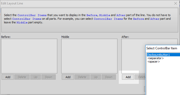
Click the 'Add Line' button.
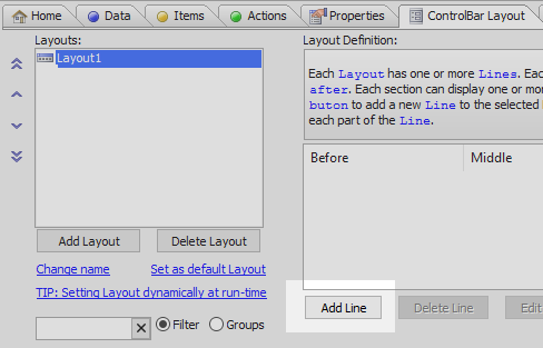
In the Edit Layout Line dialog click the 'Add' button under the 'After' section. Select the Disclosurebutton1 and click OK, OK, and OK again to close the ControlBar Builder.
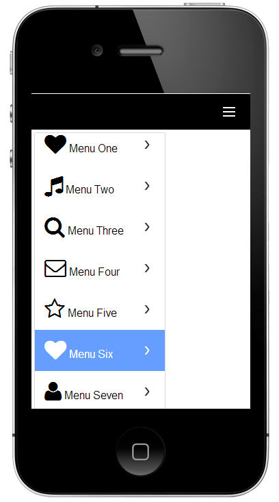
Run the component in Working Preview. Click on the 'bars' icon in the ControlBar
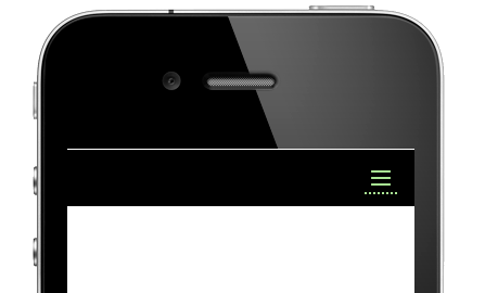
The list of static data that you defined in the list control should open.
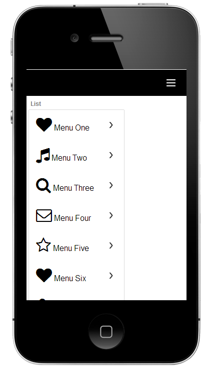
Click on one of the rows in the list and the menu should close.