Predefined ControlBar Templates
Description
The Load Sample ControlBar link can be used to create a ControlBar using a pre-defined ControlBar template. You can use existing sample templates or create your own user-defined ControlBar templates.
Discussion
When you create a new ControlBar, you can set all of the properties in the ControlBar by selecting a template (i.e. sample ControlBar). To select a template, click the Load Sample ControlBar hyperlink on the ControlBar builder Home pane.

When you click the hyperlink a window showing the templates is shown:

There are several pre-defined templates to choose from:
- Slide in menu - right
- Slide in menu - left
- Button Bar
- Drop-down Menus - Basic
- Drop-down Menus - Styled
- Drop-down Menus - Floating
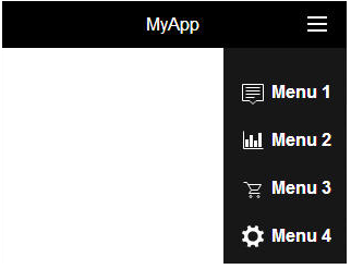
Slide in menu - right
The Slide in menu - right template is a ControlBar with a menu button aligned on the right. When the button is tapped or clicked, a menu slides in from the right side of the screen.
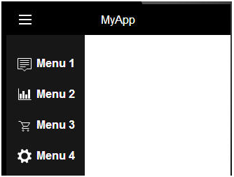
Slide in menu - left
The Slide in menu - left template is a ControlBar with a menu button aligned on the left. When the button is tapped or clicked, a menu slides in from the left side of the screen.
Button Bar
The Button Bar template is a ControlBar with a series of buttons. Each button can have an associated action. The Button Bar is commonly used to navigate panels in a Panel Navigator.

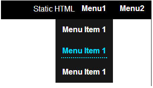
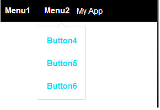
Drop-down Menus - Basic
The Drop-down Menus - Basic template contains several buttons. When the buttons are clicked (or tapped), a dropdown menu is displayed.
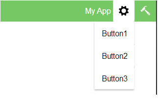
Drop-down Menus - Styled
The Drop-down Menus - Styled template is similar to the Drop-down Menus - Basic template, however it has been customized to render with a different style than the default style defined in the style sheet for the application.
Drop-down Menus - Floating
The Drop-down Menus - Floating template is similar to the Drop-down Menus -b Basic template, however the drop-down menu is styled to appear as if it is floating on the screen.
Videos
Using the Built-in ControlBar Templates
The ControlBar is highly configurable. This allows you to create solutions for many different use cases. There are several common patterns that developers use and for many of these patterns you can get a quick start by selecting one of the pre-defined ControlBar templates. For example, common patterns addressed by the pre-defined templates are: ControlBar with a menu button that animates in a menu from the left or right side of the Panel, ControlBar with buttons that reveal animated drop-down menus, ControlBar with buttons that allow you to create a tabbed user interface.
In this video we show how you can create a new ControlBar from a template and then continue to modify the resulting ControlBar.
See Also