Using Disclosures
Description
Disclosures are popup windows that come with their own ControlBar layout. They can be used to create ControlBars that cascade, where pressing one button will bring up an new layout with additional buttons. All of this can be easily accomplished within one ControlBar control.
For further instruction on how to use disclosures in a ControlBar follow the guide below or watch this video:
Showing a Disclosure
A disclosure can be some explicitly defined HTML, or it can be another Layout. In the video, we first show how a disclosure, defined as a ControlBar layout, is shown.
One of the more unusual disclosure types is Outside-After (and Outside-Before) which display the disclosure perpendicular to the parent Layout. In the second half of the video, we show how the disclosure is rendered when the Outside-After type is selected.
Add a ControlBar to a Component
In the UX Builder open the Properties page. Click on the [...] button next to the 'Style name' property in the UX Properties section.
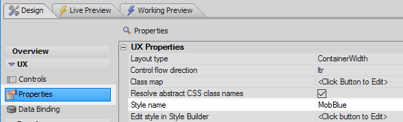
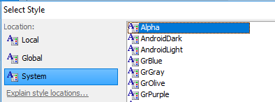
From the Location menu select 'System' and from the list of avialable styles select 'Alpha'. Click OK.
 This step is not absolutely necessary but it will give you access to the built-in SVG icons used later in the guide.
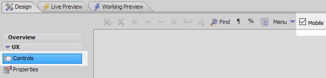
Open the UX Controls page. In the Controls page toolbar check the 'Mobile' checkbox.
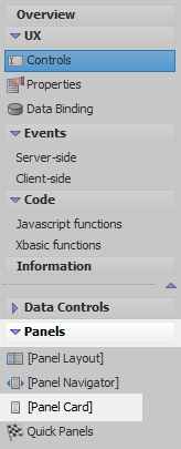
Open the 'Panels' menu and select the [Panel Card] option to add a Panel Card to the component.
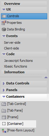
Highlight the Panel Card. Open the 'Containers' menu and click on [Container]
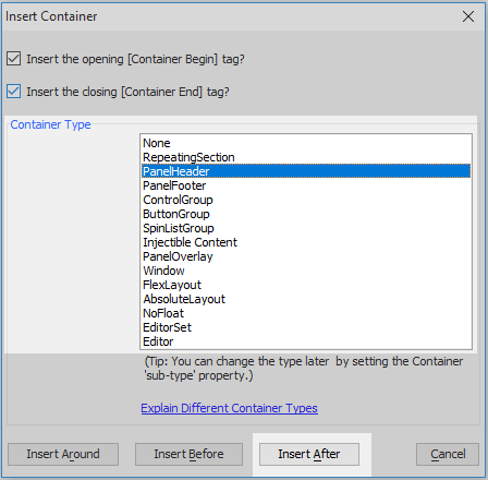
From the Container Type list select the PanelHeader option and click the 'Insert After' button.
Highlight the PanelHeader. Open the 'Other Controls' menu and click on [ControlBar] to add a ControlBar to the panel header.

The component tree should now look like this:

Add a Disclosure to the ControlBar
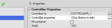
Highlight the ControlBar control. In the properties list on the right click on the [...] button next to the 'ControlBar properties' property to open the ControlBar Builder.
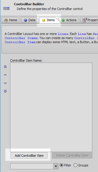
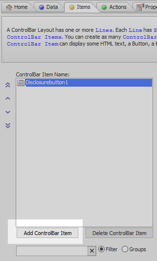
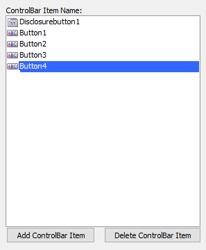
Open the ControlBar Builder's 'Items' pane and click the 'Add ControlBar Item' button.
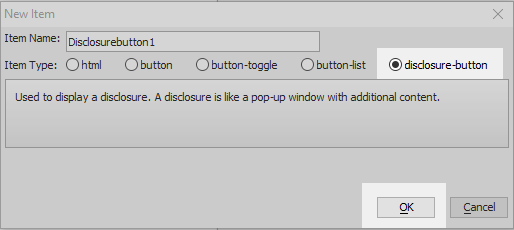
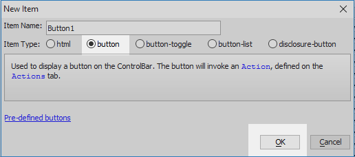
From the Item Type choices select the 'disclosure-button' option and click OK.
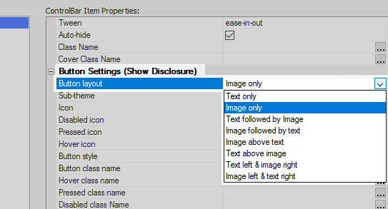
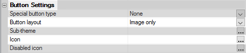
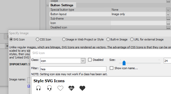
Scroll down the ControlBar Item Properties section on the right to the Button Settings section. For the 'Button layout' property select 'Image only'.
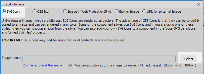
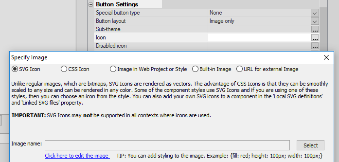
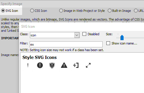
Click the [...] button next to the 'Icon' property.

In the 'Specify Image' dialog select the 'SVG Icon' option and click 'Select'.
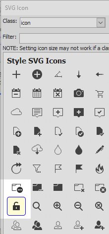
Select the 'bars' icon and click OK and OK again.

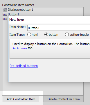
Click the 'Add ControlBar Item' button again.
Select 'button' from the Item Type choices.
Scroll down the ControlBar Item Properties for the button item to the Button Settings section. Set the 'Button layout' property for the button to 'Image only'.

Again click the [...] button next to the 'Icon' property. Select the SVG Icon option and click 'Select'.
Select an icon and click OK and OK again. This example uses the lockOpen icon.
Click the 'Add ControlBar Item' button again and add a second button.

Set the 'Button layout' property for the second button to 'Image only' and click the [...] button next to the 'Icon' property.
Choose the 'SVG Icon' option again and click 'Select'. Choose an icon to use with this button. Click OK and OK again.

Click the 'Add ControlBar Item' button and add a third button item to the 'Items' pane.
Again select 'Image only' for the 'Button layout' property and add a third SVG Icon for the 'Icon' property.
Finally, add a forth 'button' item to the list.
Give this button a SVG icon using the 'Button layout' and 'Icon' properties.
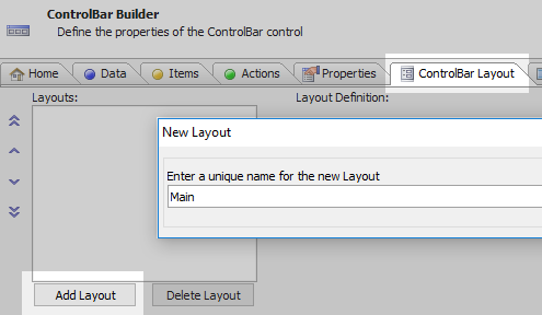
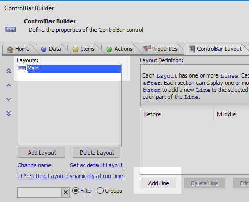
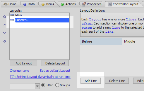
Open the 'ControlBar Layout' pane and click the 'Add Layout' button. Give this layout the name 'Main'.
Highlight the layout and click the 'Add Line' button.
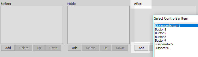
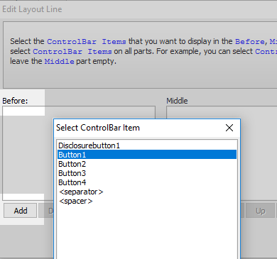
Click the 'Add' button in the 'After' section of the Edit Layout Line dialog. Select the 'Disclosurebutton1' Item.
Click the 'Add Layout' button again to add a second layout. Name this layout 'Submenu'.
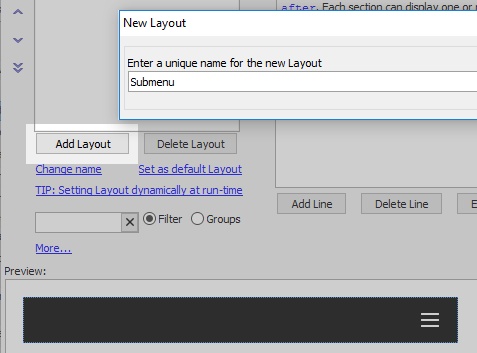
Highlight the 'Submenu' layout and click the 'Add Line' button.
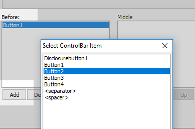
In the Edit Layout Line dialog click the 'Add' button under the 'Before' section. Highlight the 'Button1' item and click OK.
Click the 'Add' button under the 'Before' section again and add 'Button2' to the section.
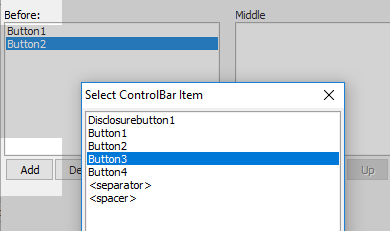
Click the 'Add' button under the 'Before' section again and add 'Button3' to the section.
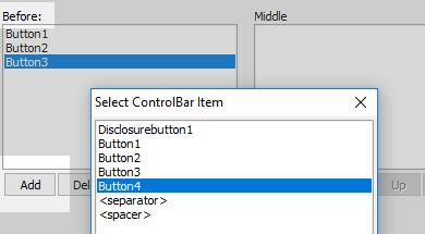
Click the 'Add' button under the 'Before' section again and add 'Button4' to the section.
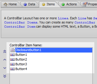
Open the 'Items' menu and highlight the 'Disclosurebutton1' item.
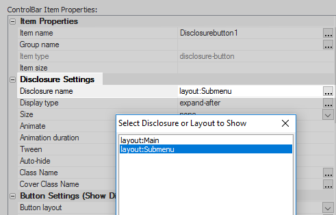
In the 'ControlBar Item Properties' list under 'Disclosure Settings' click the [...] button next to the 'Disclosure name' property.

Select the 'layout:Submenu' option.
Click the [...] button next to the 'Display' type property. Select the 'extend' option and click OK and OK again to close the ControlBar Builder.
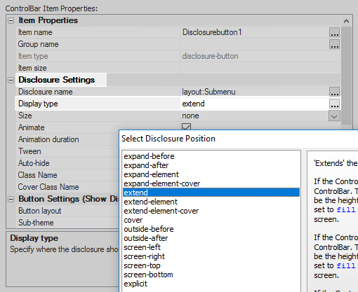 This property specifies where the 'Sublayout' will appear on the screen.
Run the Component in Live Preview.
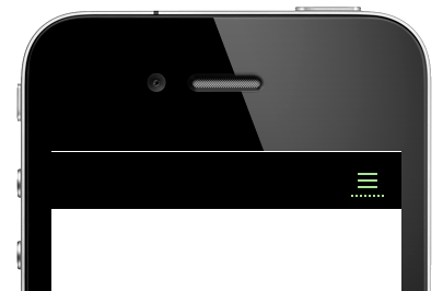
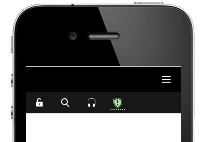
Click on the 'bars' icon, i.e. hamburger, and the Sublayout should appear underneath the disclosure button.