Sub-theme
Description
The Sub-theme property differs depending on whether the Tab or the Accordion option is selected Under the Tab type property. Changing the sub-theme changed the appearance of the tab or the accordion control.

In order to enable this functionality, you simply select the appropriate sub-theme for the Accordion, as shown in the image below.

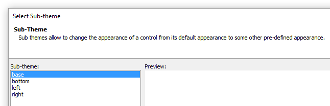
Tab Sub-theme
The Tab sub-theme contains a base, bottom, left, and right option. Changing the subtheme only changes the appearance of the tab used, not the position. For example, if you want the Bottom sub-theme to appear underneath the control you will also need to change the "Tab label position"" property to "Bottom" as well.


Accordion Sub-theme
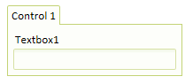
The Accordion control sub-theme contains a base option and a icon option.

The base option simply shows the control closed or expanded.

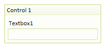
The Accordion control icon sub-theme displays icons on accordion panes to indicate if the pane is open or closed.
For example, in the image below, the first Accordion pane is open, and so an icon pointing down is shown. The second Accordion pane is closed, so an icon pointing to the right is shown.
Modifying a sub-theme
Sub-themes are generally defined in the style.js and style.css folders, inside the specific style folder. For example, the icon sub-theme for the example above is filed in the css\iOS folder. If you wanted to add this behavior to Accordions for other styles (e.g. MobBlue, GrGray, etc.), you would need to modify the style.css and style.js files for these styles as described below.
This is the code in the style.js file in the css/iOS folder that appears when the accordion control is defined...
accordion: {
    base: {
    titleClassName: 'iOSAccordionButton',
    titleSelectedClassName: 'iOSAccordionButtonSelected',
    titleDisabledClassName: 'iOSAccordionButtonDisabled',
    paneClassName: 'iOSAccordionPane'
    },
And here is the code that was added to the same style.js file in the css/iOS folder in order to add a new sub-theme called 'icon' to the Accordion control. If you wanted to add the accordion icon functionality to a custom style of your own, you would need to edit the corresponding style.js file for that style and make a similar modification.
icon: {
    titleClassName: 'iOSAccordionIconButton',
    titleSelectedClassName: 'iOSAccordionIconButtonSelected',
    titleDisabledClassName: 'iOSAccordionIconButtonDisabled',
    paneClassName: 'iOSAccordionPane'
    }
},
The text below shows the CSS that was added to the style.css file in the css/iOS folder. If you wanted to add the accordion icon functionality to a custom style of your own, you would need to edit the corresponding style.css file for that style and make a similar modification.
.iOSAccordionIconButton {
    display: block;
    text-decoration: none;
    font: 14px Arial;
    font-weight: bold;
    color: #6a6a6a;
    text-shadow: 0px 2px #d9dbe0;
    background-color: #c8c8c8;
    background-image: url('accordionClosed.png'), url('button.jpg');
    background-position: left, center;
    background-repeat: no-repeat, repeat;
    background-size: auto, 100% 100%;
    border-bottom: #ababab 1px solid;
    padding: 8px;
    padding-left: 28px;
}
.iOSAccordionIconButtonSelected {
    display: block;
    text-decoration: none;
    font: 14px Arial;
    font-weight: bold;
    color: #6a6a6a;
    text-shadow: 0px 2px #d9dbe0;
    background-color: #c8c8c8;
    background-image: url('accordionOpened.png'), url('button.jpg');
    background-position: left, center;
    background-repeat: no-repeat, repeat;
    background-size: auto, 100% 100%;
    border-bottom: #ababab 1px solid;
    padding: 8px;
    padding-left: 28px;
}
.iOSAccordionIconButtonDisabled {
    display: block;
    text-decoration: none;
    font: 14px Arial;
    font-weight: bold;
    color: #aaa;
    text-shadow: 0px 2px #d9dbe0;
    background: #c8c8c8 url('button.jpg');
    background-size: 100% 100%;
    border-bottom: #ababab 1px solid;
    padding: 8px;
    padding-left: 28px;
}