Divider HTML
Description
The HTML divider rendered between each row in a repeating section.
The Divider HTML properties defines the HTML shown between each row in a repeating section. By default this HTML is a simple dividing line contained inside a <div></div> tag. It can, however, by anything. Here is the default html:
<div class="[class.dialogRepeatingSectionSeparator]"> </div>
The appearance of the divider can be defined by calling a CSS class that can then be defined in the Local CSS definitions property.
Customizing the CSS for an HTML Divider
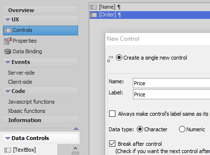
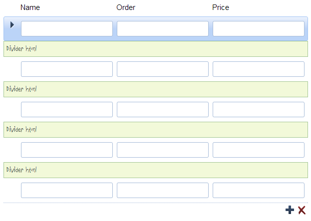
In the UX Builder on the UX Controls page open the 'Data Controls' menu. Click on the [TextBox] option to add a textbox control to the component, then add two more textbox controls.
 Use the 'Toggle break' button in the toolbar to remove
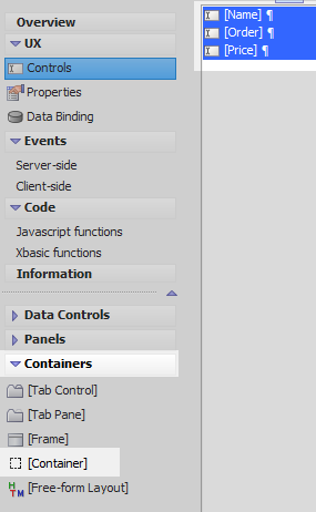
Highlight all of the controls and open the 'Container' menu. Click on [Container].
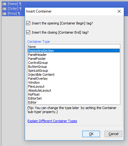
In the Insert Container dialog select 'RepeatingSection' from the 'Container Type' menu. Click the 'OK' button.
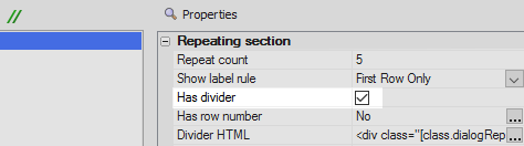
Highlight the [RepeatingSection:REPATINGSECTION_1] control in the controls tree. In the properties list on the right view the 'Repeating section' properties. Check the 'Has divider' checkbox.
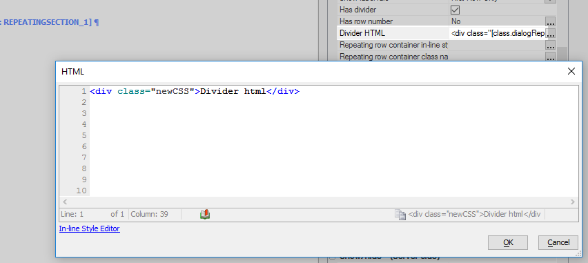
Click the [...] button next to the 'Divider HTML' property and replace the existing HTML with the following.
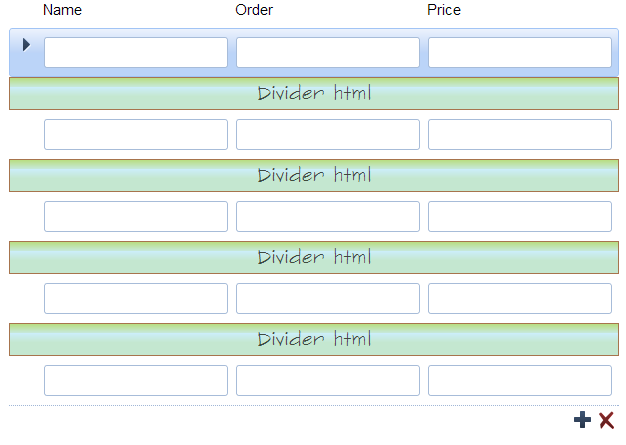
<div class="newCSS">Divider html</div>
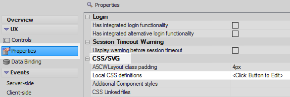
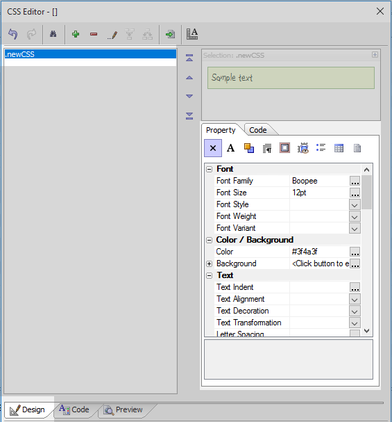
On the UX Properties page in the CSS/SVG section click on the [...] button next to the Local CSS definitions property
In the CSS Editor open the Code tab and define the CSS class that was called in the 'Divider HTML' property.
.newCSS{}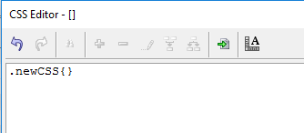 To indicate that this is a CSS class add a period '.' in front of the class name. Place two curly brackets
On the Design tab of the CSS Editor highlight the new class in the list on the left. Set the properties for the CSS class using the settings in the 'Property' tab.
Run the component in Live Preview.
See Also