Local CSS definitions
Description
Defines local CSS classes, rules, and overrides stored with the UX component. The Local CSS Definition supports CSS and SASS markup. Local CSS definitions are loaded when the UX is first rendered.
For more information on SASS syntax see http://sass-lang.com/.
CSS, or Cascading Style Sheets, present a means of adding styling to HTML files without having to make a large mess inside of the html itself. This is easy to do when different elements inside an html file require multiple styling definitions like font, color, background, and so on. CSS takes all of these properties and places them in a single class enclosed in curly brackets inside a CSS file. An element, such as a <div>...</div> tag, can then include a class definition that links to a specific CSS class that provides all of the required styling information.
There are two types of CSS classes used extensively in Alpha Anywhere and with UX components. These are abstract CSS classes and physical CSS classes. Abstract classes are essentially placeholders. When you build a component, the different html elements that are used to display the component each receive an abstract CSS definition. These abstract CSS classes are extremely raw looking and can be viewed by setting the Resolve abstract CSS class names property to be unchecked.
Abstract CSS classes are not seen in most components because their values, unless otherwise specified, are assigned to physical CSS classes. When you assign a style to a component,using the Style name property, Alpha Anywhere automatically maps the physical CSS classes conforming to that style on to each of the available abstract classes. If you want to change any of these physical CSS classes, it is easy to create a new class and then assign a given abstract class to your newly defined physical CSS class, overriding the Alpha Anywhere default altogether.
The 'Local CSS definitions' property allows you to define new physical CSS classes for controls in your component. These physical CSS classes can be assigned to specific abstract classes using the Class map property. This will override the default physical CSS class definition that Alpha Anywhere generates for a given component. Alternatively you can create a CSS class name first, in the Class map property, and then add a CSS definition in the 'Local CSS definitions' property.
The CSS Editor
Clicking on the 'Local CSS definitions' property, on the UX Properties page in the CSS/SVG section, will open the CSS Editor.
The Code Tab
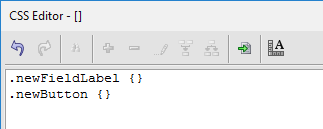
You can open the 'Code' tab at the bottom of the CSS Editor. The Code tab allows you to create new CSS class definitions. Once a new class is defined you can modify the CSS directly in the Code tab or use the properties listed on the Design tab to add styling. CSS class definitions start with a period '.' followed by the name of the CSS class and then a pair of curly braces '{}' that contain the class definition.

The Design Tab
Once you define a CSS class in the CSS Editor's 'Code' tab, you can then add styling information to the class definition. The 'Design' tab lets you modify CSS classes using the same style editing property sheet that is used in other parts of the UX Builder and in Alpha Anywhere. To edit a class simply highlight it in the CSS class list on the right side of the tab and then make changes to that classes properties.
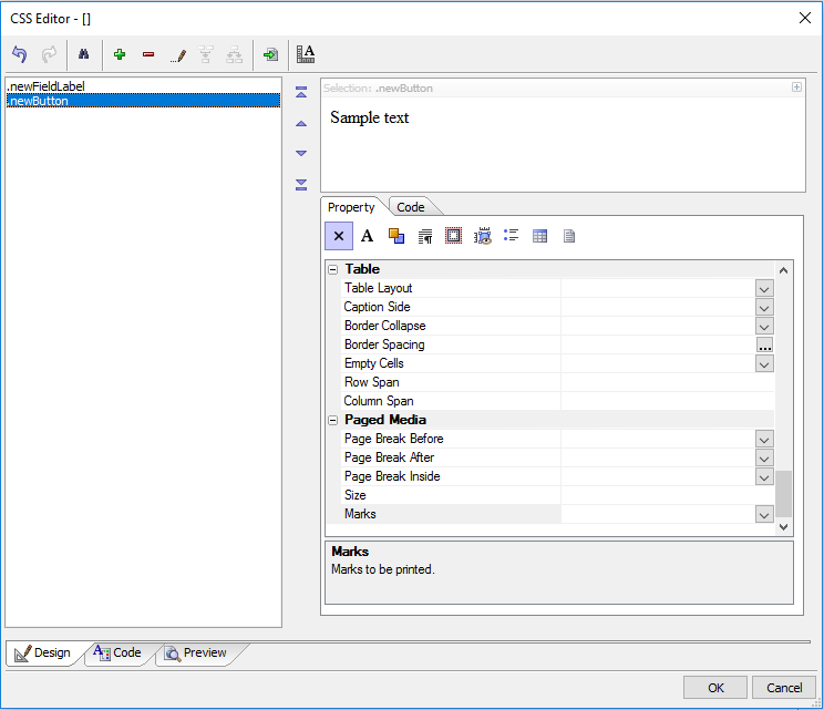
On the design tab toolbar you can also click the green '+' icon to add a new class to the list. The red minus '-' sign deletes an existing class and the pencil icon allows you to change the name of a class. You can also use the import icon to add external css definitions to the CSS Editor and the ruler icon to scale fonts in a stylesheet.
CSS Properties
- Font
- Font Family
Defines the font to use when rendering text.
- Font Size
Size of the font when rendered.
- Font Style
Style used when rendering a font.
- Font Weight
How thick the font appears.
- Font Variant
Whether the font is rendered using small caps.
- Color
- Color
Foreground color of text.
- Background
- Background Color
Sets the background color.
- Background Image
Path of an image to place in the background
- Background Repeat
How the background image is tiled.
- Background Position
How the image is position in the element.
- Background Attachment
How the background acts in relation to the window.
- Text
- Text Indent
Length of indent applied to first line of text.
- Text Alignment
How text aligns.
- Text Decoration
How render is decorated (underline, overline, line-through...).
- Text Transformation
Capitalization effects, capitalize, uppercase, and lowercase.
- Letter Spacing
Sets the space between letters.
- Word Spacing
Space between words.
- White Space
How the element should handle whitespace.
- Padding
- Padding Top
Sets the padding for the top of the element.
- Padding Left
Sets the padding to the left of the element.
- Padding Right
Sets the padding to the right of the element.
- Padding Bottom
Sets the padding on the bottom of the element.
- Margin
- Margin Top
Margin for the top of the element.
- Margin Left
Margin on the left of the element.
- Margin Right
Margin to the right of the element.
- Margin Bottom
Margin at the bottom of the element.
- Visual Formatting
- Display
What type of display bow the element uses.
- Visibility
Whether or not the element is visible.
- Float
Whether the display box should float.
- Clear
Whether content appears adjacent to a float display box.
- Overflow
How the element handles overflow.
- Vertical Align
Vertical positioning inside a line box.
- Cursor
Cursor to display on mouse over.
- Positioning and Size
- Position
Positioning method.
- Top
Element's top.
- Left
Element's left.
- Right
Elements right.
- Bottom
Elements bottom.
- Width
Elements width.
- Height
Elements height.
- Line Height
Line spacing.
- Z-Index
Stacking order of element.
- List and Generated Content
- List Style Type
List style to apply to markers.
- List Style Image
Image to use as list marker.
- List Style Position
Location of list markers.
- Table
- Table Layout
How a table is to be laid out.
- Caption Side
Position of a table caption.
- Border Collapse
How table borders are displayed.
- Border Spacing
Spacing between cell borders
- Empty Cells
How to render the border of an empty cell.
- Row Span
Rows spanned by a cell.
- Column Span
Columns spanned by a cell.
- Paged Media
- Page Break Before
Defines the page break before an element.
- Page Break After
Defines the page break after an element.
- Page Break Inside
Defines the page break inside an element.
- Size
The size and orientation of a page, two lengths followed by an orientation: auto, landscape, and portrait.
- Marks
Marks to be printed.
See Also