Color palette
Description
Defines the color palette to use for the UX Component. Applies only to this UX Component -- does not affect other components.
Discussion
If a UX component uses a version 4 type style (the Alpha style is the only style currently that is a version 4 style), a color palette can be selected for the UX component.
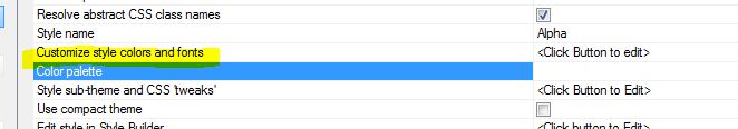
The color palette only applies to the UX Component where it is set. If a color palette has been set, the Customize style colors and fonts property is hidden. Similarly, if you have customized the style colors and fonts, the Color palette property is hidden.

Selecting a color palette is very similar to using the Customize style colors and fonts property, except that the color palette applies only to the current UX component, whereas if you use the Customize style colors and fonts property, the settings apply to every UX component in the current Web Project that uses the selected style.
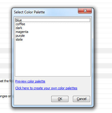
When you click the smart field for the Color palette prompt the dialog that is displayed allows you to select an existing color palette, or create a new, user-defined, color palette.
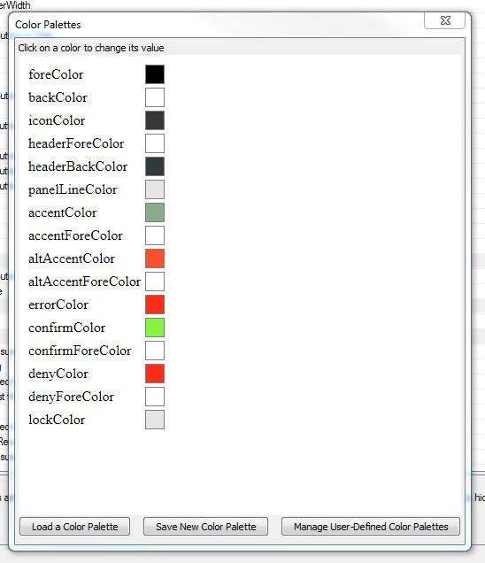
When you preview a color palette or create a new color palette you will see a dialog like the one shown in the image below. This dialog allows you to set a color for each of the available color types.