Customize style colors and fonts
Description
Customize the style colors and fonts. This provides a simpler way to customize a web theme's colors for the entire project.
The Customize style colors and fonts property presents an alternative to using the Web Theme Builder to customize styles for an entire project. One of the advantages of using this property is that you don't need to modify any classes in the style. The styles defined in the Web Theme Builder, whether local or global, are often a copy of a 'System' style (ex. iOS7, Alpha, etc.). When a copy is made, any updates to the original 'System' style will not be added to the copied version.
This property works with Sass styles (e.g. iOS7, AndroidDark, AndroidLight, Alpha, and Alpha-based Web Themes), which use Sass variables to define the colors and fonts used in the Web Theme.
For a explanation of Customize style colors and fonts, follow the guide below.
Font
In order to change the font for all of the components using this style, simply type the name of the font you want to use next to the 'Family' textbox.
Family
Sets the font for the component.

Colors
To edit colors and fonts, click the smart field for the Customize style colors and fonts property. When you edit the colors and fonts using this builder, you are not editing the Web Theme. Instead you are storing your adjustments to the Web Theme in a separate file called 'styleTweaks.json'. This means that if the Web Theme is updated in a future release, you will get the updates and still retain color and font changes. Be aware that available settings are available different for each Web Theme. E.g. the settings available for iOS are different than those for Alpha and Alpha-based Web Themes.
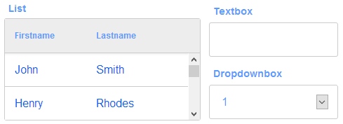
Primary Foreground color
The main foreground color in the Web Theme.
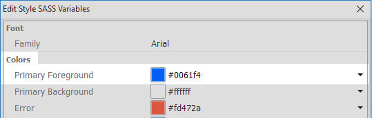
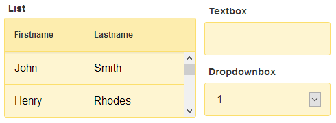
Primary Background color
The main background color in the Web Theme.

Error
The error color.
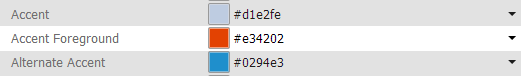
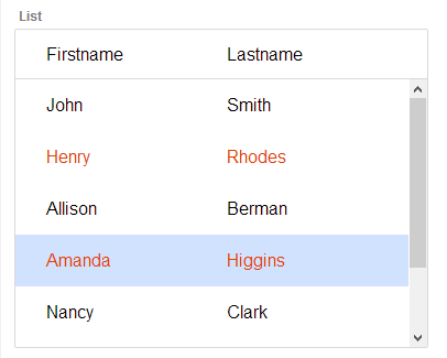
Accent
The accent color in the Web Theme. In the 'Alpha' Web Theme this setting will set the color of the cursor background for a selected row in a list control or a selected date in a calendar control. In the 'iOS7' Web Theme this feature of the calendar control is set uses the 'Calendar on Background' setting. In 'iOS7' the 'Accent' property sets the color of certain defined controls, like the record navigation buttons.
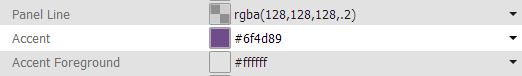
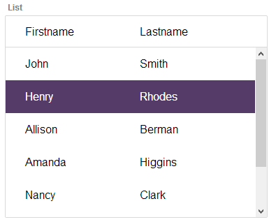
Accent Foreground
The accent foreground color to use in the Web Theme. This setting is available in the 'Alpha' Web Theme. The accent foreground color is displayed when a row is selected or hovered over on a list. One calender controls this will also set the foreground color for the selected date, as well as the date that the mouse is hovering over.
Confirm
The confirm color in the Web Theme.
Deny
The deny color in the Web Theme.
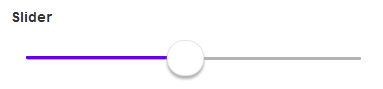
Slider
The color of the slider range bar. The color appears behind the slider when it is moved.
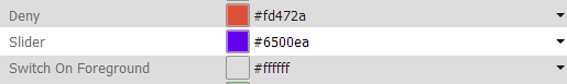
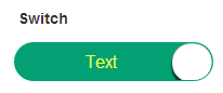
Switch On Foreground
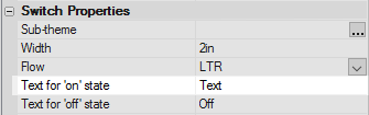
The color of the switch foreground of active text if you have a switch control. You can add text on top of a switch control by highlighting the switch control on the UX Controls page, going to 'Switch Properties', and typing in text next to the 'Text for on state' and 'Text for off state' properties. Note that this setting will only change the color of the 'on state' text. This property appears in the iOS7 Web Theme.

Switch On Background
The color of the switch background, if you have a switch control.


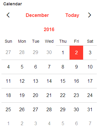
Calendar On Foreground
The color of the calendar foreground for all calendar controls. In the calendar control this color is visible on top of the highlighted date, in case the second of December. The rest of the foreground is set by the 'Primary Foreground color' setting. If you are using the 'Alpha' Web Theme, then this color can be sent using the 'Accent Foreground' property.
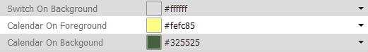
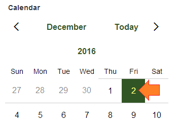
Calendar On Background
The color of the background for all calendar controls. If using the 'Alpha' Web Theme this property can be set by using the 'Accent' style.
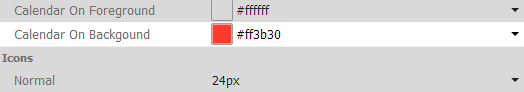
Icons
Normal
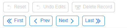
This setting adjusts the size of regular sized icons. These are not the icons that you define for individual controls using the 'Specify Image' dialog, like a custom selected SVG icon for a button control. Rather, this setting changes the size of the system icons that are added automatically. For example, this will change the size of the icons on 'Record Navigation Buttons' if you add these defined controls to a list. Some other examples might be the 'Reset' and 'Undo Edits' icons for a list control's detail view or the 'Delete Record' icon.

Small
The size for small icons.
Using the Edit Style Sass Variables dialog
Deleting Edits
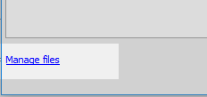
Clicking the Manage files hyperlink, at the bottom of the dialog, displays the styleTweaks.json file where your edits are stored. To delete the custom colors you have defined delete the styleTweaks.json file.
What is Sass?
Sass (Syntactically Awesome Style Sheets) is a scripting language that, when parsed, looks like CSS or cascading style sheets. Unlike CSS, Sass also allows for the definition of variables. These variables can be tied to blocks of code in the Sass file that are easily converted into CSS. When you adjust color settings in the 'Customize style colors and fonts' property, you are updating Sass variables. These values are stored in the styleTweaks.json file in the project's folder. Meanwhile, the original unaltered Sass file for the style is stored in the selected style's executable folder together with a CSS file that is composed of all of the CSS that the Sass file for that style generates. When a component is published the information from the original CSS file is sent to a 'root' folder. Some internal code checks the styleTweaks.json file to discover what changes, if any, have been made. It then determines which Sass variables have changed and uses this to update the CSS root file accordingly.
Videos
Adjusting Colors and Fonts in a Web Theme
Alpha Anywhere has always allowed you to edit a Web Theme used by a component to change any of the CSS defined in the Web Theme. But when you simply want to change some colors in a Web Theme, using the Web Theme Builder to edit a copy of the entire theme may be more than you need.
In this video, we show how you can easily adjust colors and fonts in a Web Theme.