Layout type
Description
Specify the way in which the HTML is generated
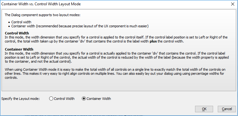
The UX component supports two layout modes:
- Control Width
- Container width (recommended because the precise layout of the UX Component is much easier.
Control Width
In this mode, the width dimension that you specify for a control is applied to the control itself. If the control label position is set to the Left or Right of the control, the total width taken up by the container 'div' that contains the control is the label width plus the control width.
Container Width
In this mode, the width dimension that you specify for a control is actually applied to the container 'div' that contains the control. If the control label position is set to the Left or Right of the control, the actual width of the control is reduced by the width of the label (because the width property is applied to the container, and not the actual control).
When using Container Width mode it is easy to make the total width of all controls on a single line to exactly match the total width of the controls on other lines. This makes it very easy to right align controls on multiple lines. You can easily lay out your dialog using percentage widths for controls.
How Does Layout Type Impact Design?
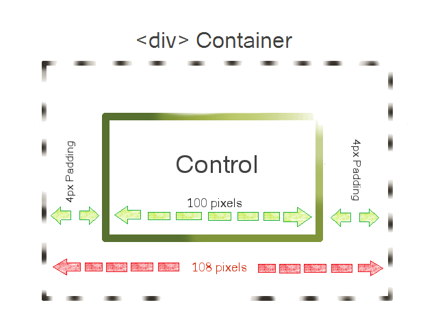
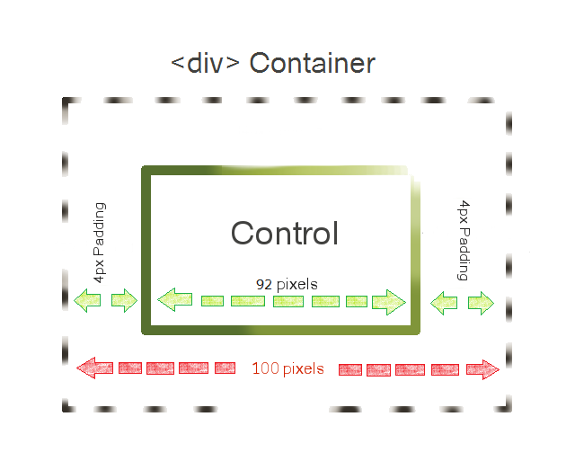
By default all controls have 4 pixels of padding around them that is defined using CSS. This padding can be adjusted using the A5CWLayout class padding property, which can be found on the UX Properties page in the CSS/SVG section. Because the 'Control Width' setting sets a specific width for the control, the final container width for a control using this setting will be the specified width of the control plus two times the width of the padding. So, if Layout type is set to 'Control Width' the control is 100px wide, and the padding is set to its default of 4px; the final width of the container will be 108 pixels.
With the 'Container Width' setting, the defined width of the control includes everything inside the automatically generated <div>...</div> tags that contain that control. Because the CSS padding is included in this div tag, the control and the padding combined must equal the specified container width. In this case if we set the control to be 100 pixels the total container width will be 100 pixels. The control itself will be 92 pixels wide and still have 8 pixels of padding.
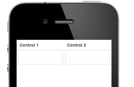
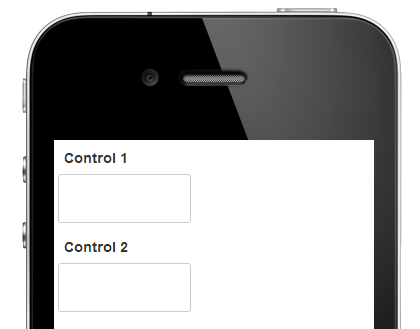
While the difference between these settings might appear trivial when dealing with a small number of pixels, the impacts on design grow more stark when a larger number of pixels or percentages are used in a control's width definition. For instance, say you have two controls that are set to '50%', meaning they will each take up fifty percent of the available screen space...
If the 'Layout type' property is set to 'Container Width' then each of the controls will appear side by side when the component is run. Because the control's width setting includes the padding as well as the defined control, the whole container will only take up half the screen.
Should the 'Layout type' property be set to 'Control Width' for the component, these two controls can no longer have padding between them and still be side by side. One control must be above or below the other. This is because the '50%' defined as the control width only includes the width of the control itself. The extra 8 pixels of CSS padding will mean that the 'div' container, which the control is automatically placed in when the component is run, will take up more than half the screen.
This is why 'Container Width' is the recommended setting, while 'Control Width' is included more as a legacy setting.
