Local sub-theme definitions - Javascript
Description
Define the Javascript for any locally defined sub-themes. Sub-themes are used to create custom appearance of certain control types such as windows, buttons, tabs, accordions, sliders. switches, etc.

Sub-themes are just what their name implies, variations on a larger theme. The larger theme in this case is the Style name of a component, for example 'iOS7', 'Alpha', or 'MobBlue'. This main theme can be set using the Style name property on the UX Properties page. Once a style has been choosen, the sub-theme property for a given javascript-based control can be used to alter the appearance of that control.
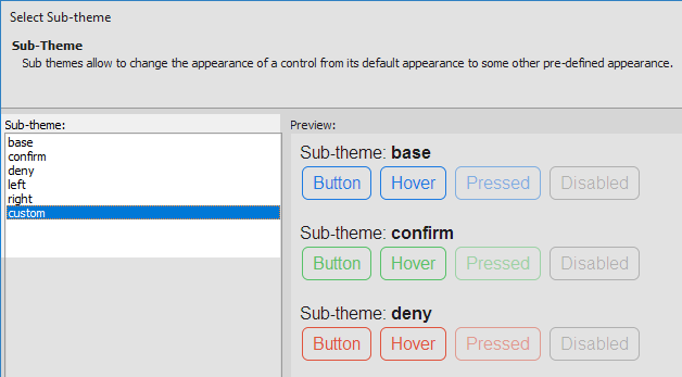
You can change a control's sub-theme by clicking on the sub-theme property in the control's properties list, on the UX Controls page, and selecting the desired sub-theme from a menu. Most styles have multiple existing sub-theme options that are available for most controls. If you add a button control to a component using the iOS7 style, for instance, you will then be able to select a 'base', 'confirm', 'deny', 'left', or 'right' sub-theme for that button. This will change the appearance of the button while still maintaining the overall look and feel of the iOS7 style.
You can also define your own sub-themes. Doing this requires defining both the javascript and css for the sub-theme. The javascript definition can be created in the 'Local sub-theme definitions - Javascript' property's code editor. The javascript itself can be pulled from an existing style, using the hyperlinks in the editor, and copied and pasted into the editor. The names of any new custom CSS classes that you want to add, as part of the sub-theme, should be included in the javascript code. These CSS classes can then be defined using the 'Local sub-theme definitions - CSS' property. For a video explanation on how this is done, watch the following video. Or read the guide below.
Define a Control and Select a Main Theme
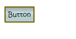
In the UX Builder on the UX Controls page. Open the 'Other Controls' menu and click on the [Button] option to add a button control to the component.

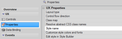
Open the UX Properties. In the UX Properties section click on the [...] button next to the 'Style name' property.
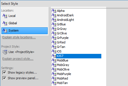
In the Select Style dialog's 'Location' menu select the 'System' option. Choose one of the listed styles, this example uses 'iOS7'. Click OK.
Defining the Javascript for a Custom Subtheme
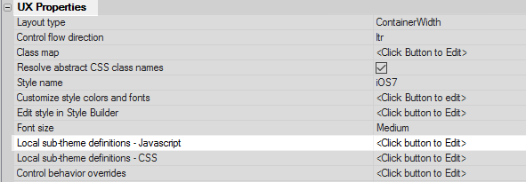
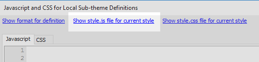
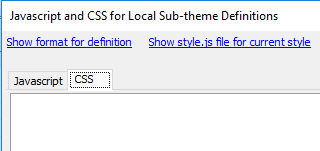
On the UX Properties page click the [...] button next to the 'Local sub-theme definitions - Javascript' option.
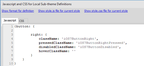
Click the 'Show style.js file for current style' hyperlink at the top of the "Javascript and CSS for Local Sub-Theme Definitions" dialog. This will open the javascript definitions for the built-in subthemes available for the current style, in this can iOS7.
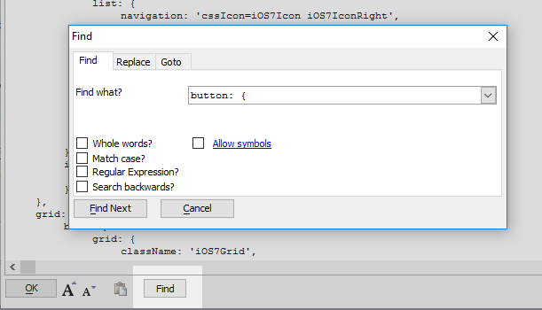
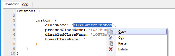
Click the 'Find' button and type 'button: {'. Click enter several times until you find the JSON definition for the button control's CSS classes. You will see the current sub-themes for the button control.
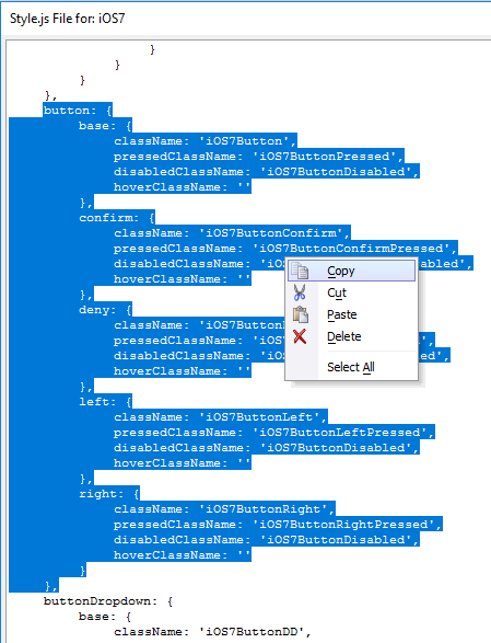
Highlight and copy the JSON definition for the button property. Click OK.
In the Javascript tab add two curly brackets.
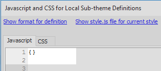
Paste the copied JSON into the curly brackets.

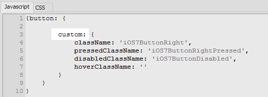
Delete all of the subtheme definitions except for one. If there are any trailing commas delete these as well.
Give the sub-theme a new name, in this case 'custom'
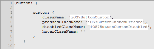
Change the CSS class name definitions in quotation marks to new CSS class names in quotation marks
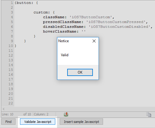
Click the 'Validate Javascript' button to make sure the new JSON is valid
Copy the first of the new CSS class names that you defined.
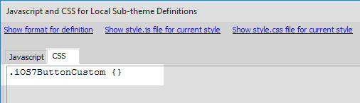
Defining the CSS for a Custom Subtheme
Click on the CSS tab in the 'Javascript and CSS for Local Sub-theme Definitions' dialog.
Paste the CSS class name that you copied from the Javascript tab into the CSS definitions section. Place a period '.' in front of the class name to define it as a CSS class and curly brackets '{}' after the class name to add a definition.
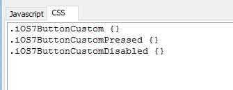
Add any other CSS class names to the CSS tab by copying and pasting them from the Javascript tab into the CSS tab.
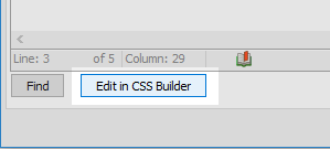
Click the 'Edit in CSS Builder' button.
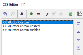
In the CSS Editor open the 'Design' tab.

In the Design tab highlight the first CSS class name in the list on the left.
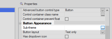
Use the properties list on the right to change the button's CSS font, background, border, text alignment, and padding.

Define the other CSS classes. Click OK and OK again.
 If you only want to change a few CSS settings you can use the 'Code' tab to copy existing CSS settings from one class to the next.You can then return to the Design tab, where then copied definitions will be reflected, and alter .
Setting a Control to a Subtheme
Open the UX Controls page and highlight the button control. In the properties list on the right click on the [...] button next to the 'Sub-theme' property in the 'Button Appearance' section.
Select the sub-theme that you defined using JSON and click OK.
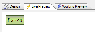
Run the component in Live Preview, you should see the new subtheme.
When pressed, the button should display the CSS class for a pressed button.