Video Player Component Properties
- Video Player Options Properties
- YouTube Video Player Options Properties
- HTML5 / Flash Video Player Options Properties
- Video Player Display Options Properties
- Other Component Properties Properties
- CSS/SVG Properties
- Arguments Properties
- Javascript Properties
- Xbasic Properties
- Other Properties
- Advanced Properties
Description
A list of video player component properties available in Alpha Anywhere.
Discussion
You can select either a YouTube Video Player or a HTML5 /Flash Video Player. Select the YouTube Player if you want to reference videos that are hosted on YouTube.
The YouTube interface supports the Oembed API, which allows the automatic inclusion of a Flash Player, if the device supports Flash, otherwise a native HTML5 video player will be used. This strategy ensures that the YouTube video content will display on all major desktop and mobile browsers.
Select the HTML5/Flash player if you are hosting your own video assets, or hosting through a streaming service. The default setting is the YouTube Video Player.
The numerous properties will automatically change, based upon your selection.
Video Player Options Properties
Video player type
Select YouTube Video Player if your videos are hosted on YouTube. The component uses the YouTube OEmbed API to embed a hybrid HTML5/Flash video player. Select HTML5 / Flash Video Player if you host the video files or utilize a streaming video service.
YouTube Video Player Options Properties
Show YouTube video title
Controls the display of the title of the YouTube video referenced by the video URL. If you are using a playlist, you may want to turn this option off since the title only references the video specified in the video URL.
YouTube video URL
The default is a promotional video on YouTube. This is provided for testing only. Typically this control is bound by an argument to a field in an Alpha Anywhere data driven component.
Use SSL
If checked will force a https:// prefix when requesting the file from YouTube from within the player. This overcomes a limitation of the YouTube oEmbed API.
Start video at offset
This parameter causes the player to begin playing the reference video at the given number of seconds from the start of the video. The player will look for the closest keyframe to the time you specify. This value is exposed as an argument and may be bound to a data field in a parent component. Option is ignored in HTML5 mobile viewer.
Autoplay
Not recommended since autoplay is considered an annoyance to users however, the option is available on desktop browsers. Mobile browsers do not support autoplay.
Show related videos on completion
Show related videos upon completion. Option is ignored in HTML5 mobile viewer.
Show video player controls
Show video player controls. Option is ignored in HTML5 mobile viewer.
Show fullscreen button
Show the full screen button within the YouTube Player to allow full screen viewing. Option is ignored in HTML5 mobile viewer.
Autohide controls
Autohide the video player controls. Controls will slide out of view after a couple of seconds from video playback start. Option is ignored in HTML5 mobile viewer.
Set default video resolution to HD
Displays the highest definition video available. Resolution displayed is optimized for the container size. Has no effect on the Chromeless Player. Option is ignored in HTML5 mobile viewer. Remember, HD consumes bandwidth.
Show video info
Controls the display of the video title and info when the video starts and when it is paused. Option is ignored in HTML5 mobile viewer.
Use modest branding
This parameter controls the display of the YouTube logo within the player control bar. Option is ignored in HTML5 mobile viewer.
Loop & replay video or video playlist on end
Enables automatic looping and replay of the video or the video and the video playlist. Option is ignored in HTML5 mobile viewer.
Use light color theme
Sets the color scheme for the YouTube Player to light colors. Option is ignored in HTML5 mobile viewer.
Related video playlist
You can provide a playlist of related videos. This is simply a comma delimited list of YouTube video ID's. Typically this control is bound by an argument to a field in an Alpha Anywhere data driven component. Option is ignored in HTML5 mobile viewer.
HTML5 / Flash Video Player Options Properties
HTML5 / Flash Player Type
Enables the selection of a hybrid HTML5 / Flash video player, a HTML5 only video player or a Flash only video player.
MP4 Video
The default is a sample open source MP4 video. This is provided for testing only. Typically this control is bound by an argument to a field in an Alpha Anywhere data driven component. Spaces are not allowed in the video URI.
Ogg Video
The default is a sample open source Ogg video. This is provided for testing only. Typically this control is bound by an argument to a field in an Alpha Anywhere data driven component. Spaces are not allowed in the video URI.
WebM Video
The default is a sample open source WebM video. This is provided for testing only. Typically this control is bound by an argument to a field in an Alpha Anywhere data driven component. Spaces are not allowed in the video URI.
Poster Image
The default is a sample open source jpg. This is provided for testing only. Typically this control is bound by an argument to a field in an Alpha Anywhere data driven component. Spaces are not allowed in this URI.
Flash Player
Multple Flash players are supported, each has a unique skin.
Video Player Priority
Sets the preferred video player, should the browser support both Flash and HTML5. Default is HTML5 video with Flash video fallback.
Fallback Title
The fallback title is displayed if the poster image is missing.
Autoplay
Not recommended since autoplay is considered an annoyance to users however, the option is available on desktop browsers. Mobile browsers do not support autoplay.
Video Player Display Options Properties
Video container aspect ratio
Typcial videographic aspect ratios are 16:9 (widescreen format) and 4:3 (standard format)
Video container height
Height is computed based on the width and aspect ratio. Default value is contained in the embed code, returned by the YouTube Oembed API. It is typically 295px through 390px.
Video container height
Height is computed based on the width and aspect ratio.
Video container width
Allows you to specify the width of the control in pixels. Default value is contained in the embed code, returned by the YouTube Oembed API. It is typically 425px through 480px.
Video container width
Allows you to specify the width of the control in pixels. Minimum allowed is 200.
Center component in container
Adds a CSS style to center the video player within the container div.
Other Component Properties Properties
Style name
Click the button to select a new style, or edit the existing style. You can also use <ProjectStyle> or <Session:varname>
Class map
Specify how the abstract CSS class names used in this component map to physical CSS class names in your style sheets.
Resolve abstract CSS class names
Replace abstract CSS class names with physical CSS class names. This should only be un-checked if you are in development mode and you want to determine what the abstract CSS class name is for a particular element in the component.
Style overrides
Selwyn - turned off. Obsolete for new styles. By default, the Tabs, Accordions, pop-up Windows, Lists (edit-combo, auto-suggest, etc.) are style using the selected component style. You can override the style for these elements. This might be necessary for certain styles where the default appearance for these elements do not work well.
Font size
Specify if the fonts in the Component should be scaled to make the component larger or smaller. Select 'Medium' for no scaling (i.e. the fonts shown will match those defined in the style sheet).
Font scaling option
Specify which CSS classes should be scaled. If you choose All, the fonts in these classes will be scaled, in addition to the fonts in the CSS classes specific to the Style that you selected: BODY, TABLE, TH, TR, TD, UL, OL, LI, P, A, BLOCKQUOTE. Choices include All, GridStyleClassesOnly.
Master template
Specify an optional Master Template. This allows you to place arbitrary HTML surrounding the component.
Page title
Specify the page title for the .a5w page that renders this component.
CSS/SVG Properties
Local CSS definitions
Define any local CSS classes. NOTE: You can include SASS syntax in your CSS definition. For more information on SASS syntax see http://sass-lang.com/
Additional component styles
Specify if any other styles (in addition to the primary style for the component) must be included. Enter a comma delimited list of style names. e.g., GlassOlive, Airport
CSS Linked files
Specify any CSS files that should be linked (in addition to the primary style for the Component). Enter a comma delimited list of filenames.
Local SVG definitions
Specify any local SVG image definitions you want to include in this component.
SVG Linked files
Specify any SVG files that should be linked. Enter a comma delimited list of filenames. Only relative filenames can be specified. Files must be in a folder relative to the webroot.
Arguments Properties
Arguments
The Video Player component's arguments define the video to display as well as a number of other options. The arguments available are dependent on the type of video the Video Player component has been configured to play.
Arguments are typically bound to a character field in a parent Grid Component. Arguments can also be bound to page, session and cookie variables. Argument values are passed into all server-side Xbasic event handlers in the component.
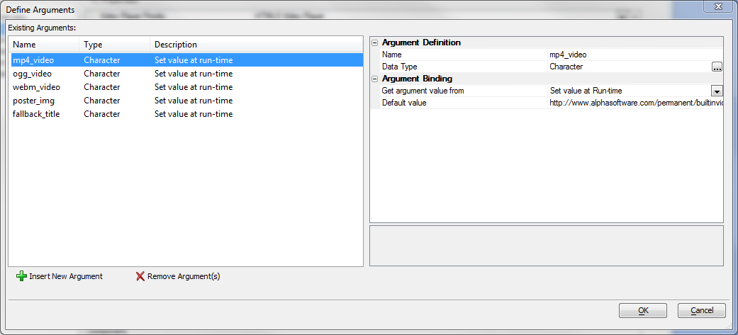
HTML5 Video Arguments
- Argument
- Description
- mp4_video
Fully qualified URL of a MP4 video typically with H.264 encoding
- ogg_video
Fully qualified URL of a OGG/OGV video typically with Theora encoding
- webm_video
Fully qualified URL of a WebM video typically with VP8 encoding
- poster_img
Fully qualified URL of a static poster image, typically a gif, jpg or png file
- fallback_title
Character string used as a fallback should the browser have no video playback capabilities
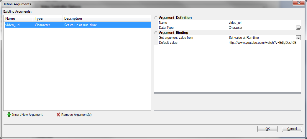
YouTube Video Arguments
- Argument
- Description
- video_url
Fully qualified YouTube video URL.
Javascript Properties
Javascript Linked files
Specify any Javascript files that should be linked. Enter a comma delimited list of filenames.
Xbasic Properties
Xbasic Linked files
Specify any Xbasic Function Library files that should be linked. Enter a comma delimited list of filenames. Defining Xbasic functions in a Function Library (that can be shared among multiple components) is an alternative to defining your Xbasic functions in this component (see 'Xbasic functions' on the toolbox).
Other Properties
Language definitions
Define strings for different languages.
Text dictionary tags
Show Text Dictionary tags (<a5:t>...</a5:t>) used in this component.
Active language
Specify the active language to use for translating strings tagged with <a5:r>..</a5:r> tags. Setting the property here is useful for testing purposes. In a real application you can set the 'session.__protected__activeLanguage' variable to specify the active language. To select the default language, enter <Default> or leave this property blank.
Remove un-consumed language tags
Should any language tags that were not replaced (because they were not defined in the Language Definition) be removed from any output sent to the browser?
Head section tags
Specify any tags you want to appear in the HEAD section of the page that hosts this component.
Component must run in IFrame
Specify if this component must run in its own IFrame.
IFrame inline style
Specify the in-line style for the IFrame. You should set a height and width for the IFrame. e.g. width: 6in; height 4in;
Advanced Properties
Other properties
Specify other properties of the component
Save component format
Specify if the component should be saved as a binary file or as formatted JSON.
Formatted JSON saves the properties in clear text. This is useful if you are using some type of source or version control system and the system has a method to show differences between versions. Choices include Binary, Formatted JSON.